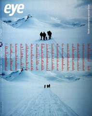
Winter 2000
Typotranslation
In a typographic tour de force, Richard Hamilton has turned Duchamp’s notes for the Large Glass into printed form
Above: Spread from à l’infinitif
Richard Hamilton’s typographic translation of Marcel Duchamp’s handwritten notes for The Bride Stripped Bare by Her Bachelors, Even, published in 1960, is one of the strangest, most audacious typographic documents ever created by a visual artist. Duchamp gave full support and encouragement to Hamilton’s careful endeavour, revising the translation from French to English three times. It was an undertaking of deep significance for both men. For Hamilton, the forensic insight he gained into the thinking of one of the twentieth century’s most enigmatic artists was to have a decisive impact on his paintings of the period, such as Hommage à Chrysler Corp. And for Duchamp? Hamilton heard later that the artist who embraced the ‘beauty of indifference’ carried the slim Green Book with him everywhere. He didn’t read it or even look at it, but placed it by his bedside, like a Gideon Bible found in a hotel room.
Duchamp’s notes towards this work, also known as the Large Glass, made in 1915-23, were first published in 1934 as loose-leaf collotype facsimiles, in an edition of 300 – this was the Green Box. In 1967, the year before Duchamp died, the Cordier & Ekstrom Gallery in Paris published a second set of notes, with the title à l’infinitif (in the infinitive). This Plexiglass edition of 150, also known as the White Box, included a booklet with a typeset English translation of the notes by the American artist Cleve Gray. Hamilton never made much headway with his studies of these notes, finding the translation inaccurate. In recent years, however, as a proficient user of Quark XPress, he sometimes reflected on how much easier it would have been to create his earlier ‘typotranslation’ had he possessed such a tool. In early 1996, in his mid-70s, he decided it would be an interesting project – ‘like a retirement hobby’ – to produce a second typotranslation, this time of à l’infinitif.

Above: Cover of a l’infinitif, published by Hamilton’s own imprint The Typosophic Society in 1999 in an edition of 5000. The cover image is Duchamp’s Glider, an element in the Large Glass. (Vector graphics reconstruction for the book by Rod Hamilton.)
The great decipherer
The first task, once Teeny Duchamp (Marcel’s widow, then still alive) had given the project her blessing, was to make a new translation of the notes. Hamilton has always played down his contribution in this respect, describing himself as ‘monolingual’. Yet, as the art historian Sarat Maharaj has shown, despite Hamilton’s protestations of ignorance, his letters to Duchamp in the late 1950s reveal a dogged determination to arrive at exact English equivalents of the French. Duchamp called him ‘mon grand déchiffreur’ (my great decipherer). ‘With guesses, hunches, and hints,’ writes Maharaj, ‘he sought to strike the right note regarding the text’s larger drift.’ The Green Box translation is best viewed as a three-way discussion between Hamilton, American art historian George Heard Hamilton and Duchamp.
The White Box notes were translated, with similar, painstaking care, by Hamilton, Jackie Matisse, daughter of Teeny Duchamp, and Ecke Bonk, author of Marcel Duchamp: The Portable Museum. A note placed at the start of à l’infinitif shows the enormous difference that the translation of even a few words can make. Duchamp’s French reads: ‘Du Scribisme illuminatoresque dans la peinture (Plastique pour plastique talionisme)’. Gray rendered this as: ‘A kind of illuminatistic Scribism in painting (a place for plastic retaliation)’. In the new version it becomes: ‘On – illuminatoresque Scribism in painting (Plastic form for plastic form talionism)’.
‘There’s so much in that little note,’ says Hamilton, at his secluded studio in the heart of the countryside, north west of London. ‘This [the Gray version] you can read and move on, because it doesn’t mean very much. Duchamp used the word talionism. I don’t need to know about French to ask: is “retaliation” talionism? Look up the word in the dictionary and the root is the same. But talionism is the law of talion and it’s an English word that is perfectly good. And you think: how does an eye for an eye and a tooth for a tooth come into this?’
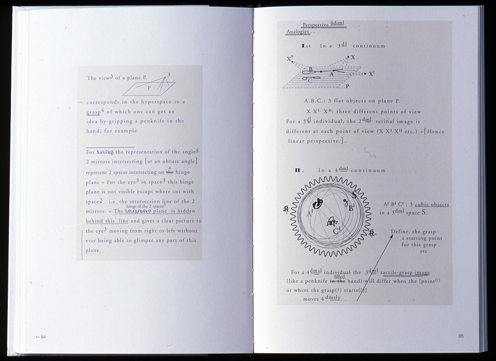
Above: Spread from à l’infinitif
A new typographic isomorph
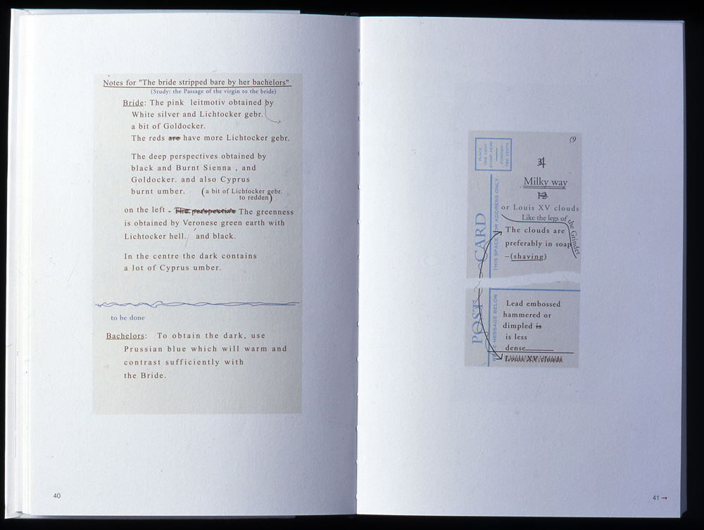
What Duchamp’s brief note proposes is that the interplay between text and image – such as that found in a medieval illuminated manuscript – could be the model for a painting. Word and image are equally important and can be combined: eye for eye, tooth for tooth, form for form. Other notes in both the Green Box and the White Box confirm that it was Duchamp’s intention to incorporate words alongside the Large Glass’s Bride and Bachelors, although he decided in the end to leave the nine-foot glass ‘definitively unfinished’ without any text. The textual dimension survives in the carefully preserved notes, but before the Green Book these guides to the Large Glass’s riddles, mysteries and blind alleys were all but inaccessible to English-speaking readers.
Bonk worked with Hamilton on the White Box typotranslation, though Hamilton, an early convert to digital technology, retained control of the master file. Previous attempts to edit and streamline Duchamp’s jottings into tight, linear, regularised typographic form always seemed to compromise and betray the free play of thought in the original notes, sketches and diagrams. Duchamp evidently understood this when he chose to publish them in facsimile form. As with the Green Book, Hamilton’s aim with à l’infinitif was to create a new typographic and graphic ‘isomorph’ of the original. ‘What the manuscript demands’, he writes, ‘is a transcription that retains the original’s graphic complexity . . . Variations in typeface, tone and colour can simulate changes in the writing medium; preserving the deletions and insertions reveals the development of ideas – even erratic spacing and punctuation can contribute to our understanding of the flow of thought.’
To convey this graphic complexity, Hamilton and Bonk employ no fewer than seventeen fonts – Akzidenz Grotesk, Baskerville, Bembo, Bodoni, Caslon, Charlemagne, Clarendon, Copperplate, Gothic, Garamond, Helvetica, News Gothic, Perpetua, Plantin, Sabon, Symbol, Times New Roman, and Walbaum – though they avoid using italic because it is too close to script. The widely letter-spaced, super-elastic typography, with continuous modulations of type size, type style, ink colour, indentation, line-spacing and line width, gives their pages a typographic character that has few obvious precedents. It’s as though a science textbook has been put into type by an intoxicated typographer with a strange sense of humour and unusual aesthetic flair.
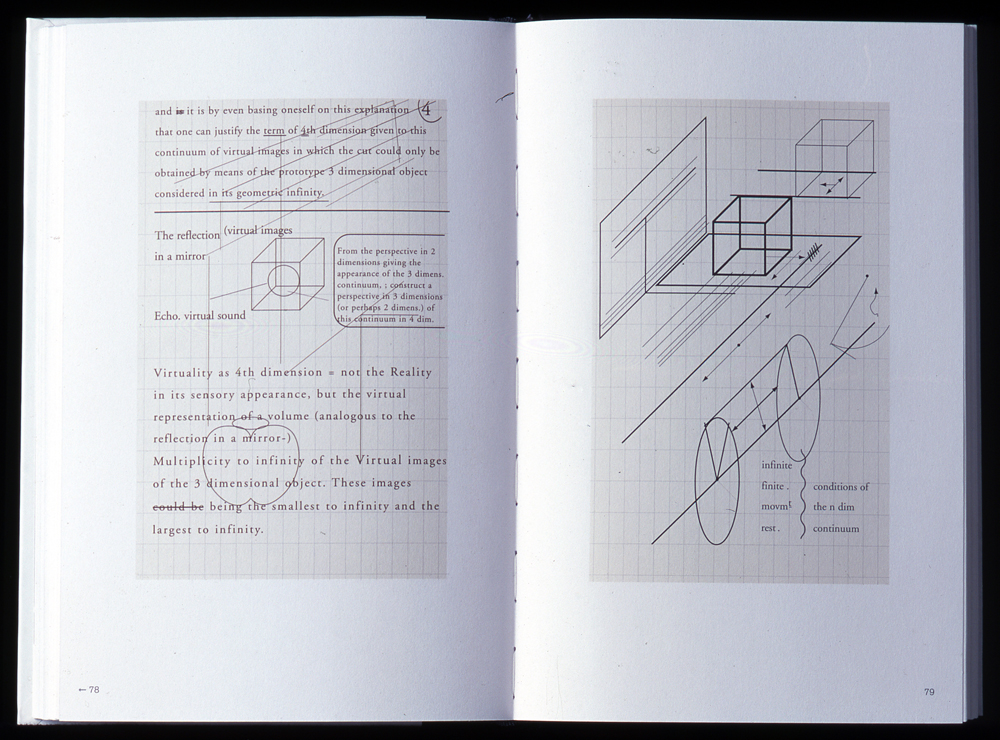
Yet the eccentricities of form are always grounded in the need to transliterate the original with the utmost faithfulness and lucidity. One difference from the Green Book is that Duchamp’s scraps of paper, reduced to approximately 75 per cent of their original size, are represented by a pale background colour. In two cases, his drawings were so loose that Hamilton retained them, but all other lines – scribbles; shading; arrows; underlines; crossings-out; even a face seen in profile – have been simulated using Illustrator and Quark XPress, when the 4.04 upgrade, with Bézier curves, became available. When Hamilton first suggested that he should re-create the Green Box drawings, he recalls that Duchamp seemed affronted. ‘Then I explained that I thought that if you convert the manuscript to text, you’ve got to convert the drawing into something that is related to the text . . . The reason I think Marcel accepted it, is because I redrew it absolutely anonymously.’
Above: Spread from à l’infinitif
The fourth dimension
In the facsimile edition, Gray divided the notes into seven labelled folders: Speculations; Dictionaries and Atlases; Color; Further References to The Glass; Appearance and Apparition; Perspective; and The Continuum. Hamilton rejected these categories and spent many hours, with Bonk’s assistance, plotting a new structure, using a series of intricate charts. Some of the notes are double-sided (they are presented recto/verso in the book) and he wanted the document to flow without the interruption of blank pages. Duchamp took an amateur interest in science and the notes posit the existence of flat beings, hyperspace and the ‘4-dmsl continuum’ – mathematicians report that his concept of a continuous, four-dimensional line made of spherical points is original. In an interview with Pierre Cabanne, towards the end of his life, Duchamp said he had conceived the idea of a projection of an intangible fourth dimension that could not be seen with the eye. ‘I thought that . . . the fourth dimension could project an object of three dimensions, or, to put it another way, any three-dimensional object, which we see dispassionately, is a projection of something four-dimensional, something we’re not familiar with . . . “The Bride” in the Large Glass was based on this, as if it were the projection of a four-dimensional object.’
The notes provide fascinating evidence of the significance of these ideas in the genesis of a poetic masterpiece that continues to resist definitive interpretation, though alchemy, numerology, Freud, Zen, Hinduism and the cabbala have all been thrown at the problem by writers anxious to penetrate and disclose its secrets. Few can have devoted themselves to Duchamp’s ‘delay in glass’ (as the artist described it) more assiduously, or with greater commitment, than Hamilton, who also spent a year in the 1960s making a full-size copy for the Tate Gallery. Still, he concludes, taking his cue from Duchamp himself, the Bride must remain ‘all things to all men’.

Above: Spread from à l’infinitif
A detached authorship
‘I’m glad I can get on with other things,’ Hamilton told me last year as he prepared the three-year project for stochastic printing in an edition of 5,000 copies, at his own expense. ‘But I find it enormously rewarding, I must say. It’s a great experience. It’s been an enrichment of my life . . . In a way these thoughts were something that Duchamp couldn’t push beyond. He was pressing against the unknown in such a way that the project was in some measure self-defeating. But for him that wouldn’t have mattered. He was sufficiently free from any of those kinds of need. He was detached.’
In this third labour of love for Duchamp, Hamilton sought to achieve a similar detachment. ‘The most important thing about the whole project,’ he insists, ‘is that my personality shall not intrude on it. My hand should not appear.’ I suggest to him that, as with the Green Book, à l’infinitif has become something more than he intended: a typographic artwork in its own right; that, in spite of himself, his own personality as an artist – an artist whose early years included a spell as an engineering draftsman – is manifest in his every graphic decision. ‘I’m afraid that is the case,’ he concedes. But there lies much of the fascination of these two projects. Hamilton’s probing ‘interpretative transcriptions’ are more than the sum of their parts. To be true to the originals, to convey the full scope of Duchamp’s plans and ideas for the Large Glass, he had to fashion new works of his own.
First published in Eye no. 38 vol. 10 2000
Eye is the world’s most beautiful and collectable graphic design journal, published quarterly for professional designers, students and anyone interested in critical, informed writing about graphic design and visual culture. It is available from all good design bookshops and online at the Eye shop, where you can buy subscriptions and single issues.