Winter 2010
A soul drifting in neon limbo
The stroboscopic credits of Noé’s movie suck the viewer into an immersive maelstrom of lettering. Critique by Rick Poynor
Even in an era as typographically aware as our own it is rare to find feature film directors who treat words and typography as an integral component of their work. Jean-Luc Godard’s oeuvre, especially the classic films of the 1960s, remains the benchmark against which all typographic film-making must be measured.
Only two contemporary directors, Wes Anderson and Gaspar Noé, use words and type to reflect their cinematic vision with any consistency, though their style and aims could hardly be more different.
Hipster or not, Anderson has an old-fashioned, almost literary, taste for chapter-like breaks in his films’ narrative, and his typography, generally based on Futura, also works as a form of self-branding. This elegant, imaginary Anderson-world has undeniable flair and humour, though the self-reflexivity is too whimsical to pose much of challenge.
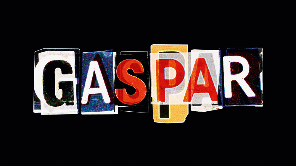
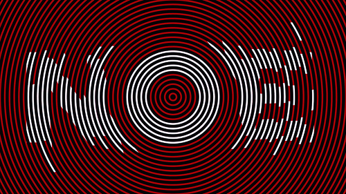
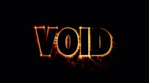
All images: the titles of Enter the Void cascade at the viewer in a blizzard of typographic noise. Director: Gaspar Noé. Typographic design: Tom Kan. Kirlian photographic effets on title type: Thorsten Fleisch. Productions: Wild Bunch and Fidélité Films.
Noé’s use of the word as a filmic device is much closer to Godard’s: he wants to disrupt and disturb. In his first feature, Seul contre tous (I Stand Alone, 1998), an alarming tale about a butcher at the end of his tether, which unfolds as a scathing, non-stop monologue, he introduces sections with inter-titles in huge capitals – ‘Justice’, ‘Morality’, ‘Living is a selfish act’. A warning that viewers have 30 seconds to leave the screening, followed by the flashing word ‘Danger’, prefaces one particularly gruelling sequence. Noé might be toying with the audience but the frenzied hammer blows of the lettering add to the film’s unnerving harshness.
In terms of placement, Noé’s use of type in his latest film, Enter the Void, could seem more conventional: he confines it to the beginning and end. Even so the type plays the same vital role – see also Irréversible (2002) – as a means of expressing the film’s dark vision. Enter the Void’s titles can be viewed online (UK DVD release is scheduled for April 2011) but the best place to experience them is with the film, on a big screen in a cinema, as an overwhelming fusion of image and sound.
The sequence, directed by Noé with design by the Paris-based Japanese art director Tom Kan, is brilliantly disorientating. From the first frame, it is like being seized by an irresistible vortex of brain-scrambling sensation and sucked down into the film’s chemically modified consciousness. The type fills the entire screen and the editing is precision-welded to the stuttering beats of ‘Freak’, a 2003 track by the English techno band LFO. The credits flash by so fast that it is impossible to absorb them all, though a few names register in the visual noise.
As a piece of graphic design, the titles are both crude and sophisticated. This is an area of tacky popular graphics previously visited for its experimental potential by the late P. Scott Makela, The Designers Republic and Jonathan Barnbrook.
Kan exploits every trick in the commercial lettering manual: drop shadows, bevelled edges, Gothic type, neon type, 1960s futurism, shattered letters, melting letters. Spliced together with Japanese characters and subjected to jittery filters and treatments, this maelstrom of words signals the delirious, immersive excitement of Noé’s Tokyo, a city of nightclubs, logos, adverts, neon, throbbing music, drugs and sexual sleaze, a place where spiritual compasses can easily spin out of control.
Enter the Void’s psychedelic spectacle of a young man’s soul drifting after death has divided audiences. Some see it as a work of exhilarating technical innovation; some find it overblown and tedious. Some type enthusiasts complained that the film failed to live up to its stroboscopic titles. This response seems not only to misunderstand how titles can condense and reformat a film’s themes, turning narrative detail into graphic shorthand, but also to overlook Noé’s broader use of typography in his work as prompt, goad and pseudo-didactic audience-baiter.
After the title sequence comes the single word ‘Enter’. Enter the Void aspires to be a door of perception and we have been invited, or dared, to venture inside. Not until the end is the phrase completed, when it transpires that the whole film is clamped, like a big queasy burger laced with hallucinogens, between great slabs of type. The words are not, then, purely functional elements that could be cast aside without changing anything. The type is an intrinsic part of the void’s texture and meaning.
Title sequence of Gaspar Noé’s Enter the Void. Typographic design: Tom Kan. Kirlian photographic effets on title type: Thorsten Fleisch. Productions: Wild Bunch and Fidélité Films.
Rick Poynor, writer, Eye founder, London
First published in Eye no. 78 vol. 20 2010
Eye is the world’s most beautiful and collectable graphic design journal, published quarterly for professional designers, students and anyone interested in critical, informed writing about graphic design and visual culture. It is available from all good design bookshops and online at the Eye shop, where you can buy subscriptions and single issues.