
Winter 2014
Against the flow

Bastion
Alexandra Falagara
Brita Lindvall
Graphic design
Illustration
Magazines
Visual culture
As editorial design becomes more predictable, Swedish feminist quarterly Bang kicks against visual norms. Critique by Rick Poynor
I first saw Bang on a newsstand in Stockholm, where the feminist quarterly leapt out. It had a textured cover that felt like canvas, adorned with a colourful camouflage pattern, and an unretouched photograph of a woman wearing a bold set of beads. It was saddle-stitched rather than perfect bound and it was A4. Now that most magazines shun the standard paper size and staples for being too low in perceived status, a return to them can look unexpectedly fresh, so long as no one else has the same idea.
The pages inside Bang were equally dissonant and, though I can’t read Swedish, that was exciting to see. Upscale magazine design has become highly predictable. From The Gentlewoman to Port, from Cereal to Kinfolk, quietly elegant typography on sheets of immaculate white space is the order of the day – all very tasteful and aspirational, but it has become a tiresome and unimaginative formula. There must be many other ways of rendering experience and representing the complexity of contemporary thinking in visual form.
Spread from Bang no. 2 for 2014 with Creative Commons images by Valerie Everett, Daniel Mott, Gaelx, Ivan Meljac and Hobvias Sudoneighm. Top: spread from same issue showing image by Tzunami. Headlines in this issue are set in Comic Neue Angular Bold.
Bang’s designers, Alexandra Falagara and Brita Lindvall, who call themselves Bastion, would probably put the criticism in stronger terms. Before they redesigned Bang in 2012, the design of the magazine, founded in 1991, was modernist; they saw a discrepancy between the assumed purity of this static visual language and an editorial commitment to feminism and social change. Conventional design styles are normative – they are considered to be the normal way of doing something and their constant reiteration reinforces those norms. Falagara and Lindvall had no idea at the outset what Bang should look like, but they knew they wanted feminist and ‘norm-critical’ strategies to be manifested visually in its pages.
The questioning of norms produces results that in some ways recall the radical magazine design styles of twenty years ago, epitomised above all by Ray Gun, although the rationale is entirely different. Where the 1990s designers wanted to assert their right to typographically interpret editorial content, and express and impose their own subjectivity, Bastion’s strategies of disruption are built on firmer, less individualistic ground and the cooperative feminist mission comes first. At least, that’s the ideal.
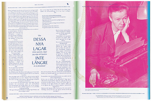
Spread from Bang no. 1 for 2014 with a photo of Swedish journalist Barbro ‘Bang’ Alving (who reported from the opening ceremony of the Berlin Olympics in 1936 and during the Spanish civil war).
There are also notable differences. Despite the loose, even haphazard appearance of some pages, Bang conforms to a tried and tested three-part editorial structure: a beginning based on the ‘Noted’ section of short items, a central well with longer articles related to the issue’s theme, and a final ‘Aftertalk’ section for texts of various lengths that deal with earlier themes and debates that took place both within and outside Bang’s pages. The grid, too, could be characterised as classical. The text type – Zuzana Licko’s Mr Eaves and Mrs Eaves – is never subjected to distortion and is highly readable. ‘We don’t believe that fonts made by women are feminist per se,’ says Bastion. ‘However, the gesture of highlighting female type designers in a male-dominated arena is a feminist action.’ Another norm-challenging gesture is the deliberate creation of orphans at the end of paragraphs, which are then centred in the line. In the opening pages, the type is in colour instead of the customary normative black.
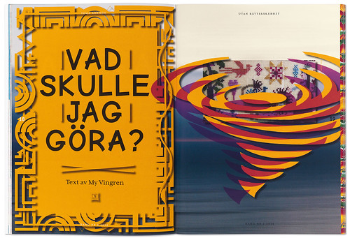
Spread from Bang no. 2 for 2014 featuring needlework photographed by Nic McPhee. Illustrated by Tzunami.
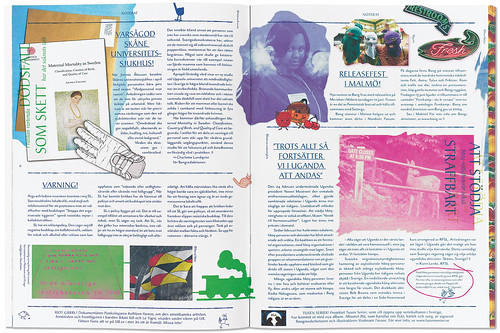
Bang’s idiosyncratic visual character arises, most of all, from its layering (another link to the 1990s), though this is fashioned with images rather than type. Bastion decorates the edges of the pages with vibrant patterns and textures that run through the entire magazine. The ‘Noted’ stories are the busiest, with images floating in from every direction, jostling around the type. There are custom-made illustrations by both professional and amateur image-makers and artists. The designers make liberal use of what they call the ‘trash of the Internet’, such as gifs and Creative Commons images, and insert tiny pictures into the footers next to brief texts. The irregular patchwork of images doesn’t necessarily illustrate the articles, but offers parallel stories intended to illuminate the themes. Images spill over the edge on to the next page, as though the whole publication is in flux.
This kind of design has the potential to divide readers down the middle and, according to Bastion, Bang’s appearance has both detractors and fans. The issues are nicely produced and, despite the unfamiliarity of the visual language, have a feeling of repleteness, even luxury. Bastion has succeeded in evolving a quirky aesthetic that promises an editorial perspective far from the consumerist exhortations and advertising-influenced visual assumptions of most magazines aimed at women. Bang’s startlingly unorthodox art direction raises questions about why mainstream women’s magazines look as they do, and about the manipulative view of their readers that these doggedly persistent publishing and design conventions so readily enshrine.
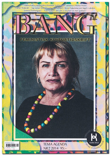
Cover of Bang no. 2 for 2014 with portrait of Swedish politician Soraya Post of the Feminist Initiative party. The masthead is based on the typeface Smaragd by Gudrun Zapf von Hesse.
Rick Poynor, writer, Eye founder, London
First published in Eye no. 89 vol. 23 2014
Eye is the world’s most beautiful and collectable graphic design journal, published quarterly for professional designers, students and anyone interested in critical, informed writing about graphic design and visual culture. It is available from all good design bookshops and online at the Eye shop, where you can buy subscriptions, back issues and single copies of the latest issue. You can see what Eye 89 looks like at Eye before You Buy on Vimeo.