Monday, 12:00am
15 November 2010
Expression of faith
Give the revered Irma Boom her head and what do you get? A catalogue like a truncated brick
By Rick Poynor
Written exclusively for eyemagazine.com and blog.eyemagazine.com
When the Museum fur Gestaltung Zurich’s book Every Thing Design became widely available earlier this year, its design by Irma Boom attracted an admiration that is now de rigueur for this designer. The Dutch star long ago entered the ranks of those saintly design figures, from the late Alan Fletcher to Stefan Sagmeister, who are so intensely revered that they can do no wrong in the eyes of colleagues.
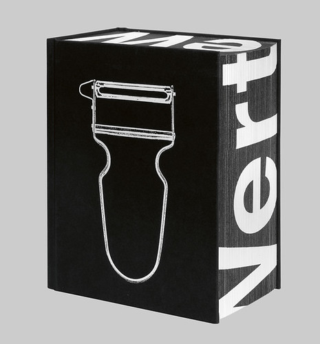
Every Thing Design, an 864-page catalogue of the Swiss design museum’s collection, is certainly striking. It has the dimensions and bulk of a truncated brick; it feels like a box with something heavy inside. In its shrink-wrapped form, the book is defiantly close-lipped about its provenance or purpose. The front cover features only the white outline of an object that might be a potato peeler. One turns the volume around to try to decipher the German word Wertewandel – is that the title? – printed on the spine and the edges of the paper. [It means ‘a change in values’.] The actual title, also on the spine as well as the back cover, is so small that it could be a subtitle or a tag line.
I looked through Every Thing Design a couple of times in bookshops, wondering whether to get it as a reference book but it is so expensive for its size that I held back from buying one until recently. Even that wasn’t easy. My copy had lost its barcode and the sales assistant struggled to find the book’s publication details – buried on page 670 – so that he could process it.
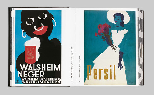
As well as design, Boom is credited with the ‘idea’ (what this means is unclear) and with image editing. Every Thing Design has a 190-page prologue, and a 190-page epilogue consisting entirely of pictures of objects and images from the museum’s collection shown one to a page. The curators gave the designer a completely free hand to choose any items she liked and to group them as she saw fit.
According to a report by Alice Rawsthorn for The New York Times, Boom didn’t consult the standard information – date, designer, materials, method of manufacture, or the object’s purpose – that curators normally consider essential to understand, contextualise and present an artefact to the public. Instead, as one of the curators, Verena Formanek, explains, Boom based her selections on ‘design-related characteristics such as forms, colours, materials, and creative processes’.
A loose underlying narrative is sometimes apparent: the book opens with a sequence that moves from circular forms to distorted circles, linked circles, curved objects, containers, decorated containers, and floral motifs. But apart from the fact that they both feature concentric circles, there is no meaningful connection or curatorial revelation of any kind to be gleaned from positioning a Dutch wall plate from 1905 next to a Swiss club flyer from 2004. The placement of a woman’s leather hat beside a collage print by Wolfgang Weingart is equally gnomic, though they both have a lot of black in them.
Admittedly, these sequences offer the kind of visual pleasure through chance juxtaposition that many viewers have developed a taste for on websites such as Ffffound!, BibliOdyssey and Eric Baker’s Today selections at Design Observer. At the simplest level, the chaotic abundance of context-free images tells the reader that there are many appealing things to see at the museum. As a guide to the curatorial mission of an institution with a world-class collection, though, the book’s visual idea overpowers anything that the curators might have to say in the essays submerged under strata of pictures. The line spacing of the text is so tight, incidentally, that the descenders and ascenders frequently tangle. If the aim is to encourage ease of reading, why commit such an elementary typographic error?
Years ago, I interviewed Boom about the 2000-page SHV Think Book that made her name internationally. ‘I didn’t think of the audience at all,’ she told me. ‘I thought if it’s good for me, it’s good for them.’ This self-serving credo might sometimes hold true, but it doesn’t necessarily follow, and it is more likely to work out if the designer spends time thinking about who the audience is and what it needs.
In this case, the curators were willing to set aside their intellectual expertise and visual sensitivity because they seem to have believed that deferring to a designer celebrated as a master of the medium would confer greater value on the book and convey a positive message about the museum to readers. As I grappled for several hours with this awkward and totally impractical volume – it won’t even lie flat and stay open on the page you are reading – I would have been happy to settle for the routine handiwork of any ordinarily competent book designer.
Every Thing Design: The Collections of the Museum fur Gestaltung Zurich, edited by Christian Brandle and Verena Formanek. Hatje Cantz Verlag, CHF42.90, €30, £26.99