
Spring 2013
Identity crisis
Rebranding ITV was meant to generate a warm glow – not the heated reaction it received from viewers. Critique by Rick Poynor
Any highly visible organisation preparing to introduce a new brand identity these days must experience a severe bout of pre-launch misgivings. There has always been backfiring publicity in the national press of the ‘It cost how much?’ variety. Social media has elevated negative feedback to new heights of unhinged invective.
Even for a national institution known to everyone and loved by many, the response to the January 2013 rebranding of ITV (the UK’s oldest commercial television network), was astonishing. Two weeks after it aired, Twitter still resounded with the snarls of disgruntled viewers. Here’s a sampling of the Twitter-bile targeted at the logo. It was ugly, rubbish, dreadful, awful, horrible, vile, bad, disgusting, crap, shit, pants, bollocks, whack, gash, tragic, tacky, stupid, foul, cringey, insipid, dull, infantile, too girly and too swirly. The logo, the tweeters vouched, was a ‘dog’s dinner’ and ‘weak and apologetic’; it looked like ‘a baby teething toy’, ‘a primary school pupil’s first attempt at joined-up writing’, ‘something you’d see on a shopping channel’ and ‘like it’s been written in butter’.
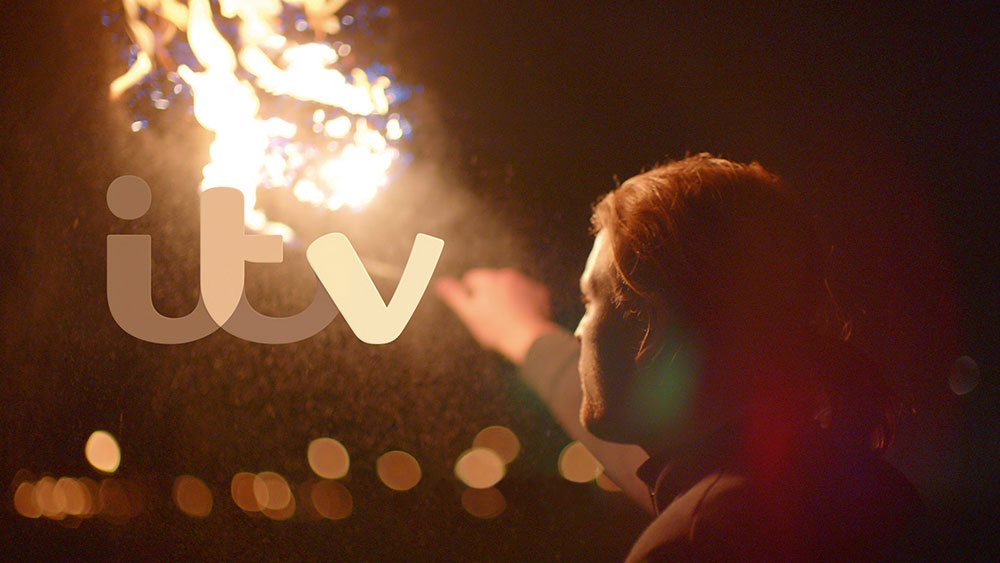
Top and right: The ITV logo pics up the colours of the film image passing behind it.
It’s safe to say that Paul Rand never had to put up with anything remotely like this. The gap between what the broadcaster hoped to achieve with the in-house rebranding – to extend the ‘warmth audiences feel for ITV’s content to the network itself’, according to a document titled Rebranding the ITV Network – and the disaffection of these viewers could hardly have been more cavernous. Tweeters were ‘not feeling the logo’, ‘pissed off’ by it, and ‘freaked out’. ‘Who gave ITV permission to change their logo?’ demanded one. ‘I hate the change and want the old one back,’ said another. Only a few went on record to mention that they liked the new identity.
Industry opinion tended to be more measured, with some coming down for and some against, but fellow designers weren’t the audience. My own view – other than mild incredulity that we have reached a point where people who aren’t designers can care this vehemently about a mere logo – is that the identity is fine. I can’t get worked up about the change because I rarely watch ITV, so I have no stake as a viewer in whether the channel’s visual identity ‘represents’ me or not. (Plenty of the designers who commented publicly on the identity expressed the same reservation.) The handwritten look of the custom type (ITV Reem by Fontsmith) has only limited appeal, though I don’t find it as confusing as some claim it to be, and the ‘written in butter’ comment accurately characterises its softness of outline. The face is tolerable when seen small, but the bigger the screen, the more cloying this butteriness becomes.
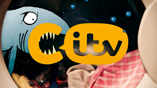
Variation of the identity for CITV, a children’s channel.
The most persuasive aspect of the identity, as applied to the main channel – now renamed ITV rather than ITV1 – is the way that it responds to the filmed backgrounds by picking out the colours, using an algorithm that tracks colours at pre-set points in the image. The ripples of colour are modern and pleasing, and the adaptive logo can embody as many kinds of mood as there are programmes on the channel. The typographic branding of the other three adult ITV channels is not as distinctive and it remains to be seen how much the restyling can do to counteract the prevailing lack of awareness about how the channels, particularly 3 and 4, are differentiated in content. The BBC has done a much better job in establishing channel identities based on clearly distinct types of programme.
Listening to the two sides, ITV creatives and audience, what struck me most was the element of overstatement in both camps. The creatives, in thrall to the power of branding, make pronouncements such as this: ‘We’d never said who we are or why we’re here. So people had no language to describe what we do and we’d never given them a reason to like us. As a result their affection is with our shows and not us’ (Rufus Radcliffe, head of group marketing). But the only sensible reason to love a channel is because it produces programmes one likes.
Channels built and maintained identities long before they thought of themselves as brands; these identities came from the aggregated quality of their output. Visual links and graphics can cement the impression a TV channel’s programmes make but they can never be a substitute, and it is absurd to crave viewers’ love for the branding itself. Paradoxically, the over-reaction of some viewers – ill founded as it was – takes branding as seriously as the branders do but responds with the opposite sentiment to the one sought. In the era of the over-managed brand, these love / hate stand-offs will occur frequently.
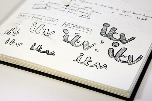
Development sketches for Rudd Studio’s design concept based on handwriting. Fontsmith honed the typography and created a custom typeface, ITV Reem.
Rick Poynor, writer, Eye founder, London
First published in Eye no. 85 vol. 22, 2013

Eye is the world’s most beautiful and collectable graphic design journal, published quarterly for professional designers, students and anyone interested in critical, informed writing about graphic design and visual culture. It is available from all good design bookshops and online at the Eye shop, where you can buy subscriptions, back issues and single copies of the latest issue. You can see what Eye 85 looks like at Eye before You Buy on Vimeo.