Monday, 10:00am
15 May 2017
Inner space man
Mike Halliwell
J. G. Ballard
Linder
David Pelham
Stanley Donwood
Graphic design
Illustration
Photography
Critique / Photography
Web Critique
Mike Halliwell’s montages illustrate J. G. Ballard’s The Atrocity Exhibition with a flair that evokes the late author’s own experiments with cut and paste. Photo Critique by Rick Poynor
Photo Critique by Rick Poynor, written exclusively for eyemagazine.com.
In J. G. Ballard’s last years, a consensus emerged about the covers of his books. Here were some brilliantly visual works of fiction by a devotee of Surrealism, Pop and all kinds of art that had somehow, despite being a conceptual gift to designers and illustrators, rarely received their due.
With a few honourable exceptions – such as David Pelham’s work for Penguin in the 1970s – Ballard’s book covers tended to be mediocre at best. I made the point in 2007 in a conference paper about the Ballardian image, later posted online under the title ‘What Does J. G. Ballard Look Like?’ Not until Stanley Donwood’s set of covers for Fourth Estate in 2014 did one of Ballard’s publishers produce a series that convincingly expresses the multiple moods of the oeuvre.
Unusually for an author, Ballard had given some visual indications of where his own preferences might lie, in two series of artworks made in the 1950s and 1960s – we showed his typographic collages in Eye 23. For years, these experiments were little known, but they are easily viewed online now, as are the five ‘Advertiser’s Announcements’ Ballard created alongside his experimental fiction. He did the artwork, arranged the block-making, and paid for advertising space, like any other client, in publications such as Ambit and New Worlds, both of which he wrote for, and the Royal College of Art magazine Ark. ‘I wanted ads that would look in place in Vogue, Paris Match, Newsweek, etc.,’ Ballard recalled; but the costs proved to be prohibitive and the series came to an end. Nor was he able to pursue his plan for an entire large-format book based on collages composed of the kind of alarming imagery – medical photographs and car crashes – that filled his novels The Atrocity Exhibition (1970) and Crash (1973).
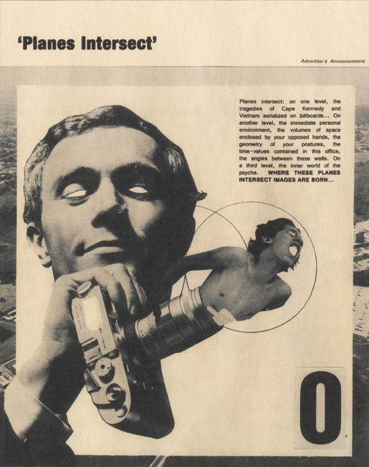
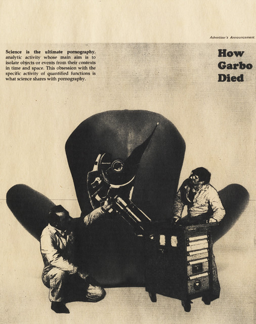
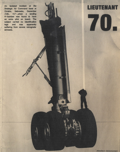
All images from Mike Halliwell’s Internal Landscapes: Images of Inner Space, a series of montages illustrating J. G. Ballard’s The Atrocity Exhibition.
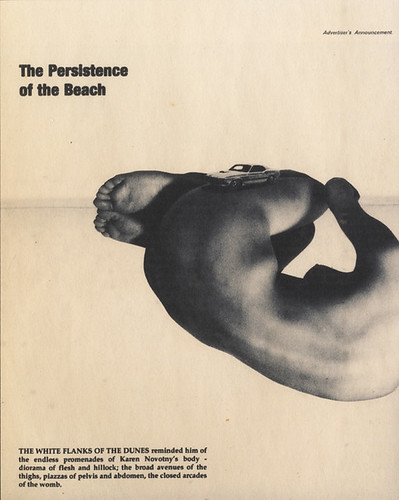
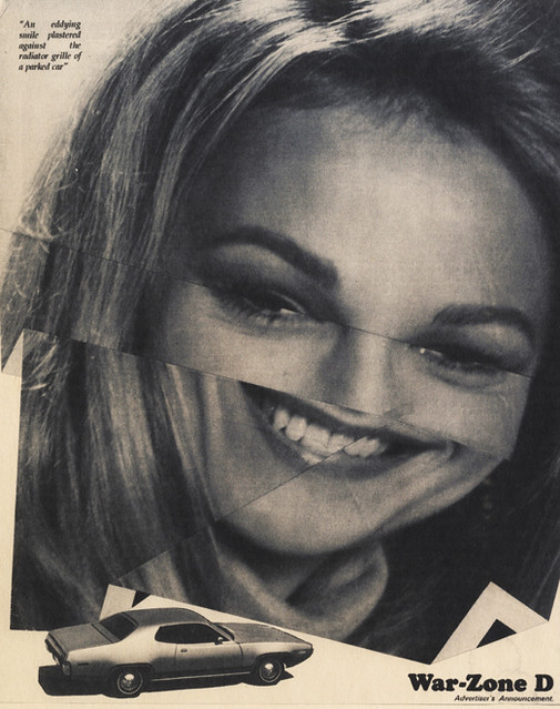
Mike Halliwell’s Internal Landscapes: Images of Inner Space, a series of montages illustrating The Atrocity Exhibition, attempts to pick up where Ballard left off. Each advert follows Ballard’s practice by carrying the line ‘Advertiser’s Announcement’, either within the image area, or within an otherwise empty panel at the top. Sometimes described as a series of condensed novels, the book is fractured into short sections, each with its own glinting, high-impact title, and Halliwell uses these – ‘War-Zone D’, ‘The Dead Planetarium’ – as his primary copy lines. Where Ballard composed his provocatively oblique texts specially for his ads, like a maverick agency man free-associating on bad acid, Halliwell extracts his subsidiary copy from the book, generally from the same section as the title.
For his ‘Advertiser’s Announcements’ Ballard used single photographs. Two feature his girlfriend Claire Churchill, and the others are borrowed images: a gun-toting nudist by Les Krims, a bondage picture from a porn magazine given to Ballard by the artist Eduardo Paolozzi, and a shot from the experimental film Alone (1963) by Stephen Dwoskin. Taking his cue from Ballard’s unrealised plan to make collages, Halliwell has cut up photos from magazines contemporary to the writing of The Atrocity Exhibition – Life, Time, Paris Match – as components for his images. In ‘How Garbo Died’, two technicians contemplate a machine part superimposed on a woman’s naked back. ‘Science is the ultimate pornography,’ reads the text, ‘analytic activity whose main aim is to isolate objects or events from their contexts in time and space.’ In the book the words are spoken by a psychiatrist, but it sounds like a Ballardian maxim.
By confining himself to pre-digital cut-and-paste, Halliwell succeeds in making images that look as though they could have been published in a 1960s issue of New Worlds or Ambit, without falling into pointless pastiche. This style of montage rooted in 1920s Modernism, executed in black and white with the cut lines showing, was still going strong during punk, when Linder Sterling and Jon Savage self-published their fanzine The Secret Public (1978); and it is flourishing again today in the online collage culture. Much of this present-day work draws on the same vintage magazines and evinces a deep strain of nostalgia, because collage’s recycling is inherently nostalgic, but Halliwell has achieved something more nuanced. Internal Landscapes – the image comes from The Atrocity Exhibition – is doubly fictional, a speculative extrapolation of the kind of project Ballard might plausibly have developed if events had taken a different turn at the end of the 1960s.
Halliwell presented the project for his MA at the University for the Creative Arts in 2016. He published the twelve images as a newsprint tabloid and this feels in keeping with the spirit of 1960s and 70s counterculture, from International Times to Bananas (Emma Tennant’s literary magazine, in which Ballard published regularly). But the colour is richer, as if yellowing with age, in the versions posted online, and since these Ballardian design fictions are purely conceptual, the realm of digital replication seems like the most fitting place for them.
Rick Poynor, writer, Eye founder, Professor of Design and Visual Culture, University of Reading
Eye is the world’s most beautiful and collectable graphic design journal, published for professional designers, students and anyone interested in critical, informed writing about graphic design and visual culture. It is available from all good design bookshops and online at the Eye shop, where you can buy subscriptions and single issues.