
Summer 2016
‘Because, history’
Typo Berlin: Beyond Design
12-14 May 2016, Haus der Kulturen der Welt, Berlin<br>
Despite its name, Typo Berlin, founded in 1996, has never been solely dedicated to type, and this year’s ‘Beyond Design’ theme broadened its scope further. We had music (Debra Shaw), comedy (Spanish duo Brosmind, illustration’s Flight of the Conchords), self-help (Maria Giudice, who vainly commanded delegates to ‘bring out your inner DEO’ – Design Executive Officer) and a whiff of ‘Design Thinking’.
Sonja Knecht asked Jon Barnbrook whether she should call him English or British. His reply – ‘I’m a European’ – elicited whoops of delight. As a sentiment that did not make it ‘beyond design’, this was, in retrospect, a bittersweet highlight.
Catherine Dixon’s talk on the ‘Show’ stage focused on ‘workmanship’ as a term more useful than ‘craft’ in the struggle against mediocrity – or ‘maker-illiteracy’ – in typography. Her urgent presentation was crammed with visual examples of practice good, bad and so-so. There was time for just one question from moderator Stephen Coles: ‘How can we fix this?’ Dixon’s simple response: ‘Through education.’
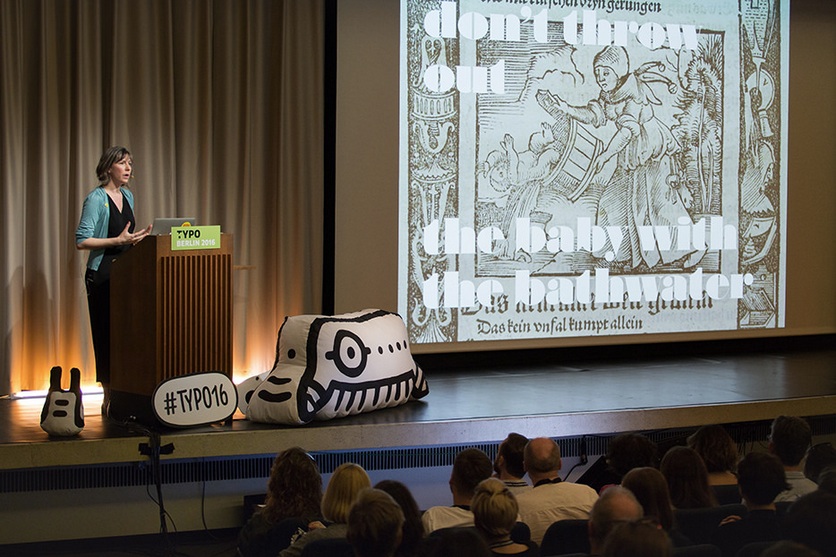
Nadine Chahine commanded the big ‘Hall’ stage with ‘Designing for split-second clarity’. She talked us through complex research on legibility in the automotive industry, in particular reading at speed and at night, giving lucid explanations of the challenges facing sign and dashboard typography, especially users with poor eyesight. She hammered home her points: ‘Age differences are significant in legibility … it’s a call to action to be more inclusive.’ Research shows that using white on black type for night-time reading makes type harder to read. When road-users are processing such information at speed, in difficult conditions, typography is genuinely a matter of life and death.
Nadine Chahine talking at Typo Berlin 2016. © Gerhard Kassner / Monotype.
Top: Catherine Dixon at Typo Berlin 2016. © Sebastian Weiß / Monotype.
Armin Lindauer quietly presented a stunning sequence of visual experiments. His systematic and mathematical processes (documented in Experimental Design: Visual Methods and Systematic Play, with Betina Müller) have an integrity that might steer designers away from thoughtless mark-making. He alerted the audience to the dangers of reading books that used phrases such as ‘visual creativity’: ‘These are toxic words … books you should never touch! Put them in the cellar with the books on crocheting.’ Mark van Wageningen’s colourful and provocative Typewood presentation was another geeky highlight.
The Typo Labs type design workshops, which began early on 9 May, climaxed with TypeCooker, an entertaining crit in which Erik van Blokland and Paul van der Laan went through workshop assignments with the aid of an overhead projector. Typical comments: ‘This “R” gets the John Travolta award’; ‘Not every letter has to be exciting or unique’; and Van Blokland’s exasperated rejection of a wonky ‘y’: ‘Not just because I say so but because [pause] history.’
Ferdinand Ulrich’s closing tribute to Gudrun Zapf-von Hesse – a little too frail to attend on her 98th birthday – was a moving and revealing lesson in type design’s history. Ultimately, and literally, the not-so-‘beyond’ presenters had the last word.
John L. Walters, editor of Eye, London
First published in Eye no. 92 vol. 23, 2016
Eye is the world’s most beautiful and collectable graphic design journal, published for professional designers, students and anyone interested in critical, informed writing about graphic design and visual culture. It is available from all good design bookshops and online at the Eye shop, where you can buy subscriptions and single issues. You can see what Eye 92 looks like at Eye before You Buy on Vimeo.