
Spring 2006
Fruitful lines of graphic type analysis
The Stroke: Theory of Writing
By Gerrit Noordzij. Translated by Peter Enneson. Hyphen Press, £15In late 2002, a group of subscribers to the ATypI mailing list conspired to discuss Gerrit Noordzij’s Letterletter, a collection of highly personal notes on writing, type and related matters published by Hartley & Marks. A separate Noordzij mailing list was created, which for a short period became a stage for heated debate and philosophical dialogues. However, many subscribers soon lost interest and the discussion waned. It might have lasted longer, and made more sense, had other writings by Noordzij been available in English. Letterletter, originally a one-man journal distributed mainly to ATypI members, is witty and rich in ideas, but too fragmented, polemical and tongue-in-cheek to function as an introduction to Noordzij’s thinking. The Stroke, Peter Enneson’s long-awaited translation of De streek, is much better placed to take that role. Published in Dutch in 1985, The Stroke stands out as the most concise and complete summary of Noordzij’s theories on type.
Born in Rotterdam in 1931, Gerrit Noordzij has worked as a typographer, calligrapher, researcher, stone carver, historian and type designer. Yet he is first and foremost a teacher. His main legacy is not in his writings, not even in his typefaces (of which only one, Ruse, is available so far). Noordzij’s life’s work, so to speak, is to have triggered a series of amazing careers. Many of his students at the Royal Academy of Art in The Hague have become renowned international designers, creating and publishing typefaces that have helped set the standards of the new discipline of desktop type design. Peter Matthias and Christoph Noordzij (his sons), Petr and Erik van Blokland, Just van Rossum, Lucas de Groot, Jelle Bosma, Albert-Jan Pool, Frank E. Blokland and Peter Verheul all took part in Noordzij’s ‘letter programme’ in the 1970s and 80s; since Noordzij’s retirement in 1990 they have in turn become teachers, continuing to spread Noordzij’s influential theory of letterforms.
This theory is the subject of the 70-odd pages of The Stroke: an analysis of the construction of letterforms informed by historical study but firmly rooted in hands-on experience. In Noordzij’s words: ‘To be able to analyse writing I need to write, and to be able to write I need the analysis. This circle-game is not played in the study, but rather in the workshop.’
To Noordzij, there is no essential difference between the written and the printed word – he defines typography as ‘writing with prefabricated letters.’ Printing types betray their origin in (hand)writing by their construction. A typeface may show diagonal or vertical contrast or stress, referring respectively to the broad-nibbed or the pointed pen – Noordzij invented the terms ‘translation’ and ‘expansion’ for these two extremes. An alphabet can have an interrupted or cursive construction, derived from the movement of the hand – is the pen lifted from the paper while shaping the character or not? The third variable in Noordzij’s scheme is the amount of contrast, from monoline to the extreme thick / thin contrast of certain nineteenth-century alphabets. Combined, these three ‘axes’ form a relatively simply model that helps users and makers to understand the workings of letters without having to fathom complex classification systems.
The serif illustrates a fundamental difference between Noordzij’s theory and traditional systems. An essential feature in most type classification systems, it has become a mere by-product in Noordzij’s model. He argues that low contrast is inherent to the sans-serif, and simply turns this convention into a natural fact: as the contrast diminishes, the serifs disappear ‘into’ the stroke, as it were. Some of Noordzij’s former students are reluctant to use the term ‘sans-serif’: they prefer ‘low-contrast’.
Noordzij’s model is a great tool for teaching people to look critically at letterforms, but it cannot be applied universally. It is incompatible with many of today’s genres and sub-genres – almost any alphabet that involves geometric construction. Noordzij tends to get normative here, dismissing such non-traditional typefaces as ‘irrelevant’. However, there is a degree of role-playing involved. Noordzij has referred to his model as ‘a simple invention’, suggesting that it was put forward for the sake of argument – its ambitions being provisional, its claims by no means universal. He needed his model to demonstrate the way things work; it is a sophisticated instrument of deliberately limited scope.
There is more in The Stroke than the model alone. For instance, Noordzij’s notes on the ‘white’ (counterform) of letters and words, and the related explanations on the relationship between stroke thickness and letterspacing should be required reading for any budding typographer.
As for the translation, Noordzij could hardly have wished for a more dedicated interpreter. To Peter Enneson, a Canadian typographer of Dutch descent, this project has been a labour of love. Its outcome is the fruit of an intensive correspondence between author and translator. However, Noordzij’s style when writing in Dutch is idiosyncratic and often informal, and his sense of humour quite subtle; not all of that could be captured in English. In Dutch, Noordzij’s tendency to be complacent and self-congratulatory is tempered by a sense of relativity and self-mockery; at times he sounds more pompous in Enneson’s English than he deserves. But on the whole, the book works well, and adequate equivalents have been found for Noordzij’s unorthodox notions.
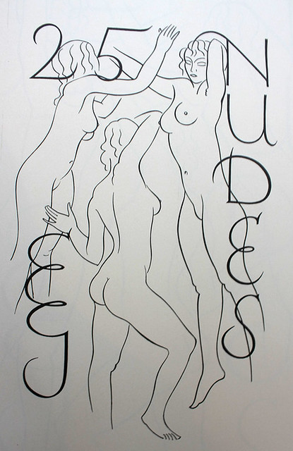
The half-title to Twenty-five Nudes, 1938.
Jan Middendorp, designer, writer and author of Dutch Type, Berlin
First published in Eye no. 59 vol. 15 2006
Eye is the world’s most beautiful and collectable graphic design journal, published for professional designers, students and anyone interested in critical, informed writing about graphic design and visual culture. It is available from all good design bookshops and online at the Eye shop, where you can buy subscriptions and single issues.