
Winter 2016
The ‘bookness’ of books
The Book: A Cover-to-Cover Exploration of the Most Powerful Object of Our Time
By Keith Houston<br> Cover design by David J. High<br> Book design by Abbate Design<br> W. W. Norton, $29.95, £18.99<br>
Hundreds of books about books have been published during the past century. A complete bibliographic list would take up this entire magazine and induce coma. I have not read most of them (in fact, the ones I have read are factually pretty similar), so I will not claim that this one is the very best of all time. Yet The Book: A Cover to Cover Exploration of the Most Powerful Object of Our Time is possibly the best of our time. It is both full of insights and deeply researched, and Keith Houston’s prose style aims for a reader more discerning than the average book-production geek. The subtitle says it all: ‘the most powerful object of our time’. Okay, it may be argued that an atomic bomb is more powerful in the deadliest sense. But as a life-enhancing force, no other human invention has contributed more to our collective enlightenment and argument as the book.
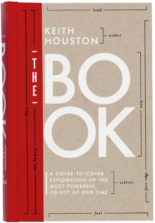
Houston has created a user-friendly reference book for both geek and connoisseur, beginning with a cover design that is ostensibly an infographic of simple technical terminology. Every physical and typographic element is indicated. For example, on the top is a graphic device indicating ‘head’ and at the bottom is ‘foot’; title and subtitle are likewise ascribed; the cloth binding is described as ‘binding tape’ and at the juncture where the book opens is written ‘hinge’; the first printed page has a lightline caption that reads ‘half title’. You get the idea – very meta – and informative and clever, too.
The handsome, classically inspired interior typography, by Abbate Design, is not just a copy of William Morris or Daniel Berkeley Updike, but a savvy interpretation of what Houston calls the ‘bookness’ of the classics. The tactility of this volume is pleasurable, not because it is a slavish facsimile of vintage printing– it is not precious enough to necessitate wearing white gloves – but rather because the entire book pays respectful homage while exhibiting an acute awareness of current technologies. It might best be called a neo-Arts and Crafts two-colour book with full colour plates.
Though it contains a generous number of images of historic artefacts, this is not a coffee-table museum book. It is meant to be read in comfort, and the reader is meant to absorb the timeline of the evolution of books – from Part I, about ‘The Page’, which looks at the development of paper from papyrus onward; Part II, on ‘The Text’ and the arrival of writing and the invention of movable type; to Parts III and IV on ‘Illustrations’ and ‘Form’. There is plenty of detail on extremely old codices (the first paged books) and gathered folios of the fifteenth and sixteenth centuries. Jumping to the early twentieth century, when ‘what came to be called “offset lithography” was a happy accident indeed,’ Houston writes about a mistake that is too complex to relate here.
Some of the book is rudimentary because we all know what constitutes books of old, which is not that different from the new. (Having said that, I have asked dozens of students to explain parchment and movable type, only to get blank stares in return.) Much of the content has to do with printing lore and the debunking of same.
Johannes Gutenberg was the Steve Jobs of his day: ‘But wait,’ Houston writes, ‘it bears mentioning that … Gutenberg, the “father of printing”, was most definitely not the inventor of printing.’ He notes that we are probably not aware that 8000-year-old stone seals, with which the ‘ancient Mesopotamians made marks on clay jars and boxes’, have been uncovered in Iraq; or that 400 years before Gutenberg, ‘a Chinese commoner named Bi Sheng pre-empted the German’ with earthenware letters, a form of movable type. In the fourteenth century, another Chinese printer, Wang Zhen, found a way of simplifying the use of 60,000 characters as separate woodblocks.
The Book is one in a new genre of in-depth studies for designers and lay people on typefaces (cf. Just My Type by Simon Garfield, reviewed in Eye 78) and punctuation (cf. Shady Characters: The Secret Life of Punctuation, Symbols & Other Typographical Marks, also by Keith Houston).
Houston transforms what might be deemed tedious history into a thorough and entertaining read, which can be read in a few sittings or over time. My only beef is with his chapter-title puns, such as one ‘Ties That Bind’ (on binding), ‘The Prints and the Pauper’, or ‘Size Matters’, which tells how Aldus Manutius’s octavo Virgil ‘ushered in the era of portable books’. I have a fondness for such wordplay, but only when I use it. Otherwise, this is essential reading for print lover and screen user.
Top: Informative and ‘meta’ cover design by David J. High for The Book.
Steven Heller, design writer, New York
First published in Eye no. 93 vol. 24, 2017
Eye is the world’s most beautiful and collectable graphic design journal, published quarterly for professional designers, students and anyone interested in critical, informed writing about graphic design and visual culture. It is available from all good design bookshops and online at the Eye shop, where you can buy subscriptions, back issues and single copies of the latest issue. You can see what Eye 93 looks like at Eye before You Buy on Vimeo.