
Summer 2016
Thesis & antithesis & synthesis (& EJ)
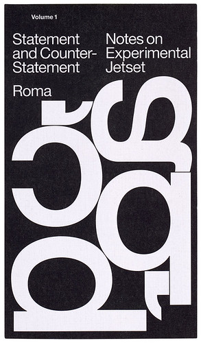
Statement and Counter-Statement: Notes on Experimental Jetset. Vol. 1.
By Experimental Jetset, with contributions from Linda van Deursen, Mark Owens, Jon Sueda and Ian Svenonius<br> Roma Publications, £20 (softcover, 576pp)<br>
There are few high-profile ‘traditional’ graphic design studios whose members discuss their work in such explicitly political terms as Experimental Jetset (EJ), the Amsterdam trio of Erwin Brinkers, Danny van den Dungen and Marieke Stolk.
Marxism, the weight of history, neoliberalism, Utopia – these are just a few of the themes that crop up in the densely packed Statement and Counter-Statement, and inform interpretation of the studio’s work in a variety of complex, sometimes perplexing ways. Several text contributions do not reference EJ specifically, but allude to their practice: designer-educator Linda van Deursen reflects on Modernist history; designer-writer Mark Owens explores the history of three-piece rock groups; Ian Svenonius enthuses about typography’s subversive potential.
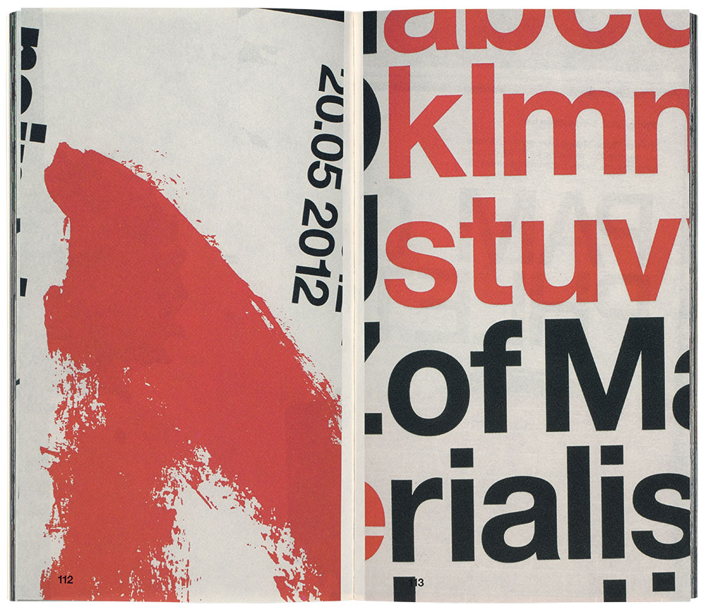
There are two image-based sections. ‘Ex Situ’ features 260 pages of scans of printed work at 1:1 size, strewn around the pages at all angles. ‘In Situ’ comprises 102 pages of black-and-white photographs showing the work out in the world, printed with a textured screen that reinforces the fact that such images of the work are images – not to be mistaken for the real objects and environments to which they refer.The heart of the book is ‘An Index of Fragments’, with excerpts from interviews, notes and correspondence written by EJ, selected and edited by Jon Sueda. Organised alphabetically, this selection spans nearly two decades in a cyclical, repetitive manner. While a conventional editor might have vetoed such an unorthodox strategy, Sueda’s decision to foreground this looping discourse has resulted in one of the book’s most notable features. What may have seemed like off-hand remarks become core themes by way of their mantra-like reinforcement, highlighting the fluctuating temporality of the remarks themselves.
Amid views on The Beatles, government subsidies, Guy Debord and ‘Tumblr culture’ (which flattens ‘objects into digital, pixelated jpegs’), we learn of the studio’s unwavering faith in the heroic ideals of Modernism, of print as the medium through which true social democracy might be realised. EJ’s allegiance to its visual aesthetic is expounded dramatically when they argue that they themselves are products of the ‘particular graphic environment’ created in the Netherlands during the 1970s by designers such as Wim Crouwel, Benno Wissing and Ben Bos. Socialism and Modernism are often used interchangeably, which is perhaps telling in revealing – for all the reference to universal languages – exactly how localised this interpretation of Modernism is. There is no mention, for example, of how a late-Modernist aesthetic could be just as easily identified with the visual language of capitalism. EJ consider themselves as part of a ‘living, ongoing narrative’ of Modernism, one in which ideology appears to have no pejorative associations, but is worn proudly as a badge of honour, a mark of principled action.
Statement and Counter-Statement appeared not long after the English-language publication of The Debate between Crouwel and Jan van Toorn (see review in Eye 90). Though EJ discuss their debt to Crouwel’s visual language, a number of their key positions and influences cited here align more closely with those of Van Toorn. That their work could represent something of an unlikely synthesis of both sides of this famous argument is hinted at in an entry called ‘Dutch Design Dialectics’, where they argue that twentieth-century Dutch graphic design history represents a (Hegelian) dialectic triad – thesis (Modernism), antithesis (postmodernism) and synthesis (a kind of reflexive Modernism). Consider Van Toorn’s views on the impossibility of a designer acting as an impartial intermediary. EJ argue that ‘there is no neutral, objective, value-free way to present a piece of information – the voice of the designer will always be there … One can always see the puppet, the strings and puppeteer.’
The view that graphic design necessarily embodies a political argument, which should be exposed to the viewer in order that they become more self-aware, is strongly present in both, too. While Van Toorn chooses to achieve this through visually ‘interfering’ in the message, for EJ, the aim is that this argument should be revealed solely through the material qualities of the work – rather than any overt political significance being referred to explicitly in its content. Though it seems idealistic to think an audience could discern the socially emancipatory potential of graphic design embedded in the nuances of paper-folding, perforation or overprinting, there is no denying the presence of the idiosyncratic argument that Statement and Counter-Statement represents.
Top and right: cover and spread from Statement and Counter-Statement. The spread shows 1:1 details of posters with photos by Johannes Schwartz of exhibitions designed by Experimental Jetset.
John-Patrick Hartnett, designer, lecturer, London
First published in Eye no. 92 vol. 23, 2016
Eye is the world’s most beautiful and collectable graphic design journal, published quarterly for professional designers, students and anyone interested in critical, informed writing about graphic design and visual culture. It is available from all good design bookshops and online at the Eye shop, where you can buy subscriptions and single issues. You can see what Eye 92 looks like at Eye before You Buy on Vimeo.