
Summer 2015
A Roman legacy
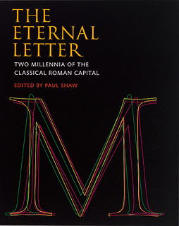
The Eternal Letter
Edited by Paul Shaw, MIT Press, £37.95 (hardback, 270pp). Designed by Linda Florio. Produced by Scott-Martin Kosofsky.
The Eternal Letter is the first in a series of books dedicated to letterforms to grow out of Codex: The Journal of Typography, which has now ceased publication. It is a substantial volume made up of 30 richly illustrated essays, all principally concerned with an alphabet that was perfected 1900 years ago and which has accompanied western civilisation through the centuries to current times.
Of these elegant and sophisticated letterforms, the finest representation is almost unanimously believed to be that carved in the inscription under Trajan’s column, the Roman triumphal column erected in 114 AD to commemorate the emperor Trajan’s victory in the Dacian Wars. The column still stands in Rome, the Eternal City; and, in their digital reincarnations, the letterforms on its inscription remain, too.
These letterforms are 1300 years older than those of the gothic type Gutenberg used to set his Latin Bible, and our perception of them today is that they are of an entirely classical design, which seems always to be in fashion and which may justifiably be defined as the Eternal Letter. We no longer use Roman plumbing techniques, nor do we buy wine in amphorae or wear togas. But the Roman design system that we do still use is made of the letterforms derived from the Trajan and other Imperial inscriptions, which remain a part of our everyday lives.
Cover design by Linda Florio.
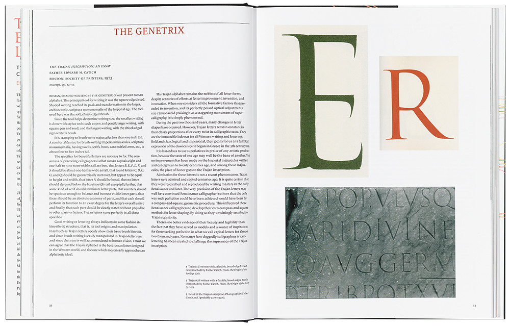
Top: Spread from The Eternal Letter: Two Millennia of the Classical Roman Capital showing the Trajanic ‘E’ and ‘R’, written by Father Edward M. Catich, plus a detail from the original Trajan inscription, photographed by Catich in the early 1950s.
In his introduction, Paul Shaw states that this book is not about inscriptions from the Roman Empire. He says of these inscriptions: ‘They are merely the starting point for an investigation into how and why the Classical Roman capital has been revived, altered and adapted, not only as a letter carved into stone but as one cut into wood, written with ink and paint, cast into lead and converted into pixels.’
Adobe Trajan, the 1989 typeface designed by Carol Twombly, has now migrated eastwards to the Greek and Cyrillic alphabets, and this is discussed critically in the essay ‘Trajan Revived Redux’ by Maxim Zhukov and Gerry Leonidas (see ‘Beyond Latin’, pp. 80-93), both of whom played a role in the development of Adobe’s ‘Trajan-isation’ of these alphabets. In a separate essay, ‘The Trajan Letter in Russia’, Zhukov shows a convincing earlier Cyrillic adaption of the Trajan letters, done in 1958 by Vadim Lazurski (Zhukov’s lettering teacher at the Moscow Printing Institute in 1960) – 30 years before Adobe’s original Latin version was released.
Also in ‘Trajan Revived Redux’, Shaw singles out the year 2011 for a flurry of activity concerning Trajan letterform revivals. He goes into some detail discussing Trajan Pro 3, Robert Slimbach’s extension of Twombly’s original font into six weights. He fires an articulated critique at the ‘emaciated’ Extra Light weight at one end, and the ‘chubby’ Black at the other. In a swipe at the ‘Bauhauslers’ who believed sans serifs to be modern rather than ancient, he says that the ‘Greeks and the Romans carved sans serif letters centuries before Jesus’s birth’. How nice it would have been to see a fine example of those letters from one of the inscriptions in the Museo Archeologico Nazionale (the Museo Romano) in Aquileia, which has the best collection of Roman Republic sans serif inscriptions in Italy (and in the world). The résumé of other sans serifs with proportions related to the Trajan inscription continues with an appreciation of Trajan Sans Pro and a specimen of its complete glyphs.
In another essay, ‘Father Edward M. Catich and the Trajan Inscription’, Shaw profiles the person who first demonstrated that the tool used to determine the Imperial letterforms was a flat or square-edged brush. Catich’s full sized, brush-written letters, shown in his The Origin of the Serif (1968), persuasively upset the Renaissance theories of geometrical origins for the letters. After working as a signwriter in Chicago during the 1920s, Catich was awarded a scholarship in 1935 to study for the priesthood at the Pontifical Gregorian University in Rome, and this gave him the opportunity to examine inscriptions. He wrote: ‘Fortified by my Chicago signwriting experience, I sensed immediately that the square-edged brush was the formative tool behind Imperial, chiselled inscriptions.’
Father Catich seemed to relish crossing swords with theorists who subscribed to the idea that the Trajan letterforms were derived from the formative influence of the chisel rather than a brush. Among his illustrious victims, Catich lists in his book Nicolete Gray, Albert Kapr, Eric Gill and Frederic W. Goudy, each one with a quotation at odds with the priest’s own brush theory. Shaw shows us an annotated page from Catich’s copy of Goudy’s The Capitals from the Trajan Column at Rome (1936). Two pages on, Catich’s own Trajan ‘R’ is shown. Accepting the Trajan interpretation game and without the slightest impairment of my high esteem of Goudy, I cannot fail to agree that Catich’s highly critical comments were spot on.
James Clough, writer, designer, calligrapher, lecturer, Milan
First published in Eye no. 90 vol. 23, 2015
Eye is the world’s most beautiful and collectable graphic design journal, published quarterly for professional designers, students and anyone interested in critical, informed writing about graphic design and visual culture. It is available from all good design bookshops and online at the Eye shop, where you can buy subscriptions, back issues and single copies of the latest issue. You can see what Eye 90 looks like at Eye before You Buy on Vimeo.