Winter 1993
A sharp rap on the knuckles
Intimate Leaves from a Designer’s Notebook
John Ryder, Gregynog Press, £85There is a short story by Balzac, “The Unknown Masterpiece”, in which the young Nicolas Poussin visits an old painter, Frenhofer. Poussin is amazed by the wonderful paintings he sees, which Frenhofer dismisses as the daubings of his youth. Fro the last ten years he has been totally engaged in his grates work, but will let no one see it. At last he yields, and Poussin and a friend are allowed into the studio. All they see is a canvas converged in scrawls, with one perfect foot just visible in a corner to testify to what might have been. In reworking his painting, Frenhofer has made it incomprehensible.
This fable has some bearing on intimate Leaves from a Designer’s notebook. John Ryder’s best-known book, Printing for pleasure, appeared in 1955, and has become a small classic of good sense and simple traditional design. For many years Ryder was art director for The Bodley Head, where he produced books which were models of good design and production and gave this distinguished publisher a visual style which was instantly recognisable. He has an unerring eye, too, in his choice of designers to work with, notably Michael Harvey, whose lettering enlivened so many Bodley Head books. The uniform edition of Graham Greene and the octavo Ulysses are just two examples of the Ryder style.
As a director of a Bodley Head subsidiary, Ryder was responsible for the publication of a number of well-produced books on typography and graphic arts. When Intimate Leaves was announced, I hoped that he would be giving us his version of Bruce Rogers’ Paragraphs on Printing, revealing how to maintain consistent standards of design and production when using a variety of printers and working within strict budgets, as well
as summing up his thoughts on design in general. Here he has done more of the latter than the former, but in curiously vague way.
His new book is very handsome. Designed, of course, by its author, it was beautifully printed by letterpress sat the celebrated Welsh private press, the Gregynog Press, under its present director David Esslemont. This paper is a laid Zarkall mould-made form Germany, its deckle edges intact, and the Gregynog binding is a model of how such things should be done. As an object, the book is impeccable.
The problem is that Ryder, like Frenhofer with his painting, has refined his text to a point where the reader cannot follow him, while his illustrations, though attractive, are insufficient to support his arguments, which often read like slide lectures without the slides. In his musings on his various themes, he has left us too far behind.
For instance of what I mean comes early on, as part of Ryder’s plea for more informed public debate on typography, which no one can argue with. As an example of the kind of critic he wants, he brings in Giovanni Mardersteig, the great printer of the Officina Bodoni and one of his heroes. But he immediately turns on Mardersteig and raps him sharply over the knuckles with his type tule. Mardersteig’s first offence seems to be that he designed a specimen of an obscure Monotype face called Pastonchi, and unwisely endorsed it. We have to read between the lines here, however, since Ryder does not reproduce Pastonchi or give an opinion on it, and apparently assumes that its faults, and the special circumstances of its commissioning, are common knowledge. The baffled reader in search of more information is given no help, since the book references are rudimentary and there is no bibliography.
Mardersteig’s second offence is once to have written Ryder a sharp letter. These twin strands of opaque argument and crotchetiness in particular leads Ryder off in all directions in his attempts to set the design world to rights. There is a series of (pretty arcane) cases where books have reproduced a letter “z” from the Damianus Moyllus writing books upside down, which would be amusing were it not presented as a crime wave. One shudders to think how he might castigate a designer who put a different title on the binding of a book from that of the title page, as happens with his own book, which is called simply “Design” on the spine.
All this tens to conceal several messages Ryder is trying to send. One is the relationship between music and typography, which is an underlying theme, regrettably never developed. Another is the importance of visual editing, in which author, editor and designers are collaborators rather than antagonists. This collaboration was typical of Ryder’s work, and it is a pity that Intimate Leaves does no convey its author’s ideas more effectively.
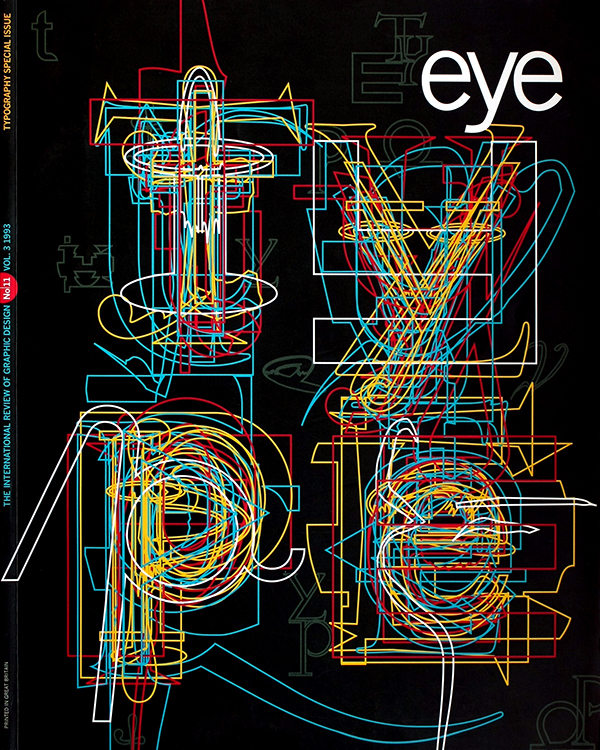
First published in Eye no. 11 vol. 3, 1993
Eye is the world’s most beautiful and collectable graphic design journal, published for professional designers, students and anyone interested in critical, informed writing about graphic design and visual culture. It is available from all good design bookshops and online at the Eye shop, where you can buy subscriptions and single issues.

