
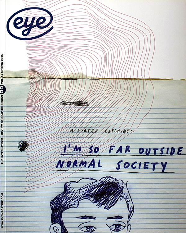
Spring 2005
Deadpan Dutch design
False Flat: Why Dutch Design is so Good
By Aaron Betsky with Adam Eeuwens. Phaidon, £5.False Flat presents a new and unsettling view of contemporary Dutch design. At first it seems as if we’re going to be given the familiar story – the one in which the form and character of Dutch design is explained in relation to the country’s peculiar geography and its people’s ingenious responses to it; the story with the implicit subtext that Dutch design is the best in the world. The two-part title of this book certainly bears out that assumption. False Flat makes reference to the subtle slope of the Dutch landscape created by centuries of land reclamation. The rhetorical statement ‘Why Dutch Design is so Good’ alludes to one of design’s most deeply entrenched stereotypes: when it comes to design innovation – in architecture, urban planning, product design, graphic design, or hybrids of the aforementioned – then the Dutch can do no wrong. It’s an arrogant pronouncement, however tongue in cheek and as such, it aptly reflects the deadpan boldness of this country’s government-subsidised, client-endorsed, and globally revered work.
Dutch design, say authors Aaron Betsky and Adam Eeuwens, is not something confined to The Netherlands; it is more of a spirit or an approach with global reach and global implications. As Betsky puts it, ‘Dutch design is not about nationality; it is an attitude and a wealth to be shared.’ And the Dutch certainly do seem to be sharing their wealth right now. Just launched in New York, for example, is Orange Alert, a year-long celebration of Dutch design, to include exhibitions of the work of light-bulb-enhancer Tord Boontje at the design store Moss and at the Cooper-Hewitt National Design Museum; a retrospective of product design anarchists Droog at the Museum of Arts & Design; a selection of works from the Cooper-Hewitt’s permanent collection guest-curated by witty craftswoman Hella Jongerius; a highly visible presence at various locations during the International Furniture Fair in May and during Fashion Week. The Premsela Dutch Design Foundation – who recently conducted a survey on The International Reputation of Dutch Design, commissioned American graphic designer Michael Rock to lecture to them about Dutch design, and is touring an exhibition entitled ‘The Foreign Affairs of Dutch Design’ – is on a mission to understand, codify and project the qualities of Dutch design.
As you would expect from a book designed by Irma Boom, False Flat is hefty. Its quarter-inch-thick cover boards and 400 pages are squared off flush with one another, making the book resemble a large brick or a building block. As you would also expect, it is well conceived, exactingly crafted, and provides a reading experience that satisfies beyond its intellectual content.
Having a Boom book in your hands is simultaneously soothing and stimulating. Soothing because once you’ve discovered its rhythm, you can relax into the book like you would into the steady jog of a train. In this case, chapters are colour-coded with tabs that are visible on the book’s fore-edge – orange for the chapters of Betsky’s linear narrative and a different colour for each of Eeuwens’ thematic incursions – and they mark out your progress like passing stations. You also know all the details have been attended to, from the positioning of the page numbers to the consistent orientation of the captions. Correspondences between the images and the themes they illustrate are indicated by the underlining of a particular word or phrase in the body text.
Decisions have been made; ideas have been followed through. And yet the result is not merely reassuring; there are elements of surprise, too. There are changes of pace. There are typographic crescendos – the font size changes from page to page, sometimes dramatically, according to Boom’s reading of the text. Images are usually confined to the right-hand pages, but you’ll turn a page and suddenly an image will fill a whole spread. The entire book’s text is run continuously in 6pt type across the front and endpapers.
Well researched, soundly argued, and full of evocative detail, Betsky’s first-person narrative, (structured around a bicycle journey as if he were some latter-day Reyner Banham) is written with a pleasing confidence that matches Boom’s design. ‘I then sweep by a large lake,’ he writes of a stage in his journey to work in Rotterdam. ‘This body of water did not exist a few centuries ago. It is the southernmost link in a chain of small lakes that are the result of a long tradition of peat digging,’ he continues in a style that evokes the script for a documentary programme.
In spite of Betsky’s confidence in Dutch design’s potential to become a universally applied principle, what emerges between the lines is a more discomfiting prediction: that the resourceful-but-quirky-dike-builder-with-subsidies characterisation of the typical Dutch designer is outdated; and that the Netherlands’ hold on design world dominance is less inevitable, and more fragile than we may have thought. As immigrants introduce new imperatives and cultural values, and globalisation brings its own pressures to bear on home-grown qualities such as idiosyncrasy and craft, both the reality and the perception of Dutch design is undergoing change in directions and dimensions it may no longer be able to control.
Alice Twemlow, design writer, New York
First published in Eye no. 55 vol. 14 2005
Eye is the world’s most beautiful and collectable graphic design journal, published for professional designers, students and anyone interested in critical, informed writing about graphic design and visual culture. It is available from all good design bookshops and online at the Eye shop, where you can buy subscriptions and single issues.