Summer 2008
He has ways of making you read
The Learners: A Novel
By Chip Kidd<br>Simon & Schuster UK, $26, £16.99
Few novels have made use of graphic design for background or context, let alone made their central character a designer. And while you could probably dredge up a number of obscure works featuring heroes (or anti-heroes) who earn their living making posters or websites (though ‘Web designer’ is often a codeword for ‘unwashed loser’) I bet very few of them actually weave a graphic design brief into the plotline.
As with his debut, The Cheese Monkeys, designer-author Chip Kidd has set the action deep in the pre-digital past, not far removed from the temporal location of Mad Men – that similarly stylish TV series. Happy, the student narrator of the earlier novel, has now graduated and talked his way into a lowly job at Spear, Rakoff & Ware, the practice where his flamboyant, self-destructive mentor, Winter Sorbeck, did his early graft.
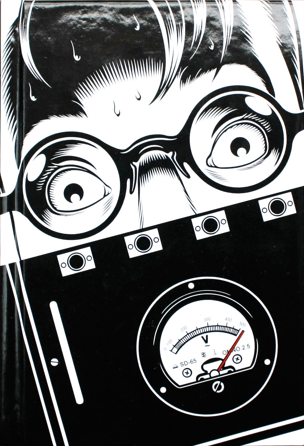
The daily routine of preparing artwork and inking is described in loving detail, and Kidd slips in design references and jokes without embarrassment. When Happy asks the enigmatic Himillsy what type she has pegged him as, she dryly replies: ‘The decorative, serif type.’ The main plot, however, is more advertising than design, since it is about the powers of (hidden) persuasion. Our hero designs a printed ad for the genuine – and genuinely notorious – research into obedience and authority carried out by Dr Stanley Milgram at Yale in the early 1960s. After seeing its devastating effects on one person in particular, Happy feels impelled to take part in the experiment, and learns things about himself he would rather not know. Charles Burns’ cover art, partially hidden behind a cut-down dust jacket, depicts a key moment.
When Spear, Rakoff & Ware invest the efforts of their raggedy workforce in a free pitch to get the account of a shoe manufacturer, Happy applies some lessons learnt from Milgram to a design and advertising project. The ending combines tragedy with farce using language that looks like a cross between Finnegans Wake and The Beano. Read it aloud and Happy’s end comes perfectly clear.
The Learners is an easy read, though not as lightweight as its tone might suggest, but you cannot help the feeling that novels are something Kidd does in his spare time before getting back to the serious business of designing covers for other people’s books. Apart from a little typographic showmanship, Kidd’s page design plays it straight. The most personal sections are single-page, italicised section dividers that discuss ‘content as metaphor’, ‘content as deception’ and so on. These are easily skipped (or skimmed) but Kidd’s designer fans will enjoy them as miniature lectures from a master, conceptually similar to the exercises he posted on YouTube to promote the book.
The Learners has enough content, experimentation, characterisation and plot twists to keep the reader engaged, but it’s not just what he says, it’s the way that he tells it – Kidd has style in spades.
Top: Illustration by Charles Burns on the cover of Chip Kidd’s novel, The Learners.
First published in Eye no. 68 vol. 17 2008
Eye is the world’s most beautiful and collectable graphic design journal, published quarterly for professional designers, students and anyone interested in critical, informed writing about graphic design and visual culture. It is available from all good design bookshops and online at the Eye shop, where you can buy subscriptions and single issues.