
Winter 2017
Imperfect beauty
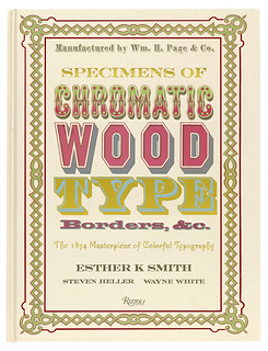
Specimens of Chromatic Wood Type, Borders, &c.: The 1874 Masterpiece of Colorful Typography
Esther K. Smith, Steven Heller and Wayne White<br> Rizzoli, $45, £32.50<br>
This book exists solely because its author Esther K. Smith considers Specimens of Chromatic Wood Type, Borders, &c. by William H. Page & Co. to be ‘the most beautiful book in the world’ – and is eager to share her enthusiasm for it with the rest of the world. But a grandiose statement like that makes one want to say: ‘Whoa, whoa, hold on a minute now! Is this really the most beautiful book in the world?’ Forget Smith’s constant comparison of it to the Gutenberg Bible – which is unfair since that book was only decorated by its owners and thus no two copies are alike – and think about other books that could claim the title.
Several immediately come to my mind: A Grammar of Color (1921) by the Strathmore Paper Company, The Color Printer (1892) by John F. Earhart – a tour de force of letterpress printing in 166 colours requiring 1,625,000 impressions – or The Grammar of Ornament (1856) by Owen Jones, an acknowledged monument of Victorian lithographic printing. All of these rival claimants to the throne have an inborn advantage over the Page specimen book. They are about colour and ornament, subjects that are inherently eye-catching.
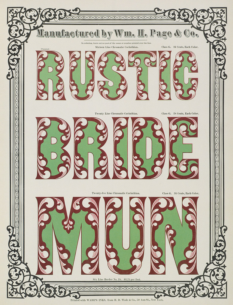
Right and top: Cover and specimen from Specimens of Chromatic Wood Type, Borders &c. Specimen shows 16-, 20- and 25-line Chromatic Corinthian.
Page’s book is about a mundane subject: type. And, in the world of type specimens, it is a stunner, especially when seen against the backdrop of type specimens before the 1870s, including those issued by Page himself.
This is where Smith’s facsimile edition of Chromatic Wood Type immediately begins to disappoint. Yes, we can easily see the amazing, eye-boggling colour combinations and enormous letters in it (most of them decorated in one manner or another), but we never get the full context in which it appeared.
The facsimile has only the barest of information about Page, his business, wood type in general, and late Victorian printing. The introduction wanders all over the place without a clear point in mind as it touches on retro styles, the personality of type, type styles as harbingers of general fashion trends, ‘typo-eroticism’ and maple as the preferred wood for wood type. Little is said about Page or his masterpiece other than it is an instance of ‘gluttony of excess’ akin to a ‘typographic Taj Mahal’. Smith’s text (four pages upfront and three in the back) does contain a single paragraph summarising Page’s career and a few nuggets of information on Chromatic Wood Type (e.g. that it cost $10,000 to print 1000 copies).
The best part of Smith’s sparse text is the suggestion that: ‘The availability of crazy ink colors may have driven this whole project. Coal tar aniline dyes and artificial colors had just been developed by an eighteen-year-old London chemist named William Perkin.’ But even here, she provides no date – the year was 1856 – for this crucial revolution in colour printing for one to know how accurate her insight is.
Similarly, although there is ‘A Note About the Type’ at the back of the facsimile of Chromatic Wood Type, nothing is said about Page’s typefaces. Smith touches upon ‘kiss’ impressions, teaching practices using wood type today, and the revelation that ‘Page did not invent chromatic type, he improved it.’ Page did this by cutting away parts of a blank to get both parts of a chromatic letter, thus guaranteeing better registration. Nary a word on the styles of the types shown in the specimen. For that one will have to read American Wood Type, 1828-1900 by Rob Roy Kelly.
As for information on H. D. Wade, whose inks were an essential aspect of Chromatic Wood Type, Smith says nothing about the earlier collaboration of Wade and Page on chromatic types in an 1859 specimen book, or how they even came to know each other.
The original Chromatic Wood Type is 14 × 18 inches in size with some letters up to twelve inches in height (which was not that big for wood type as some companies made letters up to four feet in height). The Rizzoli facsimile is not full size, but at 9.75 × 13 inches in size, it is still quite generous. The only drawback to the reduction in size is the difficulty of reading the preliminary text at the front of the specimen, but most of that material is for the printing scholar not the general reader. The colour plates look very accurate.
Unfortunately, the paper is coated and that gives the images a shininess that seems tacky compared to the original book. The cover has been deeply embossed in a manner reminiscent of the contemporary ‘smash ’em, bash ’em’ approach to polymer plate letterpress printing. It is quite ugly.
For those interested solely in visual bling, the Rizzoli facsimile of Chromatic Wood Type is perfect, but for those of us wanting to know more about its context as well as to own a reproduction that captures the true flavour of the original, the book is a disappointment. The strongest reason for the Rizzoli facsimile’s existence is that only a few of us have easy access to the surviving original copies at Columbia University, the Newberry Library in Chicago, and elsewhere. (Smith does not provide a census of existing copies.) Sadly, Gresham’s Law (that bad money drives out good) will apply, and thus it is unlikely we will see a proper facsimile of this magnificent book in a manner truly befitting its importance and Page’s place in typographic history.
Paul Shaw, letter designer, design historian, New York
First published in Eye no. 95 vol. 24, 2018
Eye is the world’s most beautiful and collectable graphic design journal, published quarterly for professional designers, students and anyone interested in critical, informed writing about graphic design and visual culture. It is available from all good design bookshops and online at the Eye shop, where you can buy subscriptions and single issues. You can see what Eye 95 looks like at Eye Before You Buy on Vimeo.