
Winter 2016
In praise of infrastructure: BR’s corporate identity manual is resurrected
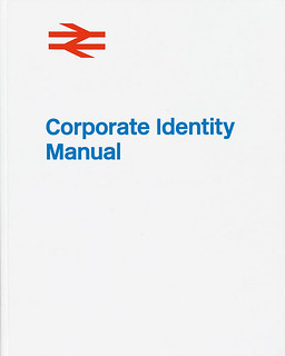
British Rail Corporate Identity Manual
britishrailmanual.com, £75<br>
The British Rail Corporate Identity Manual was a labour of love for Wallace Henning, a young designer currently working at branding agency Koto in London. Henning tracked down a copy of every page of the original ring-bound manual, plus several additional pages published later – some of which he tracked down at the last minute via social media. All the pages were photographed at high resolution to make a same-size, casebound facsimile, printed by Cassochrome in Belgium.
The young designer has been an enthusiast for this kind of Modernist identity design since he read Michael C. Place’s glowing recommendation in Spin’s Reading List 2 (see Eye 86). He bought a copy from designer Alan Cheung on eBay in 2011 and found other copies at the National Railway Museum in York.
Henning worked for Tony Howard’s Transport Design Consultancy for six months in 2010, going on to do an MA in communication design at Ravensbourne, where his final major project was to create an identity for a re-nationalised transport network. Henning returned to Howard’s company for a year during 2011-12, and worked on the Olympics signs for Network Rail stations – ‘a huge task’.
To raise money for his dream project, Henning enlisted the help of designer and crowdfunding expert Darren Wall, who was a consultant on some of the highest-funded UK Kickstarter campaigns to date, including Hate Mail, Mr Bingo’s phenomenally popular collection of abuse.
Henning also recruited Nick Job, whose doublearrow.co.uk website is a treasure trove of information about BR’s corporate identity: ‘Without Job, there would be no book. I consulted with him on many things but the main issue was to get the order of the sheets correct.’ There are 247 sheets from the manual in the book and Henning is ‘99.9 per cent confident’ that he found them all. Producing the book to a high standard was a steep challenge, especially the five, sewn-in ‘throw-out’ [gatefold] pages, but he says the scariest element was the financial risk: ‘The Kickstarter money raised didn’t allow for the quality I was looking for. This was an outright mistake, I should have had the cost nailed down!’
Henning has an almost evangelical passion for public transport and for infrastructure, which he sees as the fabric of life. ‘It is so overlooked [yet] it allows us to live the lives we do, and enjoy many things. From a personal, political view, I cannot believe that we have a situation where the essentials are privatised.’
For Henning, the British Rail identity represents ‘a social and political attitude … a time of optimism from when the nation was proud to provide a countrywide unified network that was accessible for everyone!’ – all underpinned by Gerry Barney’s iconic symbol.
The corporate design identity manual has become a totem, an icon, a nostalgic flash point for utopian Modernism. Unit Editions have published two huge, highly popular books (see Eye 90) showing examples made for IBM, Canadian National Railways and the Dutch Police. The original manuals, made in short print runs, fetch big sums online, prompting a new wave of desirable facsimile editions. Standards Manual (Pentagram designers Jesse Reed and Hamish Smyth), has now published three manuals – for the 1970 NYC Transit Authority, NASA and the official Bicentennial symbol.
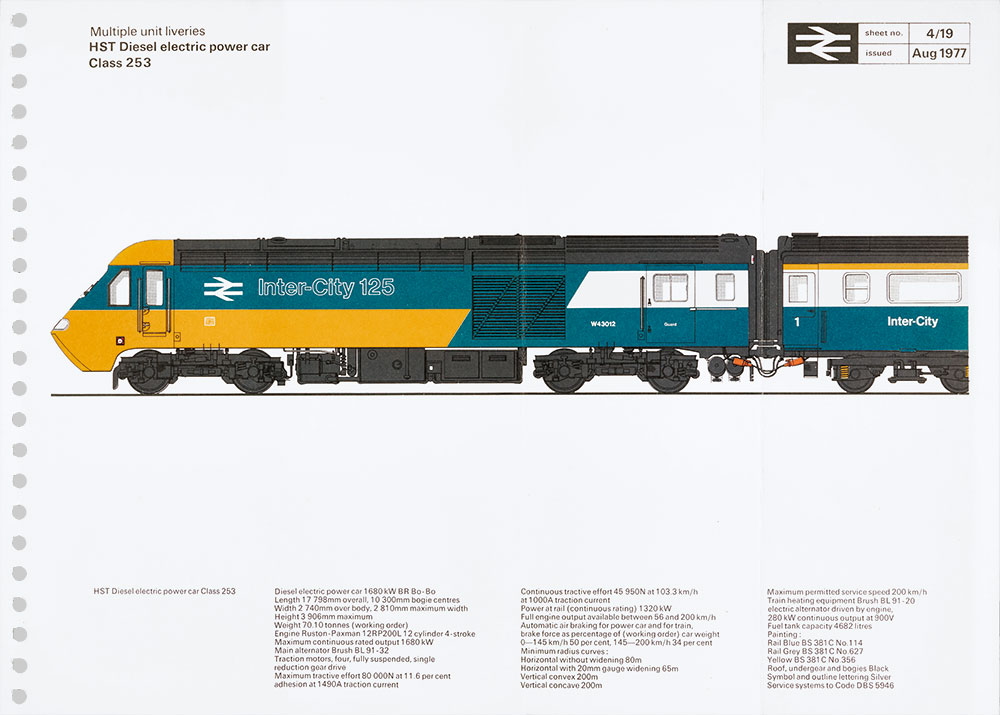
The original ring-bound manual made in 1965 by BR consultants DRU (Design Research Unit) was both a rule book and a toolkit, incorporating essential instructions about how to deploy Gerry Barney’s ‘double arrow’ symbol in a multitude of contexts. Later editions added guidelines for printed publicity, architecture, signs, rolling stock, vans, ships, uniforms, stationery and more.
Henning’s new British Rail Corporate Identity Manual (britishrailmanual.com, £75) presents all the original pages at same size, off-white on a white page, showing five of the pages as gatefolds. The relentless, detailed instructions needed to implement artwork for identity design for a vast, nationalised railway system in the pre-computer age is a thing of wonder for readers used to downloading logos and typefaces in minutes. British Rail’s appeal is summed up in a breathless foreword by Michael C. Place: ‘Aged 17 and the words “British Rail” and the …“double arrow” logo are etched into my consciousness. The excitement of attending art college to study graphic design stretching ahead, much like a train journey.’
Henning commissioned several more new pieces of writing, including an introduction by Tony Howard, Design Director of BR until its full privatisation in 1997. Howard writes that the manual was, ‘one of the first of its kind in Europe. It set the standard for how large corporate identities are implemented,’ noting that, ‘the quality and precision of information presented in the manual was critical, as was the enthusiasm of the managers.’
Gerry Barney, who designed and drew the symbol while he was a young lettering artist at DRU, is interviewed by Eye’s John Walters. ‘The great thing about the identity was that it immediately had national coverage,’ says Barney. ‘So it was in front of everybody very, very quickly. No other identity design can do that any more.’
Henning’s project celebrates a lost age – that of large, nationalised industries (BR had more than 400,000 employees); of Modernist corporate identity; and of enthusiastic craft-based designers doing their best for the public realm.
Cover of British Rail Corporate Identity Manual, 2016.
Top: One of five gatefold pages included in the re-published British Rail Corporate Identity Manual.
Andrew Robertson, writer, London
First published in Eye no. 93 vol. 24, 2017
Eye is the world’s most beautiful and collectable graphic design journal, published quarterly for professional designers, students and anyone interested in critical, informed writing about graphic design and visual culture. It is available from all good design bookshops and online at the Eye shop, where you can buy subscriptions, back issues and single copies of the latest issue. You can see what Eye 93 looks like at Eye before You Buy on Vimeo.