
Tuesday, 11:00am
26 March 2013
Banham’s Melbourne letters
anonymous designers
Stephen Banham
Design history
Reviews
Type Tuesday
Typography
Visual culture
Characters: Cultural stories revealed through typography
By Stephen Banham<br>Design by Letterbox<br>Thames & Hudson, £32
The first thing you think on flipping through Characters is: Wow, I wouldn’t mind living in Melbourne, writes Robert Hanks.
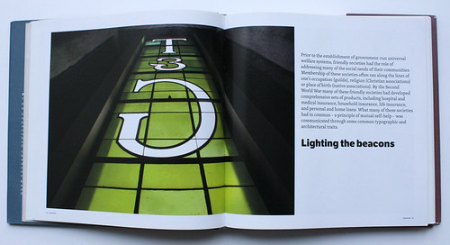
Although the title implies some wider theoretical ambitions, the book is essentially a pictorial survey of public lettering and signage in Stephen Banham’s home town, which turns out to have an unusually rich tradition of the stuff – particularly giant illuminated signs, which flourish in cities situated, like Melbourne, on flat terrain, against big skies. Some gorgeous colour photography is supplemented by well researched and often gratifyingly odd archive material.
Spread featuring the T&G tower’s illuminated sign. Photograph: Jesse Marlow, 2011.
Top: cover of Stephen Banham’s Characters: Cultural stories revealed through typography.
Melbourne Recital Centre. Photo: Patrick Rodriguez, 2011.
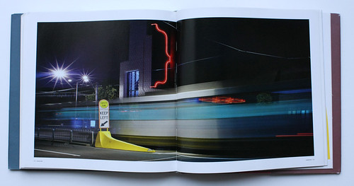
The second thing you think is: Hey, where’s my camera? Though many of the pleasures the book delivers are specifically Melburnian, it will not be hard for city dwellers in other parts of the world to come up with their own counterparts to the decayed subterranean arcades pictured here, to the buildings with carved Edwardian lettering peeking from behind modern plastic details, to the factories whose industrial iconography has been co-opted by property developers as post-industrial retro-chic. For a Londoner, especially, it is intriguing to see the traces left by the sprucing up that preceded the Melbourne Olympics in 1956, when the city apparently lurched briefly towards Madison Avenue.
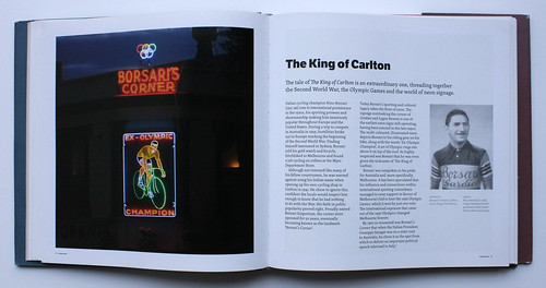
Spread showing 1930s cycling champion Nino Borsari’s storefront. Photo: Tim Fluence, 2011.
In some respects, Characters delivers less than it promises. Despite the subtitle, Banham does not have much to say about typography as such, and the ‘cultural stories’ he promises are mostly local anecdotes, about advertising that has outlasted the products advertised, or the indifference of modern developers to such hangovers; occasionally, the stories simply peter out. At times the book feels insufficiently ambitious or demanding. Banham’s points about the wider culture – shifts in typographic fashion, the decline of trade unions and mutual associations, the modern yen for ‘authenticity’ – do not rise much above the level of generalisation.
Themes that might link some of the stories are not properly developed: Melbourne’s flirtations with Americanisation (there are photographs of motels and drive-ins that would not look out of place in postwar San Diego or Phoenix) and various by-products of Italian immigration (restaurants, a bike shop, a misspelled Italian sign at a swimming pool) could have done with some post-colonial context; the creeping process by which civic identity has ceded much of the public realm to commercial interests is universal, but I would have liked to hear more about the specific Australian manifestations.
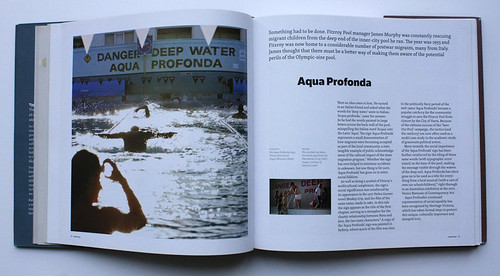
Italian pool signage spelled ‘Aqua Profonda’ rather than ‘Acqua Profonda’, an indicator, as Banham writes, ‘of how migrants were becoming accepted as part of the local community’. Photo: Rhiannon Slatter, 2011.
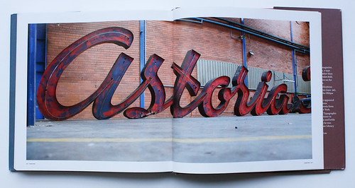
A neon sign from Astoria Taxis, established in 1950. The sign was salvaged from the building’s facade before demolition in 2000. Photo: Tim Fluence, 2010.
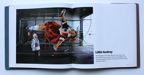
Then again, the book, designed by Banham’s Letterbox studio, contains enough material, in the shape of new and archive photographs, for readers to develop some of these ideas themselves. The illustrations are (a few sneaky repetitions aside) terrific; and Banham’s meticulous histories of the city’s illuminated signs – such as ‘Little Audrey’, the animated Skipping Girl who has survived the vinegar she was designed to sell to become a state heritage icon – are revealing of our muddled sense of what counts as tradition.
Spread featuring 87 year old Joyce Legg in front of the partly restored Skippy Girl sign. Photo: Craig Abraham, Fairfax Photos, 2009.
Eye is the world’s most beautiful and collectable graphic design journal, published quarterly for professional designers, students and anyone interested in critical, informed writing about graphic design and visual culture. It is available from all good design bookshops and online at the Eye shop, where you can buy subscriptions, back issues and single copies of the latest issue. You can also browse visual samples of recent issues at Eye before You Buy.