Tuesday, 12:00pm
4 October 2016

Giancarlo Ilipriandi (1925-2016)

A recent interview with the distinguished and prolific Milan designer, who died on 15 September 2016 at the age of 91.

In the summer of 2015, Giancarlo Iliprandi came to London for the Fedrigoni-initiated exhibition Made In Italy (designed by SEA), which featured his posters and other work from the AIAP archive. Mr Iliprandi attended the private view, drinking red wine, signing posters and chatting happily in excellent English. The following day he sat down with John L. Walters, editor of Eye and Pulp magazines, for an extensive feature about his long career. The following text was first published in Pulp no. 6 in 2015.

Giancarlo Iliprandi in 2015. Portrait by Andrea Basile.
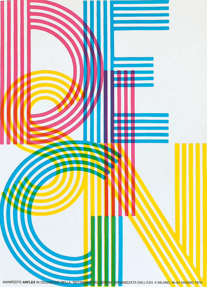
Top: One in a series of posters Iliprandi designed for Italian furniture manufacturer Arflex, 1970.

_MG_5777-copiaJB

People and paper: Giancarlo Iliprandi

“Some people in Italy say that you don’t eat with culture, but this isn’t true,” says Iliprandi. “People are not living for bread alone, they need bread and ideas!”
 John L. Walters interviews Milanese designer Giancarlo Iliprandi, whose career is celebrated in a new book.

Poster for the exhibition ‘Aggressività e violenza dell’uomo nei confronti dell’ambiente’ [‘Mankind’s aggression and violence towards the environment’], organised by the Milan Art Directors Club, displayed at the Arflex showroom, 1970.

_MG_2536

Milanese designer Giancarlo Iliprandi is a chameleon among Italian practitioners of his generation. Born in 1925, he has followed many directions since he came of age just after the Second World War, changing his studies from medicine to fine art to design while harbouring ambitions to be a writer. 
In a graphic design career spanning seven decades his approach and style has changed as radically and unpredictably as jazz musician Miles Davis, a near contemporary whose music he admires. His portfolio now displayed in *Note (Ulrico Hoepli), embraces handcrafted, ideas-driven design, typography, punchy pop graphics, hard-edged illustration, editorial art direction and atmospheric watercolour reportage.

In conversation, Iliprandi has a sharp mind and a spirited approach to everything he encounters, and strong views about the world of graphic design education, the topic which began our conversation last summer, during Fedrigoni’s ‘Made In Italy’ exhibition in London. (The well received show travels to Edinburgh on 4 November 2015). I ask Iliprandi about the 1991 speech (reprinted in *Note) that he gave for international design council Icograda, in which he outlined the essential qualities of design. In this, he declared that design should be ‘formal, innovative and functional,’ but that this was not enough – it should be ‘cultural, ethical and educational’.

Iliprandi repeats his assertions. ‘A good service is not enough. Design should be something that makes life better, not just something you can easily buy and easily consume.’

Record cover design from the ‘Canti Della Resistanza Italiana’ [‘Songs of the Italian resistance’] collection in Gallo’s ‘I dischi del sole’ series, 1965.

_MG_2142

Yet Iliprandi’s work is not difficult to enjoy and appreciate. His 1950s and 60s work – book and LP covers, posters and displays – reflects the look of ‘Milan Modernism’ with playfulness and practicality. Like many of his contemporaries, he was mainly self-taught, and necessity taught him to turn his hand to many different skills when they were needed – illustration, hand-lettering, collage and construction.

He originally studied at the Faculty of Medicine and Surgery at the University of Milan, but transferred to Brera to study painting, graduating in 1949. He then studied set design, which led to work in the theatre, designing both sets and costumes, and in exhibitions. He encountered many influential designers, including Bruno Munari (a lifelong friend), Max Huber, Antonio Boggeri and the Castiglioni brothers Achille and Pier Giacomo, whom he assisted on exhibition design. However his true vocation was graphic design.

‘When I started studying to become a graphic designer, there were no schools in Italy, so I had to learn by myself, buying books, buying Graphis and other magazines,’ he says. ‘What I saw was that the most important thing was to study typography, because typography is the ground on which everything sits. Typography is the landscape.’

Iliprandi made book jackets for publisher Valentino Bompiani and art directed Scinautico, a journal of water-skiing. He made advertising displays and publicity for the celebrated Milan store La Rinascente, and designed Uomo, its magazine. He writes in *Note that in its heyday, La Rinascente was an example of ‘total design’ – not just logo but ‘a new way of life’.

Poster for La Rinascente ‘Uomo Estate’, mid-1960s, designed by Iliprandi, photograph by Serge Libiszweski.

91

Another 7" cover from the ‘I dischi del sole’ series, 1965. From the collection of Holly Catford.

Iliprandi_ilpoverasoldato

He designed LP covers for Gallo’s impressive ‘I dischi del sole’ series of folk songs, or canzoniere italiano. When the type foundry Nebiolo assembled a research group to develop new typefaces, he was part of an Italian ‘design supergroup’ that included Bruno Munari, Franco Grignani, Pino Tovaglia, Ilio Negri, Till Neuburg and Nebiolo’s Aldo Novarese. This resulted in the typefaces Forma and Modulo.

In the late 1960s, Iliprandi adapted professionally to evolving technologies and to the changing cultural climate, exploring the possibilities of photography more than the hand-made mark. He had been fortunate in working with sympathetic clients, such as the aforementioned La Rinascente, the Italian broadcaster RAI, Olivetti, Pirelli, Treccani and Fiat, all essential players in the story of Italy’s postwar success, with managers who by and large understood the culture of design.

One of a series of advertisements for kitchen company RB Rossana, 1968-70.

_MG_2538

Some of his most graphically exuberant designs were made for the kitchen company 
RB Rossana, making work that in Iliprandi’s words was ‘dedicated to the gods of gastronomy’. Many of his graphics for the brand make use of heart symbols, or the word ‘amore’, to represent a very Italian passion for food and its preparation. The designer-client relationship lasted for more than 30 years.

Another significant client was furniture manufacturer Arflex, whose promotional materials show Iliprandi’s growing confidence with photography, and his mischievous appropriation of pop art graphics. On his display advertisements for Strips, a modular series of beds, sofas and armchairs designed by architect Cini Boeri he hired emerging talent Oliviero Toscani (later to achieve wide exposure through his work for Benetton and Colors magazine). Iliprandi also art-directed the magazines Popular Photography Italiana, Phototeca, Il Diaframma (for the gallery of that name) and Esquire & Derby, based on the 
US magazine.

Cover of internal publication Rivista Rai (for RAI, Radio Televisione Italiana) with the theme ‘The atom for peace or war’, 1968.

120_2

In the 1970s he experienced some personal troubles. In conversation with Alberto Saibene in *Note, Iliprandi confesses that he drank too much for three years, consuming almost a bottle of whisky a day. However he appears to have quickly transcended such problems, through work and through outside interests such as martial arts and fencing. For many years he was the president of the Kendo Club Miyamoto Musashi Milan.

In the 1980s his clients included Honeywell, drawing letterforms for dot matrix printers, and Grancasa, a new kind of home store in big industrial spaces, for which he made supergraphics in rainbow colours. He also became more involved in design organisations such as Icograda and the Italian ADI (Associazione per il Disegno Industriale), the Milan Art Directors Club and in design education.

In the late 1980s, Iliprandi began to paint watercolours, depicting his travels to North Africa, Iceland, Northern Asia and elsewhere. ‘I started travelling after my mother died,’ says Iliprandi. To record what he observed he began drawing and painting, because he thought that the act of taking photographs, as a stranger in a strange land, was too ‘aggressive’. ‘When you are drawing, you are never aggressive,’ he says. In *Note he talks of ‘the exhilaration of empty space’. The civil disturbances of recent years have put future trips to North Africa in doubt, but he says, ‘In Africa you can still travel south of the equator. Namibia is very nice. It is a place you can easily go round alone, with just a tent on the roof of your car.’

Cover of Scinautico, the water-skiing magazine art-directed by Giancarlo Iliprandi, early 1960s.

scinautico13

Retirement, however, was not an option. In 1993, at the age of 68, he started a new design practice, Iliprandi Associati, with Monica Fumagalli, a partner in the business. The work shown in *Note spans nearly 70 years.

However *Note is more than a monograph. The book includes Iliprandi’s family history – his father ran a car business – and there are many anecdotes and observations about colleagues, clients and the ways in which design culture and education has changed. He believes that writing is essential for design: ‘When you have a problem, and you write a precise report about it, it’s important, it’s part of the work, to make things clear.’ Iliprandi also likes to quote Munari’s assertion that ‘what is left of you is what you do for others’.

‘Many other people said the same thing – Nelson Mandela, for instance – but Munari said that in a simple way,’ he says. Iliprandi recalls Munari with great affection, as someone who was rigorous, but had ‘a talent for contagious warmth’.

In his speeches and his writing, Iliprandi sometimes gives voice to the fear that designers are too often ignored as drudges or thrust under the spotlight, expected to perform ‘a skilled juggling act’. For him, design has to be more than ‘services and show business’.

‘Some people in Italy say that you don’t eat with culture, but this isn’t true,’ says Iliprandi. ‘People are not living for bread alone, they need bread and ideas!’

John L. Walters, editor of Eye, London

First published in Pulp no. 6, 2015. Reproduced on the Eye blog with the kind permission of Pulp journal and Fedrigoni Papers.

*Note, by Giancarlo Iliprandi, published by Ulrico Hoepli, a 272-page book printed on Fedrigoni papers: Arcoprint 1 EW 140 g/m2 with Symbol Matt 300 g/m2 for the cover.

ili_hoepli

Interior of Iliprandi’s Milan studio showing a selection of his personal collections and his work including a panel from the exhibition ‘Il cardinal Federigo …’ and a poster for the nineteenth Koizumi International Lighting Design Competition for 
Students, 2005. Photograph by Andrea Basile, 2015.

_MG_5784-copia

Eye is the world’s most beautiful and collectable graphic design journal, published quarterly for professional designers, students and anyone interested in critical, informed writing about graphic design and visual culture. It is available from all good design bookshops and online at the Eye shop, where you can buy subscriptions and single issues.