
Wednesday, 6:08am
14 November 2012
Jazz in print
Matt Willey’s sumptuous brochure for UK radio station JazzFM evokes a golden age of magazine and LP sleeve art direction.
Jazz and radio came of age around the same time, the 1920s, when ‘physical music’ was clunky and expensive, writes John L. Walters.
Among its other achievements, radio transformed the way people discovered and consumed music. (Some people saw this new medium as the first sign of the end of print, too.)
Yet the fundamentally non-visual medium of radio has always needed a few visible elements, from logos to posters to online displays.
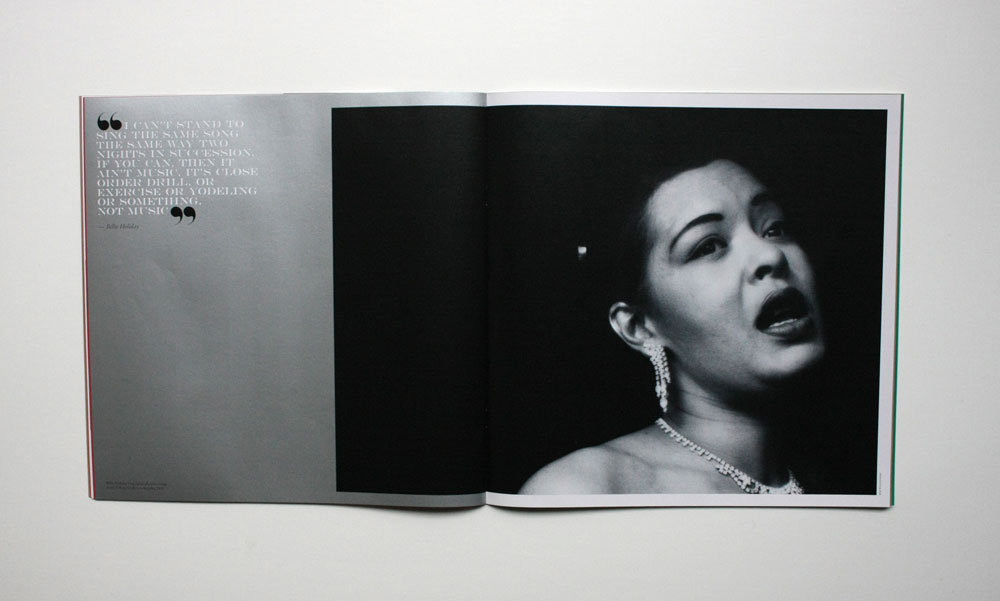
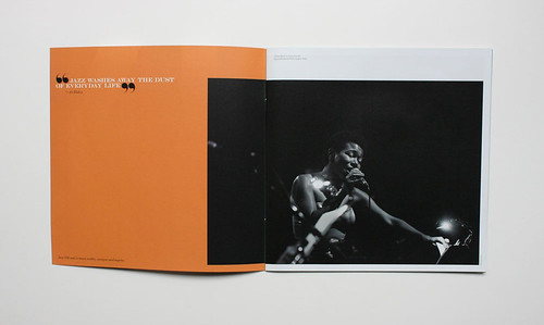
Top: Billie Holiday. Photograph: Bob Willoughby.
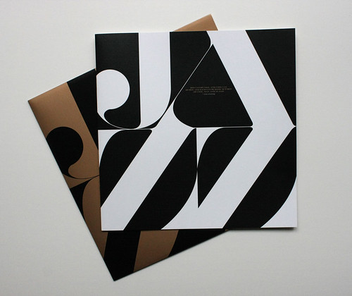
Right: JazzFM brochure and sleeve. Design and art direction: Matt Willey.
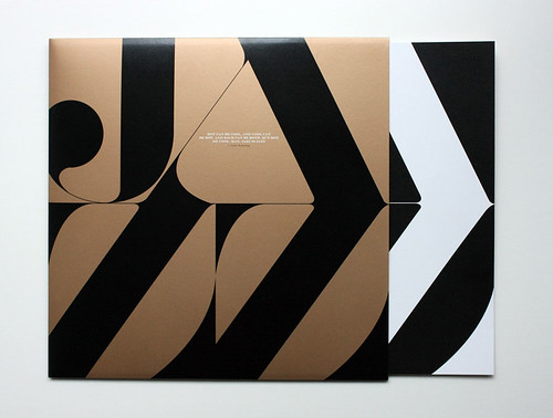
UK radio station JazzFM commissioned designer Matt Willey to create a brochure that its commercial team could take with them to meetings. Something with more impact than a business card.
The result (after twenty months of dialogue), is a beautifully printed twelve-inch square 40-page brochure with big words and big images, strong on mood and texture, that’s encased in an LP-like card sleeve bearing the word ‘jazz’.
Left: Soweto Kinch, 2011. Photograph: William Ellis. Right: Coleman Hawkins, 1950. Photograph: Bob Willoughby.
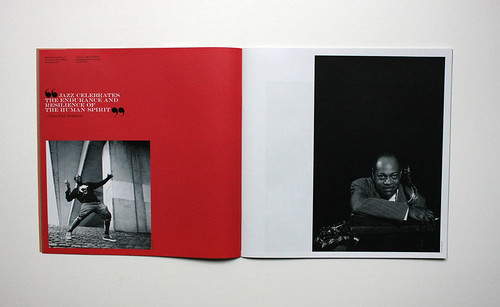
Marcus Roberts and Wynton Marsalis (right), 1992. Photograph: William Ellis.
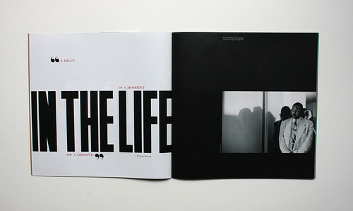
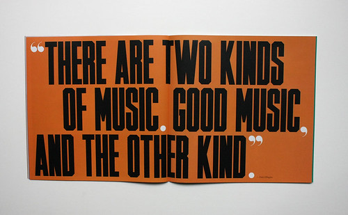
Willey sequences contemporary photography by Manchester photographer William Ellis alongside vintage 1950s prints by Bob Willoughby. The short texts sustain the jazz mood with quotations about the music from musicians such as Art Blakey, Miles Davis, Billie Holiday (top) and Duke Ellington (below) alongside a mixed bag of quotes from JazzFM’s own presenters (though lacking any words from their superb DJ Mike Chadwick).
China Moses, 2010. Photograph: William Ellis.
The result of Willey’s labours is a tactile treat for the radio station’s potential clients. The booklet pays tribute to the best of 1950s magazine art direction and a golden age of LP sleeve design, using gold, silver and a deep black that makes the most of the monochrome photography.
The two main display typefaces are Engravers and Timmons, a display font drawn by Willey himself (and named after jazz pianist Bobby Timmons). The whole package was printed in London by DG3 Europe.
The Willoughby pictures come from the book Jazz, Body and Soul.
Eye is the world’s most beautiful and collectable graphic design journal, published quarterly for professional designers, students and anyone interested in critical, informed writing about graphic design and visual culture. It is available from all good design bookshops and online at the Eye shop, where you can buy subscriptions, back issues and single copies of the latest issue.