
Wednesday, 5:25am
7 November 2012
Something to say
Anthony Burrill
Tomato
Desmond Jeffery
Gee Vaucher
Design education
Design history
Graphic design
Technology
Typography
The current vogue for letterpress is more than mere retro-nostalgia, writes Catherine Dixon in the run-up to Friday’s St Bride conference.
Letterpress is everywhere, writes Catherine Dixon (co-organiser of ‘Letterpress: Something to Say’).
Once a boutique fashion of designer-types, now it features regularly in the lifestyle spreads of magazines, a resonant feature of a wider revival in a hands-on approach to production well in evidence in the growing numbers of events and fairs such Handmade & Bound and Pick Me Up. Yet, while the coffee table collections of letterpress works seem firmly routed in a retro-nostalgia groove, this movement is being driven by younger designers and students. This is a generation for whom the computer often represents both work and play. This is also a generation of designers being called to reconsider craft, be it in the digital making of new open-source tools, or as a response to the tactile losses of e-publishing, opening up spaces for re-imagining the objectivity of texts and for exploring processes inky, mechanical and, for them, often mysterious.
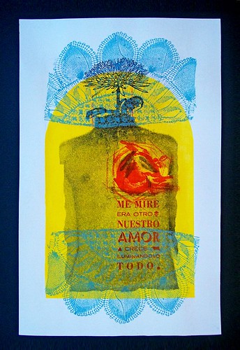
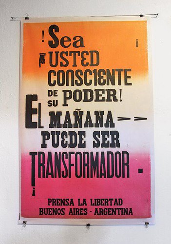
Right: posters printed by Prensa La Libertad of Argentina.
Top: work by Peter Nencini.
Given these changing perspectives, what is the purpose of letterpress in design education? To step beyond the limited scope of a dialogue too often looping around the feelgood factor of working with slow old letterpress in a fast new world, ‘6x6’ – a collaborative project supported by the University of Brighton and the London College of Communication – has set out to map educational positions on letterpress. Staff and students from six institutions with active letterpress workshops were given an open brief to explore the letterpress process through work and texts.
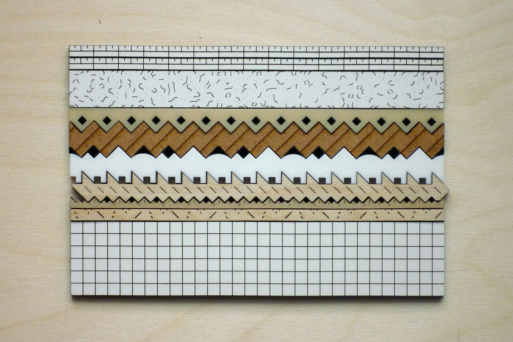
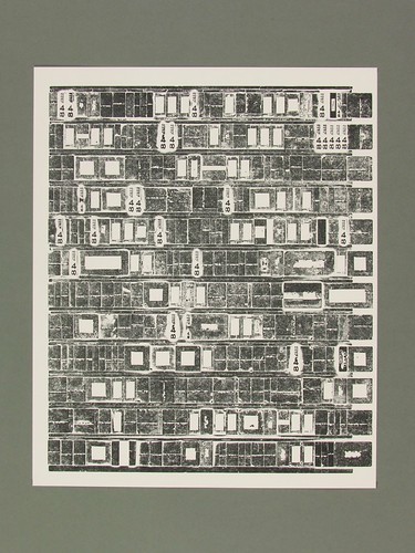
Print by Phil Baines from ‘6x6’ – Collaborative Letterpress Project. Works were printed in editions of 200, which, combined with a litho text section, will form the basis for a forthcoming exhibition and a publication.
6x6 print by Glasgow School of Art student Ross Hogg.
However, it can sometimes seem that to print something letterpress is end enough in itself. Words can be regarded as having less importance than the evidence of the process, with uneven inking and a deep impression, which are all evidence, to the trained trade printer, of ‘bad’ printing.
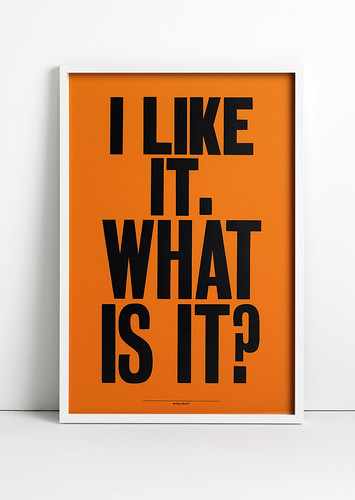
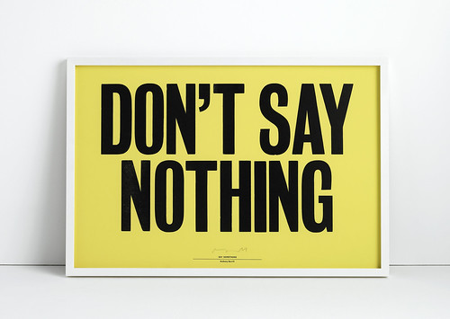
Reassuringly, there are those for whom the text does still matter. At Typo London earlier this month, designer Anthony Burrill described his approach to work as one that focused on a simple message. For the past decade Burrill has been working with a local printer, Adams of Rye, to produce his popular ‘statement’ letterpress posters.
Letterpress poster by Anthony Burrill.
Last month, the exhibition ‘Type and Space’ at Spike Island in Bristol, an international centre for contemporary art and design, featured the work of the letterpress printer and typography teacher Desmond Jeffery (1926-74). Its curators, Sally Jeffery, Jono Lewarne and Charlotte Hetherington, celebrated those projects where the words printed resonated with Jeffery at a personal level, representing a marriage of his political and professional beliefs. (See also Simon Esterson’s ‘Early adopter: Desmond Jeffery’ on the Eye blog, 4 November 2009).
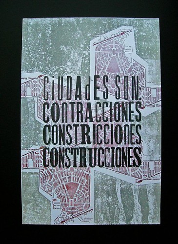
In Argentina, designer Federico Cimatti uses his own press to produce the usual stationery fodder to run his Buenos Aires business and to engage with his community at a political level, producing campaign posters and flyers under his imprint of Prensa La Libertad.
Poster printed by Argentinian designer Federico Cimatti of Prensa La Libertad.
The Spanish co-operative L’automàtica have gone a step further than most, in buying a Barcelona letterpress printshop that was going out of business. In addition to the machinery and space, they are maintaining the previous owner in his job, so he can continue to print and they can receive a proper training. This small not-for-profit collective can then produce their small-run books in a high-quality and cost-effective way, and also use their press to work towards the political changes they hope for in economically beleaguered Spain.
Contemporary approaches to letterpress feature in a one-day event in London this Friday at St Bride Foundation entitled ‘Letterpress: Something to Say’.
Dylan Kendle: Nouvelle Vague numerals.
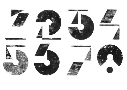
Designer Dylan Kendle of Tomato will show how he uses letterpress in his work not so much as the means to an end but as a means to a beginning – using the immediacy and modularity of wooden type as a springboard from which to develop projects, many of which are resolved digitally.
Other participants include representatives from the 6x6 collaboration, Anthony Burrill, the curators of the ‘Type and Space’ show, L’automàtica and – just announced – Crass designer Gee Vaucher (aka Gee Suss).
You can also see illustrator Peter Nencini’s Make Do Type system, and Ian Gabb who argues that letterpress should be defended, not exclusively, but rather as ‘part of a rich and pluralistic graphic culture’.
Rose Gridneff of Workshop and I will be there to provide some context along with the compositor and designer Thomas Gravemaker.
Anthony Burrill.
Eye is the world’s most beautiful and collectable graphic design journal, published quarterly for professional designers, students and anyone interested in critical, informed writing about graphic design and visual culture. It is available from all good design bookshops and online at the Eye shop, where you can buy subscriptions, back issues and single copies of the latest issue. You can also browse visual samples of recent issues at Eye before You Buy.