
Friday, 12:02pm
29 August 2025
James Mosley 1935-2025

various designers
Paul Barnes
John Morgan
Desmond Jeffery
Herbert Spencer
Louis John Pouchée
Eric Gill
Jonathan Hoefler
Edward Johnston
Fernando Mello
Design history
Typography
Catherine Dixon pays tribute to printing librarian, teacher and scholar James Mosley
Printing librarian, teacher and scholar James Mosley has died aged 90, writes Catherine Dixon.
Mosley was a figure in design history who was rarely ‘centre stage’, yet whose influence was highly significant. He was a popular speaker internationally and wrote seminal texts on typographic history. His meticulous articulation of letterform history helped scaffold the work of so many others, including type designers such as Matthew Carter, Jonathan Hoefler, Dave Foster and Paul Barnes.
In his Eye 90 feature ‘James Mosley: A life in objects’, Commercial Type’s Paul Barnes showed the magnitude of Mosley’s contribution to the typographic field, especially the importance of material artefacts in understanding how and why things were made. Objects help build more accurate and diverse historical narratives of the ways design was practised. Mosley had the presence of mind, for example, to collect Rubylith stencils used to make Letraset fonts – shunned at the time by some as not ‘proper’ typography – capturing evidence of methods and processes that might otherwise be lost.
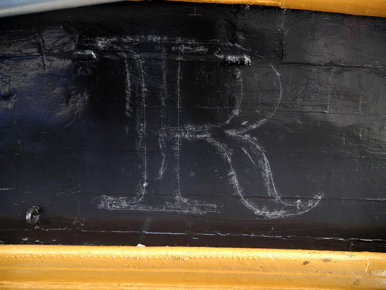
Right. For the lettering on HMS Victory, sign writer Phil Surey traced the outlines in chalk, October 2015. Photo © Abyme / John Morgan studio. See ‘Victory’ on the Abyme site.
Top. James Mosley portrait, ca. 2015.
Right. James Mosley with the completed English Vernacular letters on HMS Victory, October 2015. Photo © Abyme / John Morgan studio.
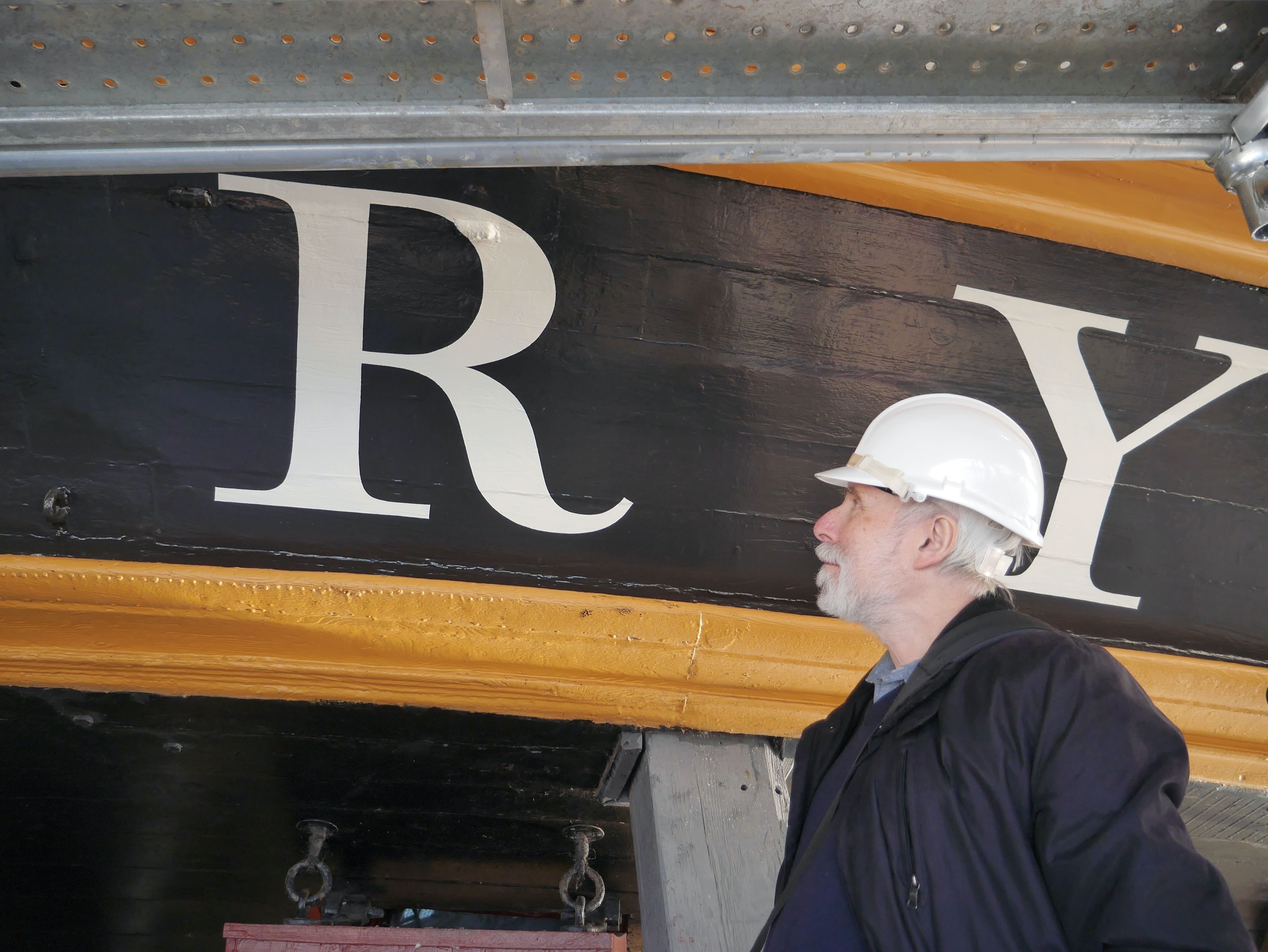
Barnes credited the precedent Mosley set for independent typographic scholarship underpinned by curiosity and observation. His opinionated writing could be effective: the inaccurate restoration of the lettering on Nelson’s flagship prompted a critique in his Typefoundry blog (2006-14) that would eventually result, through a collaboration with John Morgan studio, in HMS Victory being rendered in the English Vernacular letter that Mosley did so much to document. (See ‘Victory’ on the Abyme site.)
Through decades of teaching at the University of Reading and his 42-year custodianship of St Bride Printing Library in London, Mosley helped guide the research of countless students of type, including myself. Once, after weeks of patient study in the St Bride reading room, he instructed the assistant librarian to show me a box of his own research materials on the same subject. I know that many others are grateful for his generosity and gentle cautioning.
James Mosley talking about Johnston type at the University of Reading, ca. Spring 2007. Photo: Fernando Mello.
His official retirement from the library in 2000 was celebrated with sushi and Champagne, a rare moment of virtuosic panache that was generally hidden beneath a quiet attentiveness and modest busyness of character. Mosley never really left St Bride. His reluctance to let go was an indication of a depth of commitment to its preservation in the face of serious threat. With the late Justin Howes he helped establish the original Friends of St Bride.
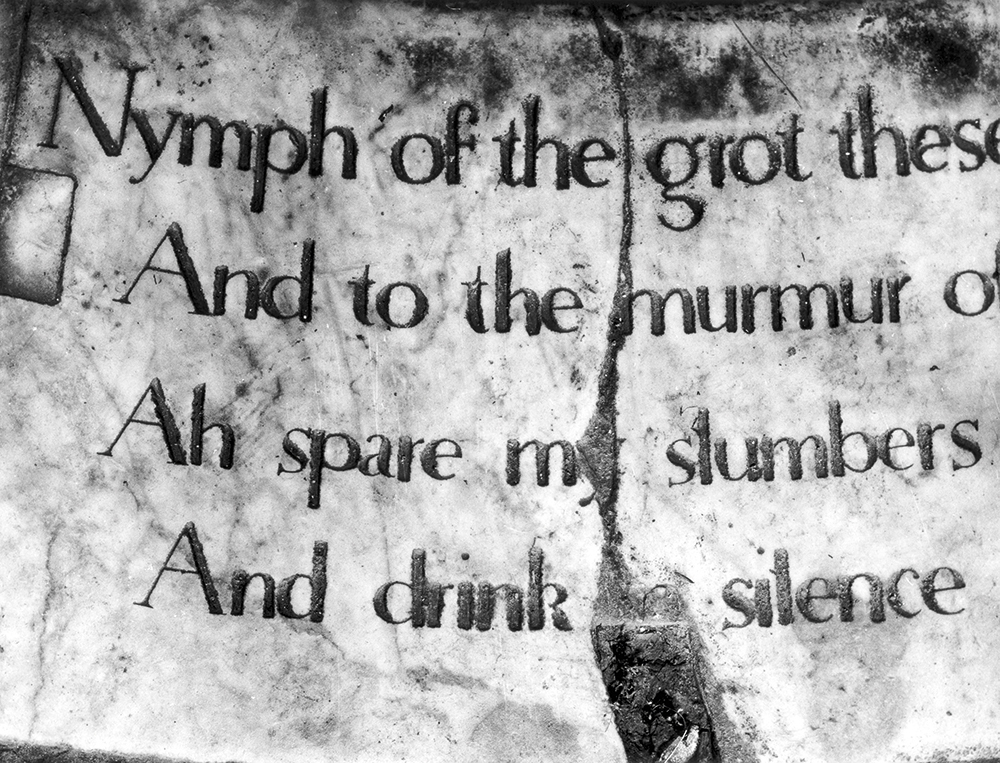
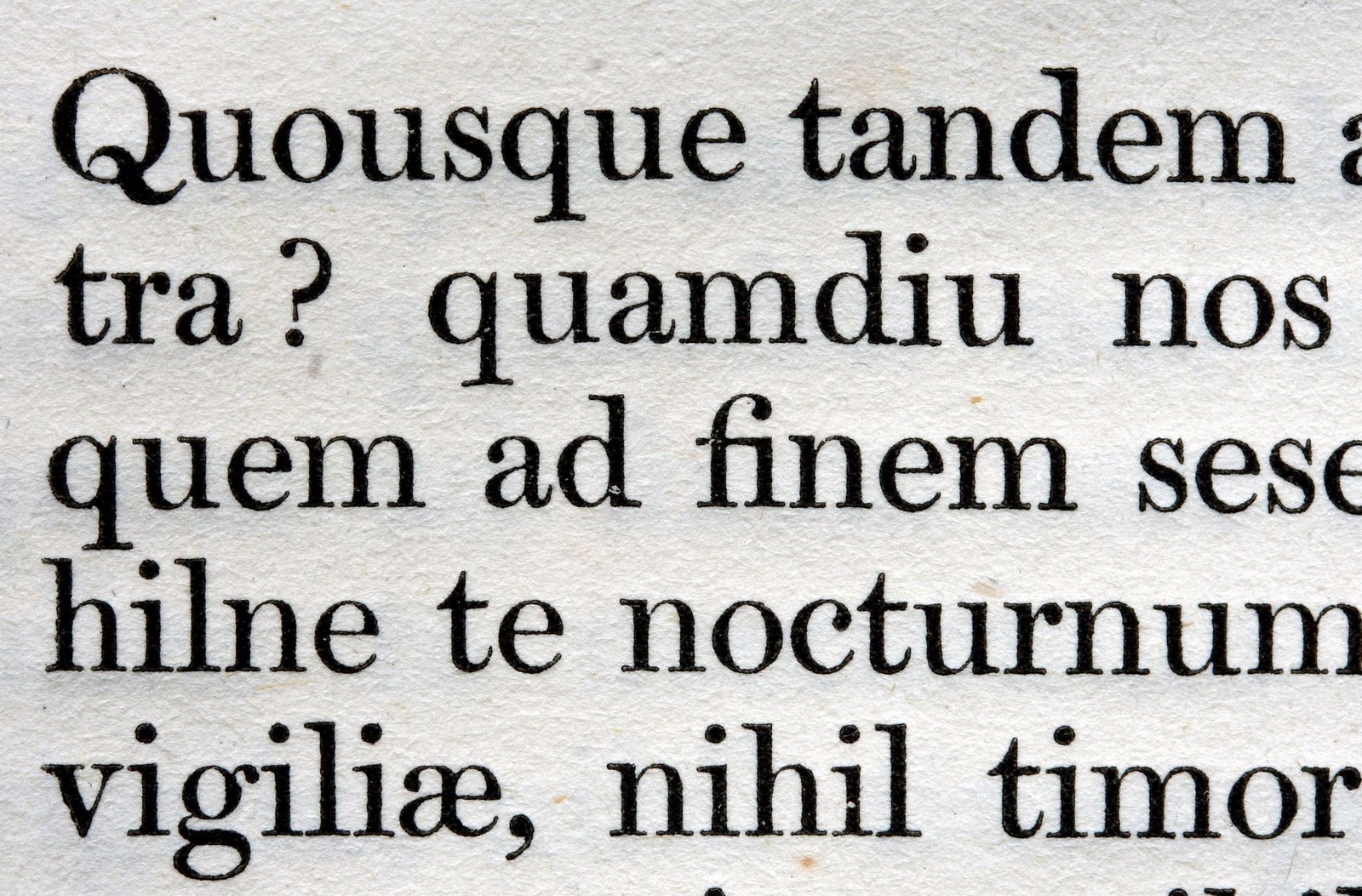
Right. Mosley’s influential essay ‘The Nymph and the Grot’ appeared in Herbert Spencer’s magazine Typographica (see Eye 31) in 1965, later revised for a book published by the British Library. It chronicled the many examples of sans serif letterforms before they first appeared in type form in the 1810s.
Sprightly into his more senior years and sharp, in both the incisive as well as the caustic sense, he could at times be guarded and territorial (as can many academics). But in good temper he was remarkably convivial, especially if good food and wine were involved. His wife, Gillian Riley, who predeceased him last year was a food writer and a fine cook. They met while students at Cambridge through a shared interest in printing.
Mosley’s interest in printing shaped his life. He brought a passion for the practical to the academic and through the knowledge he generated and shared we have much to be thankful for.
James Mosley (18 April 1935-25 August 2025)
With thanks to Bob Richardson and Paul Barnes.
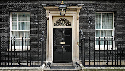
Right. See James Mosley’s critique of the lettering on the door of the UK Prime Minister’s residence, no. 10 Downing Street, October 2010.
Matthew Carter adds …
A specialised library is only as good as its librarian. It happened to me more than once that I asked for a particular book at St. Bride’s only to be shown by James a better book on the same subject. This taught me simply to tell James what I was interested in rather than ask for a book by name. In this way my interest in script types led to being introduced to Ambrose Heal’s The English Writing-Masters and their Copy-Books. James allowed me to have some of the plates photographed. I took these with me when I moved to Brooklyn in 1965 to work at Mergenthaler Linotype where they served as references for the design of Snell Roundhand, a joining script in the English tradition, released for the Linofilm phototypesetter in 1966.
Detail of William Miller’s Pica No. 2, as shown in 1813, from the specimen of 1822. From ‘Scotch Roman’ (2007, revised 2009) on Mosley’s Typefoundry blog.
In
the mid-1990s when I got interested in designing a Scotch Roman, I of
course consulted James who kindly sent me his history, Scotch
Roman, then a manuscript,
later published with several revisions and additions on his
Typefoundry blog in 2007. The text was accompanied by photocopies of types
from the Edinburgh and Glasgow foundries that were invaluable to my
work. I’m happy to say that James approved of the resulting
typeface, Miller (although not a pure Scotch Roman), with the
exception of my lowercase ‘t’ to which I had given a flat top. He
used Miller to set The Nymph
and the Grot in 1999 but
replaced the lowercase ‘t’ in the font with a pointed-top version
that he designed himself. I mention this as being the one and only
difference of opinion I had with James during a friendship of nearly
70 years.
Matthew Carter, type designer, Cambridge, Massachusetts, US
Eye is the world’s most beautiful and collectable graphic design journal, published for professional designers, students and anyone interested in critical, informed writing about graphic design and visual culture. It is available from all good design bookshops and online at the Eye shop, where you can buy subscriptions, back issues and single copies of the latest issue.