
Monday, 12:00pm
1 December 2014
The graphic languages of fashion
Graphic design is woven into fashion culture. ‘Women Fashion Power’ at London’s Design Museum shows how, says Colin Davies

Walking up the stairs to the first-floor gallery space at the Design Museum, London, you get an inclination you might be walking into an explosion, a mini Big Bang, writes Colin Davies.
A neon-lit sign shows exploding shards of Perspex that expand outwards beyond the frame. But it isn’t a meteorite you’re landing upon, it’s the latest exhibition at the museum: ‘Women Fashion Power’.
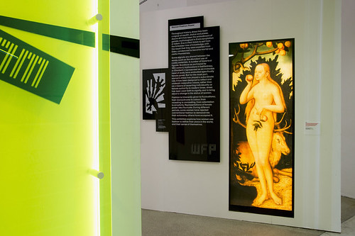
You enter through a thin hall of contextual material, including historical and contemporary portraits of women in fashion. On the Perspex signage – a collaborative design between LucienneRoberts+ and Zaha Hadid Architects – the text reads crisply: ‘…over the course of history, dress has been the most powerful signal of wealth and status.’ Then you progress to the main exhibition, which radiates out with shards of mirrors and orthogonal partitions.
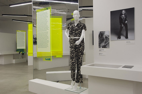
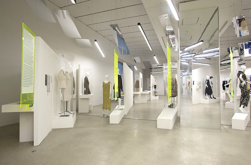
The exhibition design uses shards of Perspex, orthogonal partitions and mirrored surfaces, designed by Zaha Hadid Architects with graphics by LucienneRoberts+.
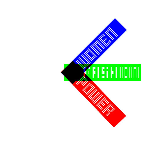
Top: the Perspex ‘clock’ allows the words ‘women’, ‘fashion’ and ‘power’ to be read and interpreted in any order.
‘Women Fashion Power’ is co-curated by fashion expert Colin McDowell and Donna Loveday, head of curatorial at the Design Museum.
One clever spatial device involves you squeezing through a narrow gap of partitions, which then opens out to a display of corsets. The experience of gently easing into the antechamber enhances your understanding of the confining ribbon corsets on display.
The exhibition – following a traditional chronological timeline – implicitly explores the relationship between fashion, politics, visual culture and, by extension, graphic design. That element may be an illustration on a London Underground poster that gently promotes ‘gender specific modification’ in fashion attire by advising travellers to ‘wear something white’, or the latest fashions for driving, cycling or swimming. Graphic design weaves itself into the changes in women’s fashion culture.
Identity design for ‘Women Fashion Power’ by LucienneRoberts+.
Trailer for ‘Women Fashion Power’ entitled Women Fashion Power: Look at what the woman next to you is saying, animated by Hungry Sandwich Club with creative direction from The Beautiful Meme and music by Josh Thompson.
The relationship becomes more obvious, even substantial, as you walk through the small exhibition: Feminism; deconstruction; Punk; social protest; eco politics and consumerism. All are articulated through a powerfully strident graphic language: STAY ALIVE IN 85; VOTE TACTICALLY; CLIMATE REVOLUTION.
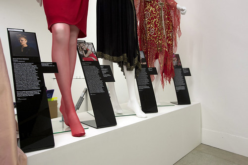
The exhibition aesthetic is Debenhams meets Chelsea Girl in its 1970s Perspex glory, while the explosion of sight lines and mirrors deconstruct the exhibition space. Historical epochs are situated in the wedges of space between the exploding floor plan. The info boards – Perspex and free-hanging – situate you in the era: 1900-20, 1970-90 and so on.
‘Women Fashion Power’ installation photograph.
Much of the work exhibited still looks fresh and insightful. Dame Vivienne Westwood’s Around Punk collection from 1977 still combines elegance with confrontation. Similarly, the Deconstructionists’ work from outside Europe, Issey Miyake, Rei Kawakubo and Yohji Yamamoto, still looks angular and layered – like a Visual Editions book design. Placed within the same group of designers is Ann Demeulemeester, whose work is often monochrome graphic masterpieces in and of themselves; here the emphasis is on line and cut. But her beautiful work is an un-tapped resource for graphic designers.
The exhibition is small and, in spite of – or in tension with – Zaha Hadid Architects design, the curation is didactic. Learning is back in fashion in some curatorial circles – think British Library rather than Comme des Garçons installation.
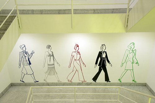
Stairwell illustrations for ‘Women Fashion Power’ by Ben Wiseman.
Leaving the exhibition, I did worry about fashion and power, and the lack of criticality in the show. In the area dedicated to Feminism, the black-and-white picture of Germaine Greer sitting on the floor in knitted trousers, T-shirt and boots is as androgynous as the image of Joan of Arc that greeted us at the entrance. Importantly, she sits un-branded and logo-free. Next to the picture – under glass – is an original paperback copy of her famous book The Female Eunuch. The cover, by British artist John Holmes, shows an empty female torso hanging like a fashion garment from a rail. But this exhibition leaves these critiques untouched.
‘Women Fashion Power’ continues until 26 April 2015 at London’s Design Museum.
All photographs by Richard Hubert Smith.
Colin Davies, Reader in Design, Head of the School of Art and Design, University of Bedfordshire
Eye is the world’s most beautiful and collectable graphic design journal, published quarterly for professional designers, students and anyone interested in critical, informed writing about graphic design and visual culture. It is available from all good design bookshops and online at the Eye shop, where you can buy subscriptions and single issues.