
Friday, 10:09am
8 June 2012
Time after time
Otl Aicher
Michael Burke
mason wells
Design history
Graphic design
Information design
Typography
Mason Wells examines an Olympic Games schedule from Munich 1972
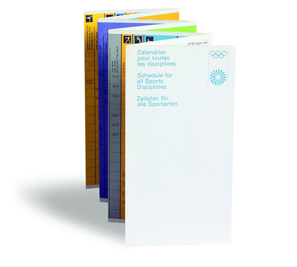
Only after the viewer has folded back the discreet cover featuring the beautiful ‘Wreath of Rays’ logo is the energy of this document fully revealed, writes Mason Wells in Eye 63.
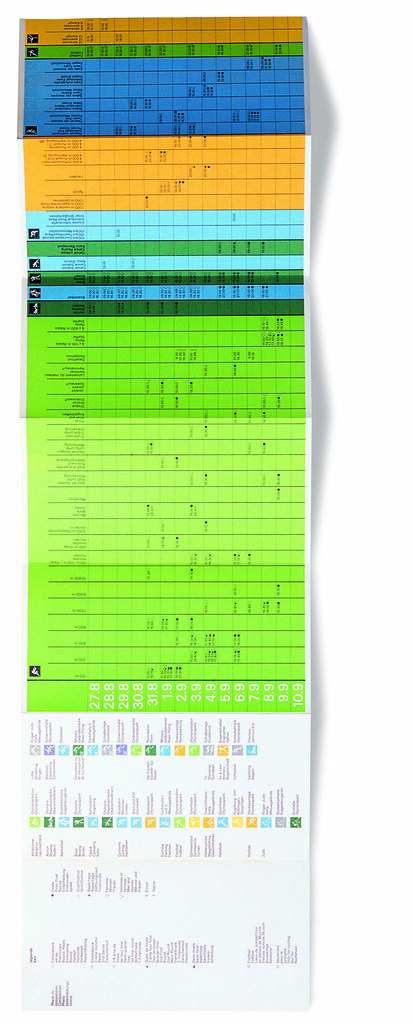
Typeset in the single weight of Univers 55, this two-sided, fold-out matrix is an excellent example of the many schedules produced for the twentieth Olympic Games in Munich, 1972.
Unlike the large-format schedules displayed around the Olympia Park, this one was intended to be pocket-size, for personal use. Michael Burke, the designer and a senior member of the 30-strong Olympic creative team, decided upon a concertina format sympathetic to the linear nature of the events programme. This format brought its own challenges. Printing it was no problem, but it took a lot of research to find the one company in Germany that could mechanically fold a document this wide.
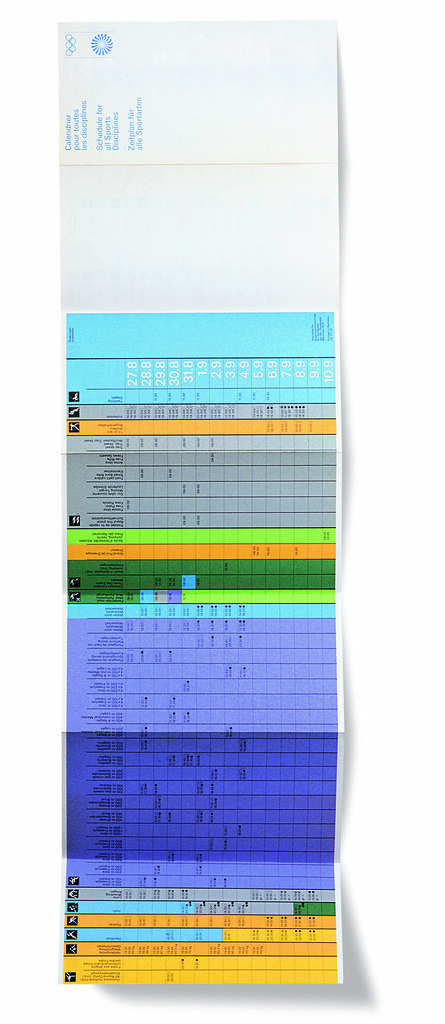
The structure of the schedule is based on a black grid using varying stroke widths to delineate zones for each event. The X-axis covers all the sports using Otl Aicher’s pictograms. The Y-axis carries the dates covered by the Games. The intersecting points on both axes give the times the events begin, with symbols denoting heats and whether it is a male or female tournament.
Within the matrix, the seven official Olympic colours are used in combination with the pictograms to differentiate the 195 events. The duration of each event defines a multitude of contrasting colour-fields – varying in scale and further reinforcing the separate sports.
Burke explains the production process: ‘The artwork was produced using layers of trace and a rapidograph pen. The grid was planned-up and the type hand-rendered – this was then passed on to the printer for make-ready. We did not have the usual problems associated with artworking because we had excellent technical support: a team of six dedicated production staff were assigned to the project. All the print and production technicians we worked with had design training. This made a tremendous difference because we were all talking the same language.’
Reproducing an artwork such as this would be taxing today, even with ‘step and repeat’ software, but at the time of production, with only analogue means, it would have been an incredibly complex task.
The beauty of Burke’s schedule is that the content and systems of organisation define the form. There are no superfluous details, yet it is as rich as any of the over-embellished ‘design’ solutions we so often see. Within Aicher’s Olympics identity design this was a minor element, yet it encapsulates the spirit and magnitude of the Games. It is testament to the design’s strength that the only reminder that this schedule is 35 years old is the date on the front cover.
Credits:
Schedule for all sports, XX Olympic Games, Munich, 27 August-10 September 1972.
Design: Michael Burke
Format: 870x240mm landscape, concertina folded to make fourteen pages, reducing down to a pocket-sized 125mm wide.
The design team of more than 30 people included Rolf Müller, Thomas Nittner, Jurgen Hoffmann, Elena Winschermann, Gerhard Joksch, Ian McLaren and Burke under the supervision of Otl Aicher.
From the exhibition ‘72: Otl Aicher and the Munich Olympiad’, London, 15 February-15 March 2007, curated and designed by Bibliothèque.
This article first published in Eye no. 63 vol. 16, Spring 2007.
Maason Wells will be taking part in ‘Munich ’72 – Design Legacy’ a symposium at Herbert Read Gallery, UCA, Canterbury on 29 June 2012.
Eye is the world’s most beautiful and collectable graphic design journal, published quarterly for professional designers, students and anyone interested in critical, informed writing about graphic design and visual culture. It’s available from all good design bookshops and online at the Eye shop, where you can buy subscriptions and single issues. Eye 82 is still available, and you can browse a visual sampler at Eye before you buy on Issuu.