
Friday, 11:00am
5 September 2008
Two degrees of (colour) separation
George Hardie
Storm Thorgerson
Bob Gill
Robert Brownjohn
Richard Hamilton
John Pasche
john l. walters
Design history
Graphic design
Illustration
Posters
Graphic Rolling Stones artefacts are saved for the nation
It began with a letter – addressed to the designer at the Royal College of Art, writes John L. Walters.
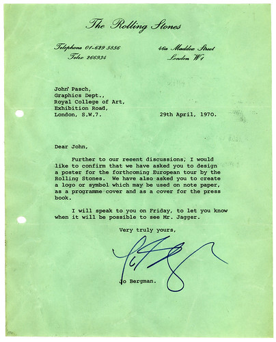
It’s funny that a document from the Rolling Stones office should look like something from the 1950s, but there it is, misspelling John Pasche’s name, and asking him to ‘create a logo or symbol which may be used on note paper, as a programme cover and as a cover for the press book.’
The rest is history of a sort. The latest instalment is the acquisition of Pasche's original artwork for the V&A, using money from The Art Fund to cover half the ‘Hammer price’ of $92,500.
Maybe it’s not on the level of the Titians, either in cost or scale, but you can’t deny that the Stones logo is a small part of cultural history – like the Stones themselves, regarded by many as national treasures.
It is interesting that the call for lasting symbol of the Stones’ corporate identity came so late in the day. (The letterhead takes its cue from the bowdlerised Beggars Banquet cover.) Brian Jones had died the previous year; Jimi Hendrix would die a miserable death a few months later. Paul McCartney had just announced (on 10 April 1970), that the Beatles would never work together again. Change was in the air.
But the Stones made a good choice. When he did the work Pasche was ‘on the cusp’ between professional practice and the Royal College, where he had been a contemporary of Led Zep / Pink Floyd illustrator George Hardie, and a year above Hipgnosis founder Storm Thorgerson. He’d been doing some freelance work with Bob Gill, with whom he got on with very well, but he was broke.
Pasche dealt directly with Stones singer Mick Jagger, who had seen the designer’s work at his final year show, and needed a poster for their 1970 tour; he notes that the singer was straightforward to deal with. By that time, the Stones had already initiated (deliberately and inadvertently) quite a heady visual legacy, including Robert Brownjohn’s cover for Let It Bleed, Gered Mankowitz’s photographs, Richard Hamilton’s Swingeing London 67 (poster and collage) and Godard’s One Plus One aka Sympathy For The Devil.
Talking about the poster, Pasche recalls: ‘Jagger said: “I don’t want pictures of the band on it, I want something graphic.” So I said what about “touring”.’
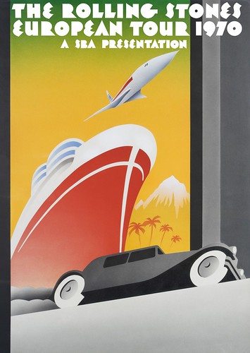
Pasche’s solution recalls a golden age of travel posters, a kind of pastiche that was fashionable in the early 1970s, and continued throughout the ‘Yacht Rock’ period of airbrushed covers and sounds. But the ‘Tongue and lips’ logo was something else. It’s rude, provocative, sexually charged and slightly ridiculous – like the Stones themselves – and it endures.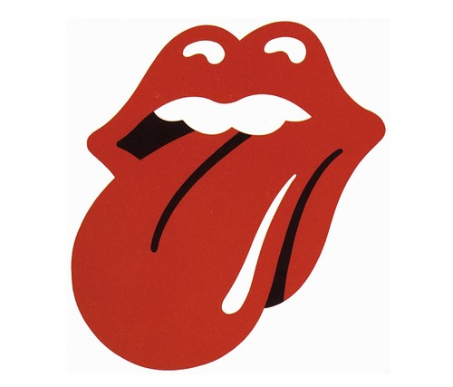
‘It felt absolutely right when I did it,' said Pasche when I spoke to him earlier this week. ‘It was the obvious thing to do at the time – it had that feeling of “rightness” you get with some projects.’ And the £50 that the Stones paid for the logo [They paid him another £200 in 1972] was welcome, though Pasche says he was absolutely broke by the time he left the College. In one of his supporting documents for the auction house, Pasche explains that Jagger, ‘showed me an image of the Goddess of Kali which was the starting point to our discussion regarding the design of the logo.’
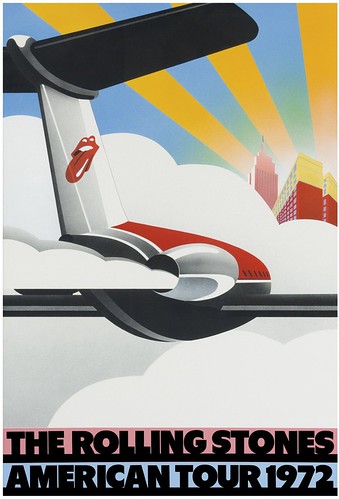
Pasche first got to use his logo on the inside sleeve for the British version of Sticky Fingers, where it replaced Andy Warhol’s grubby underpants – an image deemed to strong for delicate British eyes. And he used it on his slick poster for the 1972 tour, a spookily prescient image, when you think how Richard Branson moved from rock’n’roll to airlines with what seemed like the merest flick of Boy George’s dreadlocks.
Since that time, the logo has been used for everything you can think of, from keyrings, screensavers and puzzles to the giant inflatable that dominated the 2006 tour.
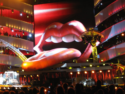
Above: concert snap from the website of Stones keyboardist Chuck Leavell. Photograph by Rose Lane Leavell.
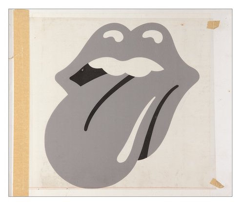
Pasche describes himself as ‘a bit of a hoarder’, but he had personal reasons for flogging the two-colour separations for the logo (see top image), complete with masking tape. He regrets not keeping his rough sketches for the Stones logo – he must have ‘chucked them in the bin’. (Though we have all heard of artists who have happily created ‘working sketches’ to sell, long after their masterworks are completed.)
But you wonder what the museums will do when it is time to acquire original artwork from today’s music designers. What price the V&A’s historical pdf collection?
John Pasche’s website is johnpasche.com
Rolling Stones: rollingstones.com
See latest Eye blog about Pasche’s posters, printed by Curwen Studio.
Eye is the world’s most beautiful and collectable graphic design journal, published quarterly for professional designers, students and anyone interested in critical, informed writing about graphic design and visual culture. It is available from all good design bookshops and online at the Eye shop, where you can buy subscriptions, back issues and single copies of the latest issue. You can also browse visual samples of recent issues at Eye before You Buy.