
Tuesday, 7:55am
29 May 2012
Type Tuesday: West coast ghosts

Rudy VanderLans
john l. walters
type tuesday
Design education
Graphic design
Illustration
Information design
Music design
Typography
Visual culture
This Emigre type specimen celebrates a lost era of LPs and recording studios
I once heard someone dismiss a former boyfriend with the put-down, ‘he’s the sort of person who files his records in alphabetical order.’ Which prompted me to think: ‘what other sort of person is there?’ writes John L. Walters.
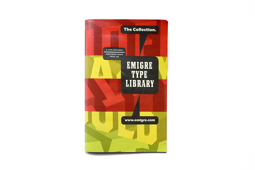
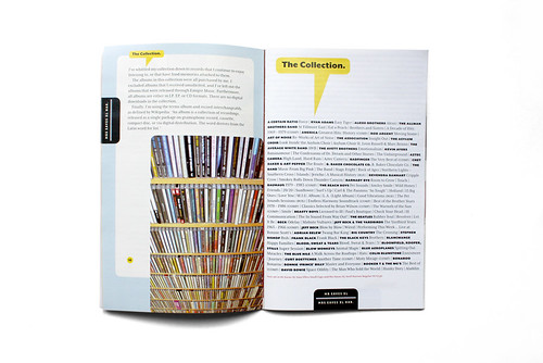
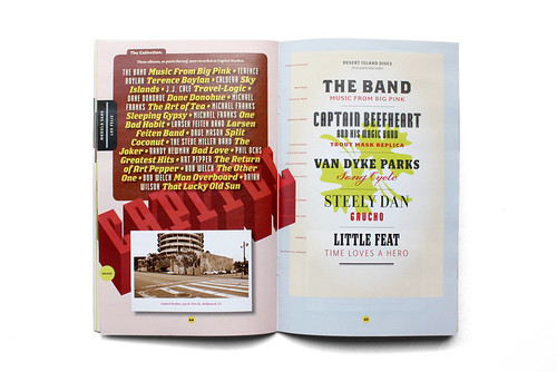
The Collection, a new type specimen from the Emigre type foundry, gives an answer to my question, revealing that co-founder Rudy VanderLans has catalogued his collection of 936 albums by recording locations (top); by dates; and by labels (Warner-Reprise comes top with 165 albums). He has organised his data into lists and infographics (top) reminiscent of the personal annual reports of Nicholas Felton. The albums are also listed alphabetically by artist (below).
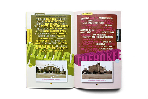
But if you think that’s obsessive, just wait until you get to pages 33-53, which show small monochrome photographs of the LA recording studios where many of VanderLans’s favourite albums were made.
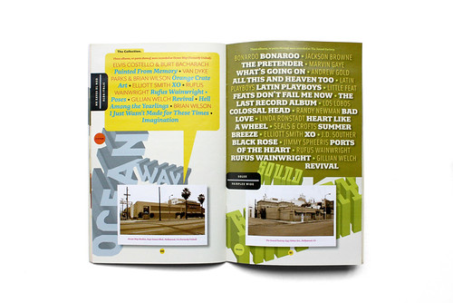
For fans of rock and pop music this has a certain fascination, realising that albums as diverse as the Beach Boys’ Pet Sounds, Captain Beefheart’s Trout Mask Replica and Prince’s 1999 emerged from the dull box that is Sunset Sound Recorders. (Hollywood Sound Recorders, where the Crusaders made Street Life and Boz Scaggs did Silk Degrees, looks even seedier.)
There is a typographic purpose to this accumulated data: most spreads show several typefaces, including Berton Hasebe’s Alda, Xavier Dupré’s Malaga and Claudio Piccinini’s Ottomat. VanderLans’s list of six ‘Desert Island Discs’ (below) uses twelve different fonts, including John Downer’s appropriately funky Council for Little Feat. In all, The Collection employs 38 different Emigre typefaces.
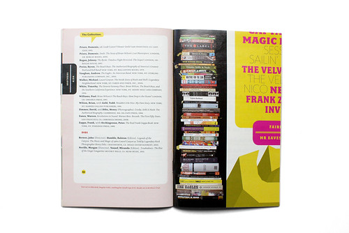
However the lion’s share of typefaces, including several from the Mr & Mrs Eaves families and decorative fonts such as Puzzler and Whirligig, are by Emigre co-founder Zuzana Licko.
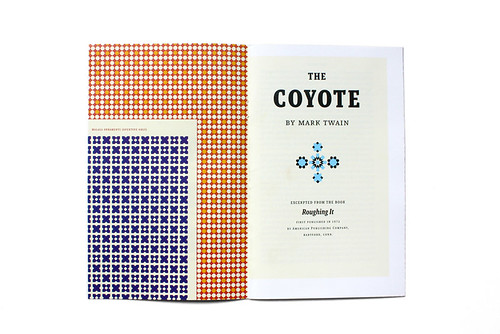
Emigre the magazine is no longer published, but something of its idiosyncratic, lightly pedagogical approach to content lives on in the foundry's specimens, such as Alda, Malaga (below, with a Mark Twain story) and Historia (see ‘California panorama’, Rick Poynor’s Critique in Eye 77).
The Collection packs in lots of nerdy, fascinating information about records from a golden era of pop and rock, when details of musicians, studios, designers and photographers could be found in the small print of LP sleeves. VanderLans explains that scrutinising credits as a teenager introduced him to his ‘future profession of graphic design’, when he noted the prominence of names such as Ed Thrasher, Ed Caraeff, Neon Park and Rick Griffith on his favourite albums.
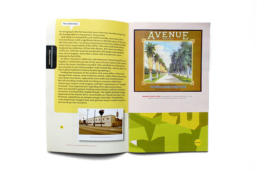
Yet it also serves the foundry’s typefaces well, with a broad selection of ornament, display, body text and some exuberant bits of 3D type that explode behind the columns and into the margins like studio echo and reverberation.
An old-school record collection, acquired over time, becomes a kind of autobiography (as Nick Hornby showed in High Fidelity), like a library of books. That’s what makes Rudy VanderLans’s Collection moving, entertaining and a genuinely heartfelt and personal vehicle for Emigre’s rich catalogue of typefaces.
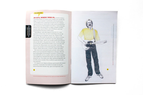
Above: spread from The Collection showing pencil illustration of Bernie Leadon made by Rudy VanderLans ca. 1975.
Details of how to order Emigre’s catalogue from emigre.com/EmigreCatalog.
Eye is the world’s most beautiful and collectable graphic design journal, published quarterly for professional designers, students and anyone interested in critical, informed writing about graphic design and visual culture. It’s available from all good design bookshops and online at the Eye shop, where you can buy subscriptions and single issues. Eye 82 is out now, and you can browse a visual sampler at Eye before you buy on Issuu.