
Monday, 6:00am
29 June 2015
Was, is & will be
For its 160th anniversary, British newspaper The Daily Telegraph unveils a new masthead, crest and typefaces
Some news outlets have a hard time staying in business for more than a generation. British broadsheet daily The Daily Telegraph celebrates its 160th anniversary this week with a confident redesign that includes a new masthead, crest and bespoke typefaces, writes John L. Walters.
For the main news stories and display copy, the newspaper group’s creative director Jon Hill has commissioned Austin News (a new version of the Austin typeface family, originally drawn for Harpers & Queen) from Paul Barnes of Commercial Type (see Reputations in Eye 82).
Barnes also drew the new masthead, which marks a return to the inline lettering of earlier Telegraph mastheads over the past century and a half. (The paper has employed a solid version of the masthead since 2003.)
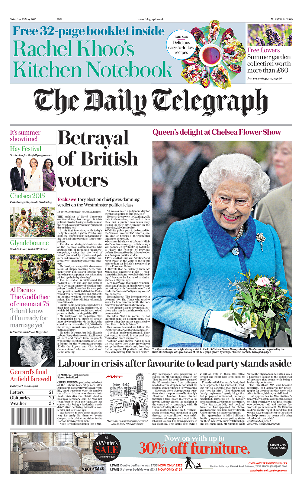
Changes in the newspaper’s masthead since it was founded in 1855. The solid version has been in use since 2003.
Top: The new-look Daily Telegraph with its masthead designed by Paul Barnes of Commercial Type, 2015.
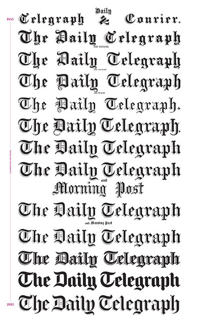
Today’s front page.
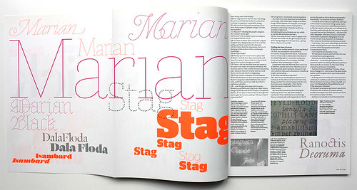
Barnes has also designed new bespoke typefaces – Telesans and Telesans Agate – for the newspaper, and has supplied two new versions 0f the inline typeface family Marian: Marian Display and Marian Poster. Austin will eventually appear in all the paper’s digital products (website and apps) and already features (alongside Marian) in the Telegraph website’s fashion and beauty sections.
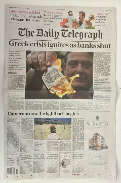
Marion Display and Austin in telegraph.co.uk/beauty/
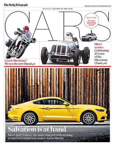
The Saturday paper’s motoring section makes bold use of Marian Poster.
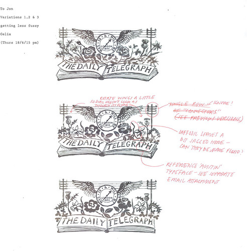
The changes reach into every corner of the newspaper and its sections, from the illustrations to the crest, a detailed piece of artwork with the motto ‘Was, is & will be’ and the date 1855, when the paper was founded in London. The new version is a simulated linocut original made by Suffolk-based artist Celia Hart, whose work draws on the traditions of Edward Bawden and Eric Ravilious.
Hill had been concerned that the previous version of the crest was somewhat ‘cold and vectorised’. He convinced his colleagues that the Telegraph ‘should be proud of its wrinkles and battle scars’ and not attempt to ape its online competitors in look and feel.
Final artwork for the crest by Celia Hart, 2015. (On Twitter, Hart described it as ‘a simulated “linocut”, hand-drawn in Photoshop.’)
Hill discovered Celia Hart’s work, which includes commissions for Gardens Illustrated magazine and Shortts Brewery, in a less traditional manner – by ‘snooping on social media’ and discovering Hart’s Instagram account.
Some newer members of Hill’s Telegraph design team were similarly recruited through Instagram and Twitter.
Motoring section using different weights of Paul Barnes’s Austin and a drop cap Marian Display ‘I’.
The Daily Telegraph is one of the UK’s last few broadsheets, with a print circulation of just under half a million (ABC Jan 2015) and a website that passed the million ‘unique monthly visitors’ mark in May 2015.
A note from The Daily Telegraph’s editor Chris Evans in today’s paper shows his commitment to readers of the printed edition: he explains that the type size and leading has increased, leading to a small (five per cent) decrease in the number of words printed. Davis writes that such changes are ‘in step with most quality Western newspapers and makes our articles far more readable … We believe that it is a reasonable price to pay in order to make reading the paper far more pleasurable.’
Design team credits: Nicola Ryan, Sara Martin, Mark Hickling, Joel Wade, Fraser Lyness and Steve Davis, led by creative director Jon Hill.
The new masthead of The Sunday Telegraph, also designed by Barnes.

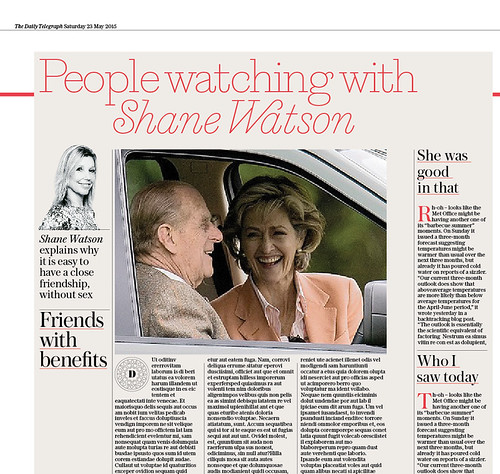
Marian Display for ‘agony aunt’ Shane Watson in the Saturday paper.
Celia Hart’s sketches for The Daily Telegraph crest, 2015.
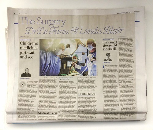
Detail of health page using Marian Display in today’s paper.
Barnes’s Marian (among other typefaces) is featured in the Commercial Type Reputations interview in Eye 82.
John L. Walters, Eye editor, London
Eye is the world’s most beautiful and collectable graphic design journal, published quarterly for professional designers, students and anyone interested in critical, informed writing about graphic design and visual culture. It is available from all good design bookshops and online at the Eye shop, where you can buy subscriptions and single issues.