
Autumn 2013
A tradition with breaks

F. H. K. Henrion
George Auriol
Joost Schmidt
El Lissitzky
László Moholy-Nagy
Edward Wright
Jan Tschichold
Margaret Calvert
Neville Brody
Pierre di Sciullo
Gerd Arntz
Fernand Léger
Paul Renner
A. M. Cassandre
Amadeo de Souza Cardoso
Josef Albers
S. M. Spencer
Barnhart Brothers & Spindler
MacKellar, Smiths & Jordan
John West
Otto Weisert
Stephenson Blake
James Stirling
Alison and Peter Smithson
James Goggin
Stencil typefaces – late arrivals on the typographic scene – are going in new directions and rediscovering their history.
Over the past decade or so, stencil letters have attracted the attention of growing numbers of typeface designers. They, in turn, have made many new stencil typefaces of ingenuity and even beauty. But given that stencil letters have been present throughout the history of type making, their entry onto the typographic scene has been comparatively recent. As late as 1950, in the specimen for Tea-Chest, Stephenson Blake’s contribution to new stencil typefaces of the 1930s, the copywriter found it strange that ‘stencilled letter-forms have had no place in the spate of type designs which in recent years, has descended with such fury upon the unsuspecting printer and typographer.’
A few years later, in what may be the first published survey of stencil typefaces (‘Stencil types’, The British Printer, October 1958), R. S. Hutchings thought it necessary to announce his subject as ‘a neglected category of type design’ that was still awaiting ‘effective exploitation by type designers’.
Despite his claim of neglect, Hutchings was still able to list 41 stencil types that had been made in the previous three decades, though admittedly his definition of just what constituted one was fairly broad. But one can sympathise with the claim and at first demur to his assertion (not quite true, as it turns out) that stencil typefaces were a twentieth-century phenomenon. Typefaces that typify stencil letters – ionics and clarendons, adapted to stencil work – were not introduced until 1937. Why so late? The answer is not entirely clear, though the history of stencil letters offers a few clues.
That history indicates that at the time stencil letters were apparently first used systematically, in the seventeenth century to mark out texts in liturgical books, they were intended to emulate conventional letters. To achieve this, the breaks in the letters, caused by the stencil plate, were to be hidden. If they were left showing they would disfigure the letters, in the opinion of one (rare) commentator of the time, Gilles Filleau des Billettes. So breaks were usually filled in using pen and ink. The view (and the remedy) recurs among later commentators, few though they are, including Benjamin Wilme and William Ford Stanley, who in the nineteenth century recommended stencils for lettering technical drawings.
Letters stencilled in liturgical books, France, eighteenth century. The breaks in the letters have been filled in with pen and ink. Photographer: Claude-Laurent François.
Top: stencil disk, invented by Eugene L. Tarbox in 1868 and manufactured by the New York Stencil Works, a company founded that year in New York City by Eugene and his brothers Jerome and Henry Tarbox. The characters are punched out of brass. 255mm dia.
Here, the breaks in the letters have been left untouched. Photographer: Claude-Laurent François.
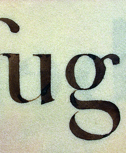
But if some saw breaks as worthy only of being hidden, there are hints that others appreciated the effect they created. This is suggested in two ways. First, in some early stencilled books, roman and italic letters are left uncompleted, and the proportion of books where this occurs increases over time. The perception of breaks seems to be shifting in a positive direction (though equally, perhaps, stencillers simply couldn’t be bothered to fill them in). And second, stencil makers begin treating their letters as pure decoration by cutting decorative titling letters and initials from separate but fluidly entwined leaves, flowers and tendrils. These designs were a product of the stencil idiom – breaks were not a problem but a programme – and they flourished in the eighteenth and nineteenth centuries. By 1906, Frederick Scott-Mitchell, in his book Practical Stencil Work, declared that all breaks (or ‘ties’) should be ‘natural’ (his word). They were the ‘keynote’ of the stencil; to fill them in was false. His was the attitude of a painter-decorator, but it extended to the letters he made.
And so, throughout their history (as far as we know), it is possible to detect diverging attitudes toward stencil letters. This must have been true, too, of typefounders: while risky, one might suppose that for some time, they saw little of interest in stencil letters (assuming they thought much about them). Perhaps letters with bluntly imposed breaks could only ever belong to the contingent world of stencilling – the breaks told you that. Why introduce such letters to type manufacture where their compromises could be avoided – where they were nonsensical? That stencil letters were apparently not made as printing types until long after the decades of nineteenth century effluorescence, when typefounders tried everything (well almost) and stencil letters were otherwise common (and occasionally celebrated), must say something along these lines.
Yet this neat scenario is not quite correct. A typeface unknown to Hutchings, Stencil-Gothic, released in 1885 (US patent no. 15,965), demonstrates that at least one nineteenth-century typefoundry, MacKellar, Smiths & Jordan (Philadelphia), was interested. (In fact two were, since Stencil-Gothic was also released by Barnhart Brothers & Spindler in Chicago, as Cleft-Gothic.) Stencil-Gothic appears to be the first stencil typeface. Its designer was John West of Brooklyn, son of the Scottish-American punchcutter and type designer James West, renowned for his script typefaces. Brooklyn, of course, is just across the East River from lower Manhattan, where in the 1880s one would have found a considerable concentration of stencil cutters, all servicing the port of New York’s busy freight operations, among other things. If one were to predict where a stencil typeface might be inspired, this would be the place.
Stencil-Gothic is a well built sans serif, though an equivocal one, too, as it is ornamented with fey, budding tendrils that sprout from the letters as if to overgrow their breaks. Is it the exception that ‘proves’ (i.e. tests) the rule? The experiment was not soon repeated, since the next stencil typeface – in name and effect – would not appear for another 45-plus years. Instead, the stencil letter finds its way into typefaces in guises far removed from its grittier modes.
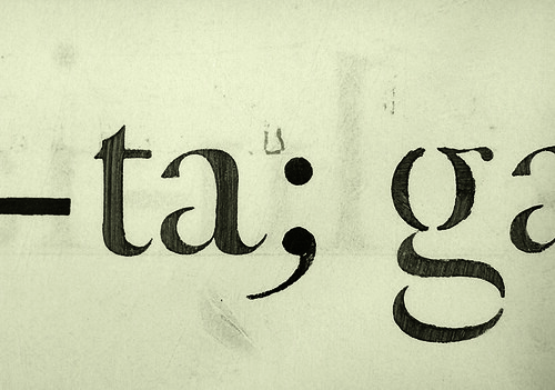
Auriol (1902), George Auriol, page from the specimen book of
G. Peignot et fils, Paris, early twentieth century.
Thus Auriol (George Auriol, G. Peignot et fils, 1902; see also his La Française, 1902): stencil-like but described as écriture typographiée (typographic handwriting), made with a brush and draped in the stylish associations of Japonisme, Art Nouveau and the work of the peintre-décorateur.
Oddly, Hutchings does not mention Auriol but instead suggests other early stencil-like letters, such as the shadow or ‘return’ part of 3D effect, two-colour (wood) types of the later nineteenth century. He was rightly cautious in claiming that these were used on their own, as there seems to be little evidence of it. But there were a few typefaces along these lines, including Hades, designed by Gustav Schroeder and released by the Central Type Foundry (St Louis) in 1889. Hades (god of the underworld) was the shadow partner to the back-slanting sans serif Erebus (darkness), and was sold both with Erebus and independently. Still, if Hades did appear solo, it seems unlikely that anyone would have read it as a stencil typeface.
Hutchings’ survey only really gets going in the late 1920s, when stencil or stencil-like letters were in the air, in the work of artists, architects and designers, and eventually in the inventories of typefoundries. This was a mostly European phenomenon at first and it encompassed designs that exploited a variety of effects: geometric components, shadows, cameo lines, grids and tints, ribbons and so on. A few typefoundries did refer to their typefaces as ‘stencil’: in 1930, in a Bauer specimen, Paul Renner wrote ‘in Futura Black the attempt was made to introduce the motif of a stencilled script into letterpress printing’; and in 1931, the Otto Weisert typefoundry (Stuttgart) released Schablone (i.e. Stencil). But these advanced, Modernist typefaces were hardly typical stencil letters. Rather, it was only in 1937, back in the United States, that two typefaces were released that were unmistakably so. Both were named Stencil (Ludlow Typograph and American Type Founders) and both were associated with actual stencil work. Two years later, Stephenson Blake released Tea-Chest (‘A stencil type’). And after the Second World War, Deberny & Peignot added the first rough-effect design, Marcel Jacno’s Chaillot (1950).
For Hutchings, stencil letters were defined simply by their ‘essential element’, the break, which opened out normally enclosed counters. He began with what he saw as the ‘standard treatment’, stencil letters with breaks obviously imposed, from the sphere of shipping and packing crates. But from there he followed the effect in many directions and so drew together typefaces that demonstrated just how broad the category could be. One or two that Hutchings included were not strictly stencil – Calypso, for example (see Eye 79). The test is this: if, when all the characters of a typeface are cut out of a substrate and afterwards remain wholly intact (as voids), then it is a stencil typeface. Seems workable (well nearly).
What follows is a selection of typefaces from recent years that satisfy this definition and show that many things are still possible with stencil letters. The themes into which examples are grouped are intended in places to bring out the history of stencil letters, a history that is gradually becoming better understood.
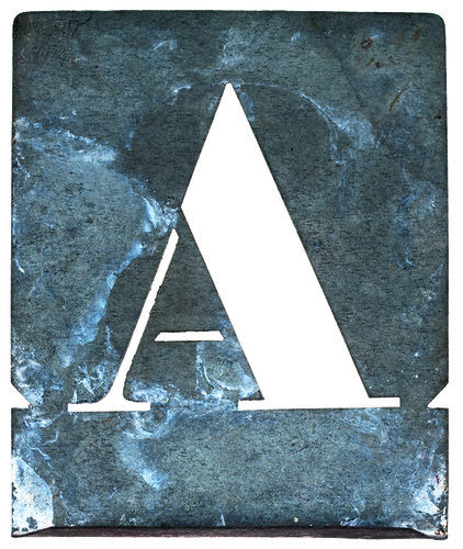
Stencil, brass, cut partly or entirely with chisels, probably made in North America. The height of the letter is 2½" (60mm).
Tools & techniques
Over the years, stencil letters have been cut with a variety of tools that tend to produce certain characteristic forms. These forms can offer starting points for typeface design.
Knives have probably been used the longest and, it seems, continuously – especially for stencils made of card or paper. The bold, sharp, sweeping forms they generate are perhaps expected (Couteau); fine, delicate, intricate forms, which one also finds, may not be. Scissors, too, can be used for stencil cutting, though they are tricky to manoeuvre inside a stencil’s cut-out parts, especially as these decrease in size. Better to use scissors not for cutting the stencil itself but for shaping letter parts (in positive) that may then be arranged to create stencil effects (Ciseaux). Another cutting tool is the chisel, in straight and curved profiles of various lengths. Its characteristic forms – segmented curves and kinked straights – are better described as faults that may or may not be a sensible basis for a stencil typeface.
Chisels were struck with a hammer through a plate into very hard wood to shape the letter. They are transitional to what became perhaps the most common tool for stencil cutting in the second half of the nineteenth century: the punch. Punches were manufactured in a variety of sizes, the smallest with grinding wheels, hacksaws and files. They, too, were struck with a hammer through a plate into hard wood. Their manufacture and use required that all unnecessary detail be removed from the punch, resulting in letters that are highly simplified (Puncho). Larger letter punches made with a raised cutting edge required less simplification (Vtg Stencil US No. 4). These are related to letters produced by stencil machines, which are die-cut. Machine-cut stencils are for the tougher end of marking and their letters are suitably no-nonsense (FF Karton).
A final stencil-making technique is etching. Here, the outline of a character is scribed into an etch ground laid onto a metal plate. Acid is then applied to the exposed metal, cutting through it to create the stencil. Etching is perfect for fine or elaborate designs and can produce stencils of astonishing delicacy.
Effects & contexts
One of the most surprising features of historical stencil work is just how fine much of it is. Letters are often precisely marked out in rich matt black ink, their edges superbly smooth, their serifs full and sharp. This contradicts what we may expect of stencil work: rough and irregular, done with a splayed, clogged brush, using a stencil plate encrusted with ink. The latter scenario is no doubt common enough, especially in workaday or industrial settings. For many, perhaps, it is stencilling of this kind that is most attractive, lending stencil letters their vibrancy, along with the speckles and smears of wayward paint or ink forced under the stencil plate or spattered around its edges. There are now large numbers of typefaces that emulate these features, to more or less convincing effect.
Apart from the roughnesses of stencil work, the contexts associated with stencil letters are also invoked by typeface designers. Stephenson Blake’s Tea-Chest (copied as East India Company and CargoCrate) was the first named along contextual lines, after the metal-lined wood tea chests once common for tea packing and shipping, which were heavily stencilled.
Some typefaces have been modelled on characters made by American stencil-cutting machines such as Bradley, Diagraph, Ideal, or Marsh. The names of these typefaces and others frequently refer to transport and freight handling: Boxcar, Cargo, Crate, Depot, In Shipment, Karton, Logistica and so on. References to the military, where stencil letters are widely deployed, also feature repeatedly among typeface names: Combat Tested, Corporal, Flak, Flightcase, Major Snafu, Militia Sans, and Shell Shock are just a few.
Typical French stencil of the late nineteenth and twentieth centuries, zinc, set no. 27, 60mm (capital height), Thévenon et Cie, Paris. Georges Braque famously used this size and style of stencil for his painting, Le Portugais (1911-12).
Architects & designers
Architects’ interest in stencil letters dates to at least the early decades of the nineteenth century, when they, together with engineers and surveyors, adopted stencils for titling and labelling technical drawings. This was mostly a British practice, and at least two decorative (tuscan) designs thus employed were adapted as typefaces in the 1940s by the graphic designer F. H. K. Henrion. Among Modernists, stencil letters and their ‘constructed-geometric’ variants also played a role in their work, especially those who trained as architects or took architectural concerns as central to their practice (Léger, Lissitzky, later Edward Wright).
Le Corbusier is the architect we probably most associate with stencil letters, so much so that they now seem entirely natural to him and his machine age architecture. And yet he was certainly not the first among Modernists to use stencil letters, nor were the Didot-like letters he chose in any way new. They were then (as they are still) typical in France, and by the time they occur in his work, around or just before 1925, they had already been in production for possibly half a century. It seems Le Corbusier left no recorded remarks about stencil letters, though one might safely conclude that their simple usefulness for titling and labelling drawings was the main reason he took them up. But their mechanical character and engineering associations must have been equally appealing as attributes wholly appropriate to his architecture.
Many modern architects after Le Corbusier adopted stencil letters for their own drawings, some no doubt on his example; in Britain they included James Stirling, and Alison and Peter Smithson. The letters used by the Smithsons were recently made into a typeface by James Goggin (not released). A number of other stencil typefaces are now associated with named designers, including Iwan Stencil (Jan Tschichold), Eames Century Modern Stencil (Charles and Ray Eames) and Calvert Brody (Margaret Calvert, Neville Brody).
Constructed-geometric
Predecessors to constructed-geometric typefaces can be found as far back as the mid-nineteenth century, when in the United States small letter punches for stencil cutting were made with machine tools. The letters were derived from the modern face and fat face letters of that era, but reduced to simple geometric elements, making them astonishingly like Futura Black and related typefaces designed many decades later. In the Modernist twentieth century, similar letters can be traced to 1915 in pochoir (stencil) work by the Portuguese painter Amadeo de Souza Cardoso, to drawings and paintings by Fernand Léger from 1917 onwards, and to the work of artist-designers such as El Lissitzky and Gerd Arntz.
Students at the Bauhaus apparently picked up on lettering like Léger’s in the early 1920s and it may be through this channel that Josef Albers, Joost Schmidt and others encountered it there. But if Léger arrived at his letters by reducing and simplifying conventional forms (as appears likely), Albers’ were achieved through a rationalised, additive process that built up letters from just three geometric elements. The result was ‘Schablonenschrift’. Albers described it as suitable for posters and other texts viewed from a distance, though its first applications (as shown in 1926, in Heft magazine) were as part of architectural schemes. These occur among other examples of Bauhaus architecture (also featured in that issue of Heft), in particular Walter Gropius’s Törten Estate in Dessau, which employed analogous construction methods based on the assembly of limited (standardised, prefabricated) components. The strategy was central to Bauhaus architecture at the time and Albers explored it further in a successor alphabet, ‘Kombinationsschrift’.
The experimental alphabets of Josef Albers precede typefaces along similar lines: Futura Black (Paul Renner, Bauer, 1929), Braggadocio (W. A. Wooley, Monotype, 1930), Transito (Jan Tschichold, Amsterdam, 1931) and Schablone (Otto Weisert typefoundry, 1931). Futura Black was favoured by Lázló Moholy-Nagy and his use of it, especially for covers of books about new architecture of the late 1920s and 1930s, reinforce the association of such typefaces with rationalised construction. But this connection was submerged under more popularistic uses that made Futura Black and the others generally emblematic of the era. They are, in any case, the parents of many constructed-geometric stencil typefaces made since.
Adaptive form
Many stencil letters appear to be adapted from existing, non-stencil letters. The technology of stencilling usually compels the imposition of breaks, and one only needs to imagine the breaks filled in to make the original letters reappear. Historically, this was often precisely the point – to get back to a conventional letter without breaks. Adaptations to create stencil letters, therefore, were often kept to a minimum, and made as inconspicuous as possible, to reduce the amount of filling in required afterwards.
It is notable that the adoption of stencil letters in the seventeenth century coincides with the growing popularity of letters that presage what we now call the modern face roman. These are surely the letters most readily adapted to stencilling, since their thin parts already tend towards breaks, which can later be easily completed.
Perhaps the most common strategy among typeface designers is to create a stencil version of a typeface that began as a conventional set of glyphs. This can be done with more or less finesse and invention. But sometimes the opposite occurs: a designer begins with a stencil typeface, to which non-stencil versions are added. Or, both versions are created in parallel, such that the stencil design is carefully planned from the start, rather than as an afterthought. The strategy suggests that the imperatives of designing stencil typefaces may be exerting some influence on their conventional counterparts.
The implied inversion of adaptive form is ‘natural’ form, typefaces in which breaks are wholly integral to the design. The breaks occur naturally, so to speak, and so no longer read as breaks, just gaps between elements. Several typefaces in this survey qualify, including A2 Bauhouse, Bery Tuscan, and Text Stencil. With the idea of natural form comes the possibility that designers of such typefaces never saw them as ‘stencil’, though they may be co-opted into the category nonetheless.
Stencil (1937), front cover of specimen, American Type Founders, ca. 1940s.
Recoveries
There are relatively few typefaces based on historical stencil letters, especially those made before the nineteenth century. This is because the liturgical books and other works in which they can mostly be found are not well known. Even less well known are the names of early stencil makers to whom specific stencil letter designs can be assigned. Jean Gabriel Bery, working in Paris in the 1780s, is an exception.
If early stencil makers working in Europe are obscure, those who took up the trade in Europe and North America in the mid-nineteenth century and later are better known, and in many cases their work can be reliably identified. In addition to the typefaces shown on this page, several others in this survey are associated with letters first made as stencils by known individuals or companies. These include Puncho (S. M. Spencer), Jeanneret (probably Thévenon et Cie), and FF Karton (Marsh Stencil Machine Company or similar).
The two typefaces named ‘Stencil’, by Ludlow and American Type Founders (now licenced to Adobe), appear to be derived from historical models. In any case, both spring from the same underlying ionic / clarendon origins, though their proportions and weights differ. Such letters became typical and effectively standardised in North America in the mid-nineteenth century when they were manufactured as steel punches, which were then widely used by stencil cutters. In the late 1950s and early 1960s, these letters were made iconic in the paintings and sculptures of Jasper Johns and Robert Indiana, both of whom had studios in the same district of lower Manhattan where earlier stencil businesses had been located.
Outliers
Some typefaces that may at first seem peripheral to the mainstream of stencil typeface design are either central to it historically or suggestive of areas where more typefaces would be welcome.
Composite. Why are the French so good at letters built up from separate, overlapping elements? The approach was exploited by early French stencil makers who cut letters in two parts, which when stencilled sequentially resulted in letters without breaks. In the late 1920s, A. M. Cassandre employed a composite approach for the two-colour (double) version of Bifur (Deberny & Peignot, 1929). Pierre di Sciullo has also explored the idea with great style.
Non-Latin. Type designers living in south and east Asia or who have visited the region confirm that stencilled letters and texts are common there, especially for public signs and markings of all kinds. Yet at present there are very few stencil typefaces based on South Asian or Southeast Asian scripts. There may be several reasons for this. One is that in many places indigenous signwriting (where stencils are used) is still a manual trade for which digital stencil typefaces may be of little obvious value. Designers also report that stencil breaks can be more disruptive to the integrity of particular (especially Indian) scripts than is the case with Latin, Cyrillic or Greek.
Gothic. The earliest known stencilled letters (fifteenth century) were of a textura design. The underlying construction of gothic or blackletter scripts, derived from separate pen strokes and lifts, make them amenable to stencil effects. Styles such as rondes and rotundas are historically present in stencil form but are rare as typefaces.
New directions
Where can stencil typefaces go?
R. S. Hutchings was convinced that if enough high-calibre typeface designers directed their efforts towards them, the stencil ‘convention’ (i.e. breaks) still had much to offer. The intervening years have proven him right.
Form. As long as there are designers to make them, inventive new stencil typefaces will follow. Some may emerge from within historical or contemporary spheres of stencil work, others will no doubt draw on non-stencil sources conducive to stencil effects.
Technology. Type technologies have been exploited to alter the features of stencil typefaces, such as the width and visual impact of breaks, or their number and position. As yet, no typeface is capable of generating randomised rough effects.
Three dimensions. When stencil letters are cut into the third dimension of built structures, they achieve a kind of completeness that is only implicit when they are two-dimensional. They become spatialised, blocking light and letting it pass, demonstrating that sometimes stencil letters don’t really exist at all, but are only a surrounded absence. Three-dimensional work can compel designers to create stencil letters that anticipate their context and thereby merge perfectly with the structure they become part of.
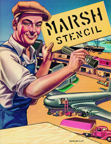
Marsh Stencil, catalogue for stencil cutting machines and supplies, Belleville, Illinois, ca. 1947.
Eric Kindel, editor and associate professor, University of Reading
First published in Eye no. 86 vol. 22 2013

Eye is the world’s most beautiful and collectable graphic design journal, published quarterly for professional designers, students and anyone interested in critical, informed writing about graphic design and visual culture. It is available from all good design bookshops and online at the Eye shop, where you can buy subscriptions, back issues and single copies of the latest issue. You can see what Eye 86 looks like at Eye before You Buy on Vimeo.