Spring 2009
Borderline
Metahaven makes visual proposals that suggest a new role for graphic design in public life
Metahaven is a new kind of graphic design team. This self-styled ‘design think tank’ is such a departure from conventional forms of practice that it is unlikely many designers have heard of them yet, particularly outside the Netherlands. Nor do they go out of their way to provide colleagues with entry points into their concerns and methods. A Dutch design historian who tried looking at their peculiarly awkward website (www.metahaven.net) confessed to me, with good reason, that its fragmentary structure perplexed her. It would be easy to dismiss the team – graphic designers Daniel van der Velden and Vinca Kruk, and spatial designer Gon Zifroni – as arcane experimentalists whose activities have nothing to do with the realities of practice.
This would be a mistake. Metahaven is one of the most theoretically informed, strategically adept and articulate groups of thinkers operating in graphic design. Their way of working is implicit in the authorship paradigm of the early 1990s, now out of fashion, but they take this to a new level of intellectual sophistication and conviction. Seen from the right angle, without commercial preconceptions, their critique of branding, identity and national borders is entirely coherent. In the five years since Van der Velden began the ‘Meta Haven Sealand Identity Project’ (see ‘The floating signifier’, Eye no. 53 vol. 14) as a funded researcher at the Jan van Eyck Academie in Maastricht, where he was a student in the 1990s, they have initiated a fascinatingly diverse range of research projects, organised conferences, conducted interviews, published essays and taken part in exhibitions, collaborating with intellectuals and policy-makers located far from the usual territory of graphic design.
Metahaven grew from a frustration with graphic design’s well-worn paths. When Kruk graduated in 2003 from the Willem de Kooning Academie in Rotterdam, she faced essentially two choices: work for the larger, more corporate companies, or go into the cultural field, which in her view was already explored to the limit. ‘But there wasn’t a space in graphic design where I felt there was a field for theory or something that you could develop without it being finished,’ she says, in the Amsterdam studio she shares with Van der Velden (Zifroni, not present, works in Brussels).
‘There is an ultra-short incubation time that every piece of graphic design has to go through,’ adds Van der Velden. At the end, the message is focused and anything deemed to be extraneous is eliminated. ‘We need a space where we can work on things without there being this funnelling or bottleneck moment where that happens.’
Sealand, a Second World War fort in the North Sea used for a time as a digital ‘data haven’, provided a metaphor for the kind of outpost they sought in design, a refuge where they would be free to think above and beyond practice – a ‘meta haven’ (they later ran the words together). Van der Velden, then still working in partnership with Maureen Mooren on projects such as Archis magazine (see Eye no. 45 vol. 12), appointed Kruk as a researcher on the Sealand project and they used the Jan van Eyck Academie’s infrastructure to organise events and invite speakers.
The unexpected destruction of the twin towers and the crushing shock of the terrorists’ attack on New York -- particularly for a generation that had grown up in the West during years of peace and security – was a life-changing event that forced Van der Velden and Kruk to see the world in a new way. The levelling of this world-famous ‘logo’ of capitalism made previously abstract discussions of iconography, ideology and representation violently real.
If the catastrophe began Van der Velden’s politicisation, he cites Empire (Harvard University Press, 2000) by the political theorists Michael Hardt and Antonio Negri as the tool that honed his understanding of the implications of globalisation as an all-encompassing capitalist empire. Van der Velden’s reading of Marxist writers shifted his political point of view ‘five kilometres to the left’, and the work of social thinkers such as Anthony Giddens, Chantal Mouffe, Scott Lash and Ulrich Beck confirmed that strategic positions held in the design world had already been theorised.
Kruk takes a slightly different view. ‘I’m much more interested in developing design languages addressing different political viewpoints, and in the discussion about them, than in promoting a single ideology,’ she says.
In her second year at Jan van Eyck, Kruk carried out research into new uses of post-communist architectural icons such as Nicolae Ceausescu’s vast Palace of the Parliament in Bucharest. Van der Velden began the Logo parc project, about an attempt to construct a ‘Manhattanesque’ business park next to Amsterdam, which led to a computer-generated 3D model of the site – ‘a critique constructed as a model’. Zifroni applied to become a researcher on the project, once again funded by Jan van Eyck, and joined them.
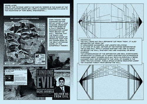
From the Ryugyong Hotel in North Korea (a huge unfinished concrete pyramid) to Osama bin Laden’s hypothetical Tora Bora command centre and the Royal Air Force’s Menwith Hill monitoring station, many of their projects target unusual architectural sites rich in political and symbolic meaning.
Uncorporate identity
For about a year Metahaven’s status was unclear, but by the start of 2006 they knew that they wanted to continue working together. In 2007, Van der Velden ended his working partnership with Mooren, and Metahaven became an enterprise primarily dedicated to research interests. Eighteen months on, he admits that the idea of a total break with commercial work was naive. ‘There’s no such thing as abstinence in design – that’s given to monks and other purists,’ he says. Today, the studio is kept afloat by teaching, workshops and lectures; grants for exhibition and publication projects from embassies, consulates and institutions such as the European Cultural Foundation and the Mondriaan Foundation; and income from writing and design commissions.
They recently worked on a website for the Venezuelan embassy: ‘They were very open and strict at the same time.’ A project for the Netherlands Architecture Institute, consisting of publicity materials for an installation and a series of events to create a stronger relationship between the NAI and the city of Rotterdam, sounds less satisfactory. ‘You find out that their marketing department is absolutely not prepared to deal with a deeper discussion of what they are doing, or what the project might mean,’ says Van der Velden. Offered a flexible identity that could look either luxurious (elitist) or cheap (socialist) as the occasion required, the NAI’s marketing team was interested in only the elite component of the proposal. ‘At some point you want the thing you proposed or otherwise nothing, which is alarming. You become less willing to compromise and negotiate on details.’
Notions of branding and identity are central to Metahaven’s research, and this includes their own. ‘We’re working to get ourselves known outside the design field and outside the visual field, actually,’ says Van der Velden. They contacted Peter van Ham, author of the influential essay ‘The Rise of the Brand State’ (Foreign Affairs, 2001), and now director of global governance research at the Clingendael Diplomatic Studies Programme in The Hague. An interview with Van Ham, as well as conversations with other thinkers, will feature in Uncorporate Identity, their forthcoming book for Birkhäuser, which they describe as a ‘manifesto for design under globalisation and a workbook of essays, narratives and truisms investigating the ambiguous state of identity and branding today’.
In October 2008, Metahaven were invited to Tallinn by the Estonian Design Center to join policy-makers, marketeers, advertising people and designers, to ponder the former Soviet republic’s national brand.
‘The idea of an outside view is strongly idealised in [small] countries,’ says Van der Velden. ‘A brand cannot be produced by someone from Estonia. It has to be Wally Olins or Interbrand or one of these agencies which have this expertise. In that, you can see again this post-historical ideology that the only thing you can connect to is the West.’
To demystify and satirise the nation-branding process, they made a number of quick visual proposals based on the Tallinn discussions and presented them a few days later as a lecture and in an Estonian cultural newspaper. In an essay for the online art journal e-flux, inspired by these experiences, they examine the two political ideas that now inform place branding – ‘soft power’ and ‘network power’ – and argue that state branding has yet to see ‘critical, alternative, or counter-hegemonic approaches’.
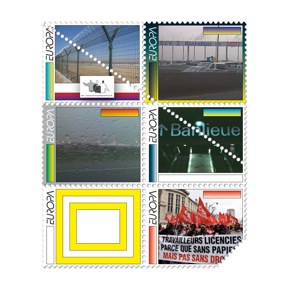
Another recent project, Affiche Frontière, for the CAPC Musee d’art contemporain in Bordeaux, took their concerns with national borders and supranational identity into the street. Metahaven created a series of ten posters for the street furniture used to carry advertising and these were displayed along the ring road that encircles the city, forming a boundary between the centre and the outskirts. ‘The ring is the demarcation line of a looming conflict,’ they write. ‘Its infrastructure is ready to be politicised.’
Each image responds with graphic urgency to the idea of borders around and within Europe. In one poster, Metahaven transform the phrase ‘L’Europe qui protege’ (The Europe that protects), used as the slogan for France’s European Union presidency, into a question: ‘L’Europe qui protege de quoi?’ (The Europe that protects from what?).
Each MUPI (mobilier urbain pour l’information) has a more visible and more expensive ‘A’ side, used for commercial advertising, and a cheaper ‘B’ side, usually used for cultural posters, representing another kind of division, and Metahaven set out to gain access to some of the more favoured positions. ‘In the centre of the city there are more expensive brands on the commercial side than on the commercial side in other areas,’ says Kruk. ‘So this system produces other borders in the city.’
For Metahaven, it was important that their posters were allowed to intrude into some of these premium ‘non-cultural’ positions, a demand that required delicate negotiation between CAPC and Bordeaux city hall, and MUPI owners JCDecaux and Clear Channel Outdoor Advertising.
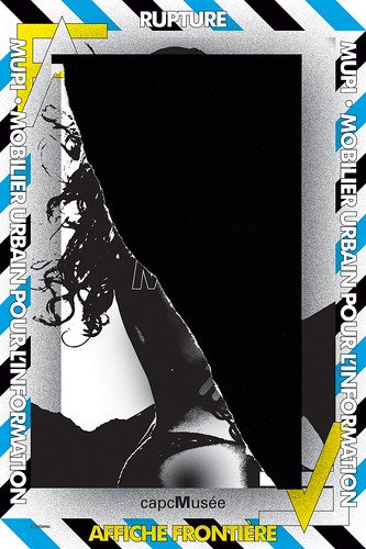
The posters, each bordered by fierce diagonal slashes, like mutated warning signs, exemplify Metahaven’s graphic approach. The designs are simultaneously raw and ambiguous, loud and enigmatic, deliberately unsettling. Their painterly qualities, accentuated by screenprinting, might make them look more like art than information design, especially in the context of a gallery project, but Van der Velden is adamant that they are not art. The posters break with the conventions of poster-making because they are not products of the system that normally generates street posters and because new kinds of information require new kinds of form. They are still design. ‘If you say, “OK, now it has become art,”’ he concludes, ‘then it has also become useless for the discourse.’
Van der Velden admits that in the early days of Metahaven, style was still a pressing concern for him – ‘it was much more about the role of exuberance, almost a longing for a new Gothic’ – and ‘Gothic’, with its suggestion of intricate formal density and emotional power, is the right word. His essay ‘Crypto Logo Jihad’, first published in Metropolis M magazine, is a loving analysis of the ‘symmetrical maze of jagged forms’ and the systematic illegibility seen in the overwrought logos of black metal bands. He has been a fan of metal, punk, grindcore, industrial and experimental music since his teens. As Van der Velden notes, Metahaven’s sometimes discordant and difficult visual style attempts to strike its own balance between hammering and poetry: ‘If you hammer too much it becomes too much like noise and if it becomes too poetic you lose the tension of the density of ideas.’
In five years, Metahaven have progressed much further towards reconfiguring the design studio as think tank than any other graphic design team I can name. The precedents for this way of working are mostly architectural: the radical Italian team Superstudio (which they cite as an influence) in the 1970s; British architect Nigel Coates’s NATO (Narrative Architecture Today) group in the 1980s; the Dutch firm MVRDV from the 1990s to the present.
Industrial designers Anthony Dunne and Fiona Raby, based in the Design Interactions department at the Royal College of Art in London, advocate design as a form of speculative research presented as proposals, models and exhibitions. Metahaven’s work likewise shows how graphic design can transcend its usual roles to become a medium of inquiry realised through visual form – they take care to stress the visual dimension of the outcome. They have teaching commitments at the Arnhem Academy of Art and Design (Kruk), and at Yale and the Sandberg Institute in Amsterdam (Van der Velden), and a more permanent academic base would serve their research goals. The inevitable danger, though, with the ‘safe haven’ provided by academia is that it can become a destination in itself.
Asked what they are trying to accomplish through their projects in relation to the political sphere, they suggest that they see themselves not as exponents of a particular ideology but as reporters, attempting to filter and explain the time they live in. Although there is potentially a place for the designer as researcher / reporter, radical political awareness implies position-taking and, beyond that, some form of action – otherwise what is it for? Certainly, the consistently political nature of their research and writing presupposes an audience actively concerned, as they are, with issues of policy and ideology, and how they are represented in visual form. If this new kind of graphic-related research is to focus on matters of wider public concern, then its audience should be the public. It will be interesting to see how Metahaven deal with the political logic and strategic implications of their analysis as their think tank develops.
Rick Poynor, writer, Eye founder, research fellow, Royal College of Art, London
First published in Eye no. 71 vol. 18 2009
Eye is the world’s most beautiful and collectable graphic design journal, published quarterly for professional designers, students and anyone interested in critical, informed writing about graphic design and visual culture. It is available from all good design bookshops and online at the Eye shop, where you can buy subscriptions and single issues.