
Winter 2009
Depth of field
chezweitz & roseapple are the new scenographers, who persuade museum curators to take the integrated approach.
Recent years have seen a transformation in the image of public museums, with elitist and scholarly priorities giving way to accessibility, entertainment and the pressure to increase visitor numbers. There can be no doubt that visiting an exhibition is now an ‘experiential’ leisure activity, which in turn presents opportunities to graphic and architectural designers to collaborate in the creation of spaces that do the very opposite of ‘dumbing down’. And yet, surprisingly, museum curators and commissioners as well as perhaps designers have been slow to recognise the potential for joint creative expertise in this field.
chezweitz & roseapple (cw&ra), the Berlin-based partnership between architectural design (Detlef Weitz) and graphic design (Rose Epple), has in the space of a few years managed to convince major international institutions of the merits of an integrated design approach to the animation of narrative space. cw&ra prefer to use the term ‘scenography’ rather than ‘exhibition design’. The term has gained currency since the Expo 2000 in Hanover because, drawing on the traditions of theatre design, it refers to spatial dramaturgy as an integrated process.
Their approach is successful because they work from the outset with the curator, shaping the content of the displays as well as the form, thus lifting the role of the designer beyond that of a form-giver. ‘We become dialogue partners of the curators, and the design develops out of this dialogue. These are quite personal working relationships, which need time to develop. If a designer just gets to design a poster, this sort of trust cannot develop so easily,’ says Epple.

Weitz and Epple started their careers within different disciplines. Epple studied illustration with Chris Corr at Central St Martins, London. Weitz studied architecture at the Technical University in Berlin and then in Ottawa, but he considers the opportunities offered by the autonomous cultural spaces of Berlin after reunification as his springboard into professional scenographic practice. Both of them were looking for something bigger than being ‘just’ an architect or designer and wanted to find a way of working with architectural form, light, film, typography and image in order create the Gesamtkunstwerk, or total artwork.
Introduced by a mutual friend, Weitz and Epple collaborated on work for clients such as the Bauhaus Dessau Foundation and the Dresden Hygiene Museum, and formalised their partnership with the creation of the company Chezweitz & Roseapple in 2006. Those institutions have continued to be important clients, and today cw&ra’s portfolio also boasts clients such as the Hayward Gallery in London, the Wexner Center for the Arts in Ohio, the Moderna Museet in Stockholm, the Louisiana Museum of Modern Art in Denmark, and Munich’s Pinakothek. Their biographical trajectories coincide with the increased pressure on cultural institutions to find novel ways to present material, particularly in the case of the fine arts, to younger audiences accustomed to following multiple narratives but perhaps less switched on to artists’ monographs.
Purists may balk at the idea of designers ‘dramatising’ displays where postwar tradition has demanded neutral surroundings for their full appreciation. However, the white cube (or black box) has not always been an imperative. European 1920s avant-garde artists such as El Lissitzky, Herbert Bayer, Walter Gropius and Frederick Kiesler engaged with the notion of articulating the observer rather than simply the objects (see ‘From object to observer’, Eye 61 Autumn 2006). In recent years, the V&A in London has started to remove the lino floors and plain ceiling coverings of its rooms to reveal the decoration in which exhibits were originally situated, defying the notion that objects or artworks must be viewed in staged isolation.
The work of cw&ra sometimes attracts the criticism that too much is demanded of the viewer, who is compelled to engage with a multiple narrative. Epple explains it in terms of ‘making the exhibits talk to you … the narrative of the scenography should help you listen to the exhibits.’
cw&ra perceive exhibition graphic design as a potentially three-dimensional space in its own right. Besides the conventional branding devices which create a visual unity between physical and printed space, Epple also makes use of graphic ‘surprises’ in a way that provides continuity with the architectural and curatorial narrative.
Sometimes it is the simplest architectural and graphic language that is the most enjoyable, in the sense that it somehow relaxes visitors instead of making demands upon them. For the Max Ernst exhibition at Stockholm’s Moderna Museet in 2008, cw&ra collaborated with the leading Ernst scholar, Werner Spies. The treatment of the artworks was duly reverential, using colour and light as a foil to the dense textures of Ernst’s work, functioning both as a structural device and an implicit allusion to the fantastical concerns of the proto-Surrealist. But it was the transition between graphics and architecture that was most notable. Printed colour on the reverse of the captions and coloured light behind some of the display panels – which were slightly raised from the wall – created the effect of colour shining out from the white surface behind.
The Ernst catalogue was more audacious in its colour play: ‘There were endless discussions about the catalogue, whether one is allowed to crop a painting or bleed it to the edges or put something on it, which is quite funny considering that these avant-garde artists rebelled against all rules,’ says Epple. There was eventual consensus and the photographs were graphically treated so that the light colours could seep in from the gutter. There was also the suggestion of chance in the way the colour fell, but also something fittingly anti-aesthetical in the way it disrupted the original image. The chapters themselves were organised in the same chronological sections as the exhibition. Through the means of this very subtle graphic technique within the binding, the corresponding light colours appeared to emanate between the pages from the spine of the book.
Less subtle but equally simple and powerful was the central motif for the Pasolini exhibition ‘P.P.P.’ at the Pinakothek, Munich, in 2005-06, which played on the association of Pasolini with public scandal. The initials P.P.P (Pierre Paolo Pasolini) were made in the form of an exhibition brand reminiscent of Hello magazine. Pasolini’s prediction of the destructive role of mass media consumption was articulated across all aspects of the exhibition and its promotion, with posters set into newsstands and exhibition information given in the form of a tabloid.
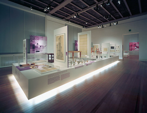
‘Bauhaus: a Conceptual Model’, which ran in its Berlin realisation from July until October this year, re-appropriated many of the Bauhaus visual codes that are often lifted wholesale in Bauhaus communications, in particular referencing Bauhaus researches on colour and the systemisation of design. Visitors were referred to the three ‘foundation forms’ of triangle, circle and square, which were used as entry and exit points, and a constellation of these forms became part of the graphic identity. The most satisfying re-appropriation (interestingly, the closest to Bauhaus original research) was the formation of the free paper map of the exhibition, which, as it unfolded, revealed all three forms simultaneously.
The Bauhaus exhibition (designed with Isabel Prugger and Hans Hagemeister) was the latest in a line of close collaborations with the Bauhaus Foundation in Dessau, who joined forces with the two other key German Bauhaus research institutions: the Foundation Weimar Klassik and the Berlin Bauhaus Archive. The architectural construction suggested the evolution of the school as it moves through three major phases of location and philosophy, ending in a discomforting combination of Miesian stylishness and claustrophobia as the Nazis close in and darkness descends. The spectral progression through the space was a reminder for even the least scenographically conscious visitor of the school’s gradual evolution – an immense political and cultural journey from beginning to end.
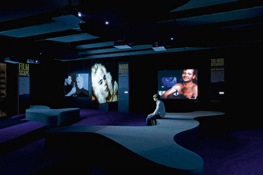
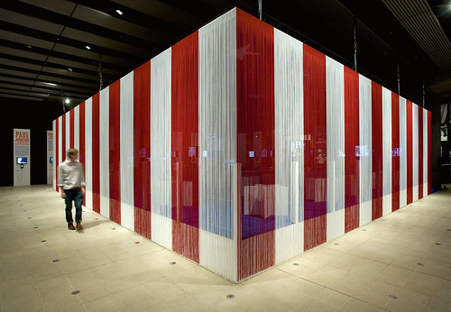
‘Bauhaus: a Conceptual Model’ had 166,000 visitors in just two-and-a-half months. However, it wasn’t cw&ra’s first large-budget ‘blockbuster’; they were commissioned to realise the Andy Warhol ‘Other Voices, Other Rooms’ exhibition (shown in Amsterdam, Stockholm, Ohio and London in 2008-09). The Warhol scenography was fittingly brash and exaggerated, and visitors could feel the pleasure that Weitz himself, not given to understatement, had in its conception.
Star-shaped seats and captions, stars-and-stripes bead curtains and the use of Hoefler & Frere-Jones’ Cyclone and Knockout fonts, reminiscent of neon advertising, played up the American dream and showbiz. Proliferation, duplication, ostentation and the invitation for the visitor to surf restlessly across the exhibits (which were multiples rather than originals) reflected perfectly the spirit of the artist.
The achievements of the collaboration between Weitz and Epple in a short space of time are remarkable, and almost seem to take the pair by surprise. While acknowledging their success they are not over-confident, which perhaps arises from the fact that just two designers are challenged with all the responsibilities that come with these complex collaborations, which invariably involve dozens of players.
The Berlin location is relevant here: the city offers a vast pool of low-paid (often unpaid) top creative talent coupled with famously low rents. It is not clear whether under the commercial pressure of a financial metropolis cw&ra could enjoy the freedom of exhaustive creative research and a knee-deep cutting-room floor. The team of freelancers hired to develop their ideas is so flexible that it can shrink and expand from two to fifteen within a day. This is typical of Berlin’s creative economy, which relies on the precarious existence of freelance professionals. Individual co-workers at cw&ra talk of rapid burnout and the need to ‘recover’ from each project.
I asked Weitz and Epple where they would like to go next: ‘It would be great to “do” a whole museum, including all aspects that create an atmosphere of a public space, such as opening times, gastronomy, the outside, visitor interactions, all forms of communication etc.,’ says Epple. Weitz is also thinking about how scenography can be moved on to a new plane, recognised as a form of communication in its own right. How do we exhibit scenography? As Berlin gradually and inevitably loses its unique, quirky and provincial character, which is such an attraction for so many itinerant creative people, and begins to resemble other European capitals, it will be interesting to see how chezweitz & roseapple position themselves – as designer duo, or international agency.
First published in Eye no. 74 vol. 19.

Eye is the world’s most beautiful and collectable graphic design journal, published quarterly for professional designers, students and anyone interested in critical, informed writing about graphic design and visual culture. It is available from all good design bookshops and online at the Eye shop, where you can buy subscriptions, back issues and single copies of the latest issue.