
Spring 2013
Learning on location
Linda Kwon looks at ways to learn about type beyond the conventional classroom.
The lessons learned outside the classroom are often the ones that have the biggest impact on our education. And that applies to typography, where valuable knowledge can be acquired by changing one’s surroundings and observing letterforms in context, connecting with peers and engaging in dialogue. There are now a number of workshops worldwide that try to achieve those aims.
The variety of typographic educational destinations is immense, from idyllic islands to the gritty urban backdrop of London or New York. Those seeking a more specialised type adventure can choose between calligraphy, typography and letterpress printing in Italy, design history explorations at the Bauhaus in Germany, or typeface design supplemented with study of non-Roman script letterforms in India or Japan.
The Reading connection
It is no coincidence that many of these programmes have links to Reading. Reading University’s Department of Typography and Graphic Communication began regular pilgrimages to Italy and Northern Europe in the early 1970s under the tutelage of the course’s founder, Michael Twyman. These ‘vacation courses’ were inspired by Twyman’s memories of the art history trips to Italy that had sparked his interest in inscriptions back in the mid-1950s. He described this method of relocating the classroom as an ‘indispensable element in Reading’s typography programme. There is really no substitute for seeing real inscriptions in context: the whole experience demonstrates in a heightened and specific way the part played by lettering in the past.’ [1]
Garrett Boge, typeface and letter designer – and Reading postgraduate alumnus – founded the Legacy of Letters tours to Italy in 1997, together with Paul Shaw, design historian, letter designer and instructor at Parsons School of Design and SVA (School of the Visual Arts) in New York. Each tour is a concentrated ten-day programme, in which participants learn techniques in calligraphy as well as the fundamentals of setting type and letterpress printing. Trips to churches, museums and libraries provide the context and concrete examples for a study of the history of the Western alphabet, via ancient inscriptions and medieval manuscripts; lush Italian vineyards are among the backdrops.
Typography Summer School is a London-based programme which aims to bridge the gap between education and professional life – it is akin to a typography finishing school, targeting recent design school graduates who are looking to sharpen their skills further. The designer Fraser Muggeridge (see Eye 75), who also teaches at Camberwell College of Art and on the MA Book Design course at Reading, saw the need for a programme that would allow students to work on a project for an actual client. At the outset, students are presented with a brief that they work on over a week, building up to the final critique that concludes the course. The idea is, in part, to boost students’ confidence and presentation skills by having them create and present ‘small achievable typographically led projects’. In some cases, the projects have led to placements and the chance to see work carried through to production.
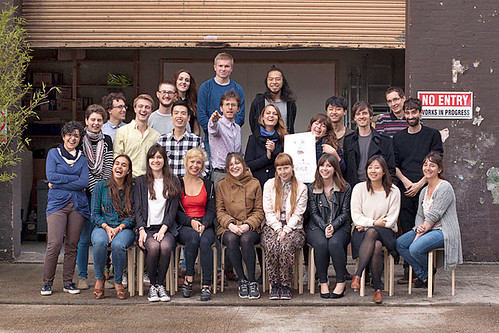
Typography Summer School 2012. Week one group. Photograph: Ollie Stockbridge.
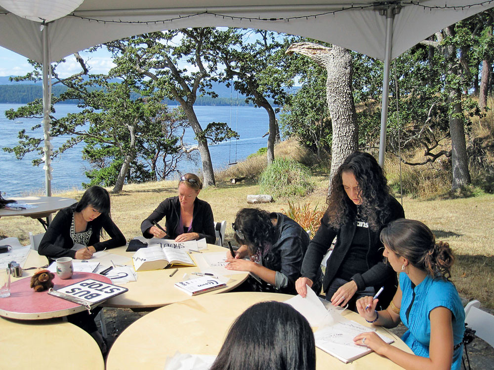
Top: Tiffany Wardle de Sousa leads a hand lettering project in the outdoor waterfront studio at Type Camp Galiano Island, 2009. Photo: Stephen Coles.
The original idea was to bring together students from the various graphic design schools around London and the UK; in fact, the programme has attracted an international mix. Muggeridge, also a Reading graduate, has aimed to provide an intimate learning environment, in contrast to the 50+ mega-sized classes that have become common in British undergraduate design programmes. Prices are lower than comparable programmes, to keep the school accessible. Gourmet frills may be left out, but the programme doesn’t scrimp on guest lecturers, who have included Ken Garland, David Pearson and A Practice for Everyday Life (aka Apfel). Past participants have cited the opportunity to meet and learn from some of their design heroes as one of their main reasons for applying.
This summer, Typography Summer School will be offered in New York City for the first time. The New York programme is the result of a collaboration between Muggeridge and Ryan Waller, a designer at Other Means studio and a visiting faculty member at Pratt Institute in New York City, who had been recommending Typography Summer School to his students.
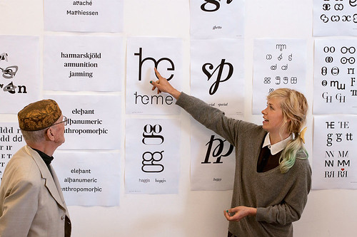
Typography Summer School 2012. Netta Peltola presents the results of a one-day workshop with Ken Garland. Photo: Ollie Stockbridge.
Cross-cultural immersion
Type Camp International was born out of a slightly different motive. Shelley Gruendler, a US typographer, designer and educator with a PhD (subject: Beatrice Warde) from Reading – wanted to give students space for experimentation, allowing them the freedom to make mistakes. While academic design programmes may be rooted in traditional measurements of ‘success’, Type Camp was founded in 2007 on the principle that ‘learning typography can be a freeing experience, rather than a limiting one.’ As Gruendler and Type Camp India instructor Dr Rathna Ramanathan explain, ‘If deadlines, grades and clients are removed from the situation so that experimentation and exploration can be a priority, then the possibilities for innovative and unique solutions are unlimited.’ [2]
According to Gruendler, ‘Type Camp is a catalyst for new ways of thinking. It’s all about seeing new possibilities.’ That is what Laura Worthington found: she applied because ‘I knew I still had a lot to learn and was at a place where I was stuck. When you are self-taught, you miss out on the valuable insight of others who have been down the same path you want to follow.’ The advice she received at Type Camp led to her award-winning typeface Hummingbird. [3]
Type Camp draws from a broad spectrum of participants, including design professionals and typeface designers as well as those outside the field of design interested in learning about typography. It has a wide geographical spread, too: over the years it has been offered in such varied locations as Brazil, California, London and Galiano Island, near Vancouver; this year, Type Camps are taking place in Australia, India, Canada and Japan. The global spread matters, as the ability to bring a multilingual awareness to graphic design and typography becomes more and more relevant. Zenab Bastawala, a graphic designer in Sydney who is starting the MA Typeface Design programme at Reading this autumn, discovered that she had a head start in type design because her ethnic background has provided her with fluency in three scripts, Arabic, Indic and Latin. Type Camp India encourages designers to ‘immerse themselves in a culture and philosophy outside of their own, thereby extending themselves as both human beings and as designers,’ say Gruendler and Ramanathan (who also studied at Reading). During the camp, students are able to explore non-Roman scripts through an introduction to Tamil.
Shared experience
But students learn more than skills: Aileen Lord travelled from Melbourne to Type Camp Bauhaus to hone her type skills, but ‘I came out with a sense of design legacy. Type Camp has shown me that as designers we have the opportunity to create something bigger than ourselves.’ For Wayne Thompson, Type Camp Australia participant, ‘The shared experience of fifteen people camping, eating and sharing type talk together is not to be underestimated.’
Drawing on Reading’s legacy of transporting the classroom beyond four walls, these typography programmes are making connections between typography of the past, present and future, and across cultures and borders, bridging the gap between the classroom and the wider world.
1. From an interview with Michael Twyman by Garrett Boge on LetterPerfect.
2. From the essay ‘Type Camp India: Pluralism in Design Education’ by Shelley Gruendler and Rathna Ramanathan.
3. Hummingbird (2012), a script face with contextual alternates, won the Communication Arts 2013 Typography Annual Typeface Design Award. Hummingbird can be found at MyFonts.com.
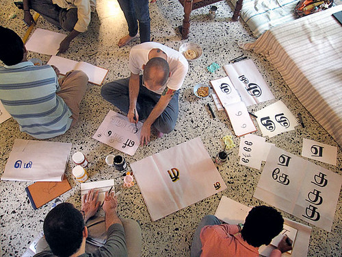
India Type Campers work with local sign painters to refine their Tamil lettering skills at Type Camp India, 2009.
Linda Kwon, metadesigner and writer, London.
First published in Eye no. 85 vol. 22 2013

Eye is the world’s most beautiful and collectable graphic design journal, published quarterly for professional designers, students and anyone interested in critical, informed writing about graphic design and visual culture. It is available from all good design bookshops and online at the Eye shop, where you can buy subscriptions, back issues and single copies of the latest issue. You can see what Eye 85 looks like at Eye before You Buy on Vimeo.