
Winter 2011
Old school layout
Every fortnight, art director Tony Rushton and editor Ian Hislop lay out Private Eye in a way that’s hardly changed in 50 years
For three days every fortnight, Private Eye’s production team gather in the magazine’s top-lit studio in Soho to put the issue together in an eccentric combination of old-school paste-up and desktop computer layout.
Much of the satirical magazine’s copy is created in-house, written by hand on sheets of pink paper that are dropped into wire baskets. Designers and layout subs then type up the stories on their computers and set them in the appropriate type style: from single-column jokes to two-column pastiches of other papers and mags.
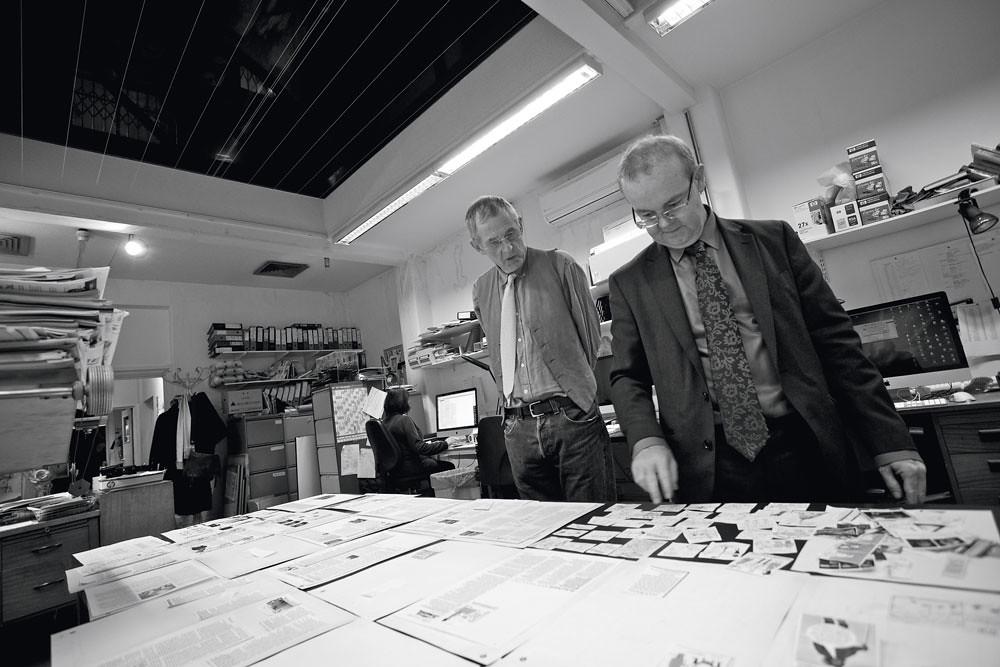
They print out and trim the items for art director Tony Rushton and editor Ian Hislop to arrange on a layout pad in the centre of the room, along with cartoons, photos and bits of regular artwork. ‘I’m sure it’s quicker this way,’ says Rushton. ‘It’s easier to read a piece, that size, in your hand rather than going over to a screen and getting it up.’
The topicality of its contents means that speed is essential: ‘Ian likes to be absolutely on the ball. We go to press on Monday night and we’re on sale in Tesco’s on Tuesday morning … everything is condensed into the last few days.’
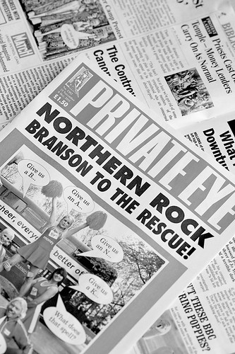
Cover of issue 1302.
Top: Rushton (left) and Hislop contemplate their creation in the airy, top-lit studio at the back of Private Eye’s Soho office. Photo: Phil Sayer.
If you ignore the row of huge monitors, the process is not that different from the way the magazine was assembled nearly 50 years ago, when Matthew Carter devised a basic grid for Private Eye and designed its masthead.
Nicholas Luard, who owned the Establishment Club with satirist Peter Cook, had taken a stake in the magazine and asked his designer friend to knock it into shape. (For a while, it was produced in the waiters’ changing room of the club.) Luard envisaged a glossy like Queen or Town magazine. Happily, Carter persuaded him otherwise.
‘My real contribution to the design of Private Eye was to make sure it was not designed,’ Carter says. ‘I did, however, make a couple of suggestions that were adopted. I cut up some of the earliest issues and pasted the pieces in a dummy to show how features that recurred in every issue could appear in a predictable place. This gave the layout a slight orderliness and consistency that replaced the original style of “betting-shop floor”, as co-founder Willie Rushton described it.’
Carter also designed the masthead nameplate (first used in May 1962), and an alphabet he describes as ‘a piece of nameless juvenilia that only ever existed as cut and pasted stats’. Both are still in use: Tony Rushton says that when ‘He Who Must Be Obeyed, great God of typographical design’ [i.e. Matthew Carter] gives you something – in this case, a sharp, clean bromide of nameplate and alphabet – it is unwise to change it.
Rushton started as ‘general dogsbody’ in 1962 – at the invitation of managing director Peter Usborne, he insists, and not ‘through the back door’ because he was Willie Rushton’s cousin – doing layout and ad production. For a few years in the 1960s he unsuccessfully combined the roles of art director and managing director.
Private Eye was part of a wave of alternative / anti-establishment mags produced with camera-ready artwork. New technologies – offset litho, dry transfer lettering, the ‘golfball’ typewriter – made production cheaper and more flexible than that of the New Statesman or The Spectator, which were still printed using hot metal type.
Letraset, which Rushton discovered via a giveaway sheet with the Architectural Review, was, he said, ‘a huge step forward’, but he still keeps a library of type catalogues and specimens to photocopy, cut up and re-assemble when needed. ‘A huge amount of the variety of the type is because we’re parodying other publications.’
Fiftieth anniversary issue, 2011.

On the day of our visit (a quiet Thursday as opposed to a manic Monday), designer Bridget Tisdall and sub Megan Trudell are laying out the less time-sensitive features: a Daily Mail pastiche with the headline ‘Is Dawn French worryingly thin?’ and a ‘Nursery Times’ feature about the governor of the Bank of England.
Each story is set as a separate InDesign file, printed out and handed to Rushton. When Hislop arrives later in the afternoon, the two put the pages together from the raw materials: cut and paste without the Cow Gum.
‘I think there are universal things about layout,’ says Rushton. ‘The end is the crucial thing we’re after, not the means. I have a constant battle with the editor … because the first ten pages [the ‘colour section’] are produced and designed in a day. And it’s mad because he wants to get all these good stories in and there is this need to keep a balance … Then again the middle section of the magazine, which we call the jokes, is a wonderfully movable feast and that’s what gives me the most pleasure because it’s a constant change, every joke piece is approached differently.’
When they made the jump to InDesign, the production team were anxious that the readers’ experience should change as little as possible. So the rules between columns and stories, previously hand-drawn with a Rotring pen, were scanned and added to page files as images. A close look at recent issues reveals computer-generated rules and boxes, but the pages retain the tightly packed grid of text and images Carter prescribed in 1962.
In addition to the grainy photographs and regular comic strips (‘Yobs’, ‘Celeb’) there are up to twenty spot cartoons in each issue. In his 50 years there, Rushton has dealt with all the leading British political cartoonists, starting with Michael Heath, Gerald Scarfe, Ralph Steadman and Barry Fantoni in the 1960s. And he has continued to find and champion younger contributors, such as Jon Link of Modern Toss (see Eye 75).
‘It’s difficult to know what turns them on to cartooning,’ Rushton says. ‘I think some of them could be stand-up comedians manqués, who can’t quite make it but have that flow of gags. A lot of them, unless you really discipline them, will send in twenty gags.’
The Carter typeface and masthead, now digitised, make Private Eye instantly recognisable on British newsstands. Are the words ‘redesign’ or ‘relaunch’ ever muttered? ‘They are,’ says Rushton, ‘and mocked. If you’ve got something that works, then don’t change it.’
When Eye published a blog post about Private Eye’s V&A exhibition, magCulture’s Jeremy Leslie posted a link to the piece, commenting: ‘Private Eye has an art director – who knew that?’
Rushton reacted to this back-handed compliment by likening the design to good tailoring: ‘A £2000 suit from Savile Row should be so quiet and so elegant and so perfectly made that it doesn’t jump at you.
‘I’ve always seen the Private Eye design as an evolutionary thing, parallel with that of the Porsche 911, because that’s a 1960s car which is still very much liked but it’s just gradually changed and improved.
‘The crucial thing is that in the 1960s Private Eye was a more visual magazine than it is today. We carried less text and more illustration. As we’ve grown up, we carry more to read. Given the fact that we now have sales of more than 200,000, we’re obviously doing the right thing!’
John L. Walters, Eye editor, London
First published in Eye no. 82 vol. 21, 2012
Eye is the world’s most beautiful and collectable graphic design journal, published quarterly for professional designers, students and anyone interested in critical, informed writing about graphic design and visual culture. It is available from all good design bookshops and online at the Eye shop, where you can buy subscriptions and back issues.