
Summer 1995
Reputations: Peter Saville
Peter Saville
Pentagram
Brett Wickens
George Hardie
Dan Fern
Mick Brownfield
Malcolm Garrett
Herbert Spencer
‘This is a post-design era. It’s deliberately going against all those things that were canonised in the 1980s and are now exhausted.’ Interview by Rick Poynor
Peter Saville was born in Manchester, England, in 1955. He studied graphic design at Manchester Polytechnic from 1975-78. In 1979, he was a founder partner of the independent record label Factory Records for which he developed an identity and image that were to prove influential well beyond the music business. His relationship with the company lasted until 1991. From 1981-83, Saville was art director of the Dindisc record label in London, where he was responsible for identity, packaging and marketing. His early sleeves received immediate acclaim and he won three silver awards in the 1981 D&AD Awards. In 1983, Saville established his own studio, Peter Saville Associates, with regular collaborator Brett Wickens. During these years, music industry clients such as Roxy Music, Ultravox, Peter Gabriel and New Order were joined by institutional clients such as the Whitechapel Art Gallery, London, the Pompidou Centre, Paris, and the French Ministry of Culture, as well as fashion clients including Yohji Yamamoto, Martine Sitbon and Jil Sander. In 1990, Saville closed his studio and joined Pentagram’s London office as a partner. He continued to work with existing clients while carrying out projects for the Natural History Museum, London, and Channel 1 in Los Angeles. The relationship did not work out and, in 1993, Saville, accompanied by Wickens, left Pentagram to join Frankfurt Balkind’s Los Angeles office as a creative director. In 1994, he returned to London, where he works as a freelance for British and European clients, including London Records and the Italian bag and luggage maker, Mandarina Duck.
Rick Poynor: You returned to London last summer after an abortive year at Frankfurt Balkind in Los Angeles. What went wrong?
Peter Saville: I think it was partly that my commitment to being in Los Angeles was questionable. It would have been much healthier to have been in LA for twelve months as an individual, and if I wanted to stay then having discussions with a company. Even though I was familiar with LA, I completely underestimated what it meant to live there and how far away it is, and I began to realise that there weren’t so many people in LA that I actually wanted to work for.
RP: Presumably the company found your notorious working habits – the late starts, non-arrivals and all-nighters – pretty baffling.
PS: It baffled Pentagram when I was there, it baffles me actually, and of course in America, with the American work ethic, it’s just unheard of. I have a real problem with going to work for the sake of going to work. When I have to produce something, I do it. When I don’t have work to realise, I’m looking for what to do. In a way, I work all the time, but I’ve never disciplined myself or been in a situation that disciplined me into going to office at 9:30 in the morning and staying there until six o’clock and then going home.
But there were some mitigating circumstances. There was little for me to do at Frankfurt Balkind. I was there pursuing an almost intangible concept. I hadn’t thought through who the clients were going to be.
Many people say to me, ‘Well, you’re better off out of Pentagram.’ And I am better off – so are Pentagram. And with the things that have happened since leaving Frankfurt Balkind, I can only say that I’m better off out of Los Angeles too. Perhaps I should have had the sense not to get involved in the first place, but it seemed worth a try, just as it seemed worth a try at Pentagram. But neither situation was right for me. It’s better for me to be an independent consultant and leave implementation and back-up to people who enjoy it and cause less trouble for the system.
RP: Like your contemporaries, Neville Brody and Malcolm Garrett, you have received a great deal of recognition and by this state in your career you might have expected to become, if not the new establishment, then certainly a more central figure. But somehow it hasn’t happened. What are your feelings about that?
PS: That’s absolutely right and it’s something I’ve thought about many times. In some ways we are an establishment – thought I didn’t realise it until recently. You work away through your 20s and into your 30s thinking, ‘My contemporaries and I will never get our break.’ And then, interestingly, something happens, which I don’t think you can imagine when you’re younger, and that is that the previous generation, who are the establishment, finally fall off the top and purely by this process of elimination you do eventually become the establishment. It was comforting to realise that when you’re in your late 40s and 50s you will be one of the few who are deemed ‘suitable and appropriate’. It’s just the natural process of evolution.
The more critical point you are touching on is, I think, a circumstance of the design business as it has developed over the last ten years. In some ways, graphic design is still a young profession. The 1980s came only a decade or two after graphic design as we now think of it gained recognition in Britain. The 1960s generation became the establishment of a profession that they invented. They wrote the rules as they went along and led the clients with them. As ever, another generation came through which was in some ways radical compared to the previous one. But there was no new ‘corporate’ client-base for the next generation. I was among this group and we were full of alternative ideas, but these were raw thoughts – not mature philosophies – and by the time the mainstream was in synch with our thinking, our ideas had been absorbed into the culture of the existing design establishment and assimilated into their strategies. By virtue of being the first ‘established’ consultancy generation, this was an impediment that our predecessors has not confronted. Our commercial viability and visibility, and what we intrinsically had to offer through our understanding of our generation, were later hijacked by all those younger new design groups who were really just a splinter division of that establishment. Almost ever week through the 1980s you would hear about a company that has just been set up by designers from Michael Peters with an account executive from Fitch – and they were already working for W.H. Smith. Well, they always had been … probably always will be.
RP: How have these insights affected your own relationship with more mainstream clients?
PS: Well, I think it’s important not to feel bitter about reality. You can’t help but wise up as you get older. I have recently been working with a major television station in Germany on a review of their identity. There was a feeling – implied, not stated – that anything was possible. But of course it wasn’t. The latitude for change was terribly limited. As a high-rating station they had an investment in their identity. Who in their right mind is prepared to gamble with that? All you can possibly do is try to solve any practical problems, subtly enhance the identity and nudge its image towards the future, You realise why the men in suits say they’re not interested in innovative creativity. It’s because they can’t afford to be. They can’t afford to change the identity of the station overnight unless they’re prepared to invest heavily in supporting that change and in the media campaign to accompany it.
RP: But you are nevertheless still primarily looking for situations that will allow for, as you put it, innovative creativity?
PS: Is somebody asked me to consider incremental improvements to the packaging of Spaghetti Hoops, the implementation is unlikely ever to appeal to me, but the thinking involved would intrigue me. I’m very happy to apply my mind to all kinds of communications and visual problems, but I find the carrying out of a lot of the work tedious. I was completely sploit by my first five years working and only wanted to do things that I enjoyed doing and that would prove incredible freedom.
RP: How important was the music to you during those early years?
PS: It was massively important – in the abstract sense – in that pop music is something you wish to be associated with when you’re young. It’s the single most powerful form of popular culture. So it’s an incredible stimulus, an opportunity you must grasp. That said, it’s important – I’ll use some marketing-speak now – in a branding sense to know how you feel about each particular band you’re working for. If it’s a kind of music, a brand, that you personally love, that helps. It may be a brand that you hate, but you have to be detached and professional. You have to understand a Peter Gabriel customer whether or not you are a Gabriel customer yourself. These days it’s harder than it was 15 years ago. There are more scenes than anybody can know – it was relatively simple back in 1980.
But I never used to base my work literally on the music, Because of lead times, the first chance you had to hear the finished music was six to eight weeks after you should have started the design. I based the work on my knowledge of the client and the category their music fell into, but more importantly, on what I felt the visual aspirations of the group’s audience to be. Those covers were very carefully positioned – they were ‘pitched’ at a perceived audience.
RP: Sometimes in the early days you said you were using the covers as a way of learning about the history of graphic design, but more recently you have described them as acts of ‘appropriation’ parallel to what was happening in the art world. Which was it?
PS: Both. I’ve found myself accounting for the work in different ways at different times, depending on what people were able to appreciate. Appropriation – in the post-modern sense – has never really been understood by the journalists of the music or graphics press who wrote about the work. I find myself talking to people now who seem to understand it, but between 1980 and 1985 they didn’t understand it at all. You would say things that didn’t go into print. People just glazed over.
RP: So what was the thinking behind your use of appropriation?
PS: You have to remember the design climate back in the 1970s. In British popular graphics, music and fashion there was a spirit of revivalism, recycling and retro-chic – dressing up in 1950s clothes, having your hair cut short, buying Bakelite radios. My feeling is that the twentieth-century fin de siècle started in the early 1970s as a reaction to contemporary culture having finally run out of steam – the 1960s being to my mind the last bright burst of modern spirit. From a young person’s point of view, the things that were in a way avant-garde in the early 1970s were David Bowie, Roxy Music and movies like Bonnie and Clyde. When you lose confidence in your own time you seek comfort in another time. The cutting edge graphic designers in London at the time were George Hardie, Bush Hollyhead and Dan Fern, the airbrush illustrators Mick Brownfield and Philip Castle and art directors such as Nick de Ville who did the Roxy covers.
As a chronically groovy wannabe, I was desperately keen to know what was going on in music and fashion and graphics and art. I had a wonderful art teacher at school who said, ‘You should do graphics.’ Many times afterwards I’ve thought, ‘Maybe I should have done photography. Maybe I should have been a fashion designer.’ At college, one thing that made me different from the other graphics students was that I was more interested in what was going on in other departments – in fashion, photography, product design and architecture. Around 1974, Roxy were the single biggest influence in my life – from hairdressing to fine art all points were covered. I had a good grasp of Pop and they were the quintessential living expression of Pop Art.
I had – and to some extent still have – more a fashion designer’s or stylist’s sensibility than a graphic designer’s. The fashion world has a readier understanding of what’s happening. Fashion’s existence is dependent on reference and reinterpretation, season after season. You see a radically new look perhaps once every ten years, usually accompanying real sociological change or technological development. The rest of the time, in between these major changes, everybody’s going through little changes, just for entertainment.
RP: And for your generation, Punk was a movement of radical change?
PS: Punk itself, as a look, was really only a moment’s aberration. For six months, Punk was like the parting of the Red Sea and anybody who was fit and ready enough could run through. By association with certain people in Manchester I got pulled through the gap. But the look of Punk didn’t offer much hope for a fresh graphic language – this is where Malcolm [Garrett] was to be invaluable. Malcolm had a hard copy of [Herbert Spencer’s] Pioneers of Modern Typography. The one chapter that he hadn’t reinterpreted in his own work was the cool, disciplined ‘New Typography’ of Tschichold and its subtlety appealed to me. I found a parallel in it for the New Wave that was evolving out of Punk. In this, as it seemed at the time, obscure byway of graphic design history, I saw a look for the new, cold mood of 1977-78.
Of course, the whole point with appropriation is knowing what to do, and when. Try to find the graphic design house that didn’t have a Bauhaus book on its coffee table by the mid 1980s – you wouldn’t have found one in 1978 or 1979. In 1983, when I put flowers on the cover of Power, Corruption & Lies, we hadn’t seen flowers in pop culture since the 1960s. But [fashion designer] Scott Crolla was buying Sanderson fabric and Georgina [Godley] was running it up into dresses and there was this buzz about Flower Power coming back.
So for me, the door to graphic enlightenment was this book, Pioneers of Modern Typography. My entire education about the art and design movements of the twentieth century, other than Pop, began at that point. Every time I found something that really touched me, I was eager to express it.
RP: Apart from fans of the music, the art community seems to have understood this work more readily than other designers.
PS: Well, they pick up the references and they don’t have a problem with the idea of appropriation. In the post-modern era, the notion of plagiarism didn’t come into it. If Jeff Koons took a photograph of a Nike ad and put it in a gallery, at the time nobody called it plagiarism. He was obviously making a statement about Nike and the art market. To me, it was better to quote Futurism verbatim, for example, than to parody it ineptly – it was a more honest, more intellectual and in a way more artistic approach. It was so literal and so obvious that it never crossed my mind that people would think that I had invented this work. But some did. People were shocked because they thought I had created an original and were disappointed to discover that it was reinterpreting a previous work. I think they were missing the point.
RP: At what stage did you become aware of post-modernism as a cultural idea?
PS: In 1978, while working on the second Factory poster. On a trip to London I picked up a book of Philip Johnson’s proposals for the AT&T building in New York. On the cover was the broken pediment. It made me think that maybe I wasn’t wrong in wanting to use Tschichold’s later work – that and a John Foxx album cover for Ultravox [Systems of Romance] with serif type on a black background. Within 12 months, neo-classicism and the influence of architectural post-modernism were everywhere. People in New York were buying columns to out in their apartments. My contribution was the graphic equivalent. It was always an emotive feeling and after a year or so I began to trust my senses. I didn’t need to wait for supportive signals and became brave enough to take a step myself, but nearly always informed by some historical reference.
RP: Did you ever read much of the theory?
PS: I’ve never read much of it because I always find art criticism gets too heavy to read through. The funny thing is that the art world didn’t really speed up until the early 1980s. The fascinating thing was then seeing what that school of early 1980s artists in New York did with the thinking.
RP: When did you first see Julian Schnabel’s 1980 painting Ornamental Despair, with the detail from your cover for Joy Division’s album Closer?
PS: Robert Longo told me to look at it. I didn’t know it was happening at the time. I met Robert around 1983. He said ‘What you’ve been doing for the last five years has been an influence on me and a lot of my New York contemporaries.’ Robert told me about Schanbel’s velvet Closer painting and said that the music of Joy Division was a major inspiration. They were interpreting the same theme, as art. I found that all the way through the 1980s I could predict the phases of New York’s art. Neo-Geo was particularly obvious. I wish I’d had the confidence to go and do it, but I was not brave enough.
RP: Do you view your work as a kind of art?
PS: Yes, it is in certain examples where the innovation was the appropriation. But I’m happier with the pieces where I created a genuinely new image or a new combination of things, as in Power, Corruption & Lies where I began to mix A and B, instead of just presenting A or B. Then the whole period around New Order’s Substance in 1986-87, because that was when I felt really compelled to produce something new. Reference and retrievalism were no longer appropriate.
You have to remember there was never a brief, never a problem to solve, and clients who had no time to make any input and were confident that I would come up with the input anyway. Given those circumstances, what can you do except your own thing? And my own thing happens to be a synthesis of what’s going on at the time expressed through the graphics medium. I can’t paint it, I can’t sculpt it and I have great difficulty turning it into three dimensions. I’m dependent on the methodology of graphics to realise my ideas.
So it is a kind of art and that body of work in particular motivated motivated some people to say ‘Peter, why aren’t you making this as art?’ And 1988 onwards was a very sobering learning process about what made something art. It may not be art, but defining it and ultimately selling it as art is another thing altogether. I spent a couple of years tentatively considering the art market and came to the conclusion that with art, it doesn’t really matter what you do. As long as you’re prepared to give up your day job to do it, it will be your art. But if you only do it at the weekends, it’s a hobby.
So one of the things I’ve been doing over the last few months is reassessing who I am in the scheme of things, and I’ve tried not to burden myself with the demands of a studio or staff or company or business. And some interesting questions have occurred to me: the outside world may see a distinction between being an artist and being an art director, but do I see a distinction? Why do you have to do it the way it’s always been done? Do you have to fit into a known category? If I made art I would use the same media that I always use.
RP: What are the sources of your recent designs, based on photo library shots, for the New Order singles and the album Republic?
PS: Immediately prior to this had been the longest period I had ever spent in Los Angeles – six weeks doing the identity for Channel 1. In 1992, the idea was circulating that perhaps the mass media had become our new avant-garde. American art has run out of energy and the really interesting new European art, which was going to come out of London, had yet in impact. For twelve months there was the curious fascination with Hollywood. And I was thrilled to be there soaking up the influences, but there was nowhere much for them to go because I was at Pentagram, with few outlets for freeform activity.
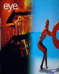
Then I found myself with a New Order campaign. It was a commercial album and I knew that visual ‘entertainment’ would be a requirement. I showed the group perhaps 200 visual references – things cut from magazines, bits of type, photographs, written pieces, cartoons, digital things, anything that said ‘1992 / 1993’. One particularly LA category I called ‘PCH’ – ‘Pacific Coast Hi-way’. Just one image from ‘PCH’ was all that they could agree on, out of 200 possibilities. The only context in which I could imagine using the images was in juxtaposition with others, as in [Dan Friedman’s] Artificial Nature, creating some kind of narrative.
For the first time I had a tape of the tracks, so over Christmas I drove to a beach, listening to one track a day. I played word association – feelings, moods, anything – and wrote them down. The result was a list of almost 100 topics which were dispatched to the photo libraries. Every day was like Christmas! I’d go into Pentagram and there would be this stack of images to look at. Out of every 50 pictures there would be one or two. I wanted cowboys and along came these guys. I wanted burning buildings and I got this one. We had no idea at this point how they would go together, but what was evolving in my mind was a post-LA experience: television culture, mass-media overload, the irony and wild juxtapositions of channel-surfing, where you flip from CNN to MTV to the Shopping Channel to something quite horrific on the news. Brett [Wickens] scanned a few into Photoshop to try out the ‘blend’ function and suddenly a narrative had entered our project. It’s LA, it’s a riot, it’s Nero fiddling while Rome burns, and the juxtaposition of the two images – fire and water – becomes the Los Angeles experience.
RP: What was the American response to this work? One American admirer of your early covers I spoke to didn’t like them at all.
PS: They are more likely to get it in the art world than they are in the design world, where they are still nostalgically in love with design. This is a post-design era. It’s deliberately embracing the photo library and it’s going against all those precious things that were canonised in the 1980s and are now exhausted. This is like plastic clothing. It’s a sort of coming to terms with the trashy realities of our time and saying, OK, there is an aesthetic here, let’s work with it. Let’s stop pretending that our world is antique papers and woodblock type. The real world is a Whoopi Goldberg movie. So what can we find there to talk about and work with?
RP: Are you still as enthusiastic about the Hollywoodisation of the information business as you seemed a while back?
PS: I’m not so enthusiastic about Hollywood from an image point of view. Republic was styled in a way that was both a parody and also a tribute to that look. I’ve worked through that and I think some more interesting threads have emerged from popular culture since the early 1990s.
My professional theory was that as communication design becomes increasingly screen-based, Hollywood – where there is a deep pool of talent in filming, lighting, editing, mixing, casting and so on – would become involved in multimedia production. In practice, nothing has changed to alter that theory, except that multimedia is in a much longer development stage and implementation cycle than anybody was facing up to. Everyone was excited about it and wanted to believe that multimedia and interactive television would be the normal course of events within 18 months. If it had happened that quickly you probably would have found more communications design going on in LA as a response. But because it is taking so much longer it’s probably fair to say that other places, which have the same kind of talents but perhaps not the same depth, will become equally competitive.
RP: So where do you see yourself fitting in?
PS: I really don’t know. To be horribly honest, as a graphic designer the one period of my life when everything felt right and fell into place was from 1978 to perhaps 1986, the period during which I was doing record covers and happy to be doing record covers. I had the benefit of being considered successful at it and I had some recognition. But in 1986 I was 31 and that is a fairly critical age. The time had come to go somewhere else.
There is no shortage of things for me to do with my life, but what should you be doing to be happy? In order to answer that I think you have to find out who you are. Over the last ten years there has been a lot of asking myself, ‘What is it that I do?’
RP: You are currently based at Tomato [see Eye no. 13 vol. 4]. Their freewheeling approach seems the opposite of your own poised and classical work. How did this come about?
PS: When I saw you there a year ago I was briefly back in London for a few weeks. I had been doing a commercial in Paris. I knew John [Warwicker] and I was hearing all the noise about Tomato, so I went there to see what was happening. John was very welcoming. After various trials and tribulations, and needing to find a place to do work, I went back and talked to John, who said, ‘We’ve talked about you and feel it would be interesting for you to be around.’ As you know, there is no room in there, it’s a mad atmosphere, it’s not the best working environment, but the energy and charm of the people and the edge to what they’re doing – that’s really compelling.
RP: You’ve been appointed as communications director of the Italian manufacturer Mandarina Duck.
PS: It’s a major commission for me. Between the end of October and December 1994 I thought ‘the Factory Records of my later life may be Benetton.’ But that didn’t happen. Then along came another enquiry from Italy, providing me with an opportunity, for a year or more, to create an important international campaign. This is a good project for me to be involved in. It will demand input from many different people – other designers, photographers and image-makers – and that will be really interesting.
Rick Poynor, writer, Eye founding editor, London
First published in Eye no. 17 vol. 5, 1995
Eye is the world’s most beautiful and collectable graphic design journal, published for professional designers, students and anyone interested in critical, informed writing about graphic design and visual culture. It is available from all good design bookshops and online at the Eye shop, where you can buy subscriptions, back issues and single copies of the latest issue.