Autumn 2010
California panorama
Emigre’s latest type catalogue uses historical sources to display wildly varied fonts with rollicking gusto. Critique by Rick Poynor
Emigre type catalogues have always offered more than the average type specimen. As each new booklet arrives, it forms another piece in the constantly evolving but somehow always consistent and immediately recognisable graphic identity that is the Emigre project. One day someone should do a book about these typographic gems. Emigre’s endlessly resourceful co-founder Rudy VanderLans, the living template for the designer as editor / author / entrepreneur, is probably already planning it.
VanderLans’ latest type specimen, Historia, is something of a hybrid. For years now he has been taking photographs, and since Emigre magazine ceased publishing in 2005, this has become his primary interest. These pictures surface in several self-published projects, such as his trilogy of books about southern California inspired by the music of Van Dyke Parks, Captain Beefheart and Gram Parsons, and in Supermarket (2001), his most elaborate photo book to date, based on six years of road trips to the Mojave desert.
VanderLans is a photographer of places and atmospheres, and his picture-making provides a pretext for exploring a local environment he clearly adores. As an émigré himself, the former Dutchman Ruud van der Lans – these days a naturalised us citizen – brings an outsider’s eternal fascination to the strangeness of the landscape that became his home.
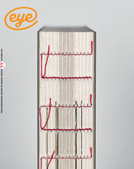
The Historia specimen started out as a plan to publish a larger book with thirteen panoramic scenes of battlefield locations from the US-Mexican war of 1846-48, which led to the US annexing California. Having toured the state and completed the pictures, VanderLans decided to insert captions and notes into the images to supply background information, in the style of nineteenth-century depictions of historical sites. Mixing and matching Emigre typefaces, he created a series of typographic labels, which became so congested they supplanted the pictures they were supposed to explain. The project was put on hold until the Emigre team realised it could be used to demonstrate font combinations from their library.
The photographs are shown so small (95mm wide) that it is hard to judge them fairly, though the entire drift of the project suggests that VanderLans does not believe they work as pictures on their own merits. A battle, often little more than a skirmish, might have occurred long ago in these locations, but the areas tend to be built over now and there is nothing of great interest to see, while the tiny scale sabotages any sense of panorama.
Because the presentation of the pictures lacks conviction, I found it hard to become involved in VanderLans’ texts about his site visits, though I normally enjoy his writing. It may be that this particular concept does not travel well and you need to be Californian – or Mexican – to identify with it. On the Emigre website, we learn that a reader has already written to tell VanderLans where to find a historical marker for the La Mesa battlefield in Vernon, CA.
Nevertheless, this booklet is one of VanderLans’ finest type specimens. He has long been a highly inventive and original typographer, although his decision to focus his talents exclusively on Emigre products has led him to be less highly regarded as a designer than he should be. For Historia, he created thirteen typographic panoramas, one per battlefield, with each shown in its entirety and as a full-page detail. These ‘labels’ are ravishing little patchworks, as richly textured and juicy to sample as the antique stock and bond certificates and orange-crate labels that inspired them.
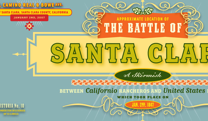
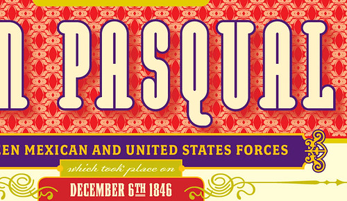
In his introduction, VanderLans mentions that customers often ask which typefaces from the Emigre library might be used together. He sidesteps any such prescription, arguing that the issue of suitability is largely a matter of context. Historia more than proves the point with a gallery of 39 wildly varied Emigre fonts, from Frank Heine’s Dalliance to Zuzana Licko’s Modula Round Serif, as well as a generous quantity of flourishes, ornaments and patterns. Each label has a coherent graphic image embroidered around the battle’s name, each one is different, yet their styles correlate and harmonise as part of a series. On the Emigre site, where they are displayed, clicking on a typeface within the label brings up the full character set – a useful touch.
Historia takes un-ironic pleasure in its historical sources while remaining a creation of its time. It displays warmth of colour, a brilliant command of detail and nuance, an uninhibited love of embellishment, and a devil-may-care, rollicking gusto that leaves a lot of contemporary graphic design looking short on visual ideas, undernourished and pale.
Detail from the Battle of San Pasqual in Southern California.
Top: Detail from a spread about the Battle of Santa Clara, ‘a skirmish’ in central California.
Rick Poynor, writer, founder of Eye, London
First published in Eye no. 77 vol. 20 Autumn 2010.
Eye is the world’s most beautiful and collectable graphic design journal, published quarterly for professional designers, students and anyone interested in critical, informed writing about graphic design and visual culture. It is available from all good design bookshops and online at the Eye shop, where you can buy subscriptions and single issues. Eye 83 is out now, and you can browse a visual sampler at Eye before You Buy.