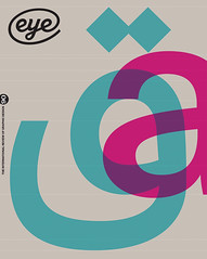
Summer 2015
Editorial Eye 90

The wider world’s interpretation of type and typography can be broad, vague, prejudiced, opinionated, highly fanciful and charmingly enthusiastic. Typefaces and fonts are often celebrated in social media, and hashtags (such as our own #TypeTuesday) demonstrate that the word ‘type’ can embrace everything from chalkboard scrawls to distressed wood letters, taking in signwriting (like that of Pete Hardwicke), calligraphic swirls and rusting typewriters along the way.
In this milieu, everyday text type – for comfortable reading on page or screen – is the Cinderella, obliged to remain in the shadows, doing the chores. Yet the challenge remains to make contemporary readable fonts like Fred Smeijers’ Quadraat, the one we are using throughout this special issue.
Our Reputations interview with Smeijers asserts the importance of practical research, an approach that has also guided the work of James Mosley. In ‘Beyond Latin’ we examine the challenges of making non-Latin typefaces and families – designers freed from older technical limitations now face the demands of new markets, both global and local.
City ID’s Moscow Metro project shows the potential of type to unify a city’s transport system. And in ‘Counter intuition’ Cyrus Highsmith discusses the value of teaching type design to students – not to turn them into type designers, but as a way to make them better typographers.
John L. Walters, Eye editor, London
First published in Eye no. 90 vol. 23, 2015
Eye is the world’s most beautiful and collectable graphic design journal, published quarterly for professional designers, students and anyone interested in critical, informed writing about graphic design and visual culture. It is available from all good design bookshops and online at the Eye shop, where you can buy subscriptions, back issues and single copies of the latest issue. You can see what Eye 90 looks like at Eye before You Buy on Vimeo.

