
Winter 1993
Stop sitting around and start reading
Postmodern typography sees the reader as an idler in need of short sharp shocks. But is reading really so passive a process?
Graphic designers used to have straightforward reasons for what they did. Paul Rand, for instance, could say, ‘If it looks terrific, then that’s all I care about. After the looks, and strictly of secondary importance, comes client approval.’ [1] Marcello Minale was equally clear: ‘The core of our philosophy is that design is based on self-expression.’ [2]
As these simple credos have come to seem thin, more complex but equally designer-centred explanations have filled the vacuum. Michel de Boer of Studio Dumbar strikes a now-familiar note: ‘Design should not be too easy, either to do or to see. The receiver of the message should be made to work, forcing them to think about what they see.’ [3] And if this disciplinarian injunction still sounds over-simplistic, more sophisticated versions are available. Michèle-Anne Dauppe has invoked ‘the post-modern condition’ and ‘radical approaches to communication’ which ‘attempted to engage the audience with the text, to make the audience ‘work’, and to emphasise the ‘construction’ of meaning. Radical typography might aim not to flow seamlessly, legibly, but to halt and disrupt, to expose meaning and language as problematic.’ [4] Rick Poynor suggests a Paris-Michigan lineage: ‘“The Cranbrook theorists” aim, derived from French philosophy and literary theory, is to deconstruct, or break apart and expose, the manipulative visual language and different levels of meaning embodied in a design.’ [5]
The visual style associated with these positions could (very loosely) be called ‘postmodern deconstructed’, or pomo for short. The pomo claim is that reading is passive, uncreative, one-dimensional, and that readers are underchallenged, too lazy to discover that meaning is undecidable. Typographers should goad them to work – typically by removing familiar landmarks, by laying obstacles, diversions and false trails, and by recognising that ‘the cry of “legibility” masks a reactionary attitude against progress, change or critical intervention.’ [6]
The tone of these claims – of idlers in need of short sharp shocks – may sound familiar. But they pre-date both Thatcherism and pop deconstruction, and were made by book artists long before Barthes and Derrida featured in lifestyle pages. Joel Roth wrote in 1969 of a ‘new use of typography … based on erratic type arrangement which pulls the reader in as an active participant, and makes reading a creative act rather than passive absorption of information.’ [7]
A variant on this theme is what Sharon Poggenpohl, editor of Visible Language, curiously calls ‘content-responsive typography’. It is preferred in her journal because: ‘People read less, they obtain more of their information from other media … contemporary readers who are distracted by more dynamic modes of presentation demand … more responsive typography.’ [8]
These assertions deserve a response. First, there is little or no evidence to support them. The evidence we have about reading points to the contrary: that ‘reading’ is a highly complex set of activities, working on many levels – from the relatively automatic one of eye movements to the intentional levels of navigating, monitoring, sampling and selecting. When people read they make strategic choices, constantly generating inferences and hypotheses – about intention, relevance, tone of voice, and so on. Far from being passive and mechanical, reading is typically active and purposeful. (And all this is uncontroversially in line with post-modern theories of signifying practices which argue that each reading is a re-writing.)
Second, when pomos generalise about reading they often hide undeclared assumptions about what kind of readers they have in mind. They are less likely to imagine people deprived of literacy and its promises than a more comfortable fraction of the population favoured by designers as ‘target audiences’. (What if readers are old, or visually impaired, or not very good at reading, or poor, or ignorant of their rights?) They rarely describe what kinds of reading form the object of designing, but seem to exclude educational texts, reports, forms, specifications, walkers’ guides, catalogues, price lists, reference books, maps, diagrams, food and medicine labels, dictionaries, timetables, schedules, user manuals, and so on. Pomos appear to prefer something bracketed off within a more privileged ‘literary’ or ‘artistic’ category.
Third, ‘content-responsive typography’ – today justified as a response to the alleged demise of reading – seems little more than a new label for a well-worn rationalisation. Marinetti’s hasty perceptions and screams do not need quotation here, but Vincent Steer may be less familiar. A founder of the British Typographer’s Guild in the 1930s, he recommended that ‘a detective story might read more convincingly in a matter-of-fact typeface like Scotch Roman. A book intended to be read by a doctor or scientist might suitably be set in a precise and pedantic type like Bodoni Book, while a light novel … would call for a more robust typeface.’ [9]
Fourth, the tale of a lost golden age (once people read, now they watch videos) is here implicated with a competitive account of design, in which readers’ choices are mediated by the free market. To survive the hazards of that market, messages have to be ostentatiously differentiated to draw attention to themselves, better to encourage readers to discriminate within an array of shopping opportunities.
Sceptics might ask: of all the sources of knowledge about reading and communication (cognitive psychology, ethnology, ergonomics, discourse analysis, feminism…) why have typographers defaulted to those which neither offer nor require evidence? To ones which permit them to ‘theorise’ reading as passive osmosis, to marginalise readers (mere receptacles) and at the same time to foreground the act of designing (explained as the ‘challenging’ of empty vessels)? Whose interests do such theories serve?
Although typographers may sprinkle their utterances with post-modern ferments (and perhaps, when business improves, the more expansive inflections of management-speak), their reflexes still draw them towards homelier territory. What could be more natural for young prizewinners than to describe their student days in epic terms: ‘It was very academic … and it gave me an incredible grounding in type. But I had to fight to be creative.’ [10] We know from Hollywood – remember Charlton Heston’s The Agony and The Ecstasy and Kirk Douglas’ Lust for Life – that it was ever thus.
Not much has changed. Once designers just wanted to look good; now they also want theories to justify looking good. To graduate into the creative elite they must first make a visibly personal mark. This designer-centred romance, which pomo designers share with Paul Rand and Marcello Minale, is endorsed by Hermann Zapf, who enthuses that ‘typographic creativity can be expanded … as long as it is controlled by people with knowledge and taste.’ [11]
Designers’ insensitivity to users is not unique to typography. Donald Norman reviews industrial design: ‘A good way to find out what the design world cares about is to read the magazines of industrial design. ID is a fascinating magazine, with clever innovative design. But I detect little interest in making design usable, functional, or understandable.’ [12] And Ted Nelson, who put hypertext on our Macintoshes, is unimpressed by developments in design for interaction between people and computers: ‘It is nice that engineers and programmers and software executives have found a new form of creativity in which to find a sense of personal fulfilment. It is just unfortunate that they have to inflict the results on users.’ [13]
Critical reasoning about design has always offered alternative – modest but more challenging – forms of explanation. In 1968 the British Working Party on Typographic Teaching reported that inadequacies in design education arose mainly from treating the subject as ‘a form of personal visual expression … Consequently, many unspectacular areas of design … which play an important part in our lives are either not designed at all or are designed badly.’ [14]
In 1970 Anthony Froshaug – practising, teaching and writing from the margins – reviews a showcase of ‘pioneers’: ‘“Modern” typography is not a mode; it consists in a reasoned assessment of what is needed, and of what somehow is done, under certain constraints. When technical and social constraints change, the important thing is not to spray a random pattern on the page but to assess the new, with the old, requirements of the text.’ [15]
Two decades later, in a final provocation, Otl Aicher argued that when ‘typographic signs become mere graphic material used as a kind of formal “quarry” for symbols and textures … then writing is reduced to nothing more than an aesthetic object.’ [16]
Does any of this matter? Most graphic designers have managed to get by without explanations much more complicated than ‘just do it’. But traditional graphic design has probably had its day, and is unlikely to survive – except perhaps as a ‘heritage’ craft – the more demanding questioning it now faces. The challenge for designers, still, is to explain. ‘Because I like it this way and hope that other people will too’ or ‘because it expresses my feelings’ may be fair explanations for relatively content-free designing. And while inadequate for design tasks which involve active readers with questions and purposes of their own, they at least have the virtue of honesty. What we are offered, in their place, is a mixture of personal preferences and designer-centred ideology. To elevate this to the status of a theory on design for reading is just another step on a false trail.
1. Paul Rand, cited by James Woudhuysen, Blueprint, September 1989.
2. Marcello Minale, Design no. 489, September 1989.
3. Michel de Boer, cited by Graham Wood, Desktop Publishing Commentary 7, 1991.
4. Michèle-Anne Dauppe, Eye no. 3 vol. 1, 1991.
5. Rick Poynor, Typography Now: The Next Wave, London: Booth-Clibborn Editions, 1991.
6. Michèle-Anne Dauppe, Eye no. 3 vol. 1, 1991.
7. Joel Roth, Journal of Typographic Research, 3 (2), 1969.
8. Sharon Poggenpohl, Visible Language, 25:4, 1991.
9. Vincent Steer, Printing Design and Layout, London: Virtue [no date: 1932?].
10. ‘The Miller’s Tale’, Design Week, 22 February 1991.
11. Hermann Zapf, Hermann Zapf and his Design Philosophy, Chicago: STA, 1987.
12. Donald Norman, The Psychology of Everyday Things, New York: Basic Books, 1988.
13. Ted Nelson in B. Laurel (ed.), The Art of Human-Computer Interface Design, Reading, MA: Addison-Wesley, 1990.
14. WPTT, Interim Report, 1968.
15. Anthony Froshaug, Studio International, no. 924, 1970.
16. Otl Aicher, Typographie, Berlin: Ernst & Sohn, 1988.
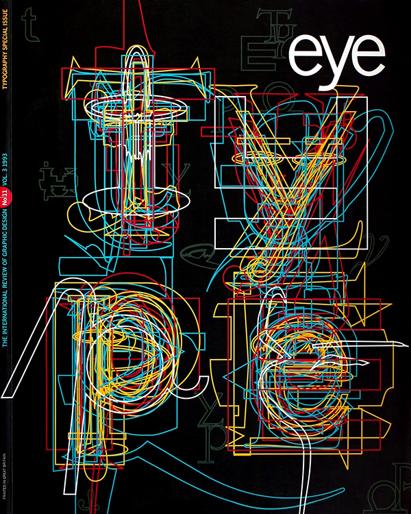
First published in Eye no. 11 vol. 3, 1993
Eye is the world’s most beautiful and collectable graphic design journal, published for professional designers, students and anyone interested in critical, informed writing about graphic design and visual culture. It is available from all good design bookshops and online at the Eye shop, where you can buy subscriptions and single issues.