Tuesday, 11:00am
10 March 2015
Words and pictures talking
Gerald Cinamon
Jean Mohr
anonymous designers
Book design
Design history
Graphic design
Photography
Typography
Critique / Photography
Canongate has reissued John Berger and Jean Mohr’s A Fortunate Man, about Gloucestershire doctor John Sassall. How does it compare with the 1967 original? Photo Critique by Rick Poynor

Photo Critique by Rick Poynor, written exclusively for eyemagazine.com.
A Fortunate Man by John Berger and Jean Mohr, a portrait of John Sassall, a doctor in rural Gloucestershire, is widely regarded as a masterpiece. The book’s narrative is composed almost equally of prose and photographs and these strands merge with great subtlety. Almost 50 years after publication, it’s hard to think of a similarly sized non-fiction book, intended for ordinary reading, which achieves such finely calculated and meaningful transitions between text and image.
Bizarrely, for anyone who admires it, A Fortunate Man has been out of print in Britain for many years, despite Berger’s high status as a writer, although an American edition has been available. In 2003 it was republished as a classic study by the Royal College of General Practitioners, but that edition, intended for doctors, was never widely distributed.
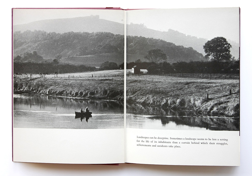
‘Landscapes can be deceptive.’ The opening words and image in A Fortunate Man by John Berger and Jean Mohr.
Right: New hardback edition published by Canongate, 2015. Design: uncredited.
Top: Readers Union & Allen Lane, hardback book club editon, 1968. Photograph: Jean Mohr. Design: Gerald Cinamon.
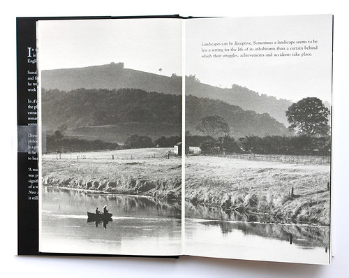
Now, at last, A Fortunate Man has been reissued by the Edinburgh publisher Canongate, with a new introduction by Gavin Francis, a doctor and writer. The original hardback, from 1967, was designed by Gerald Cinamon, who also reformatted the book in 1969 as a paperback with a smaller page size. (I have previously written about the title’s publishing history at Design Observer.) While Cinamon had exceptional materials to work with, A Fortunate Man would have been a less involving reading experience without his visual sensitivity.
There is nothing unusual about reconceiving a book for a new edition, even when it includes many pictures. A Fortunate Man is a special case, however, because of the chemically precise fusions achieved in the two original editions between the text and images. The book’s new design implicitly acknowledges the extent to which the original designs are intrinsic to its form, while at the same time playing down the issue of how the book came to look as it does (or did). There is no design credit in the new version. When I made inquiries, Canongate told me that the book was laid out by the typesetter – Palimpsest Book Production in Falkirk – ‘keeping as close to [the] positioning in a previous edition as possible’. Berger had the final say, in consultation with Canongate’s editor, about the picture placements. Mohr doesn’t seem to have been involved, although he is co-author and his 75 pictures occupy, in area, around 68 of the new book’s 171 pages.
John Sassall at work in his consulting rooms. Readers Union edition, 1968. Photographs: Mohr. Design: Cinamon.
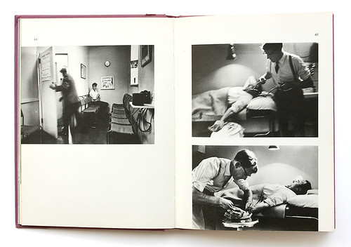
Canongate edition, 2015. Design: uncredited. The text is on the following page in the original edition.
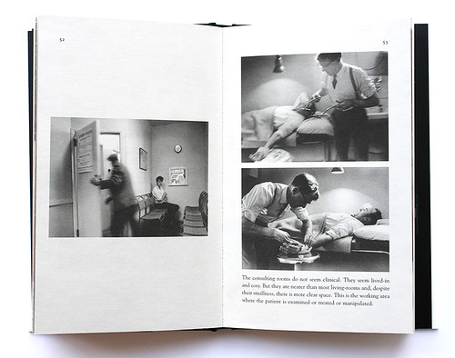
In his introduction, Francis doesn’t examine the structural originality of the book’s narrative, and he glosses over the complexities of its composition by briefly quoting Berger, who says that, having written the text and compiled the photographs separately, he and Mohr ‘reworked it so that the words and pictures were like a conversation; building on, rather than mirroring, one another.’ There is no discussion of how decisions were made about where the pictures would go, what size they should be, or whether they should be cropped (which some were), and no mention of the designer’s role. These are crucial points when it comes to understanding how the book came to work so well, and yet they are skimmed over as though the content just fell into place.
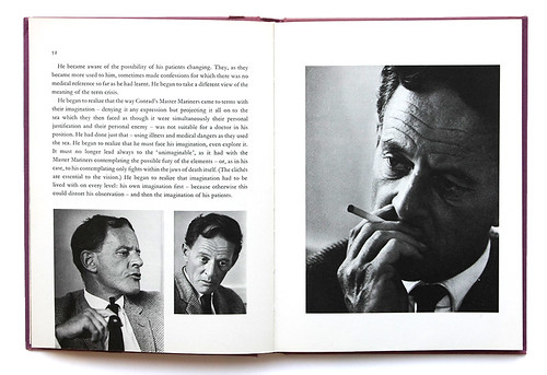
Although the new edition is a hardback, it uses the proportions of the Penguin paperback rather than the original hardback’s broad page, and the text column is consequently narrower. Despite these constraints, the picture placement takes its cue from the hardback most of the time, though it sometimes follows the paperback, where Cinamon did some substantial reworking. At two crucial moments – powerful sequences showing four portraits of Sassall in conversation, and five pictures of an anguished woman and her husband – the new layout goes awry.
A sequence of four portraits of John Sassall. ‘He began to realize that he must face his imagination, even explore it,’ writes Berger.
Readers Union edition, 1968. Photographs: Mohr. Design: Cinamon.
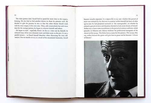
Canongate edition, 2015. Design: uncredited. The smooth flow from reading into contemplation of the portraits is lost, as is the finely judged emotional progression from picture to picture.
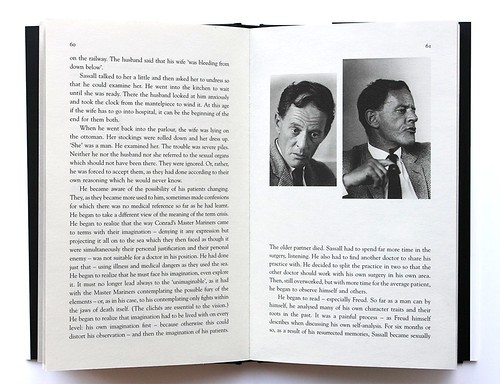
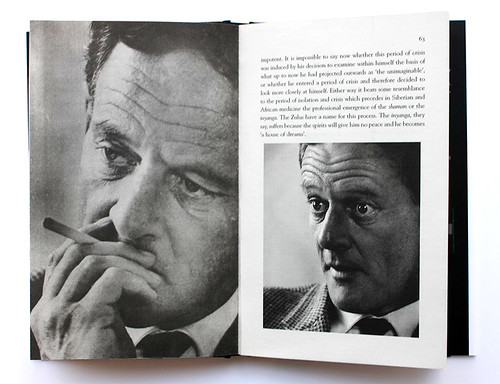
Cinamon used many bleeds, often on a single edge, and these have been reduced in number with some loss of graphic flow and tension. Pictures that were once anchored now float less dynamically (pages 129 to 132). In two instances (pages 67 and 74), substantial crops designed to focus attention on a patient have been replaced by images showing more of Sassall. These are interesting to see but don’t add anything vital to our understanding of these scenes and there is no shortage of pictures of Sassall in the book. On page 88, a slightly different version of Sassall carrying out a procedure has been introduced, possibly because the original print was lost, but an error is more likely. The pictures were shot just a moment apart.
There are other points where unnecessary adjustments have been made, though one correction I would like to have seen has been overlooked. The book closes with a picture of Sassall ascending the path towards his house. In the paperback edition, for design reasons, Cinamon took the liberty of reversing the picture so that Sassall appears to climb out of the book and into the future, rather than to double back on himself. The new edition follows the paperback and retains the flipped version, rather than reverting to the original presentation of the picture.
For new readers, unfamiliar with earlier editions, A Fortunate Man’s intimate view of a dedicated doctor and his trusting patients still has tremendous impact. Where the latest edition arguably gains is in the higher resolution of the pictures. They are printed to a contemporary standard and details not previously visible can now be appreciated; the images were heavier and had more contrast in earlier editions.
‘We give the doctor access to our bodies,’ writes Berger. Readers Union edition, 1968. Photograph: Mohr. Design: Cinamon.
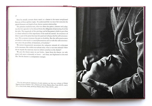
Canongate edition, 2015. Design: uncredited.
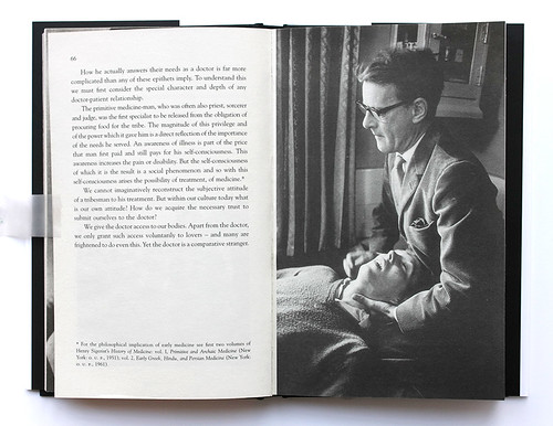
Nevertheless, the new edition raises questions about how to treat a book of this kind. A Fortunate Man is not merely a stack of manuscript pages and a pile of photos. It is a carefully worked out set of relationships – alternations of text and image; picture sequences and page turns – performed and realised by design. The reliance on Cinamon’s uncredited earlier work shows that the publisher accepted that his layouts are intrinsic to the book. Otherwise, why not commission a complete redesign and present the new edition, without apology, on those terms? In the event, this version of A Fortunate Man falls between two stools. The reissue needed a firmer editorial grasp of what makes the book so special, not just in its subject matter and writing, but as a marriage of word and image.
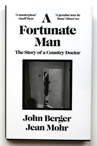
Canongate edition, 2015. Photograph: Mohr. Cover design: Peter Adlington.
Rick Poynor, writer, Eye founder, London
Eye is the world’s most beautiful and collectable graphic design journal, published quarterly for professional designers, students and anyone interested in critical, informed writing about graphic design and visual culture. It is available from all good design bookshops and online at the Eye shop, where you can buy subscriptions and single issues.