
Summer 2014
In the right place
In this extract from his book, Gerald Cinamon explains how he brought integrated book design to Penguin – first at his kitchen table in the 1960s; later as chief designer
In 1960, I had decided to move from New York to London, and later visited Penguin Books, where there were two welcoming faces: Hans Schmoller, production director, fresh from Penguin’s triumph at the Lady Chatterley’s Lover trial, and Germano Facetti (see Eye 29), the new Penguin art director.
My first Penguin commission came in 1961 from Kaye Webb, the Puffin Books editor, who handed me a box of jumbled newspaper clippings of Ronald Searle’s St Trinian’s cartoons and miscellanea with the remark: ‘Jerry, darling, can you do something with this?’
I became a specialist in illustrated books. These books were designed on my kitchen table at Courtnell Street, Notting Hill, before the children returned from school each afternoon. There was a scattering of drying galleys, and the smell of Cow Gum was fairly overwhelming. In mid-1963 Germano began to give me the occasional Pelican cover to design: Culture and Society, then followed Kenneth Clark’s The Nude. In the meantime I worked freelance for Queen, a magazine art-directed by the brilliant Tom Wolsey.
Penguin asked me to design the monthly Penguin Book News. All the copy and illustrated material was supplied by Tony Mott, Penguin’s publicity manager. Germano was then commissioning covers or text artwork from the best British illustrators so, for the pages of the Book News, I had more than enough wonderful illustrations to use, as well as complete freedom in the design of the journal.
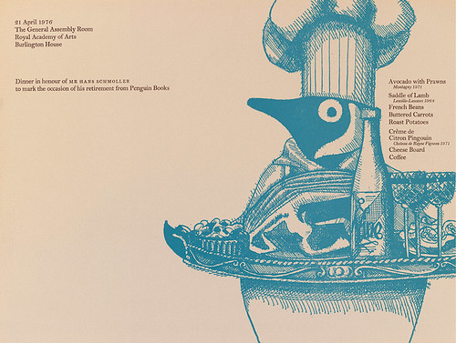
Menu for Hans Schmoller’s farewell dinner party, 1976.
Cinamon: ‘As chief designer at Penguin, I commissioned many jacket illustrations, but this was an odd job – an amusing illustration by Paul Bowden for this dinner party, attended by the Penguin Directors at the Royal Academy of Arts.’
Perhaps it was through designing the cartoon books and books where illustrations are integrated within the text, such as the Penguin Book of the Renaissance, commissioned March 1964, and the later Penguin Book of the American Civil War, that I eventually became ‘the’ Penguin designer of integrated books (although still working from our kitchen table). From this time until 1985 I designed most art and architecture titles, many of which were part of a series such as ‘The Architect and Society’, ‘Style and Civilization’, ‘Art in Context’, ‘Penguin New Art’ and, in paperback, the revised ‘Pelican History of Art’ (PHA). At this time the use of letterpress was fast disappearing. The use of one paper for the text and another for halftone illustrations – as in the Pelican History of Art cloth-bound series designed by Hans – was becoming too expensive. The increasing use of offset printing allowed for text and halftones (photographs) to be integrated on the page for far less cost and at far more convenience to the reader. Fortunately I was there at the right time.
My working methods for the integrated books, long outdated, were as follows. With the edited typescript and numbered illustrations, I was given a pre-printed form indicating the page size of the finished book, the number of illustrations, and any problems that might appear in the manuscript. I would then decide on an appropriate typeface, the size, leading, position and width of setting on the page, and the position of folios (page numbers) and, if appropriate, running heads. I then went through the manuscript noting on a separate plan the importance given by the author to each illustration: should the illustration be to the text width (single column? double column?), to the page width – and, if so, would bleeding the illustration on any side destroy any crucial detail? Did the author compare two adjacent photographs (could one be smaller?)? Did any of the photographs need professional retouching?
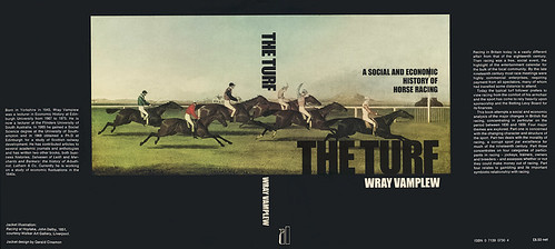
The Turf: A Social and Economic History of Horse Racing by Wray Vamplew (Allen Lane, 1976); jacket flaps not shown.
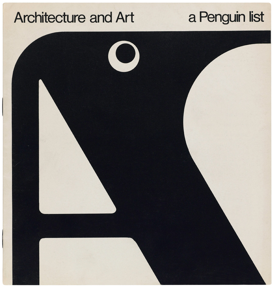
Top: Penguin list cover, 1967.
Two important series were ‘The Architect and Society’ and ‘Style and Civilization’. One title was John Berger’s The Success and Failure of Picasso. Text and illustrations were very tightly integrated. When I had finished the paste-up some weeks later there were several places where an illustration simply couldn’t appear after a particular word or line of text so Tony Godwin (a senior editor at Penguin), sent me off to Geneva to discuss these problems with Berger, who could not have been more understanding, and may even have added or deleted a word or two to get over such problems.
The Picasso book raised another problem. Germano Facetti designed the cover, which I did not particularly like. I mentioned to Hans that I would prefer to design the covers for those titles where I had designed the text. Germano never spoke to me again.
Two series began at this time: ‘Style and Civilization’ (Pre-Classical, Gothic, Mannerism) and ‘The Architect and Society’ (Inigo Jones, Palladio), and there were individual titles such as Victorian Architecture. Each series had to have its own individual look. By 1967 I had already started perhaps the most challenging project of my Penguin life: ‘Job 404, 26 June 1967: PHA redesign’. Hans asked me to make up several specimen spreads for a reduced size paperback (A5) version of the ‘Pelican History of Art’ for Nikolaus Pevsner’s approval. Each PHA title was a massive task. Over the following 21 years I pasted up (or down) about 10,000 individual pages: there must have been about 50,000 pieces.
Neo-classicism by Hugh Honour, 1968. Design: Gerald Cinamon.
Gerald (Jerry) Cinamon, designer, author, London
This is an edited extract from Gerald Cinamon: Graphic Design, published by Beth Cinamon, designed by SEA.
Eye is the world’s most beautiful and collectable graphic design journal, published quarterly for professional designers, students and anyone interested in critical, informed writing about graphic design and visual culture. It is available from all good design bookshops and online at the Eye shop, where you can buy subscriptions and single issues. You can see what Eye 88 looks like at Eye before you buy on Vimeo.