
Summer 2015
A Dutch battle that still rattles
The Debate: The Legendary Contest of Two Giants of Graphic Design
By Wim Crouwel and Jan van Toorn<br> Foreword by Rick Poynor; essays by Frederike Huygen and Dingenus van de Vrie<br> Designed by Office of CC, Amsterdam<br> The Monacelli Press, £20 / $24.95 (hardback, 176pp)<br>
Fiery debates on the ethical, political and cultural ramifications of graphic design are rare. Yet as Rick Poynor notes in his Foreword to this transcript of the famous 1972 clash between Wim Crouwel and Jan van Toorn, polemical exchanges between the titans of graphic design are not unknown. He cites the 1940s quarrel (in print) between Max Bill and Jan Tschichold on the question of the New Typography versus traditional norms – a dispute that resulted in each accusing the other of pro-Nazi sympathies. Poynor also mentions the ‘even more impassioned clash’ in 1989 between Tibor Kalman and Joe Duffy (see Eye 87), when the two art directors locked horns about the over-commercialisation of design. These debates, and the more cerebral encounter between Crouwel and Van Toorn, have generated enough metaphorical dark energy to become embedded in the collective psyche of graphic design.
Today, the design dialectic in its more elevated forms is confined to academia, the occasional conference, and a handful of books, journals and blogs. The comment strands of various blogs once provided a home for intelligent discussion, but now even those platforms are less well populated than they once were. The notion of deep discussion around the subject of graphic design has retreated into a sort of entropy. Vitriol and personal preference stand in for critical debate, and the current discourse consists mostly of mud-slinging centred on high-visibility projects, such as the London 2012 Olympic Games logo, and partisan exchanges around corporate branding.
In contrast, the Crouwel / Van Toorn debate is a model of deep and passionate engagement with the subject of graphic design. The positions of these two giants of Dutch design, both now in their eighties, can be summarised as objectivity versus subjectivity. Crouwel represents the ideal of the designer as selfless messenger; Van Toorn espouses the notion of the graphic designer as interventionist – an enabler of criticism and empowerment.
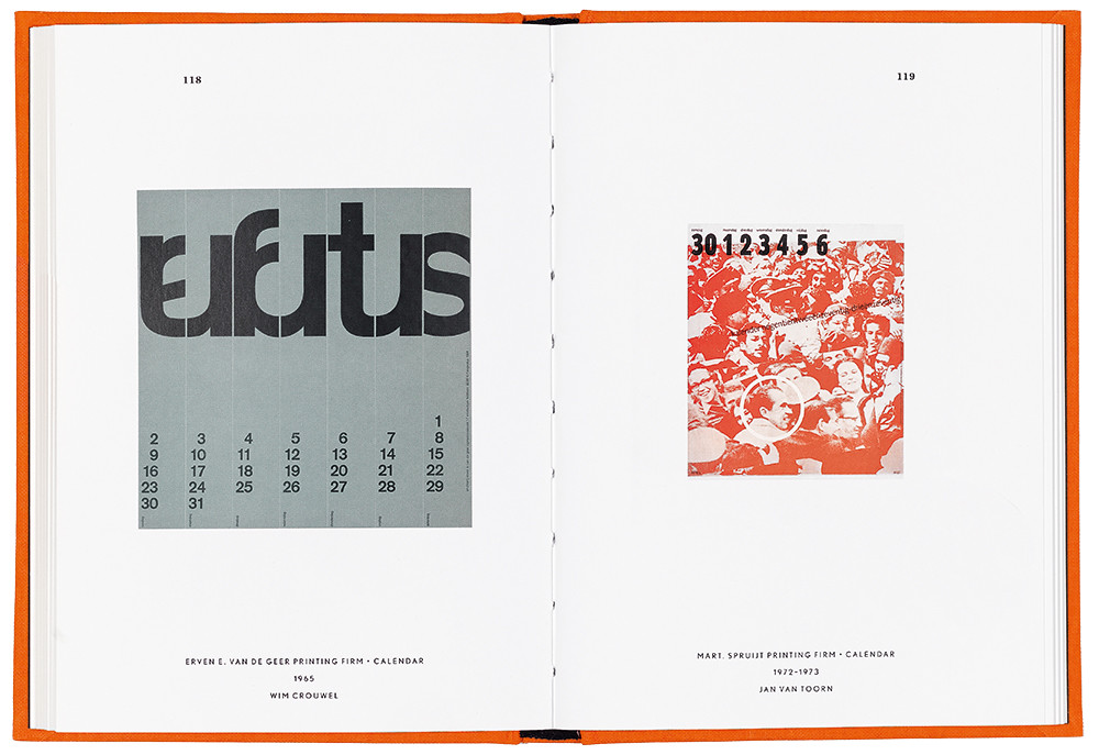
The Debate: The Legendary Contest of Two Giants of Graphic Design, designed by Office of CC (Chin-Lien Chen and Chris Vermaas)
Top: Crouwel’s 1965 calendar for printer Erven E. van de Geer (left) and Van Toorn’s 1972-73 calendar for printer Mart. Spruijt.
In an early exchange, Crouwel spells out his position: ‘I believe that as a designer I must never stand between the message and its recipient.’ Van Toorn rebuts this idea: ‘I do not believe that a designer can adopt […] the position of neutral intermediary. The acts you perform take place through you, and you are a subjective link. But you deny this subjectivity, meaning you view your occupation as a purely neutral one.’
The debate in its transcribed and translated state is remarkably short and only occupies 23 out of a total of 176 pages of this, the first English-language version in book form. The discussion covers three main areas: the social and professional role of the designer; the value of grids and typographic tradition; and the function of the graphic designer when designing for museums and art galleries.
Both men speak from positions of conviction. The exchanges are mostly courteous and respectful of each other’s viewpoints. Only on the question of the use of grids – a fundamental of Crouwel’s practice – does the discussion reach boiling point. Van Toorn vehemently states: ‘You impose your design on others and level everything. You were at the forefront, and now our country is inundated by waves of trademarks and house styles and everything looks the same.’ He continues: ‘To me, your approach is not relevant, and in my view you should not propagate it as the only possible solution for a number of communication problems, because it’s not true. What your approach does is basically confirm existing patterns. This is not serving communication – it is conditioning human behaviour.’ For his part, Crouwel dismisses subjectivity in design, and singles out Van Toorn’s Spruijt calendar for a mild put-down: ‘as pretentious as a piece of so-called good design, or as a clean piece of design.’
Reading this debate 40 years after it happened, it is hard to see what all the fuss was about. This is because the polarities that both men represent no longer exist to anything like the degree they once did, and the notion of there being only one position for the designer to adopt is redundant. Graphic design today is characterised by what Rick Poynor calls its ‘pluralism’ – a condition he defines as a ‘willingness to accept that there are plenty of ways of doing design, or anything else, and many equally valid outcomes.’
Nor does the transcribed debate offer the sort of clarity and precision of argument that might be expected from these two highly intelligent and articulate men. It is unclear whether this is the fault of the translation, or something to do with the hothouse nature of a public debate where members of the audience shouted angry comments (‘That is bullshit!’ ‘That’s a lie!’ ‘Crap!’ ‘Nonsense!’).
In truth both men are better served by the many quotes from their writings used by Frederike Huygen in her essay ‘The Debate in Context’. With her customary sharp eye and deep knowledge of Dutch design, Huygen uses well chosen extracts from the published texts of the two protagonists and, in so doing, allows them to make their arguments with more force and greater pointedness.
Regardless, both men are giants of the profession and individualistic practitioners worthy of our gratitude and admiration. They have added greatly to the storehouse of design philosophy, and that fact alone makes this book an indispensable addition to the literature of graphic design.
Adrian Shaughnessy designer, writer, Unit Editions, London
First published in Eye no. 90 vol. 23, 2015
Eye is the world’s most beautiful and collectable graphic design journal, published quarterly for professional designers, students and anyone interested in critical, informed writing about graphic design and visual culture. It is available from all good design bookshops and online at the Eye shop, where you can buy subscriptions, back issues and single copies of the latest issue. You can see what Eye 90 looks like at Eye before You Buy on Vimeo.