
Summer 1993
Is anybody out there reading?
Octavo, issues 1-8
Edited by Mark Holt, Hamish Muir, Michael Burke, Simon Johnston (1-6), Eight Five Zero Publishing
One of the features of Octavo magazine that made it so appealing to anyone who encountered the first issue, published in the summer of 1986, was the finite nature of the enterprise. Its publishers, the London design firm 8vo, planned to produce just eight issues of their sixteen-page journal of typography, at a rate of one every six months. By the end of 1989, the mission would be complete and Octavo would dissolve.
If such a schedule suggested seriousness of purpose and a precise agenda of ideas, this was more than confirmed by the early issues. Two members of the team had studied with Wolfgang Weingart in Basel, and Octavo had a high-mindedness and purity that set it apart intellectually and aesthetically from both the commercial and ‘style’ wings of contemporary British graphics. Octavo was sternly opposed to typographic mediocrity, nostalgia, fashion, decoration, symmetry, centred type and the hated serif. It was for a semantically determined use of structure and the infinite possibilities of typographic experimentation. ‘We take an international, modernist stance,’ the first editorial concluded. ‘This is necessary in England.’
The first three issues fall into a natural trilogy: the white issues. There is a beautifully sure sense of exposition to the page designs and, in articles on Anthony Froshaug, Ian Hamilton Finlay and Geoff White, great care in the matching of pictures to text. The format changes from issue to issue, but the designers’ hands working the levers of the grids are relatively unseen. Judged as magazines, these issues (and perhaps issue 5, on lowercase) remain the most conceptually rounded and interesting.
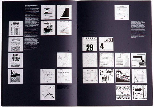
Below: Spread from fourth issue of Octavo (87.4) which is entirely taken up with Wolfgang Weingart’s celebrated illustrated lecture ‘How can one make Swiss typography’(1972).
Top: Lavish embossing in issue 6.
It has taken three years longer than originally planned to complete the series, but despite the time lag the magazine has not really developed. Most significantly, it has not engaged critically with new developments in typography (digital or otherwise), or with the challenge to Modernist assumptions such work poses. Octavo’s heroes, even when they are still alive and working, are all figures from an earlier phase of typographic thinking – Weingart, Greiman, Willi Kunz – selected for their conformance to 8vo’s Modernist ideals. Not until its article on Philippe Apeloig in issue 7 (1990) did Octavo venture into less familiar territory, though even Apeloig, whose work permits a high degree of distinctly frivolous non-structural decoration, has clear links to Modernism.
This is not to say that 8vo should like postmodernist developments. Quite possibly they detest them, but by ignoring work from what, for the sake of shorthand, we might call the Emigre school the magazine has cut itself off from the main lines of Euro-American debate.
A Modernist rebuttal of Emigre’s position would certainly have been possible, perhaps desirable, but Octavo has not attempted this. Yet strangely, while it fails to analyse deconstructivist tendencies that one might have supposed would be anathema to it, it displays them like symptoms in its own electronically generated pages.
All too often in the later issues, the structural conceits overwhelm the content. Octavo was heading this way by issue 5, where the grid is rotated so that everything – headlines, pictures, art – reads on the slant. In issue 6, an editorial on visual pollution is buried alive under slabs of backwards-reading type. In issue 7, bright yellow grids like gingham tablecloths swamp the pages, while picture captions are given as grid references which must be looked up at the back.
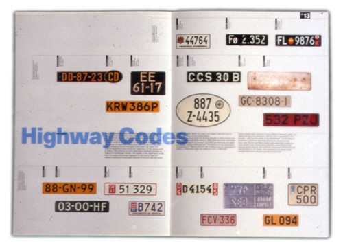
By this stage there is a feeling of aesthetic surfeit and exhaustion about Octavo, especially when compared with the confidence and clarity of its debut. For the first time production quality becomes an end in itself. Five pages of issue 6 are given over to embossed car number plates, an idea that would have occupied only one or two pages at the start.
There is an inescapable sense that the editors doubt whether anyone is reading and have stopped trying to ensure that they do. They give us tiny type, dauntingly wide measures, a chronology tipped unusably on its side. In issue 7, these doubts are declared. ‘Most people who buy Octavo do not read it,’ writes Bridget Wilkins in the magazine’s most notorious experiment, a brief essay on ‘Type and Image’ shattered into several dozen impenetrable word-bites.
Packaging from the eighth issue of Octavo, 1992, released as a CD-ROM.
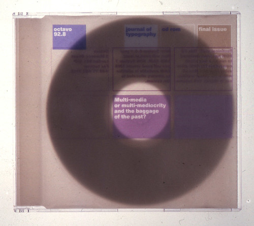
As it turned out, this spread proved to be more prophetic than it knew. The final issue, published at the end of 1992, takes the form of a CD-ROM on the theme of multimedia and the future of non-linear communication. It is a move both brave and frustrating, which denies Octavo physical unity as a set of objects and robs it of a proper sense of ending while undeniably opening up an important new topic for discussion (for the minority of readers with the drive to play it on). For its long-awaited final act Octavo has ceased to be a journal of record and become the manifesto it always threatened to be. In my view it is a mistake. Imagine the book dealers selling second-hand copies in twenty years’ time: issue 8 will be the not-quite-Octavo and, nine times out of ten, I would guess, the missing part of the set.
For me, the editors had it about right in issue 1 when they quoted Jan Tschichold: ‘Simplicity of form is never a poverty, it is a great virtue.’ Somehow, in the seven years it has taken them to complete this audacious and memorable project, it is a truism they slowly forgot.
Rick Poynor, Eye editor, London
First published in Eye no. 9 vol. 3, 1993
Eye is the world’s most beautiful and collectable graphic design journal, published for professional designers, students and anyone interested in critical, informed writing about graphic design and visual culture. It is available from all good design bookshops and online at the Eye shop, where you can buy subscriptions and single issues.