
Spring 2019
Waste not
Vaughan Oliver
Tony Brook
Claudia Klat
Chris Bigg
Nigel Grierson
23 Envelope
Design history
Graphic design
Music design
Reviews
Technology
Vaughan Oliver: Archive
Editors: Adrian Shaughnessy and Tony Brook Art direction: Tony Brook and Claudia Klat Unit Editions, £75

For many years Vaughan Oliver was the in-house designer for the 4AD record label, creating an enormous body of haunting, immediately recognisable music design. Artists and bands whose music was cloaked in Oliver’s astringent mix of image and type include the late Scott Walker, David Lynch, the Pixies, the Breeders and Lush (see Split poster and CD cover, 1994, above, with images by Richard Caldicott). Oliver’s collaborators included photographer Nigel Grierson (see Eye 37) and designer Chris Bigg.
The lavish two-volume, Kickstarter-funded Vaughan Oliver: Archive (Unit Editions, £75) makes no claim to be a monograph; it is more like the catalogue to an imaginary exhibition. There is the sense of an archeological dig into the vast archives that Oliver has donated to the University for the Creative Arts in Epsom. An extended sequence of full bleed photos shows the overlit storage room that now holds Oliver’s mechanicals, transparencies, proofs, posters, press ads, box sets, sleeves, lyric sheets and other materials that his little studio coaxed into being.
‘No corner of a record cover was ever left underdesigned,’ writes Adrian Shaughnessy (co-editor with Tony Brook) in one of several short text sections that punctuate the image-driven softbacks. It is fitting that Oliver’s designs, which often derived their visual distinctiveness from the accidents and commonplace details of print process, should be further fetishised in the archive boxes and envelopes detailed in volume one.
Page after page reveals the source of this monkey, or that pair of copulating horses, plus the way Oliver would derive an image from crumpled paper or the flat bed of his PMT (Photo-Mechanical Transfer) camera. Far from demystifying Oliver’s sleight of hand, the art direction (by Tony Brook and Claudia Klat) deepens it, adding another layer to the legend. Oliver’s vast output serves to remind his admirers of the craft, graft and negotiation needed to complete any design job. If he is a ‘designer’s designer’ it is because he holds a mirror to the practice of graphic design.
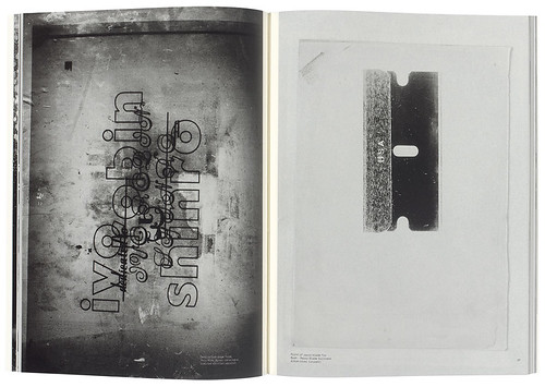
Where volume one, ‘Archive Materials and Fragments’, celebrates Vaughan Oliver as the designer who never threw anything away, volume two, ‘Archive Remnants and Desires’, hits another level, with a sequence of PMT prints (above) and a sooty copy of the Repromaster Mark3 manual.
‘For most designers, it was normal at the end of each day to have a waste paper bin full of mutilated PMT prints,’ writes Shaughnessy. ‘Oliver kept his, and this act of retention has resulted in the book you are now holding.’
Cover of Vaughan Oliver: Archive (Unit Editions), 2018.
John L. Walters, editor of Eye, London
First published in Eye no. 98 vol. 25, 2019
Eye is the world’s most beautiful and collectable graphic design journal, published quarterly for professional designers, students and anyone interested in critical, informed writing about graphic design and visual culture. It is available from all good design bookshops and online at the Eye shop, where you can buy subscriptions and single issues. You can see what Eye 98 looks like at Eye Before You Buy on Vimeo.