
Blog: Typography
10 December 2012

Sun-cheese wheel-ode
Dom Sylvester Houédard’s 1968 concrete poetry tribute to fellow poet Ken Cox is a double spiral of hand-set type, mysteriously linked by the sport of cheese rolling. Fraser Muggeridge explains.
The letterpress printed concrete poem designed by Dom Sylvester Houédard first caught my interest because…
22 November 2012

Noted #46
Schwitters, typewriting, wood type, the future Detroit Printing Plant and the United Stats of America
This past Friday the last British-made typewriter, the CM-1000, left the Brother factory in Wrexham…
21 November 2012

Hand-made in Cambodia
Painted signs enliven the streetscapes of Kratie, a sleepy provincial capital in North East Cambodia.
Cambodia is a country awash with hand-painted signs, writes Sam Roberts. They form an integral…
14 November 2012

Jazz in print
Matt Willey’s sumptuous brochure for UK radio station JazzFM evokes a golden age of magazine and LP sleeve art direction.
Jazz and radio came of age around the same time, the 1920s, when ‘physical music’…
13 November 2012

Type in Wapping
Pencil to Pixel opens up Monotype’s archive of typographic history, from artwork to artefacts
The ‘Pencil to Pixel’ exhibition, which opens this Friday at Metropolitan Wharf in London, gives…
7 November 2012
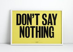
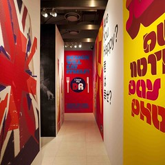
Something to say
The current vogue for letterpress is more than mere retro-nostalgia, writes Catherine Dixon in the run-up to Friday’s St Bride conference.
Letterpress is everywhere, writes Catherine Dixon (co-organiser of ‘Letterpress: Something to Say’). Once a boutique…
2 November 2012
Graphic design history to boot
Everything must go when Ian Anderson sells off the contents of The Designers Republic (TDR) archive in its Car Booty Affair in Sheffield.
At what point does the ephemera that is graphic design become collectable? When does a…
29 October 2012

Giants of the visual imagination
While others struggle with ‘personal expression’, the Vignellis prove that a simple approach and focus makes great design, writes Quentin Newark.
Quentin Newark writes: As I was designing the catalogue for the Tate Modern exhibition ‘Albers…
26 October 2012

Noted #45
Sneaker art, Coverthink on news design, Kerouac, Lubalin, letterpress and a letter from the Gentle Author.
This week in Noted: branding, editorial design, Kerouac’s scroll, letterpress, more Herb Lubalin and an…
24 October 2012

The Bloomsbury set
De Bondt, Boom, Burrill, Butterick, Garland, Kubel, Scher and many more make Typo London 2012 a highly ‘Social’ affair. No question about it.
Typo London commenced with graphic designer Sara De Bondt’s fittingly understated introduction, writes Sarah Snaith…