Tuesday, 11:08am
13 July 2010
Back to front
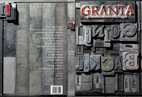
Why I went to St Bride Library to make Granta’s latest cover
For me St Bride Library has long been an place of fascination and wonder, writes Granta artistic director Michael Salu. I discovered the library a few years ago, while working as a designer at Random House. My first encounter with the oil, wood, metal and the smell of history made an indelible impression on me.
Particularly because the modern designer (especially one with a sizeable workload) is likely to spend considerable time perched awkwardly on an ‘ergonomic’ chair in the glow of a monitor, shuffling through the underwhelming grey window of a digital font library.
Since my introduction to St Bride, I had always hoped for an opportunity to collaborate with the team there. I remember being quietly awestruck on my initial visit as Nigel Roche showed us around, instantly naming any object, tool, machinery, process or indeed, typeface as we trod cautiously around a seemingly endless labyrinth of rooms and corridors. Anyone with even a passing interest in typography and printing will be blown away by the richness of St Bride’s archive and the knowledge and enthusiasm of the team that runs the library.
At Granta magazine, from editorial to design, we develop literary and visual concepts for the chosen theme for each issue. The challenge is to inspire thought and discussion, to ensure that the impact of visual elements matches the world-class literature within our pages. Issue no. 110 (‘Sex’) was an opportunity for us to create a visual response to some of our written pieces using film (www.thisisnotapurse.com).
With Issue no. 111 themed ‘Going Back’, we have an agile but emotional collection of fiction, non-fiction, poetry and photography that is largely about memory. How do we preserve memory and deal with the marks it has left? Many of the written pieces look at memory’s physical imprint, tackling the ravages of war and industry.
Initial brainstorming on how to visualise memory concluded that the cover itself needed an industrial veneer. Something textured, aged and primed with history and wisdom. I began to think about how our preservation of memory has evolved over the years and considered how memory is now increasingly virtual. Creating a cover for this issue seemed the ideal opportunity to produce something in homage to antiquated and largely obsolete processes.
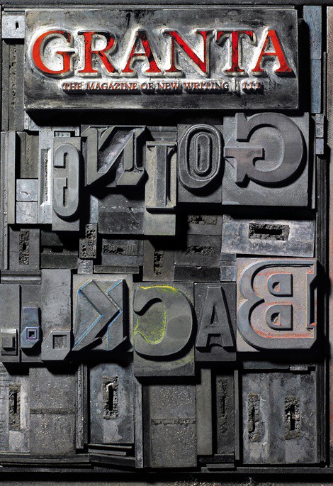
After a quick-fire discussion with the Granta team, we decided to create a typographic cover comprised of pieces of metal type used on old printing presses. These letterforms appear backwards in order for the type to print the correct way around on the press, which seemed a perfect conceptual fit for our theme, ‘Going Back’. A quick mock-up was simulated in Photoshop, using a variety of typefaces and styles to create the title, which I think complements the flexibility of the text within.
For this concept to work, we needed to strive for authenticity; to create the actual physical object itself. The typefaces had to be sourced, traditionally hand-set and photographed. I approached St Bride in the hope they would have the time to assist us with this cover.
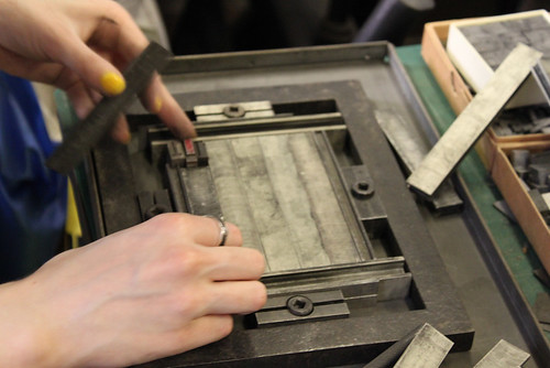
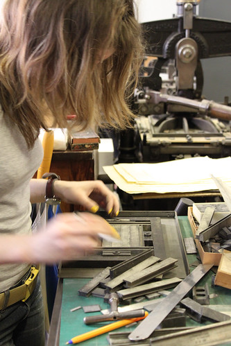
Fortunately, Nigel Roche and his knowledgeable team were willing to help make this a reality. My rough draft was enough for them to work from, and they set about putting together a cohesive composition. A selection of typefaces were sourced from their archive, and all the type on the title and back cover was hand-set by Kim Vousden, a talented typographer and designer who volunteers at the library.
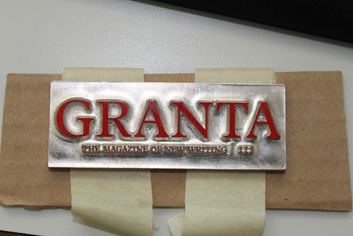
In order to make the entire cover work, the Granta masthead also needed to be manufactured in a similar old-world way. We set about finding a company that could create a metal cast of our brand typeface Plantin, to fit with the rest of the piece. Photocast Products in Liverpool did so obligingly and swiftly, also adorning the type with the red from the Granta branded identity.
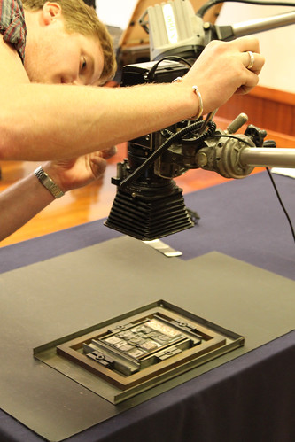
The photography is by still-life photographer Giles Jenykn. We had worked together previously on something equally as intricate: the laser cut, smoke-addled sleeve artwork for Tricky’s deluxe edition of Maxinquaye. I knew he would be perfect for capturing the visceral intensity and memory of the days of movable type. The St Bride team allowed us to use a display room to shoot the piece. It was a team effort: Kim fastidiously tweaked and made any necessary modifications on the day, Giles busied himself with his immaculate attention to detail, and cups of tea and typography-specific conversation flowed. Ah, the camaraderie of type-fiends …
We at Granta are ecstatic with the end result and eternally indebted to St Bride Library. The 111 cover encapsulates heartfelt memories from the likes of Iris Murdoch, Chimamanda Ngozi Adichie and Richard Russo. It is also entirely fitting that this image adorns an issue featuring an extract from the Autobiography of Mark Twain (kept under lock and key for the past 100 years). It hums with an industrial intensity evocative of the dynamic changes of our recent history.
Eye magazine is available from all good design bookshops and at the online Eye shop, where you can order subscriptions, single issues and back issues. The summer issue, Eye 76, out this week, is a music special. You can read a selection of pages on Eye Before You Buy on Issuu.
Student subscriptions are half price, see bit.ly/EyeStudentOffer.


