
Monday, 11:00am
18 August 2025
Books received #61
Designed for Success, Floppy Disk Fever, Schriften, Lettering, Écritures and Propagandopolis
Our latest ‘books received’ covers three unconventional publications and a facsimile of a typographic classic.

Designed for Success: Better Living and Self-Improvement with Midcentury Instructional Records (MIT Press / Penguin Random House). By Janet Borgerson and Jonathan Schroeder. $39.95
Authors Borgerson and Schroeder, whose previous books include Designed for Hi-Fi Living and Designed for Dancing, have chosen for the third of their trilogy to focus on the covers for ‘instructional’ records, the midcentury forerunners of podcasts and Duolingo, which have rarely excited the interest of record collectors. They divide their research into ‘At Work’, ‘At Home’, ‘At Leisure’ and a final short chapter ‘On Vinyl and Cultural History’, which notes that one of the first instructional successes was a vocal training record released in 1916.
The Designed for Success chapter ‘Becoming a Better Worker’ features the record Airman!! from Documentary Recordings, 1959.

Most of the covers shown span the 1950s and 60s, with titles such as Learn the International Morse Code (1951), Speed Reading Made Easy for Everyone (1963), Selling the Sizzle (1960), The Art of Mixing Drinks & Music (1969) and Music for Cooking with Gas (1956). Many covers are workmanlike or kitsch, but designs for ‘music appreciation’ discs are closer to what collectors still appreciate about jazz and classical albums of that era: Jason Kirby’s design for Hughes Panassié’s Guide to Jazz (1956), for example, and Leonard Bernstein Conducts for Young People (1963), with its lettering by Taro Suzuki, age 9. The authors make an argument about instructional records that sounds remarkably contemporary: ‘Instructional records … were generally experienced in private … [they] blurred lines between private and public, between home and work, and between occupation and leisure.’
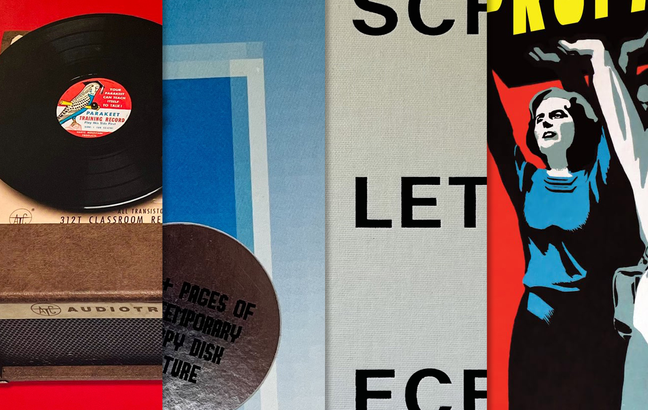
Right. In Chapter 11 ‘Learning to Listen: Music Appreciation’. Leonard Bernstein Conducts for Young People, New York Philharmonic. Photos by Robert F. Seraping. Lettering by Taro Suzuki, age 9, 1963. Below. In the Chapter ‘Leisure and Sport’ is the album cover Let Your Parakeet Teach Himself to Talk, distributed by Hartz Mountain Products Corporation, ca. 1955.


Floppy Disk Fever (Onomatopee). By Niek Hilkmann and Thomas Walskaar. €18
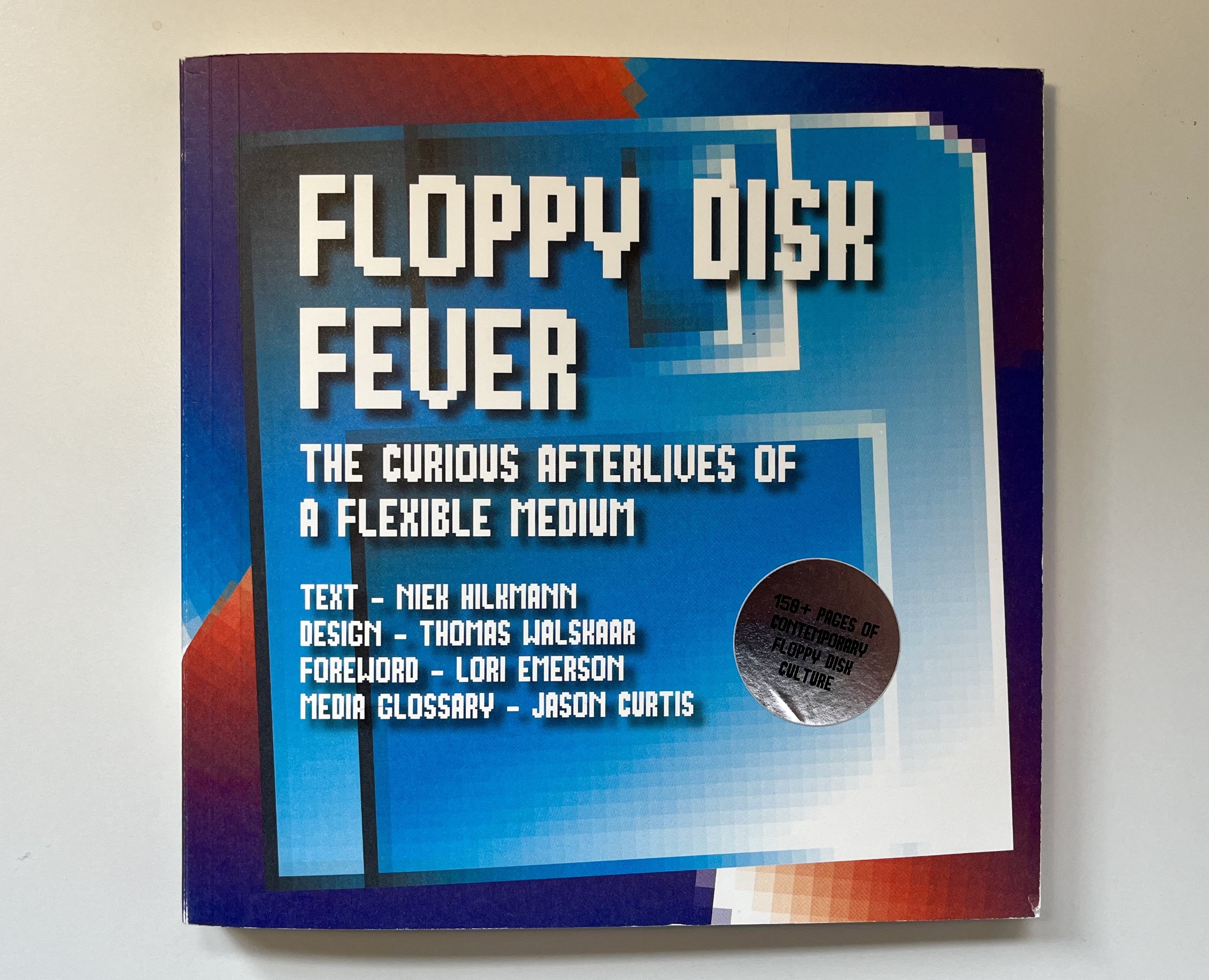
This square softback focuses on a different kind of disk, which author Niek Hilkmann describes as ‘the most prevalent and eye-catching obsolescent consumer-oriented electronic data carrier of the twentieth century.’
Spread from Floppy Disk Fever which features a quote by Tom Pesky, founder of floppydisk.com and ‘last man standing in the floppy disk business’. Design: Thomas Walskaar.
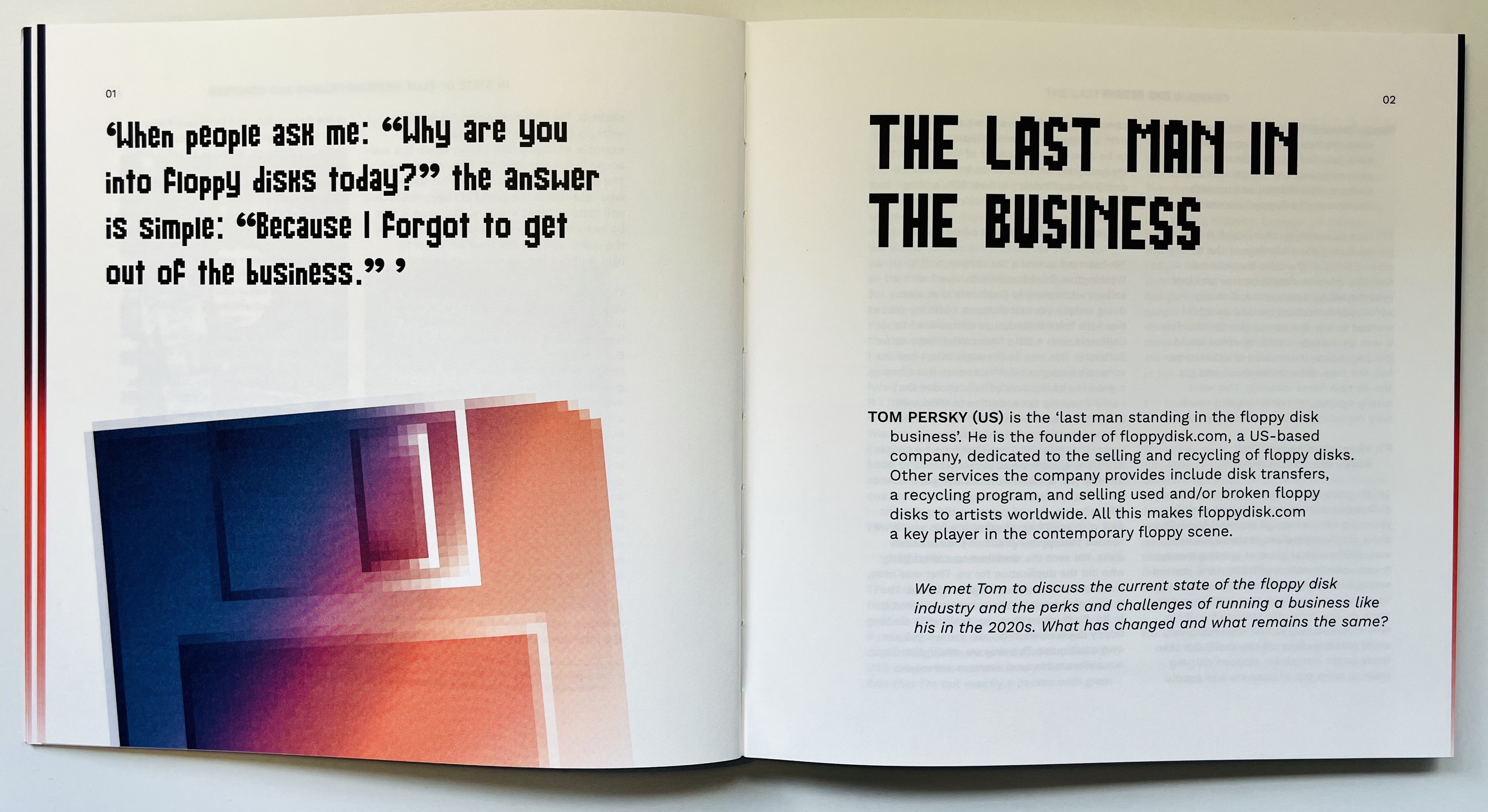
The ten chapters include subjects such as Tom Pesky, founder of floppydisk.com, still selling and recycling floppy disks; Nick Gentry, who makes oil paintings over obsolete media; Joerg Droege and A. J. Heller, who make diskmag Scene World, literally a magazine published on a floppy; and Jason Curtis, who founded the Museum of Obsolete Media. The book covers games, art, design, movies, music, literature and more. Pesky compares its ‘beauty and elegance’ to that of a watch. Curtis supplies a useful glossary that covers terms such as KryoFlux, Tefifon and Eye favourite Sneakernet.
Profile Number 18 by London-based artist Nick Gentry, who repurposes obsolete media for his canvases. Oil paint and used computer disks on wood, 85cm x 81cm, 2019.

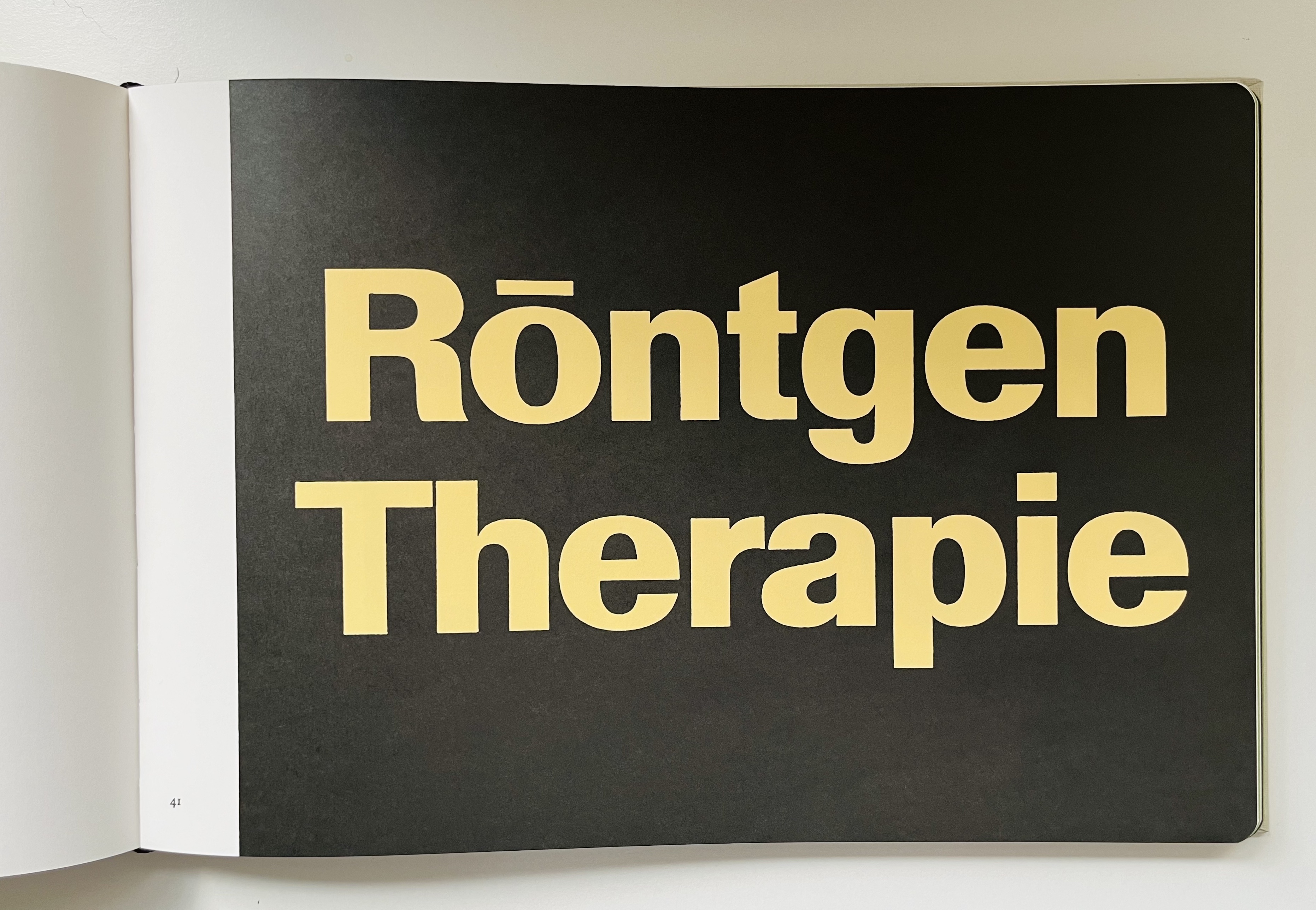
Schriften, Lettering, Écritures (Dinamo Editions). By Walter Käch. £44
This is a carefully executed near-facsimile of the influential, trilingual (German, English, French) book detailed in Peter Bain’s Eye 92 article ‘A manual of hand-made Modernism’.
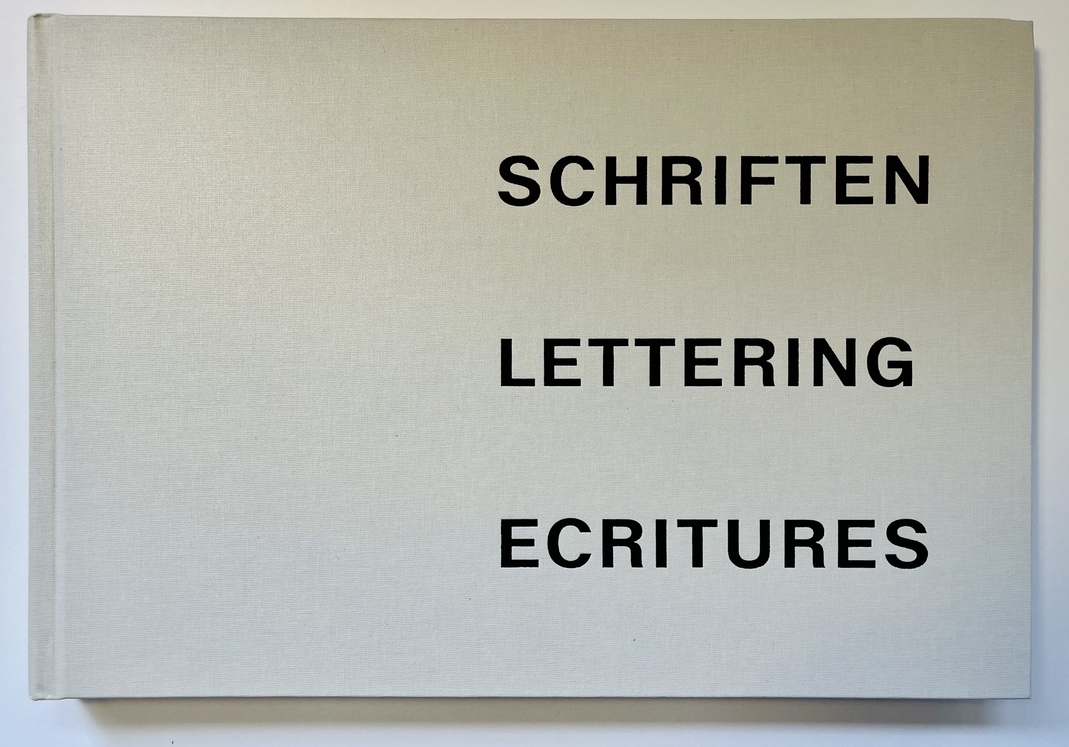
An introduction by Dan Reynolds explains how Käch’s book became a collector’s item, especially for type designers. ‘Without Käch’s direct instruction and the examples provided in this book’, writes Reynolds, ‘it is hard to imagine the development of Univers and Helvetica.’ The reprint is casebound, rather than loose-leaf, and slightly smaller in format than the original. Foreword, introduction and colophon are set in the typeface ABC Walter Neue, designed by Dinamo Typefaces and based on Käch’s lettering.
A page from the book Schriften, Lettering, Écritures, (The Handbook for Lettering) by Walter Käch (1901-70), which was intended for study and to promote gute Form in the field of type design.
Propagandopolis (Fuel). By Bradley Davis. Introduction by Robert Peckham. £24.95.
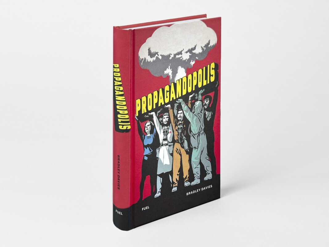
The image anthologies designed and published by Fuel Design (see Eye 93) have covered many quirky subjects, from bus shelters to chess players (see Eye 107) and Russian prison tattoos. This recent, more sober volume is based on the online collection Propagandopolis, and spans 62 countries, from Afghanistan to Zimbabwe.
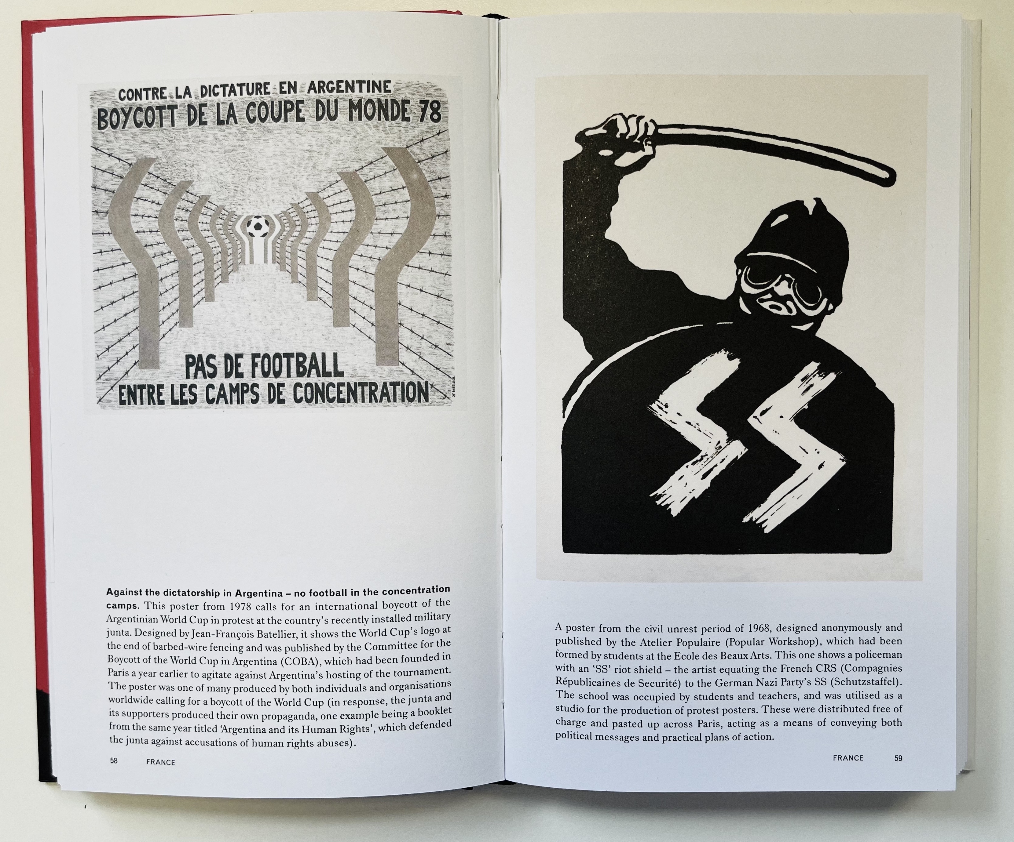
A spread from Propagandopolis, which features a poster (left) from 1978 which reads ‘Against the dictatorship in Argentina – no football in the concentration camps’. The French poster on the right is from the civil unrest period of 1968, designed and anonymously published by Atelier Populaire (Popular Workshop).
In his introduction, New York-based historian and academic Robert Peckham quotes Hitler, Bernays and Chomsky, and notes that the ‘A-Z structure of this book reminds us that propaganda isn’t just tethered to totalitarianism; it has far more complex colonial, post-colonial and democratic histories.’
An anti-gossip poster from the 1960s in Thailand, which reads ‘Women, socialising and liquor often lead to secrets slipping’.

Author Bradley Davis provides detailed and informative captions throughout the 208-page book.
Right. A spread of two Libyan posters, the left a portrait of Muammar Gaddafi on a large balloon, celebrating the 22nd anniversary of Gaddafi's rule, 1991. On the right of the spread is a postcard (ca. 1970s) showing a photomontage of Muammar Gaddafi visiting Mecca.

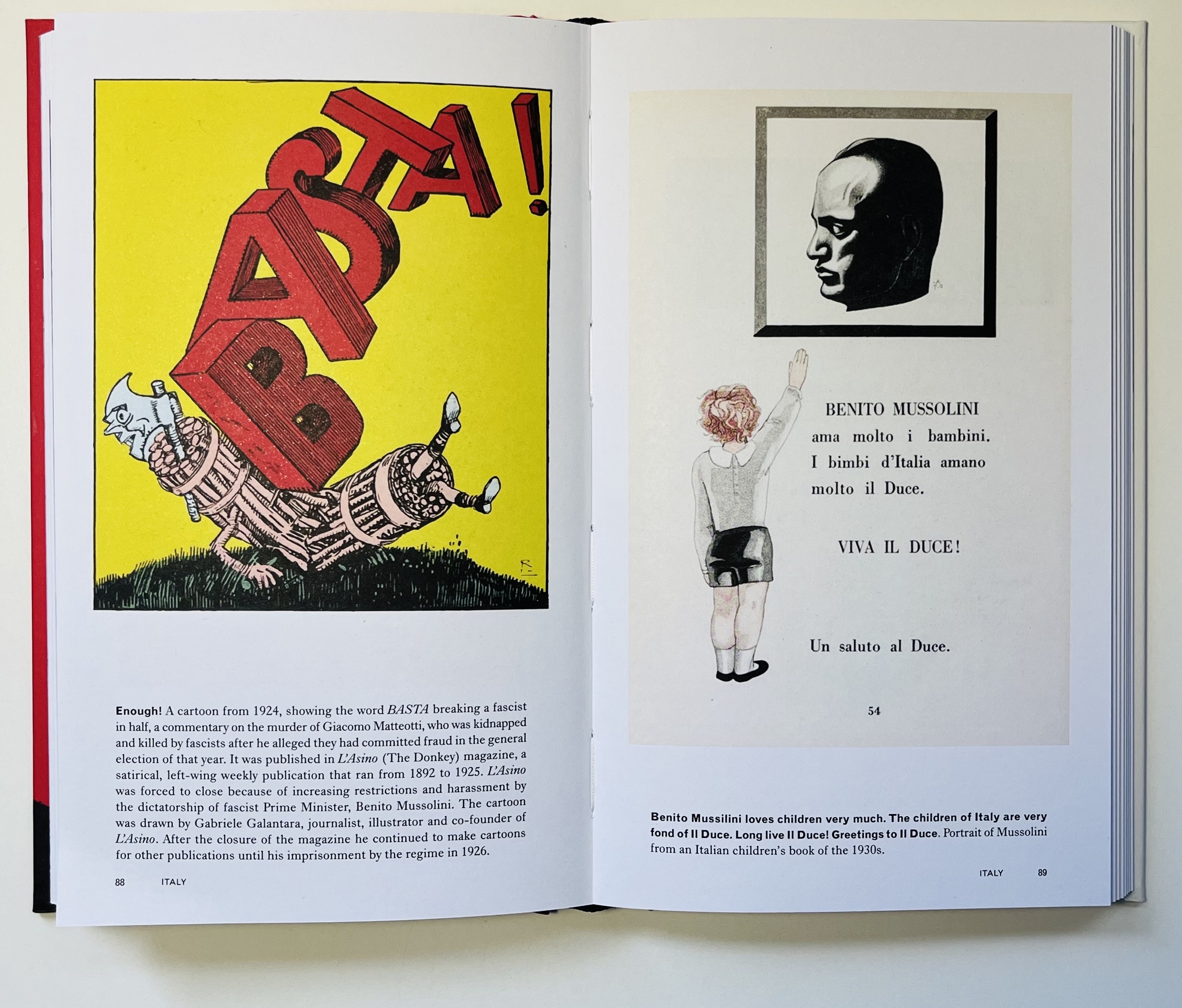
Right. Two Italian posters. The left, a cartoon from 1924, showing the word ‘Basta’ (Enough) breaking a facist in half, published in L’Asino [The Donkey] magazine. On the right of the spread from a children’s book in the 1930s reads ‘Benito Mussilini loves children very much. The Children of Italy are very fond of Il Duce. Long Live Il Duce! Greetings to Il Duce’.
Eye editors, London
Eye is the world’s most beautiful and collectable graphic design journal, published for professional designers, students and anyone interested in critical, informed writing about graphic design and visual culture. It is available from all good design bookshops and online at the Eye shop, where you can buy subscriptions and single issues.