
Friday, 12:00pm
9 January 2026
Books received #62
Tony McDermott
Bloomfield / Travis
Michael Hodgson
Bloomfield / Travis
Anja Lutz
Lucienne Roberts
Mindy Seu
The Rodina
Jason Grant
Silvia Sfligiotti
Alice Chau
Hamada Masuji
Jeffrey Ludlow
Adrian Frutiger
Diana Fawcett
Helen Wellington-Lloyd
Chris Morton
Jamie Reid
Malcolm Garrett
Nils Stevenson
Gee Vaucher
Design history
Graphic design
Music design
Reviews
Visual culture
Greensleeves, The Outdoor Archive, On the Edges of Graphic Design from A—Z, Making Modern Design in Japan, 1928–1930, A Sign Is, Turning Revolt into Style
Here are half a dozen interesting books that landed on Eye’s desks and plan chests in recent months, including two very different views of music design from the 1970s and a glimpse of an exquisite Japanese design journal from the late 1920s and 30s.
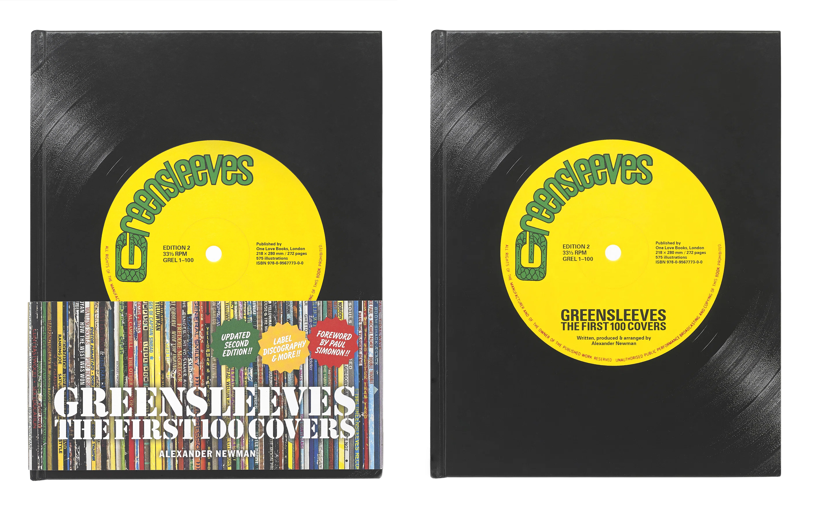
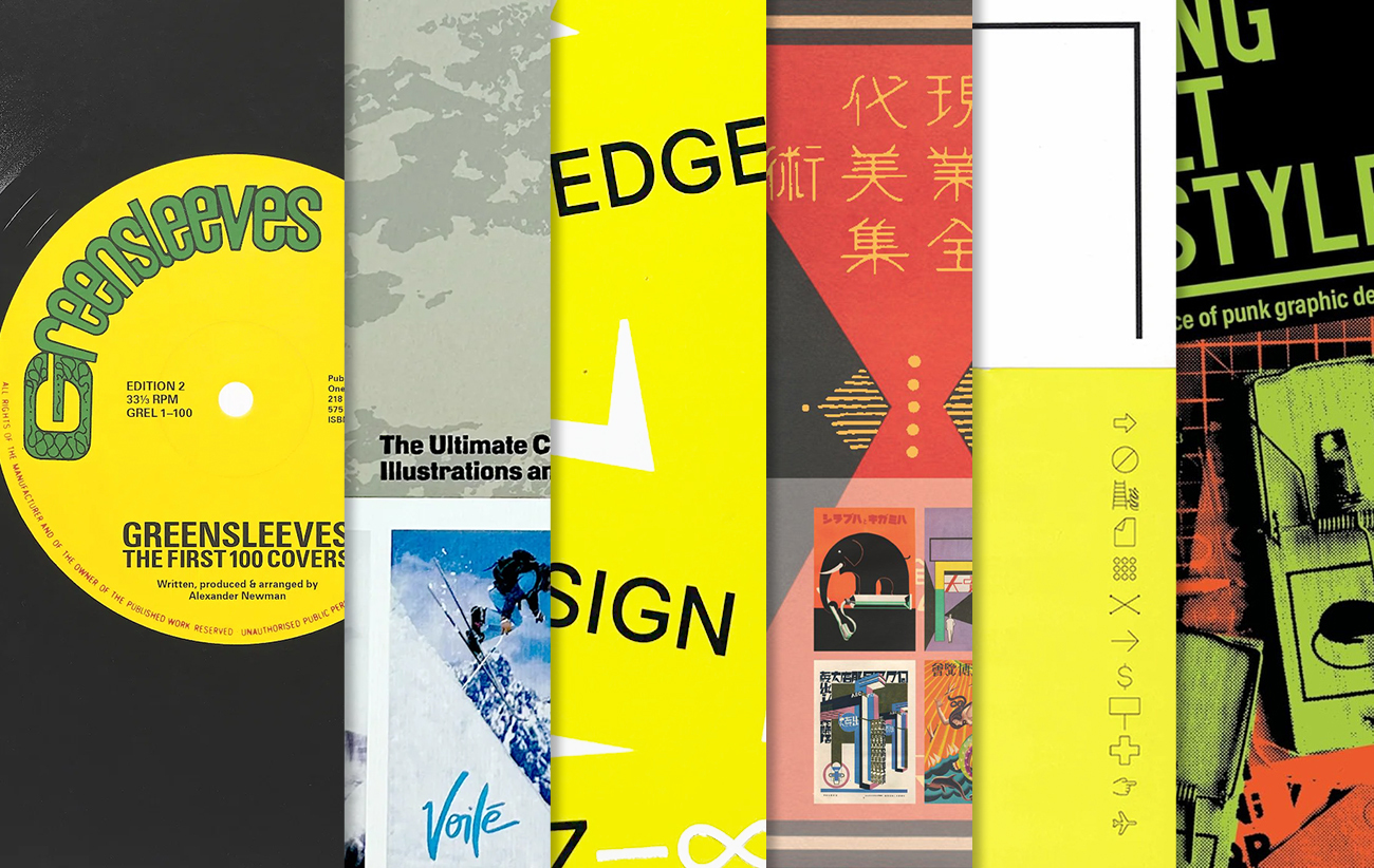
Greensleeves – The First 100 Covers (One Love Books). By Alexander Newman. £50
This second edition (of a book published in 2010) covers the first 100 covers from reggae and soul label Greensleeves Records, founded in London’s Shepherd’s Bush in the late 1970s. With a foreword by Clash bassist Paul Simonon, the book is divided into sections starting with an introduction by author Newman, then moving into interviews and finishing with a section that displays the 100 covers, along with other archival material.
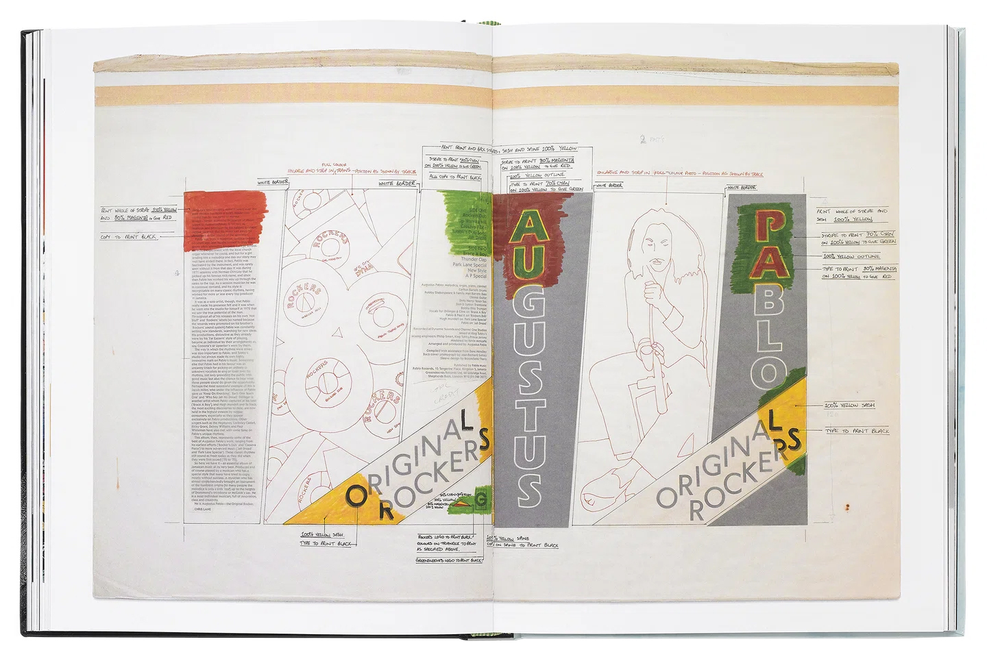
Spread from Greensleeves featuring original artwork by Bloomfield / Travis – complete with instructions for the printer – for the 1979 Greensleeves LP Original Rockers by Augustus Pablo.
Starting in with Best Dressed Chicken in Town by Dr Alimantado, the album covers showcase a variety of artwork, design, type, lettering and photography. The 100th album, Burning Spear’s People of the World by (1986), designed by Michael Hodgson, features artwork inspired by the cut-outs of Henri Matisse. The fascinating Q&As are with the label’s founders, Chris Sedgwick and Chris Cracknell, illustrator / designer Tony McDermott, photographer / journalist Dave Hendley, mastering engineer Kevin Metcalfe and guitarist / producer Patrick ‘Chiki’ Donegan. There is also a comprehensive discography that document’s Greensleeves’ vast output from 1977 to 2024.
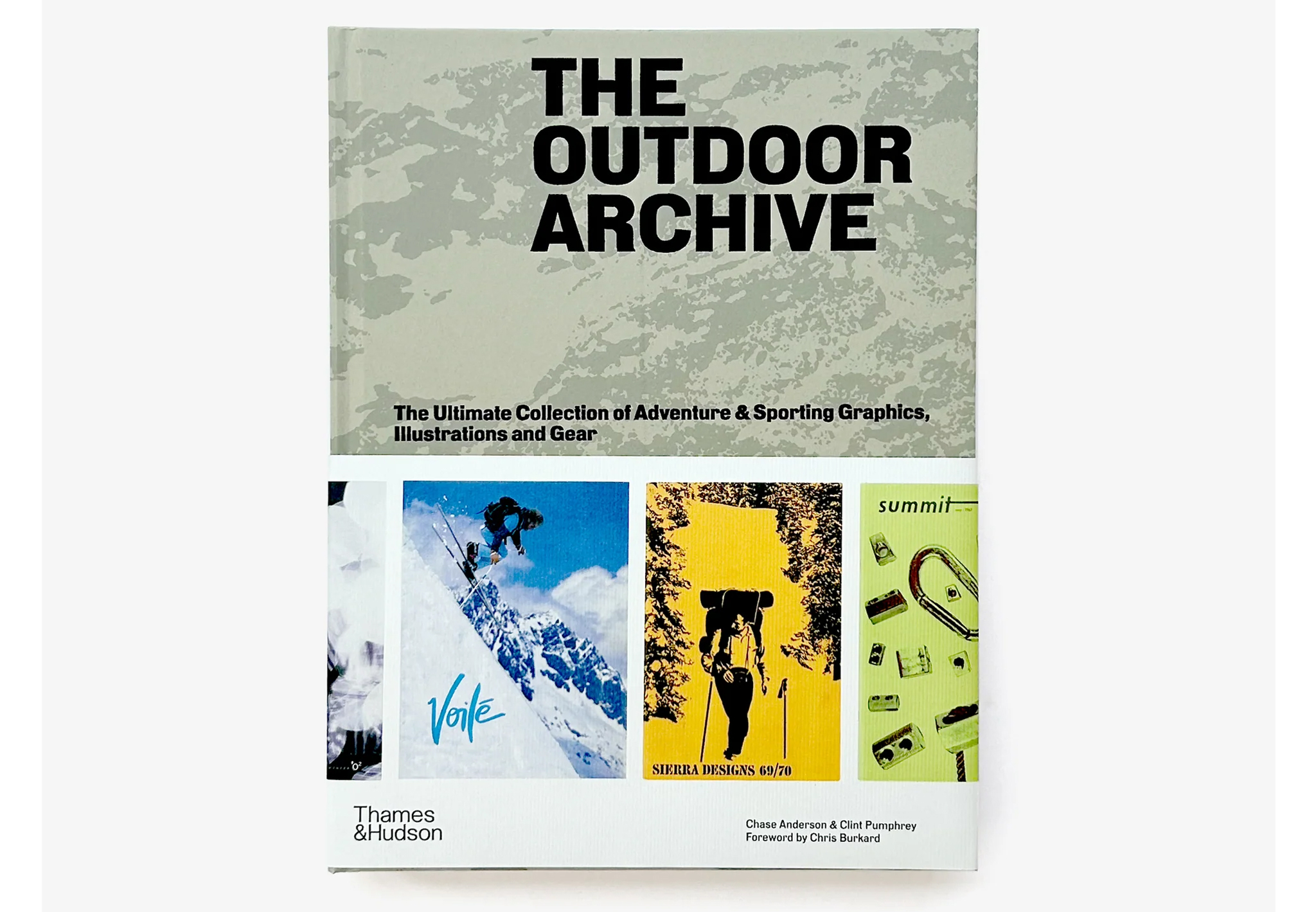
The Outdoor Archive: The Ultimate Collection of Adventure & Sporting Graphics, Illustrations and Gear (Thames & Hudson). By Chase Anderson and Clint Pumphrey, foreword by Chris Burkard. £50
This archive of outdoor covers features more than 600 illustrations from catalogues and magazines, such as Columbia, Snow Peak or North Face. Drawn from the Outdoor Recreation Archive at Utah State University and spanning a century, the images, ranging from illustration to grainy photographs, create a compilation that crosses generations, outdoor activities and places.
The Outdoor Archive includes a visual index of featured artworks by 71 active brands organised alphabetically by brand name and chronologically by year.
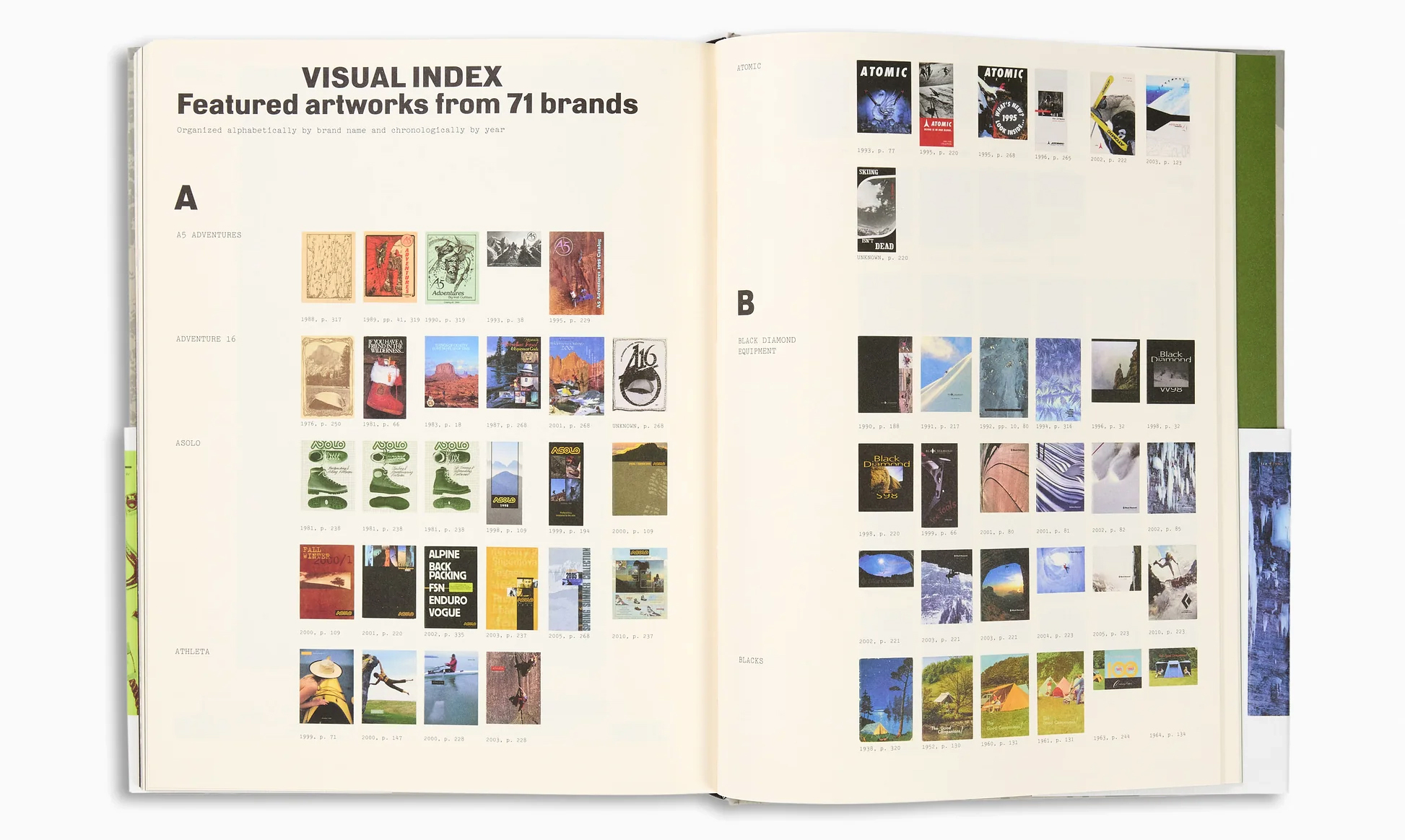
The contents are organised by medium – from nature (outdoors photography) to processed (treated photography), remixed (collage) to lines (illustration), object (product photography) to words (typography). Interspersed throughout the book, more than twenty designers, sportspeople, ‘creatives’ and industry leaders share their personal reflections. Also included in the book are four eight-page inserts, printed on a different paper stock, that display a variety of spreads from the catalogues’ interiors. The book finishes with a ‘Making Of’ section, which provides a behind-the-scenes look inside the archive.
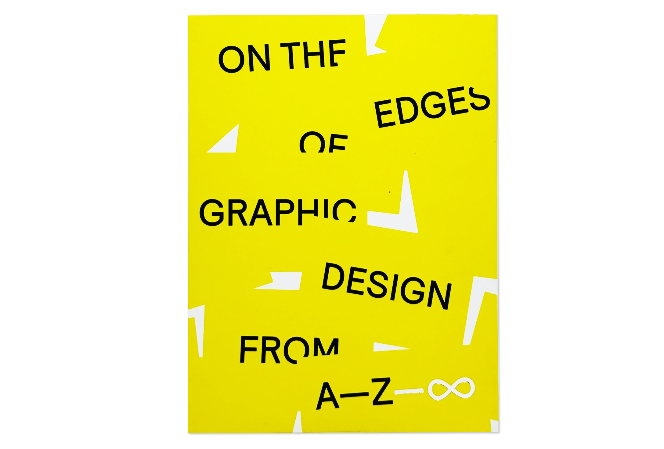
On the Edges of Graphic Design from A—Z—∞ (Set Margins) By Anja Lutz. 32€
A—Z is a Berlin-based space for experimental graphic design focusing on promoting projects and ideas that go beyond the boundaries to explore the unconventional. This publication showcases the last six years of the space, the journey of ideas, the projects and questions that have surfaced. In his introduction, Jason Grant (Inkahoots) reflects on making an impact as a designer ‘in the margins’ as a site of radical defiance and possibility. See ‘Unity and justice and …’, Grant’s Eye 99 article about the ‘New Anthems’ project he took to the small Berlin gallery in 2019.
The first part of the book titled A—Z’ features the variety of activities that have happened in the space, including a Counter Session by designer Mindy Seu.
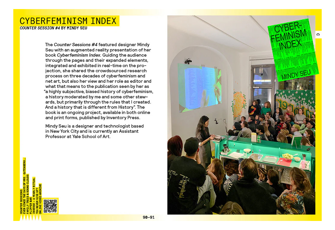
The book, split into two sections and including a range of imagery from events through the years, was designed and conceptualised by A—Z founder and curator Anja Lutz. The first section is organised alphabetically and features all the projects, workshops, exhibitions, talks and a wide range of activities and events initiated by A—Z, in alphabetical, cross-referenced entries. It includes contributions from designers such as Lucienne Roberts (see Eye 37 and 39), Mindy Seu (see ‘Type in Toronto’), and The Rodina, among many others.
The second section titled ‘—∞’ features 36 international designers, including Eye contributor Silvia Sfligiotti, Richard Niessen, James Langdon (see ‘Chaos and confidence’) and Loraine Furter, who were invited to envision the future of graphic design and how it could be enacted in a transdisciplinary space like A—Z.
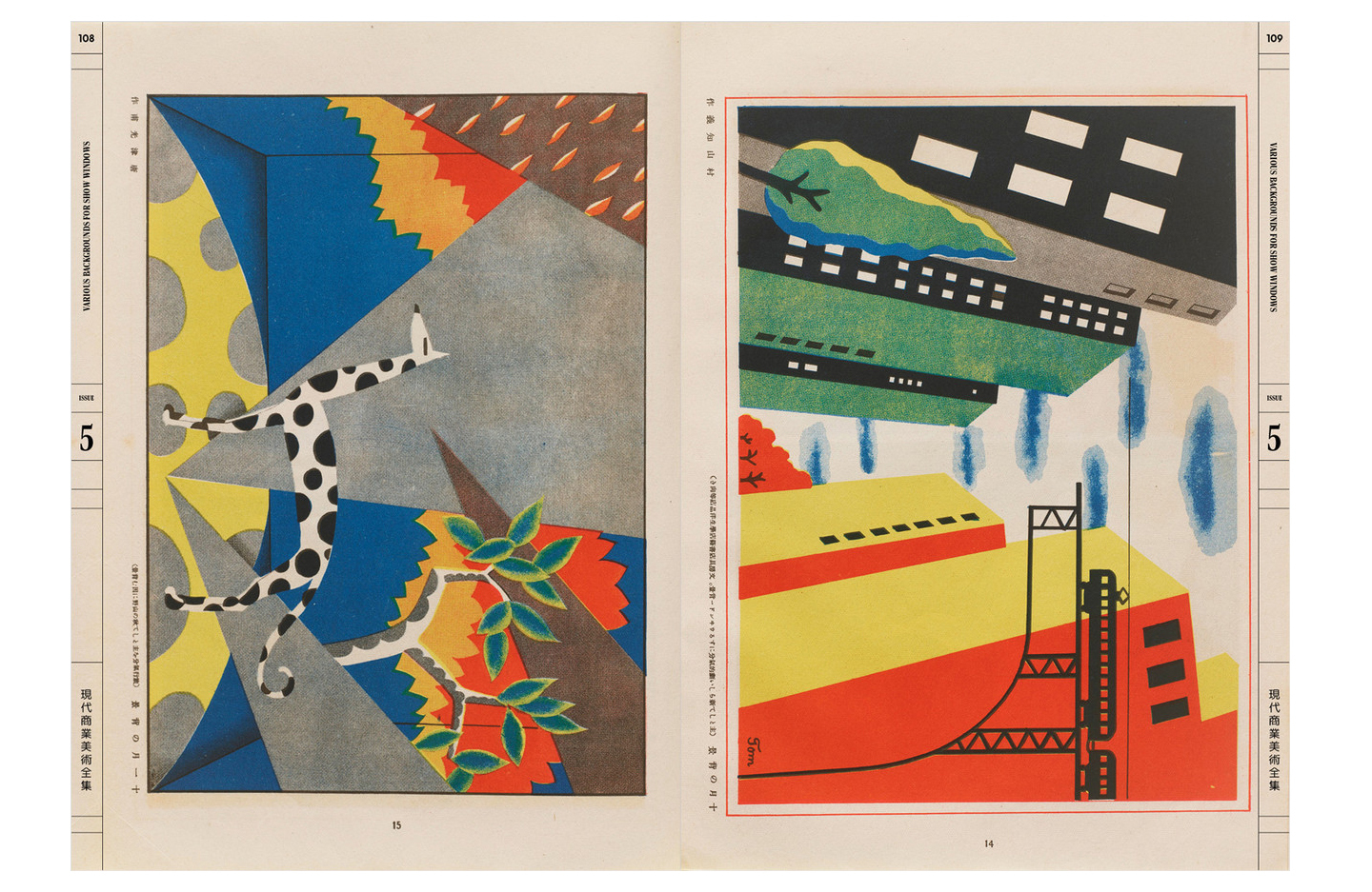
The Complete Commercial Artist: Making Modern Design in Japan, 1928–1930 by Gennifer Weisenfeld, Letterform Archive, $60.
Gendai shōgyō bijutsu zenshū 現代商業美術全集 [The Complete Commercial Artist] was a groundbreaking series of 24 journals about design and illustration aimed at Japanese professionals. Published in hardcover and softcover, the image-dominated editions covered a broad range of commercial art and typography, both local and international, printed in a variety of techniques including tri-colour and what author Weisenfeld terms ‘a vibrant section of original designs printed in spot colours with offset plates’. Between June 1928 and September 1930, The Complete Commercial Artist featured articles by 100-plus authors and original work by more than 170 Japanese artists.
This generous 432-page compendium was art directed by Alice Chau and published by Letterform Archive (see Eye 108 and 100) in 2024. Its carefully printed visual contents include posters, ‘practical signboards’, exhibition displays, flyer and label design, lettering, typography, trademarks and monograms.
The final and 24th volume incorporated a 100-page ‘manifesto’, by series editor Hamada Masuji (1892-1938) that referenced a wide range of intellectuals and artists. Masuji declared that the ultimate aim of commercial art was ‘to build a rapturous world of beauty for the happiness of people’s lives’.
The book features biographies of contributors to The Complete Commercial Artist, including Murayama Tomoyoshi, Murota Kurazō, Nakada Sadanosuke, Okamoto Ippei, Onchi Kōshirō, Saitō Kazō, Sugiura Hisui, Takehisa Yumeji, Takei Takeo, Yajima Shūichi and more.
Included in Volume 5 ‘Various Backgrounds for Store Windows’, setting a narrative and decorative backdrop for display of goods.
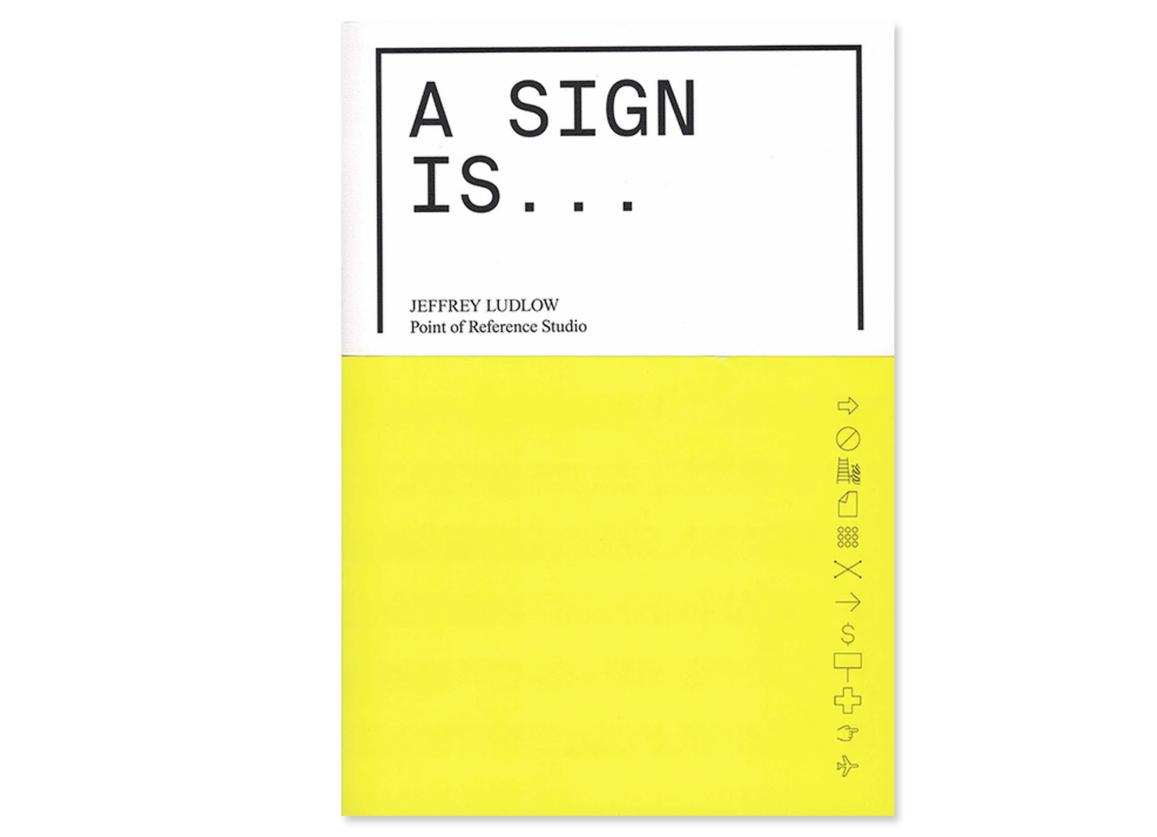
A Sign Is … (Oro Editions). By Jeffrey Ludlow / Point of Reference Studio. $35
A Sign Is aims to uncover the origins and cultural relevance of specific signs. Author Ludlow, a wayfinding designer based in Madrid, has amassed more than 1000 images (often shared on his Instagram account @por_research) over two decades of practice.
In the ‘Hacked’ chapter, the book showcases different instances of hackers changing the text on Variable Message Signs (VMS), ranging from pranks to foul language and political and racist rhetoric.
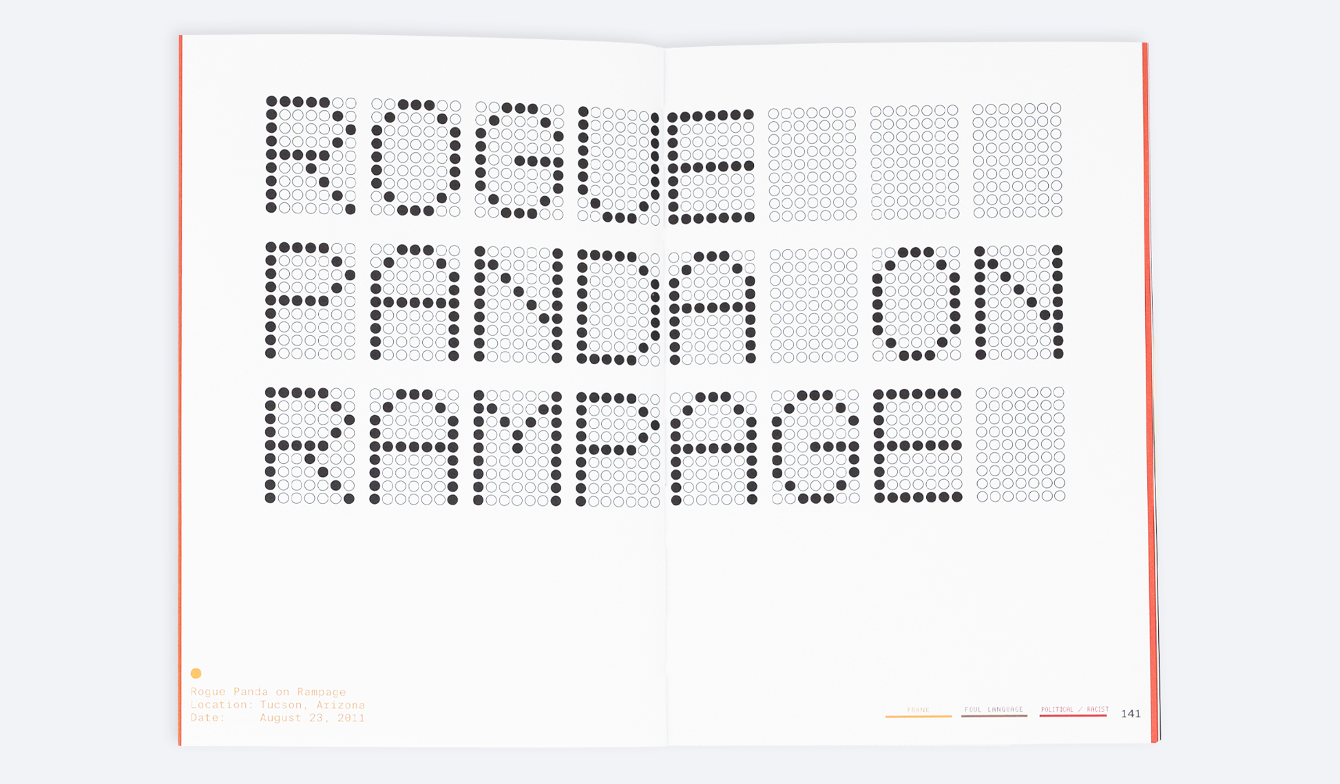
With his pictures pasted across twelve chapters, Ludlow tackles ‘Orientation’ (without words), ‘Waste’ (about OOH advertising), ‘Protest’ and ‘Air Travel’, which states that the Frutiger typeface (see Eye 31) is used by eight of the world’s largest airports.
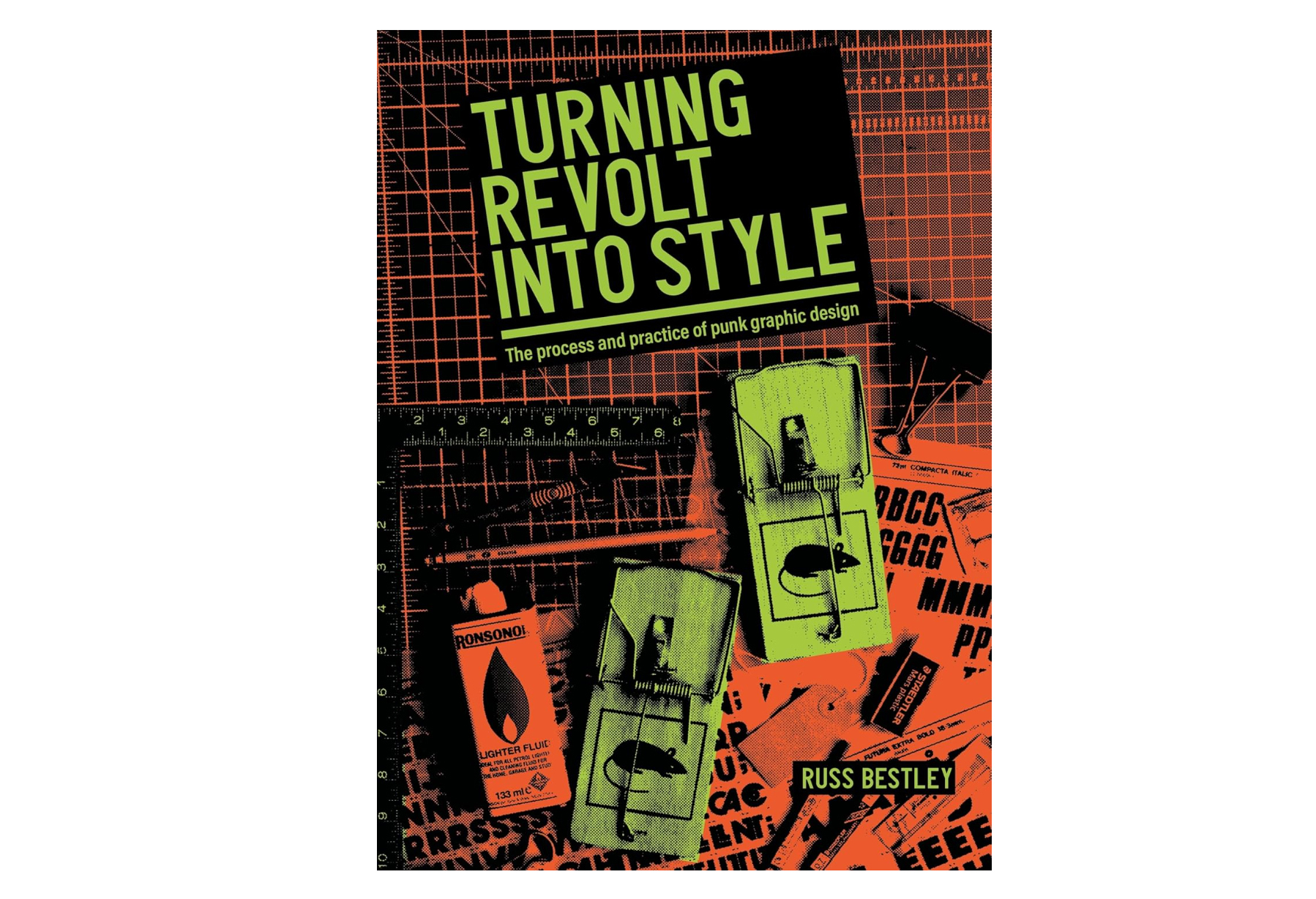
Turning revolt into style: The process and practice of punk graphic design (Manchester University Press). By Russ Bestley, £85.
Russ Bestley’s Turning Revolt into Style is the fruit of the author’s long study of the graphic artefacts and practices of the punk rock era. The book is part of an MUP series called ‘Studies in Design and Material Culture’, and based on Bestley’s research and interviews, focusing on design and typography in the UK in particular. Readers may recall the Eye 33 article ‘Punk uncovered: an unofficial history of provincial opposition’, which Bestley co-authored with the late Ian Noble. Bestley is also the editor of the academic journal Punk & Post-Punk.
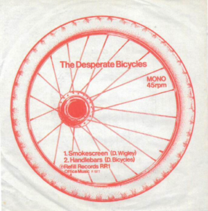
Diana Fawcett’s design for a 7-inch single by The Desperate Bicycles, 1977.
Spread from Russ Bestley’s Turning Revolt into Style, which acknowledges the ‘broad spectrum of attributions of the “punk” tag …’.
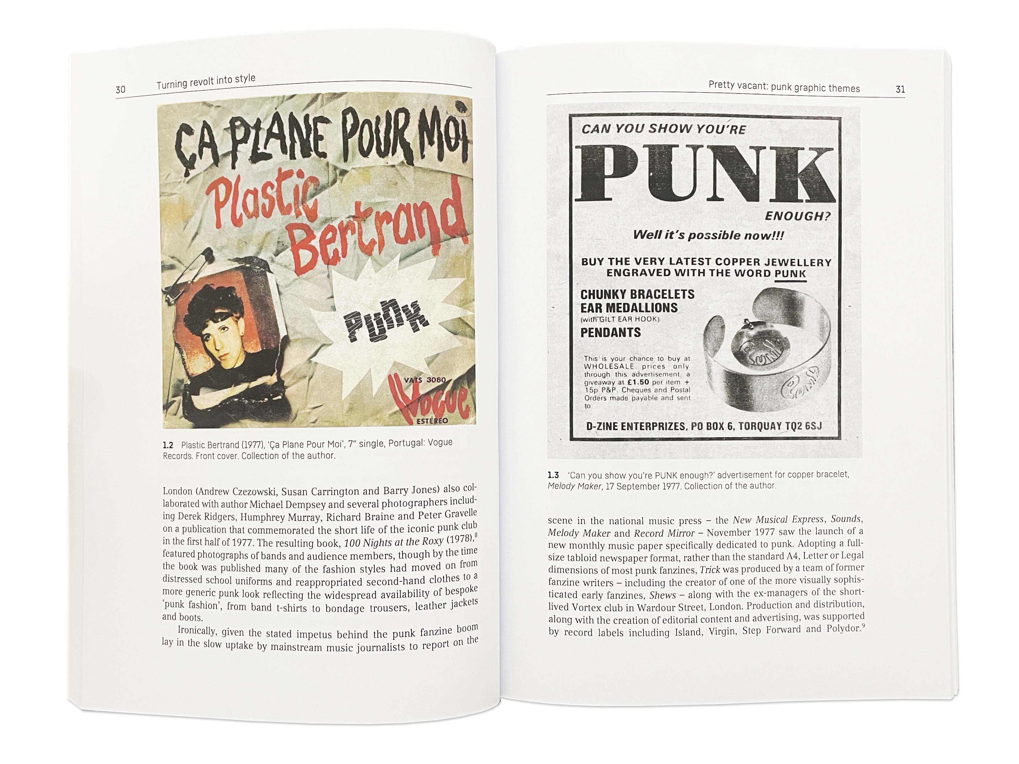
The 270-page book covers work by many designers familiar to Eye readers, including Malcolm Garrett, Gee Vaucher and Jamie Reid, but also sheds light on lesser known figures such as Chris Morton (Stiff records art director), Diana Fawcett and Helen Wellington-Lloyd, ‘who produced graphic material with Nils Stevenson during the summer of 1976’, prior to Jamie Reid’s involvement with the Sex Pistols. More than an exercise in nostalgia, Turning Revolt into Style deserves attention for its documentation of some enduring, influential aspects of graphic culture.
Original Sex Pistols logo designed by Helen Wellington-Lloyd, 1976.

Eye editors, London
Eye is the world’s most beautiful and collectable graphic design journal, published for professional designers, students and anyone interested in critical, informed writing about graphic design and visual culture. It is available from all good design bookshops and online at the Eye shop, where you can buy subscriptions and single issues.
Links
Greensleeves – The First 100 Covers. One Love Books
The Outdoor Archive, Thames & Hudson
On the Edges of Graphic Design from A—Z—∞, Set Margins
The Complete Commercial Artist: Making Modern Design in Japan, 1928–1930, Letterform Archive
A Sign Is, ORO Editions
Turning revolt into style, Manchester University Press