
Monday, 11:56pm
23 November 2009
Designing for Dieter Rams
Bibliothèque on the graphic roots of product design
There are important designers and then there are the really important designers, writes Mason Wells of Bibliothèque. Dieter Rams is definitely one of the latter.
During his long tenure as head of design at Braun, the German consumer electronics manufacturer, the enigmatic Rams emerged as one of the most influential industrial designers of the late twentieth century.
Designer Jasper Morrison says: ‘Rams is not just a product designer, but a designer in the most rounded sense of the word, able to apply his skills to any situation.’ This is the main reason we have so much respect for his work. For Bibliothèque, he has been as influential as any of the graphic designers cited as the pioneers of Modern European graphic design.
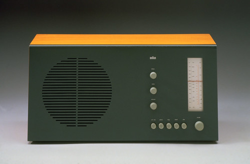
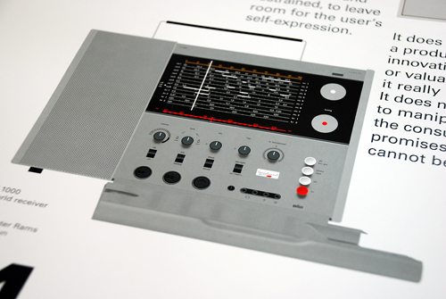
Below: Braun SuperHet VHF and medium wave radio, 1961. Designed by Dieter Rams and Hans Gugelot
Rams’s work uses graphic design, and applies it to the criteria of ergonomic form (as opposed to the usual book or poster format). In some cases it even seems that the form of the product has evolved around the graphics.
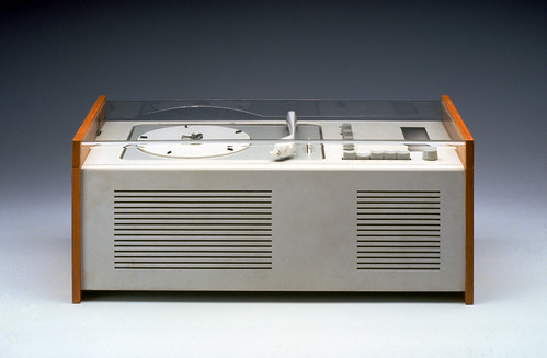
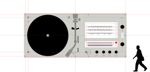
Above: Braun SK 4 radio-phone, 1956. Designed by Dieter Rams.
We had known about the Rams exhibition taking place in Tokyo through contacts at VITSŒ, the manufacturer that produces Rams’ 606 shelving system. So when we were informed that The Design Museum was going to host the exhibition, we approached the curators to consider us as the designers. Previously we had produced the exhibition graphic design for Cold War Modern at the V&A, and we had initiated our own exhibition of Otl Aicher’s 1972 Olympic Design Programme (see Mason’s article about this show in Eye 63). Both projects had strong links to Dieter Rams, so we were confident that we were right for the job.
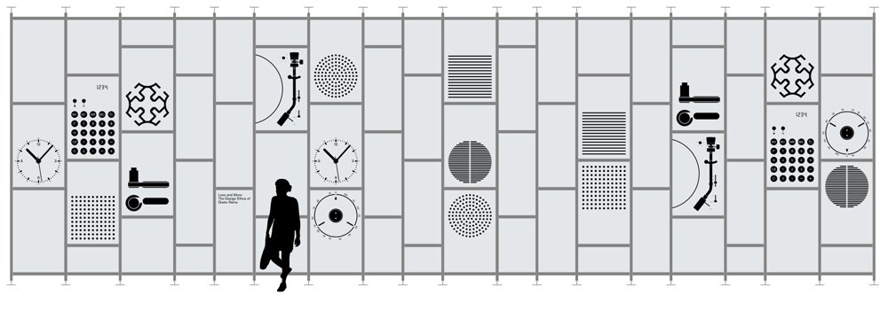
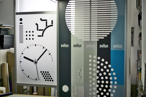
Klaus Kemp, the curator of the Tokyo exhibition (see Robin Richmond’s review of the catalogue in Eye 73) recently described the objects in the Rams exhibition as ‘pictures’, and this struck a chord with us. Our exhibition design has been informed by the graphic nature of the objects. The layouts on many of the Braun products are excellent examples of three-dimensional information design – not only the use of controlled typography, but also in the pragmatic use of colour, geometry, positioning and alignment of dials, switches, buttons, jackplugs and screws. Our approach was to express this by extrapolating these aspects and using them as visual elements throughout the exhibition experience (below).
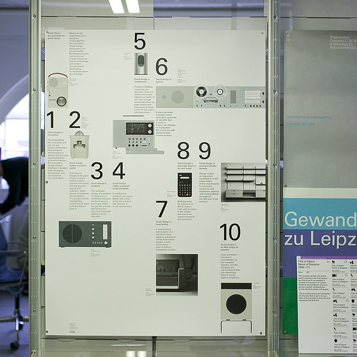
The exhibition features 244 objects across five sections spanning six decades. Our implementation uses several graphic processes – each appropriate to specific content. The entrance (top) is an internal façade using the 606 compression system that spans the entire width of the upper gallery (approx 15x5m). Key graphic elements are integrated using the visual language from selected products of Braun and VITSŒ in order to set the tone.
The five sections – Dieter Rams solo projects, Braun team projects under Dieter’s leadership, VITSŒ, Typology and Legacy – are delineated by panel / partitions that use product elements such as speaker grilles, calculator layouts and hi-fi interfaces relevant to each story. In each instance we have removed elements by routing away the geometric shapes of the products – the effect is as if the product has been deconstructed and re-scaled beyond the intended proportions (below).
A seven metre-wide mural on the back wall (painted – as opposed to vinyl or digital runout) of the Audio 300 stereo system reinforces the rational approach to product layout (below).
Finally, technical illustrations that combine line artwork with photographic elements (allowing for subtle undulating forms, concave and convex buttons and changes in lighting) have been used in the subsequent exhibition marketing and a VITSŒ side-project – a seven colour A0 poster (below), featuring Rams’s famous ten principles of design.
On the penultimate day of installation we had the good fortune of being introduced to Dieter Rams. Our first (very nervous) question – did the exhibition meet his expectations?
‘Of course’ he said, ‘I can see how much hard work has gone into it’. He understood our graphic interpretation of the products, and he was keen to explain his own approach to graphic design within the sphere of product design. It was an absolute honour and an inspiration to get firsthand insight from one of the elder statesman of design.
Less and More – the design ethos of Dieter Rams, is at the Design Museum until 7 March 2010.
Eye is available from all good design bookshops and online at the Eye shop. For a taste of the magazine, try Eye before you buy.