
Friday, 3:27pm
17 December 2010
Escape from nostalgia
Letterpress methods and the struggle between progress and pastiche
As Christmas draws closer, many of us can look forward to receiving wonderful gifts which after a brief honeymoon find themselves at the back of cupboards or serving as an impromptu clothes-horse, writes Alexander Ecob.
I’m sad to say my own forgotten enthusiasm sits on top of a chest of drawers in the shape of two rather dusty Adana machines. It is with great admiration therefore, and more than a little envy, that I view New North Press’s latest exhibition: ‘Reverting to Type’.
Housed in the Standpoint Gallery in Shoreditch, East London, ‘Reverting to Type’ is a testament to the resurgence of traditional techniques in a design-community increasingly enamoured with the physicality of its profession. There is a wide variety of work on show, by both seasoned practitioners from across the globe and practising students from down the road. The real highlights are the specially produced collaborations from familiar names such as Phil Baines see Reputations in Eye 69, Fraser Muggeridge studio (see ‘They work with words’ in Eye 75) and Catherine Dixon.
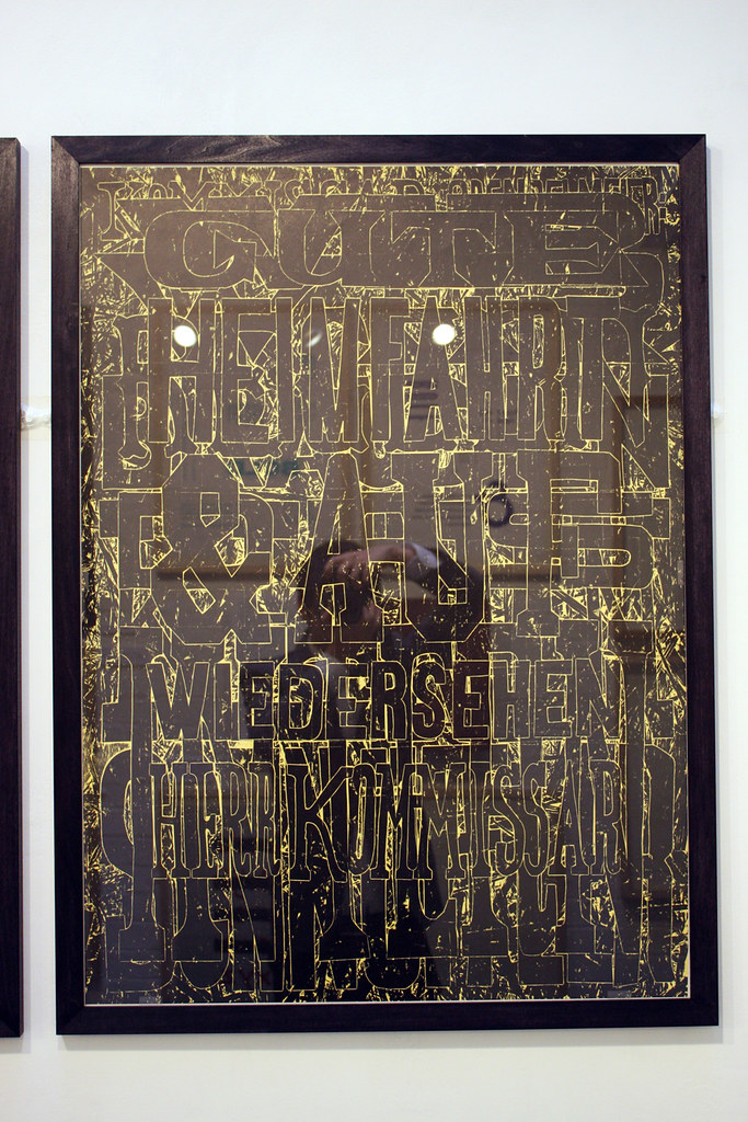
Above: Fraser Muggeridge studio & NNP. Edition of 35.
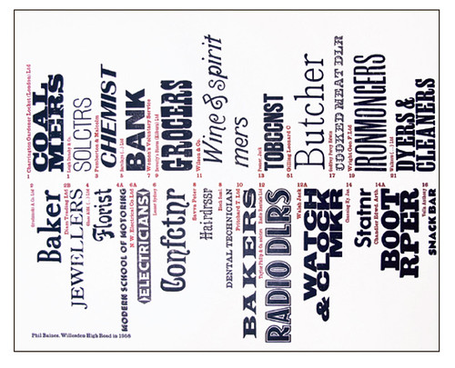
Above: Phil Baines & NNP. Edition of 35.
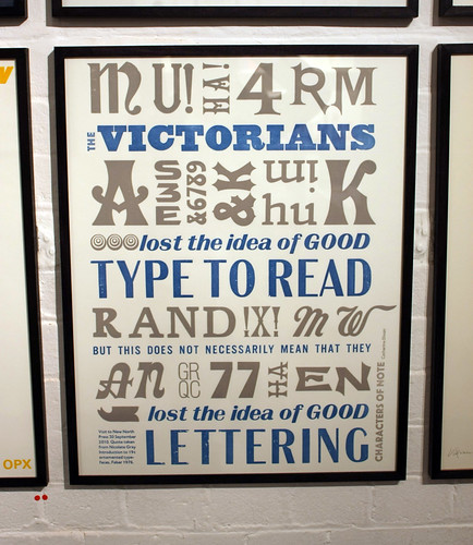
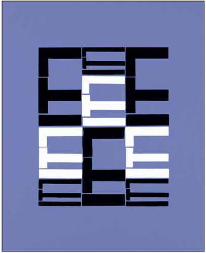
Above: Catherine Dixon & NNP. Edition of 35.
But when the initial wonder of the spectacle has passed, the most striking impression the exhibition gives is the state of contemporary letterpress as a struggle between pastiche and progress. As with many collections of letterpress, there is more than a little work featured that remains within the well trodden ‘letterpress aesthetic’ (fans of centred type and mismatched fonts will not be disappointed, and there are more ornaments than you can shake a composing stick at) that implies a greater concern with image aggregation than understanding of context.
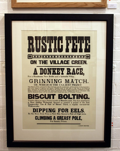
Above: Typoretum 'Rustic Fete'. Edition of 4.
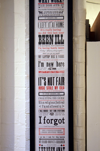
Above: Chelsea College of Art & Design ‘Excuses’. Edition of 50.
Luckily for the experience (and the show’s claim of letterpress being ‘reinvented for modern-day usage’) there are pieces with which exhibitors step away from the nostalgia of the process, and it is in these that the real success of the show lies. Works by David Pearson (see Eye 77) and Dafi Kühne (keynote speaker at the recent St. Bride Library letterpress conference ‘Forward Thinking’ (see Eye blog) in particular stand out, along with many other fine examples of what can be achieved when letterpress is treated as a method rather than a style.
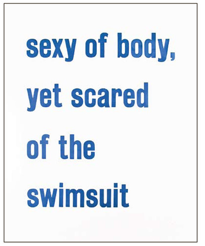
Above: David Pearson & NNP. Edition of 35.
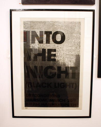
Above: Dafi Kühne Into the Night. Display only.
So despite questions about the necessity of yet another playbill-style poster, such is the beguiling nature of letterpress and the undoubted quality of much of the work on show, that it would be very difficult to do anything other than thoroughly enjoy this collection of inspiring contemporary printwork. As for me? I’ll order a new set of rollers tomorrow, I swear.
> 24 December 2010 and 4 > 22 January 2011
Reverting to Type
Standpoint Gallery
24 Coronet Street, Hoxton
London N1 6HD
www.standpointlondon.co.uk
Eye is the world’s most beautiful and collectable graphic design journal, published for professional designers, students and anyone interested in critical, informed writing about graphic design and visual culture. It’s available from all good design bookshops and online at the Eye shop. For a taste of the latest issue, no. 77, see Eye before you buy on Issuu.