
Tuesday, 11:24pm
18 May 2010
Five from the Eye Archive: Japan
various designers
john ridpath
the back issue department
Design history
Graphic design
Visual culture
Cute Culture, Motomichi Nakamura, Phonetic Characters, eye tests and JPG
Here, by popular request, are links to five articles, ‘fresh from the Eye archive’ with Japanese associations.
First, here’s a Q&A with image-maker Motomichi Nakamura (see also the cover of Eye 62) on the subject of the graphic canon: ‘Design history has always been a way to resolve problems posed by ever-changing media, cultural attitudes and other external factors. Seeing how designers in the past have adapted can be inspiring at a time when we have to deal with media that are completely new and still developing …’
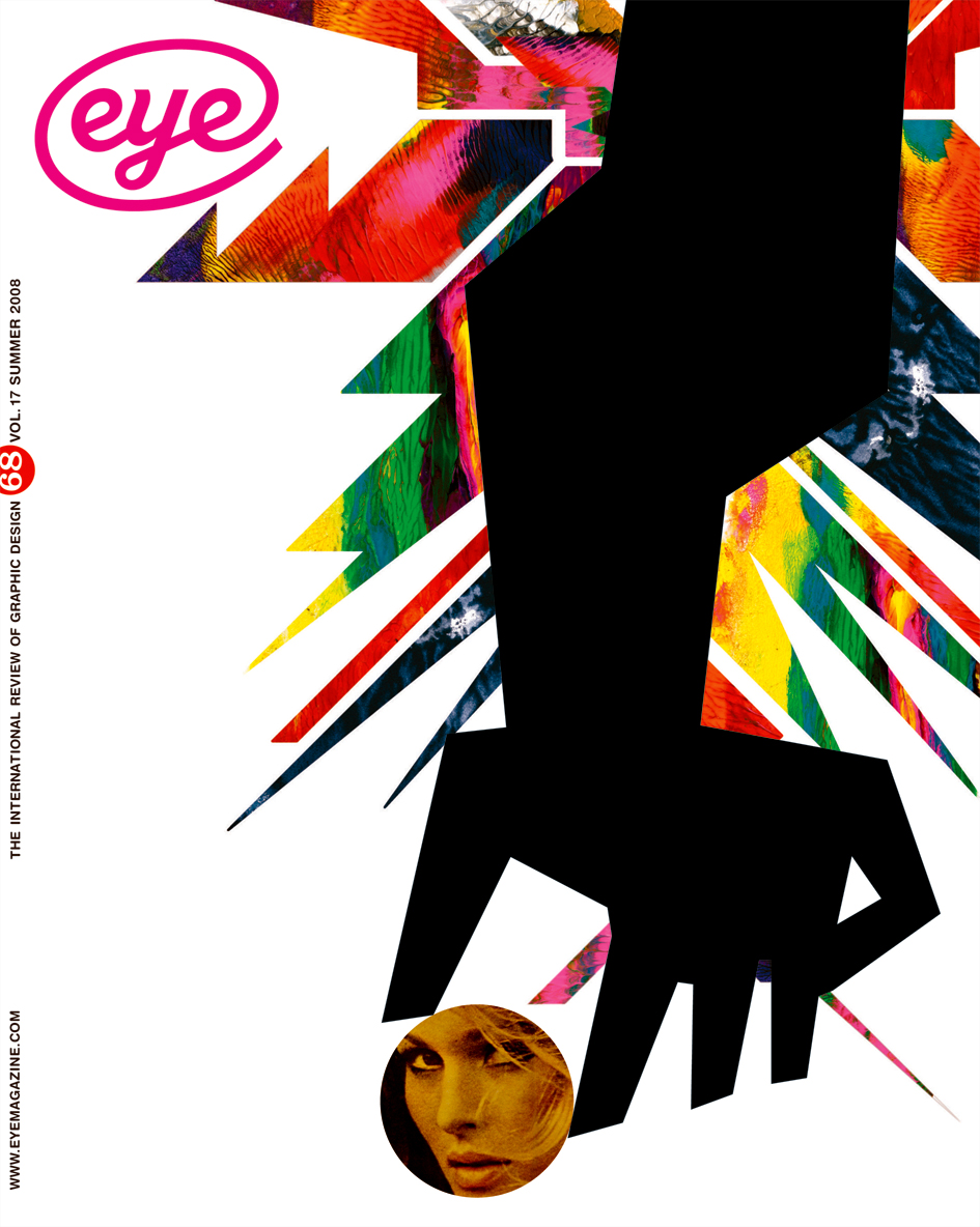
‘Who cares about graphic design history?’, (Eye 68).
‘High-school girls carrying satchels with small Kyoro-chan attached and professionals talking on their mobile phones with Kogepan (‘burnt bun head’) characters hanging from the straps are not rejecting the traditional beauty of Zen gardens or woodblock prints in favour of wasting energy and money on useless objects. The popular taste for these mascots is based, in many ways, on traditional aesthetic qualities associated with Japanese art and nature, and plays an important role in the everyday lives of Japanese people today.’
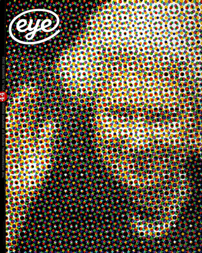
‘Cute culture’, by Miki Kato (Eye 44)
[Michael Johnson’s] ‘Phonetikana [...] shows the English reader how to pronounce each Japanese character, with phonetic syllables such as “hoh”, “shee” and “koo” – the idea being that “you don’t even have to learn the shape”. Using this, you can see that the four characters in (for example) the Japanese version of the Uniqlo fashion logo (below) read “yoo”, “nee”, “koo”, “roh”; and read the katakana for Pecha Kucha (“peh” “chee” “ya” “koo” “chee” “ya”)’

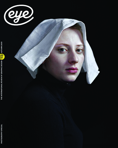
‘Character studies’, by John L. Walters (Eye 73)
‘Ophthalmology and its related fields of vision care have at their disposal a battery of tests able to assess the health of our eyes and the state of our vision [...] one test that might be recalled is the “Ishihara”, an odd-seeming portfolio of printed disks made up of coloured dots, numerals and squiggly lines.’
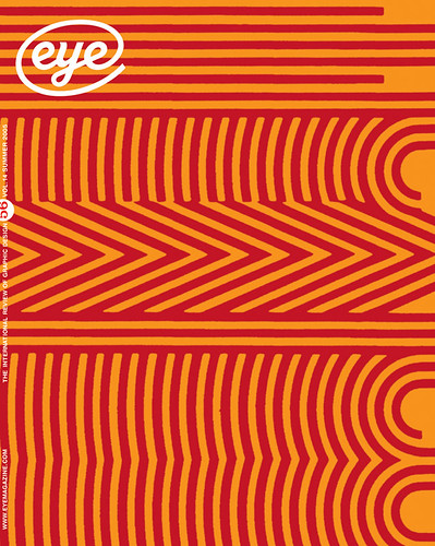
‘Ishihara’, by Eric Kindel (Eye 56)

‘The title of this doorstop-sized tome says a lot about Japanese design all by itself. JPG offers a visual overview of young Japanese graphic and interactive design, both of which are integrally tied to those curious suffixes found on image file names.’
‘The look of young Japan’, review by Daniel Nadel (Eye 48).
John Ridpath, writer, coder, London
Eye is the world’s most beautiful and collectable graphic design journal, published for professional designers, students and anyone interested in critical, informed writing about graphic design and visual culture. It is available from all good design bookshops and online at the Eye shop, where you can buy subscriptions and single issues.