
Tuesday, 1:30pm
1 September 2009
Hands on
Adding soul (and soil) to the television test card, MTV EMA part 1
‘Fired up and hired’, Liz Farrelly’s Eye 72 article about MTV includes several examples of the channel’s approach to design and animation. In this two-part blog, Paul Ayre, former head of On-Air Graphics at MTV, writes about his methods.
Each year’s EMA [Europe Music Awards] had a distinct theme or concept – Caravan/ Borders (Berlin, 1994), Circus/ Freak Show (Paris, 1995), Television (London, 1996), Enchanted Forest / Fantastic Voyage (Rotterdam, 1997) – and a different director / animator or art director to produce the main show titles and the main advertising campaign.
My job was to come up with an alternative take on the theme, which alluded to the main event, but had a distinct look. The director’s contribution was to be kept under wraps and seen only at the show (or, in the case of the ads, no more than a few days before), for maximum impact. I had to come up with an aesthetic that would inform all activities in the four- to six-week lead-up to the main event, and for a week or so afterwards, including title sequences and packaging, content graphics for all satellite shows, nominated artists’ profiles, promos, idents and sponsorship trailers. This material was also to be used as content graphics in the main event.
In 1996, for example, when the award ceremony was being held at Alexandra Palace, in north London, the first home to BBC Television, the theme was Television (and the guest talent Phil Hunt).
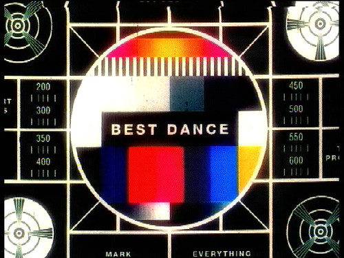
The test card, a standard televisual icon, was to be used as a device in the title sequence and content graphics for the awards. This was the only reference I had; no storyboard. When asked what I was going to do, I said, ‘I don’t know, I suppose move it around…’; and they left me to do my own thing.
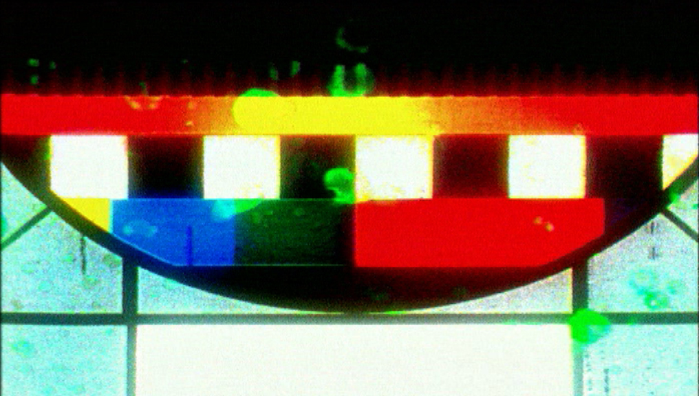
The print designers, who included Nicolas Charavet, were using test card devices in their stuff. So I took that lead; I asked Nick to help me design and produce the cards. We made numerous test cards; the artwork was put on a film rostrum camera, and we shot them on 35mm.
Once the film was developed, a negative and print were produced. I had a gut feeling that it was all too clean, too antiseptic; it lacked personality, it needed to be fucked up, and more organic. I decided to add some soul.
I got a film print made, then took it home to my spare room, and unravelled the spool. I then proceeded to spray, into the air, a combination of washing-up liquid, floor cleaner, bleach and furniture polish, twice a day for about a week. Later, I buried the film in the garden for a week.
Then the film was cleaned, twice, and then telecined (prepared for television broadcast). This is when we zoomed into and panned across various details on the cards to reveal the categories, artist / band names, and other information, in a very methodical, mechanical, hand-cranked way.
The original test cards were predominately black and white, with straight lines; but this was all disrupted by random colour and texture, introduced by the chemical reactions to the film caused by the various processes. In a way it complemented the geometry of the test card, and the linear movements made in telecine.
To come: MTV Europe Music Awards graphics 2. The ingredients that went into Rotterdam’s Fantastic Voyage (1997)
In ‘Fired up and hired’, in the latest issue of Eye (no. 72 vol. 18, Summer 2009), Liz Farrelly considers MTV’s track record in motion graphics.
For further examples of Paul Ayre’s work see www.1459ldn.com
Eye is available from all good design bookshops and online at the Eye shop, http://bit.ly/Eyeshop. For a taste of the magazine, try Eye before you buy, http://bit.ly/ebyb.