
Wednesday, 11:00am
8 October 2008
How Mexico went for gold
A glorious rerun of the 1968 Olympics identity . . . with one omission
I had no idea until a friend mentioned it, writes Daoud Sarhandi. ‘Congratulations,’ he said, ‘the quotes look great.’ Quotes? What quotes? ‘Mexico 1968. In the museum … the Museo de Arte Moderno.’ And so Carolina Rivas and I went, with our daughter, into Mexico City to take a look at ‘Designing Mexico 1968: An Olympic Identity’. Although I hadn't revisited the subject since ‘This is Mexico … this is 1968’ was published in Eye 56 – or rather since I was forced to reply in Eye 59 to a critical letter written by Eduardo Terrazas and Beatrice Trueblood – I felt right at home among the artefacts and epoch in the museum.
That happens after working on a subject for as long as it took Carolina Rivas and me to piece together the aforementioned article. Indeed, after working as long (and at times as painfully) as we worked on ‘This is Mexico…’, everything in the exhibition seemed so familiar that I felt I might have lived through 1968, in Mexico City, as a part of the design team! (I was six years old at the time, living on the outskirts of Bristol.)
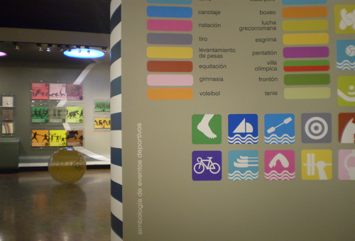
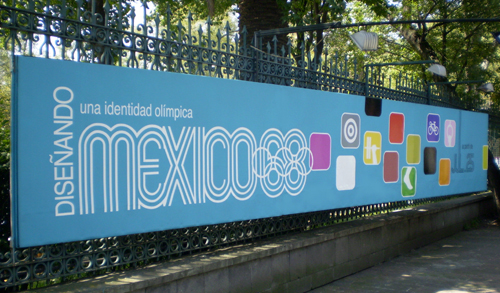
‘Diseñando México 68: una identidad olímpica’ contains every glorious visual element included in our article, and more. The curators have even gone to the trouble of reproducing the striped acetate balloons that floated over the Olympic stadia during the games. (Our toddler particularly enjoyed kicking them around the museum.) And very elegant ‘in the flesh’ the balloons are too. One element conspicuously missing from the exhibition, however, is the Huichol tablas we were particularly proud to reveal in our article, along with the anthropological design story behind them. (This was the element referred to by us that caused so much offence to Mr Terrazas and Ms Trueblood.)
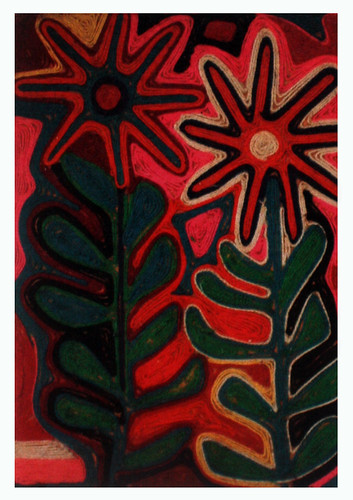
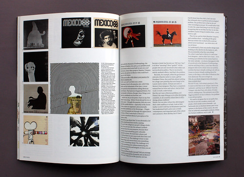
Above: Huichol tabla, 1950s.
[Alfonso Soto Sorio acquired this floral tabla in the 1950s, and showed it in the first exhibition of Huichol art, which took place in Jalisco in 1959. In the 1960s. In an interview in the Eye 56 feature, Soto Soria explains that Pedro Ramirez Vazquez suggested developing some ideas for the Olympic identity ‘along the lines of the art the Huichol normally create: using lines and the sorts of colours they like to use.’]
When I asked one of the curators of the current show if she knew of the tablas’ existence, she nervously replied: ‘Oh yes, we have some of them in the basement. Pedro Ramírez Vázquez sent them. But there was no room to hang them.’ I took her point about the space; the relatively small room dedicated to the exhibition is rather cramped. However, it would have been nice to have seen the Huichol Indians’ contribution honoured, if only briefly.

On the way out I noticed that Eduardo Terrazas is one of the exhibition’s two curators. So I wasn’t so surprised about the entirely missing Huichol representation after all. We did scratch our heads on our way home, though, wondering why, when he was so adamantly against our article at the time of its publication, there were translated fragments of our Eye article (in Day-Glo orange letters, moreover) all around the exhibition.
‘Diseñando México 68: una identidad olímpica’ runs until March 15, 2009 at the Museum of Modern Art (Museo de Arte Moderno) in Mexico City. If you’re passing through you should definitely go and see it: it brings a great design moment alive; the elements look as fresh, contemporary and startlingly original today as they must have done 40 years ago.
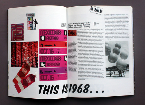
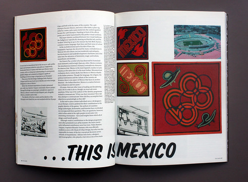
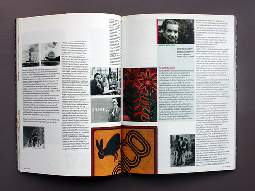
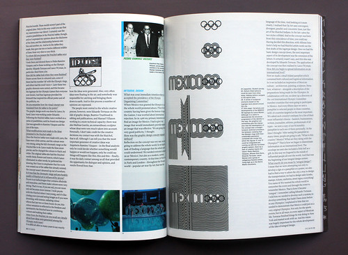
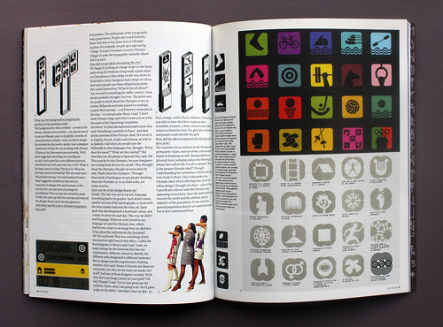
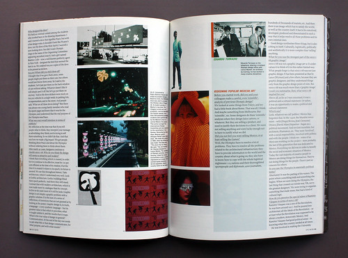
Above and below: all seven spreads from ‘This is Mexico … this is 1968’ by Daoud Sarhandi and Carolina Rivas from Eye no. 56 vol. 14, Summer 2005.
Eye is the world’s most beautiful and collectable graphic design journal, published quarterly for professional designers, students and anyone interested in critical, informed writing about graphic design and visual culture. Subscriptions and back issues (including Eye 56), are available from all good design bookshops and online at the Eye shop.