
Friday, 9:00am
29 December 2017
Noted #85
Archimedes wood type, Lubalin’s root beer label, Play! diary, Fedrigoni 365, L’Obs does Camus, Riposte #9 … and eels
Here are a few things that caught our attention in recent weeks.
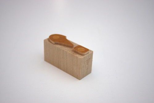
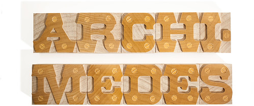
The Virgin Wood Type Manufacturing Company, located in Rochester, New York, has released the font Archimedes in hard maple wood blocks. This ornamental typeface – featuring the imprints of screw heads – is currently offered in uppercase characters and punctuation. Archimedes is a revival of the rare font known as Page No. 122, made in collaboration with Hamilton Wood Type and P22 Type Foundry.
Archimedes Screw wood type exclamation mark.
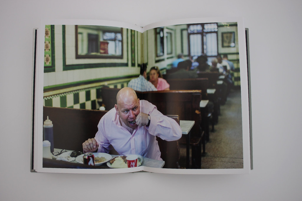
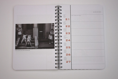
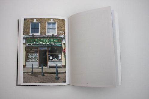
Top. Spread from The Englishman & the Eel, Dewi Lewis, 2017.
Archimedes wood type, a collaboration between Hamilton Wood Type, P22 Type Foundry and Virgin Wood Type.
The digital version has variations in the type of screw-head: Screw (flat), Philips, Hex and Star.

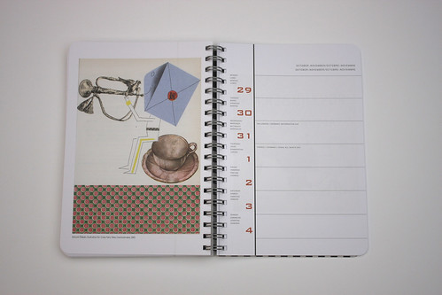
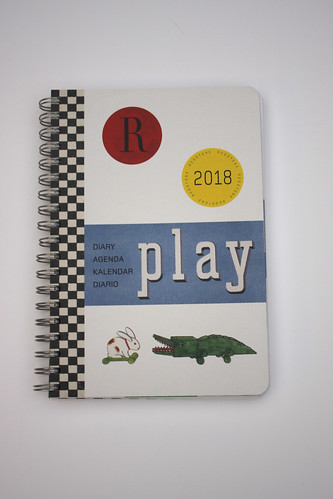
Redstone is marking its 30th anniversary with the Play! diary for 2018. The idea of ‘play’ is invoked through whimsical illustrations and photographs of toys, children at play and artwork that uses play as a theme. Salient examples include a page from a 1931 Soviet children’s book, a photograph of Joan Brossa’s 1988 sculpture No Entry and John Rombola’s circus-themed 1956 textile design.
Bohumil Štepán’s 1965 illustration for Crazy Fairy Tales is featured in the last week of October / the first week of November.
Markéta Luskačová's 1983 photograph, London, 1983, is featured in late May.
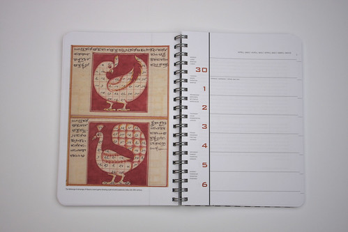
The first week in May features a mid-nineteenth century Indian board game called The Maharaja Krishnaraja of Mysore.
Play!, Redstone, £16.95.
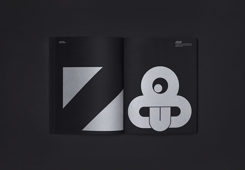
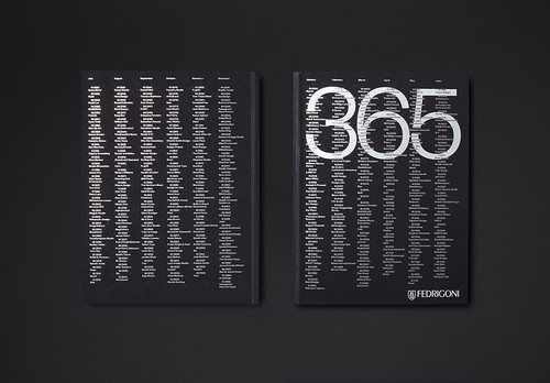
In Fedrigoni’s 365 calendar (launched recently at London’s Protein Gallery), each day is represented by a page designed by a different designer or studio, selected by designers TM.
Spread for 7 and 8 February, by TM / Danny McNeil (left) and Haider Muhdi.
Spread for 25 and 26 December, by Gerald Cinamon (left) and Chris Chapman.
Spread for 13 and 14 June, by This Studio (left) and Joe Cruz.
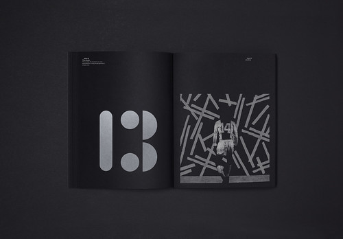
Fedrigoni 365, TM Studio, £15.
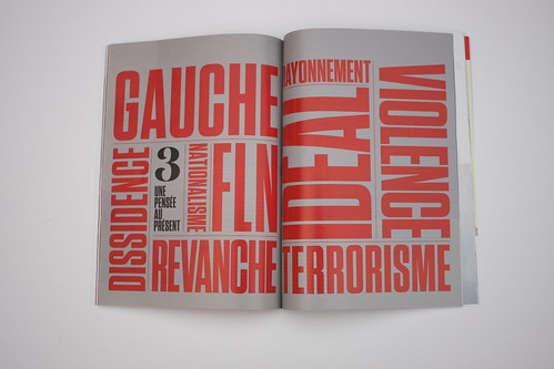
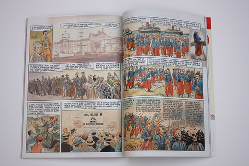
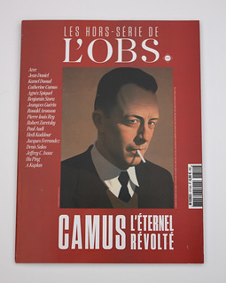
The 97th special issue of French news magazine L’Obs was dedicated to writer and philosopher Albert Camus. The edition is divided into five sections: an introduction, a section on his life, an ‘inventory’ of his work, ‘A thought in the present,’ and a conclusion.
Spreads from the special Camus issue of L’Obs.
L’Obs special issue 97 cover. Art director: Serge Ricco.
 Sp
Sp
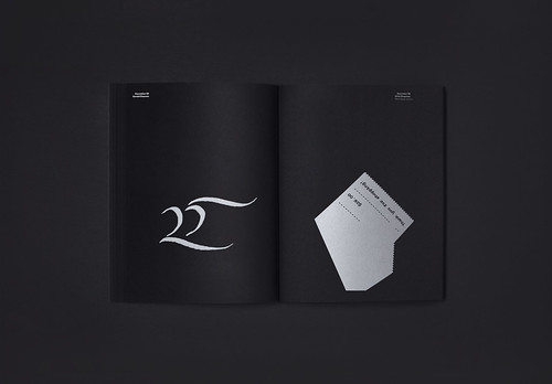
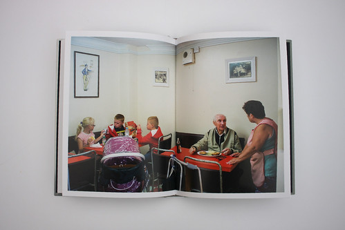
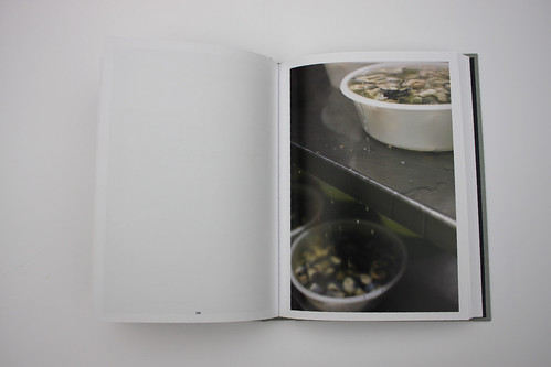
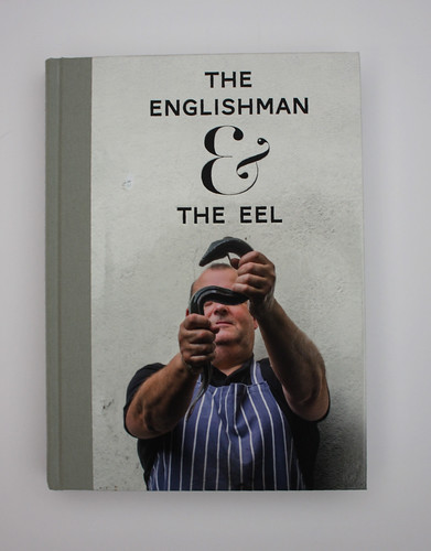
The Englishman & the Eel, a new photobook by Stuart Freedman (Dewi Lewis Publishers), captures the contemporary life of the traditional London pie and mash shop, with vivid photos of chefs, customers, storefronts, countertops and large numbers of eels.
Spread showing the interior of a traditional pie and mash shops, from The Englishman & the Eel, 2017.
Eels preparation.
The façade of a pie and mash shop in East London.
The Englishman & the Eel, Stuart Freedman, Dewi Lewis Publishing, £29.
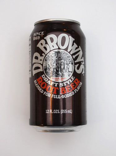
At Monty’s Deli in east London’s Hoxton Street not only is the food amongst the best Jewish cuisine in the capital, but the typography is good, too – co-owner Owen Barrett was born into the Reading typographic clan of Sue Walker and Mark Barrett. Monty’s is now selling Dr Brown’s American Sodas, part of whose retro charm is a packaging identity designed by Herb Lubalin in 1975. It’s typeset in Windsor with a fizzy twist.
Dr. Brown’s Draft Style Root Beer, a favourite of Eye’s art director Simon Esterson. Original typographic identity design by Herb Lubalin.
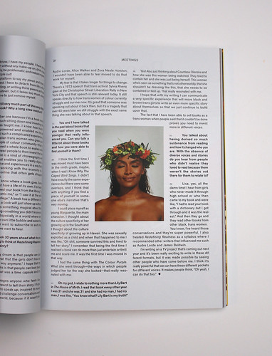
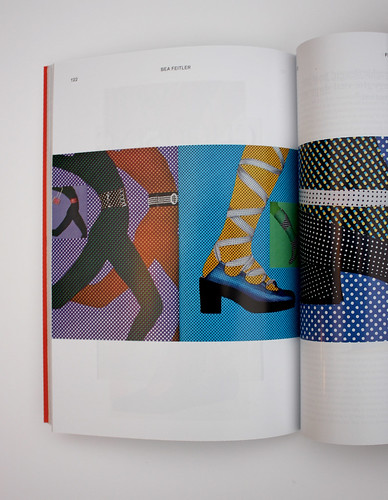
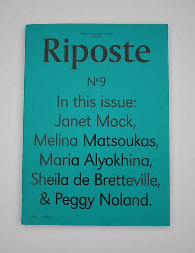
The latest issue of Riposte, (‘A smart magazine for women’, see article in Eye 92) has much of interest to graphic designers. Riposte no. 9 includes a feature about art director Bea Feitler (1938-1982, see Eye 95) and an interview with Sheila Levrant De Bretteville (see Reputations in Eye 8) by Meg Miller.
Pages from Riposte no. 9.
One of two cover designs for Riposte no. 9, 2017.
Eye is the world’s most beautiful and collectable graphic design journal, published quarterly for professional designers, students and anyone interested in critical, informed writing about graphic design and visual culture. It is available from all good design bookshops and online at the Eye shop, where you can buy subscriptions and single issues.